
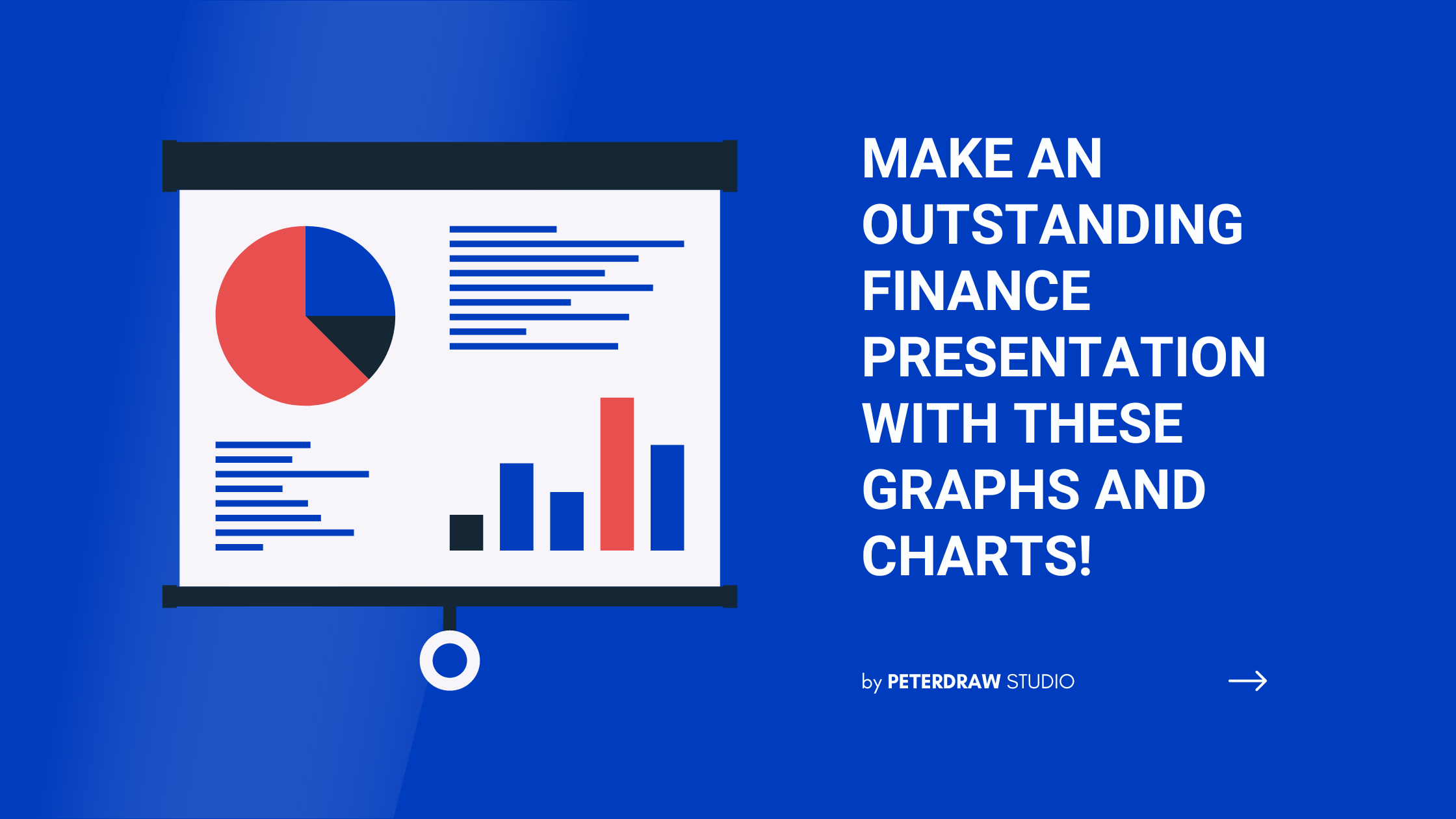
For you who work in the finance field, getting along with numbers and data is like seeing the old friends. Everyday, you probably play with them that could get you suffer in hassle. It can be even worse if you can’t arrange them well and appropriately. No wonder that a finance presentation is like your savior to present your financial report. But, have you been familiar enough with the types of the graphs and diagrams used in your report? Have you chosen the correct one to present your data? Let’s find out the answer here!
Why Must Use Graphs, Charts, and Diagrams in Your Finance Presentation?
A finance presentation without graphs, charts, and diagrams is like serving a pizza without topping. Those graphs have been a part of this presentation that you can’t tear apart. Basically, they are the aids that help the marketers and finance to serve the data more accessible. Besides, they can also make your data look more pleasant and easier to comprehend. At the next stage, you can manage and analyze your data to create the best strategies and tactics you need to take in the upcoming period.
Most-Used Basic Graphs That You Need to Know
There are many types of graphs you can work with to excel your finance presentation. Each graphs has different main point that differs one to another. Here are several basic graphs that you frequently see to make your presentation more insightful with their ultimate aims they hold.
1. Line Graph
Let’s come to the simplest one, the line graph. This chart is one of the most common graphs that serves the data modestly. It displays the dynamic data that change regularly from time to time. Thus, you can pull the thread and analyze what makes your financial condition goes ups and downs. In short, this graphs is perfect to use when you want to catch up with the trends and make prediction. Besides, it is also helpful to compare two or more different variables, situations, and the information within the period.

2. Bar Chart
Besides line graph, bar chart is another popular graph that is mostly used to present the data in the finance presentation. You can use this chart to deliver the economic condition, market fluctuation, statistics, and digital customer experience. Also, you can compare several categories of data in one bar chart.

Essentially, it contains several elements like axis, scales, label and bars. Those elements show the measurable values in different units that has different height and length. Furthermore, this chart is perfect to visualize nominal or ordinal grouped data, since it can reflect the large data changes over the time, like the line graph does.
3. Pie Chart
The next chart your can deal with to nail your finance presentation is the pie chart. This chart holds an essential role when it comes to present the distribution of an item. It gives you a clear illustration of some proportions in a super easy-to-read format like a ‘pie-slice’.

You can tell how your data go based on the size scale of each pie slice. It reflects the values that each data hold. Shortly, it breaks down a group into smaller pieces that displays from part to whole relationships.
4. Area Graph
The last but not the least, go with the area graph whenever you want to show the change in one or several quantities over time. It can show you the similarities and differences between one or more sets of data. Basically, it is the combination of the line chart and the bar graph. Casually, each area has different shade color that showing the value changes with another variable. Visual wise, it gives a significant effect on how we perceive the data.

This graph can help you convey the relationship of each component. Besides, it is also the best one to present the data magnitude. For example, you can include this graph in your finance presentation to compare of the sales of two products or more within the period.
Use Finance Presentation Templates to Make Your Works More Remarkable
Working with numbers and data can be really time-consuming. Besides, it can also spend your energy to deal with the other financial things. Meanwhile, you need to keep your good work in the team. Don’t let your executives and your clients down with not-so-ready presentation. You can still nail it by applying ready-to-use presentation templates like this thread below that you can pick.
Ivory Charcoal Minimalist Professional Finance Presentation Template
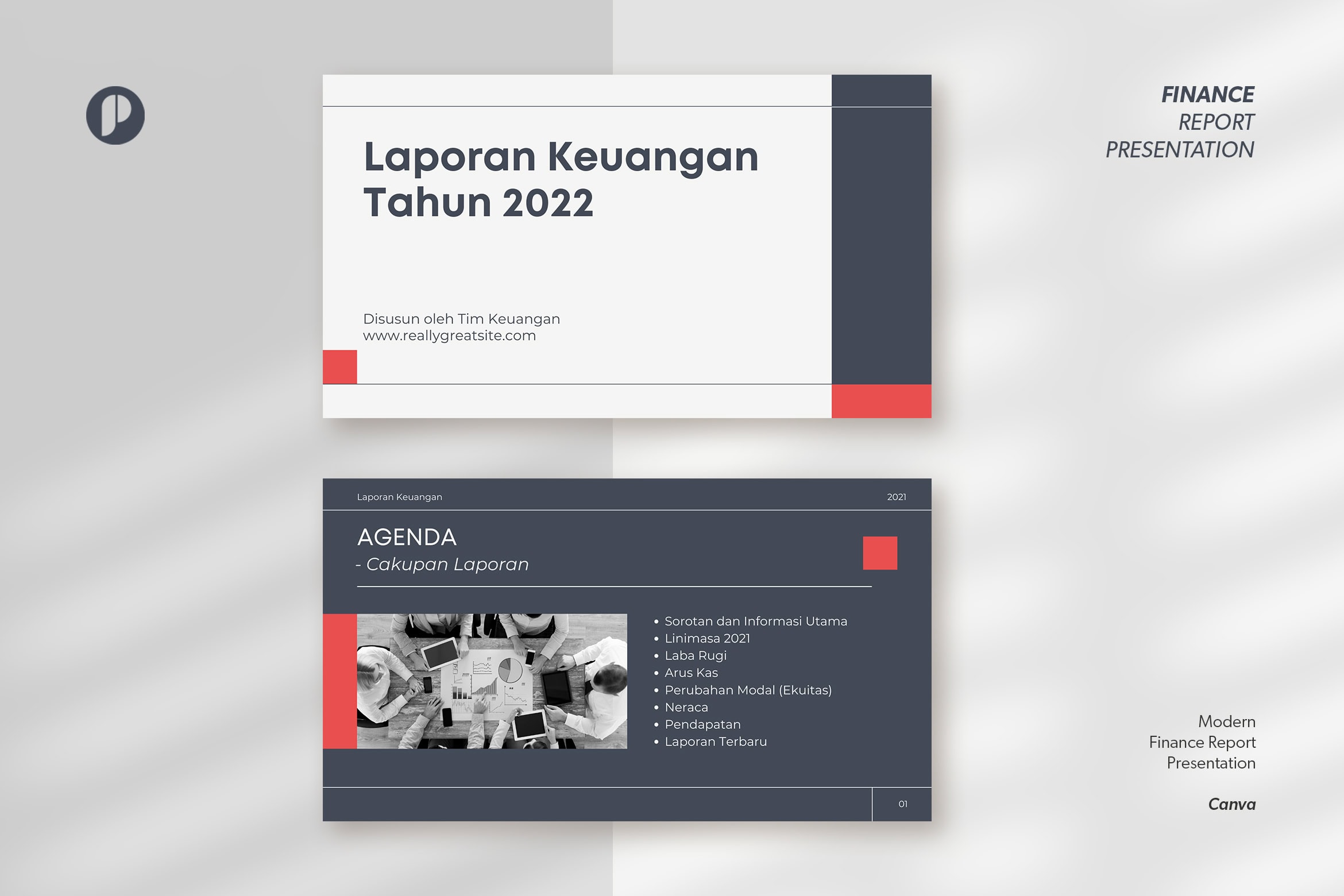
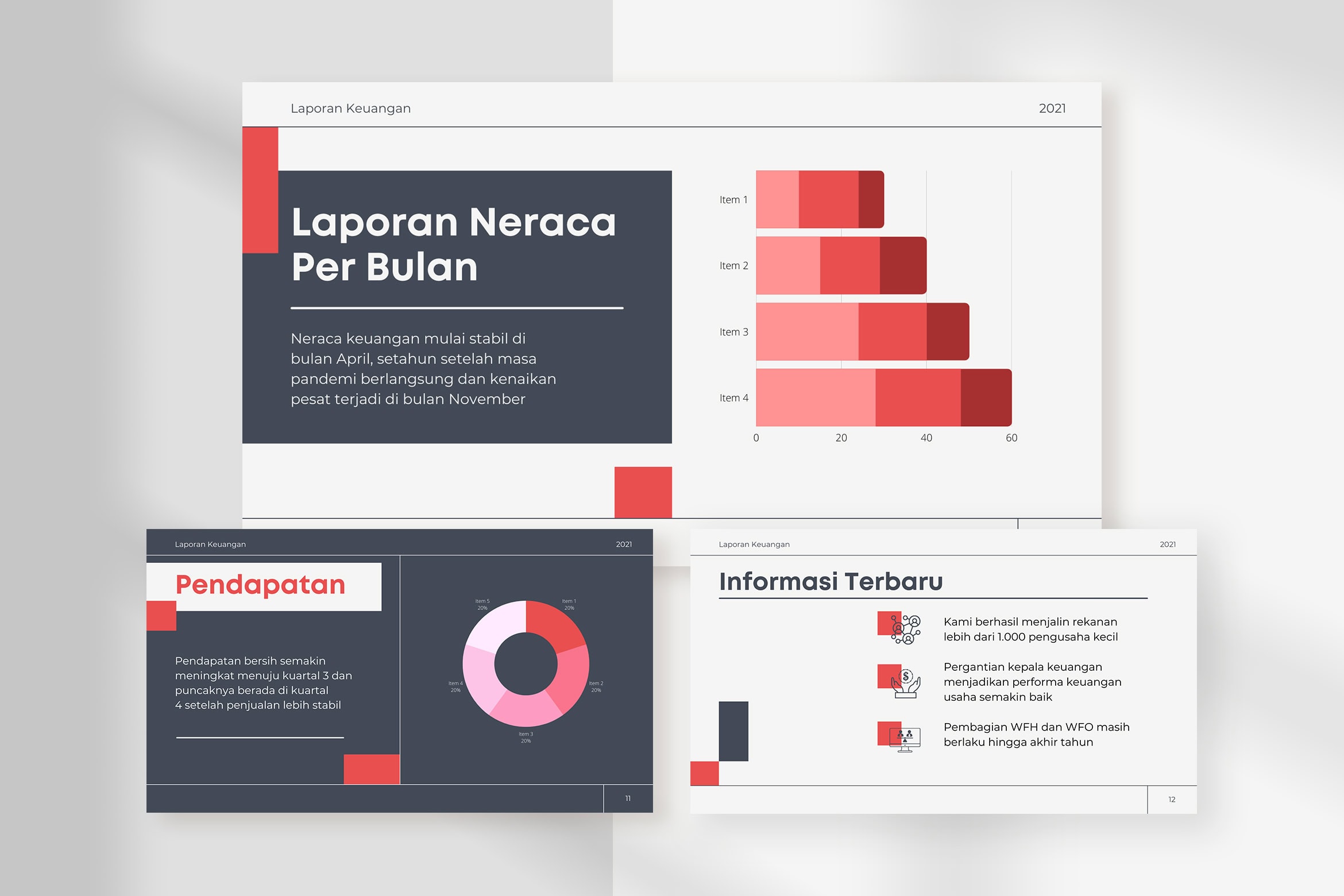

Make an amusing financial report with this rocking charcoal presentation! This template provides you with numerous graphs and charts that you can apply for your data. Besides, it combines charcoal, red, pink, and white in one color palette. In addition, its neat and well-organized layout creates a credible look for your business. So, are your ready to rock your presentation with this professional template.
White Clean Economy and Financial Presentation Template


Are you a big fan of a simple, clean, and minimalist concept? This template is meant for you then. It has a neat layout and a firm color combination that make this template look unique. Even though this template holds simplicity, it still gives you an attractive look. With its clean visual appearance, you can present your financial report at most convincing way. Most importantly, this template also provides you with multiple graphs you can work with. So, you can rely on this template when it comes to make an appealing presentation.
Lemonade Grayscale Modern Financial Report Presentation

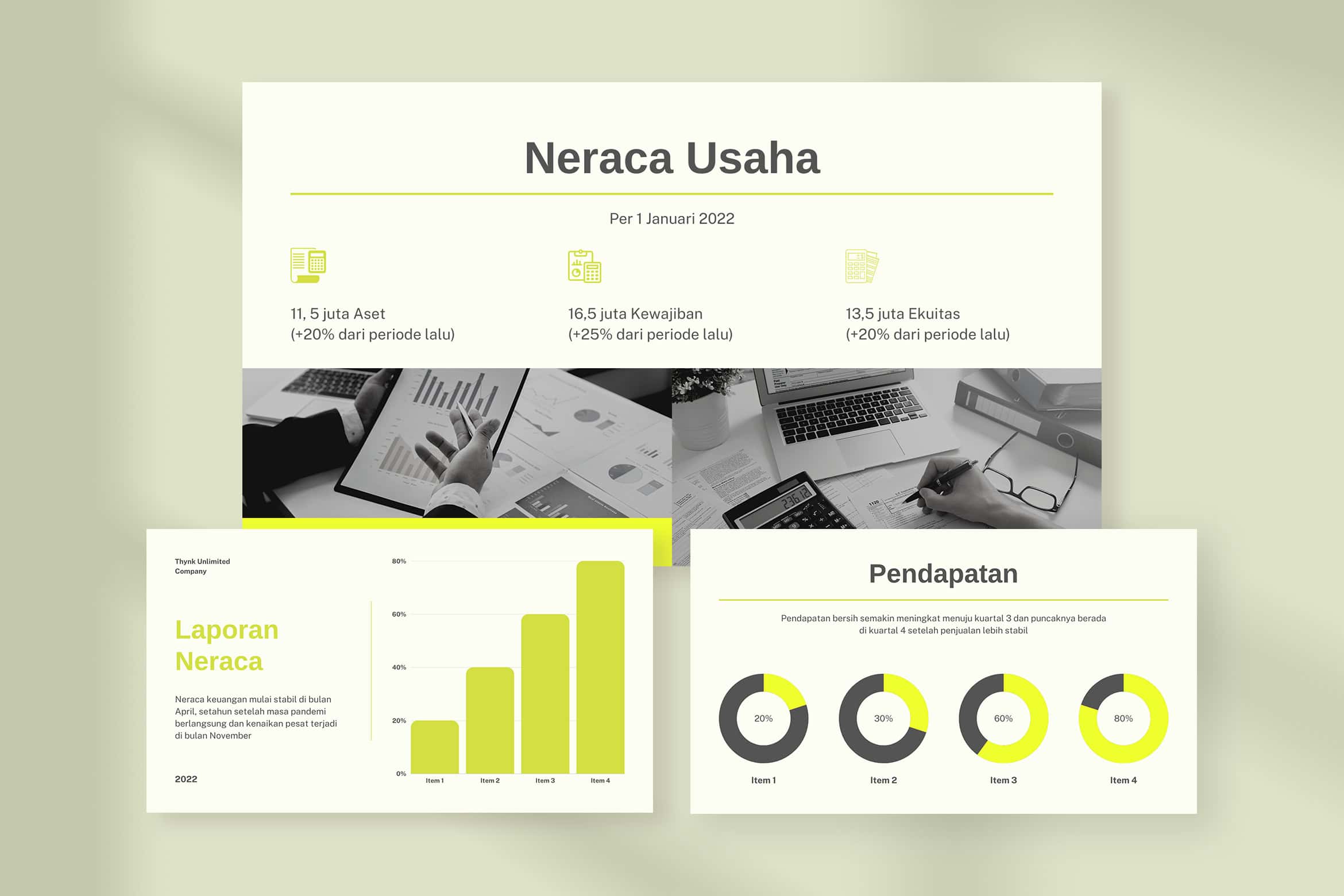

The combination of yellow and grayscale can be another color theme you can choose to make a convincing presentation. It is like what this Lemonade Grayscale presentation does to bring another nuance to amuse your audience. This template has a captivating look that can highlight your professionalism with its neat layout. What’s more, you can have several graphs and charts designed in a trendy and modern way. You don’t have to work extra hard to make your report attractive, because this template can help you achieve that.
HetRee Tosca Violet Modern Gradient Cryptocurrency Presentation


Do you still look for an eccentric template that evokes your uniqueness? Well, you can try this modern template then. From a far, this template can attract everyone’s attention with its alluring color gradient. It puts tosca, blue, violet, and white into one harmonization that pleases your eyes. Moreover, this template also provides you with neat and well-organized layout that make it more captivating. Make a remarkable presentation with this modern template!
Cloudy Blue Modern Investment Fund and Finance Presentation


Dark doesn’t always mean bad. Otherwise, it can gives you elegance and sophisticated look like this Cloudy Blue template. This one is completely perfect for you to deliver your finance report in front of your executive. It has dynamic look with a bundle of charts you can try and adopt. Over and above, the cloudy blue tone makes this template look even more attractive. Don’t hesitant to show your incredible work with this modern template!
In conclusion
Creating a well-informed presentation yet still look attractive is not an easy task. Moreover, there are many thing you need to handle as a finance worker. Graphs and charts can be your best buddy to make your presentation, visual-wised, look more convincing. You can try one of our recommendations to help your work. In turn, you can also explore our collection to get the best template that can complement your needs. Lastly, feel free to reach us for help and other details. Have a great day!