From Web2 to Web3: How Web3 in Web Design Is Redefining Online Ownership
See how web3 in web design blends blockchain, wallets, and UX to create secure, decentralized, user-first digital experiences.

To provide a good user experience, you must have a good interface first. With the right overall layout and design, your website can have good business development, especially in the long term. It is possible as long as you apply UI design principles. What are these principles? Why are they significant for the website or application interface design you have? Let’s find out the principles below!
Users of your website or application can be anyone and from various backgrounds. Most people don’t even understand the terms UI or UX. They only know what they see on their screen. Therefore, to make things easier for everyone, you should keep your designs as simple as possible. Place only necessary features with specific purposes to not confuse them. Being experimental is okay, but you still consider function and usability.
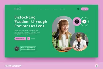
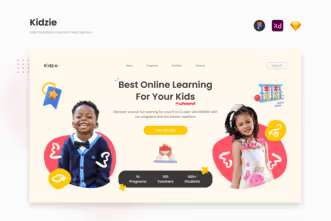

Simplicity may be the basis of UI design principles. However, without consistency, your UI design can result in an inconvenient user experience and an unattractive appearance. The consistent UI means that every page has the same or similar sequence of feature placement. It is related and helps in terms of efficiency. It also will help navigate users to explore the product or service you offer more conveniently. Besides the placement of features, you should be consistent in typography, design pattern, color palette, iconography, and layout.
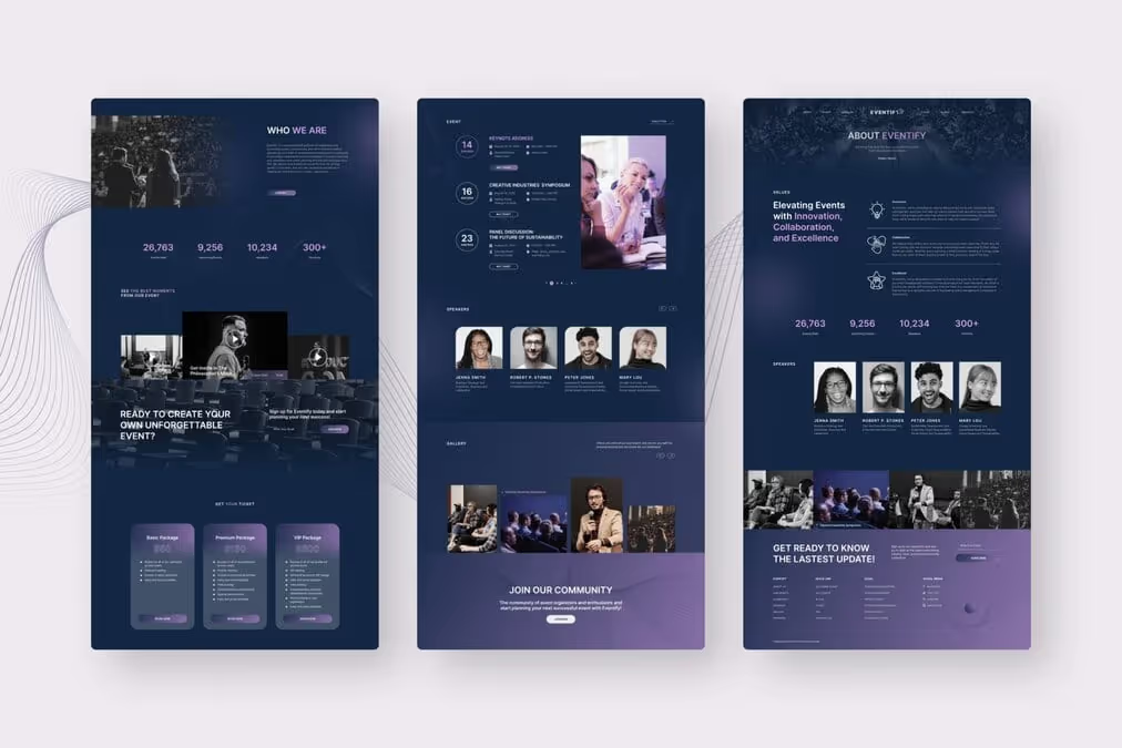
Clarity is one of the principles that applies to any design, not only in UI design. It is very important since it can affect users’ understanding of your website or application. Clarity comes from the consistency and simplicity of your UI design. Besides, you have to pay attention to the contrast in color, size, texture, direction, and shape for legibility and clarity of the design. Last, being truthful in delivering the message is part of clarity building. So, properly convey your message openly as much as possible.
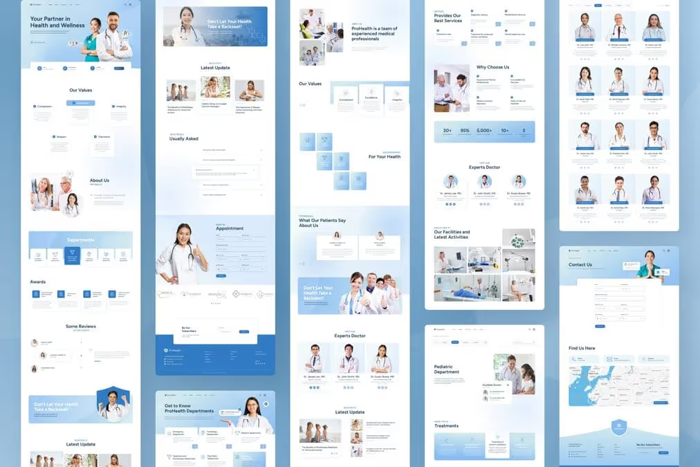
Remember that your UI design users can be varied. Consider that there are some with disabilities or impairments. Finding design solutions to accommodate their needs is the answer. By providing accessible design, you have an opportunity to reach more audiences. By using high-contrast colors, providing captions, adding alt text to images, or providing transcriptions in video or audio content, you can solve the accessibility problems.
The proportional balance of your UI design can create satisfaction, completion, and cohesion. However, what this balance means? It refers to the distribution of the visual weight of your design. You can adjust the element size, color, shape, and texture to create a balance visual weight. It becomes an important UI design principle since it can affect the visual direction. Make your left and right, upper and below, every side of the UI design, has a good balance.
Every graphic design should have a visual hierarchy, including UI design. It helps the user know the order of importance. You can direct users to take the desired action with the proper hierarchical arrangement. Some elements you can adjust to maintain the hierarchical level are color (bright and mute), size (smaller less important), font (styling and size), and negative space (give some breather).
Something familiar will be easier to accept and understand. That’s why you cannot ignore familiarity as one of the UI design principles. Especially if you want your website or application to have many users. The more familiar your design is, the better. This familiarity is related to usability.

When the user cannot find the features, buttons, or other useable elements in the usual place, its usability level is decreased. You may find such layouts boring and want to experiment with the new layout. However, considering the user needs, it is better to maintain the familiar layout.
You can’t realize the consistency in UI design unless you incorporate repetition on every page. Repeating elements can improve user experience and elevate familiarity, too. It doesn’t mean you copy-paste all the elements in one page into another one. You can pick one or two to apply, to build unity. Some elements you can repeat, such as colors, patterns, fonts, images, and textures.

How can you get your users to find the things you want to highlight? It is where the role of emphasis applies. You can draw people’s attention by emphasizing some elements. To navigate the users to find their most important information, you can adjust the scale, positioning, color use, arrow placement, bold text, and so on. The right emphasis can invite people to do the exact action you want from the users eventually.
With the increasing number of digital devices that can be used to access, especially websites, more people prefer responsive UI designs. Responsive design means that the layout and content can accommodate different screen sizes and devices. Whether the user opens the website on desktop computers, tablets, or smartphones, the UI design can give its best usability. Wouldn’t it be a less-wearing experience to find content accessed via a mobile phone, for example, but still have a display for a computer screen?
Knowing the UI design principles is insufficient to help you create a good UI design. Designers often make mistakes, especially beginners, which are considered trivial. Then, what to look out for when creating a design?
Creativity Over Usability – Nothing forbids developing creativity. Unfortunately, excessive creativity can eliminate the usability of the design you make.
Too Reliant on Design Trends – Trends will fade and be replaced by other trends. Before following the trend, do some research first. Is it ok or enough with the current design?
Style Over Substance – Don’t just offer style without considering the content. If your content is meaningless, your users will not last long.
Each of the UI design principles is interrelated. One is missing, and it can affect the overall impression. To present a friendly UI design that can be used well by users, make sure you follow all the above principles as much as possible. The more you optimize your UI design, the better the user experience will be.