
Web-Safe Fonts vs Google Fonts: Which One Should You Choose for Your Website?
Compare performance, design options, and expert tips to create fast, beautiful websites with perfect typography using Web-Safe Fonts vs Google Fonts.

The grid system serves as a structured guide that organizes complex layouts effortlessly. It divides the canvas into clear columns and rows that support visual balance. Designers depend on this blueprint to place elements with consistency. As modern websites evolve quickly, this framework becomes vital for responsive results across devices.
Therefore, understanding structured layouts helps designers create consistent work in today’s fast landscape. Users expect seamless experiences across many screens without visual inconsistency. Clear systems give designers confidence when arranging dynamic content. This approach supports stronger visuals and improves usability effortlessly. Using structured design ensures teams stay competitive in an evolving digital world.
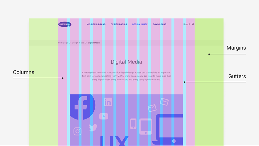
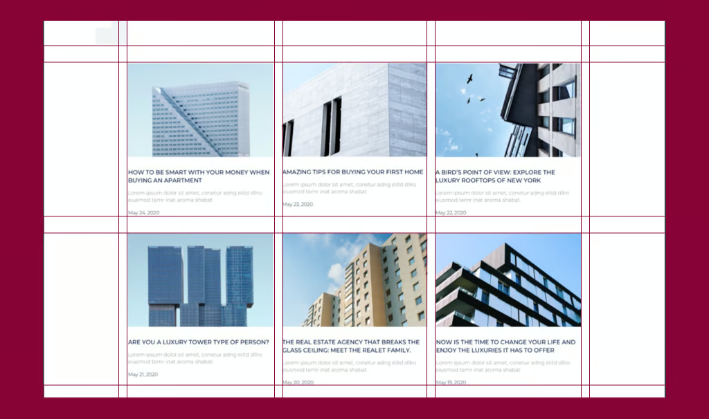
A grid system is a framework of intersecting horizontal and vertical lines that organize content into a structured layout. Originating from print design principles, it has seamlessly transitioned into the digital realm, where flexibility is key. In web design, grids help maintain consistency, balance, and alignment, making sites easier to navigate and more professional in appearance.
This structure isn't rigid. Modern grids offer flexibility, and they adapt to many layout needs. Meanwhile, CSS-powered structures adjust fluidly, so every screen gets a balanced design. They keep visuals sharp on desktops, tablets, and compact smartphones alike.
The grid system's journey started in the mid-20th century. Pioneers like Josef Müller-Brockmann led the way. He championed modular grids in Swiss typography. This approach brought order to visual communication. It influenced graphic design deeply. Fast-forward to the web era now.
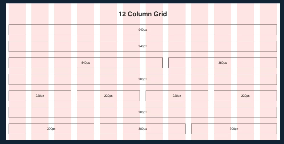
Frameworks emerged in the early 2010s. Bootstrap popularized 12-column grids widely. These grids offered simplicity and responsiveness. They made layouts easier to build. Developers adopted them quickly for projects.
Today, the design landscape shifted dramatically. Native CSS capabilities drive this change. Designers no longer rely on heavy libraries. They use built-in tools instead. These create lighter, faster sites overall. This evolution highlights a key keyword: CSS Grid. It sets the gold standard now. CSS Grid excels in two-dimensional layouts.
Unlike its predecessor, Flexbox shines differently. Flexbox focuses on one-dimensional flows mainly. It's another vital related keyword too. CSS Grid handles complex setups effortlessly. Think hero sections or dashboards. It arranges elements in rows and columns seamlessly.
This progression affects responsive design greatly. It's our third SEO-friendly keyword. Early grids stuck to fixed widths. They caused awkward reflows on mobile devices. Now media queries transform everything. Viewport units add flexibility too. Grids scale dynamically across screens. They prioritize user-centric experiences always. This ensures seamless viewing everywhere.
Adopting a grid system isn't merely about aesthetics; it's a strategic choice that yields tangible advantages. Here's why it's indispensable:
In short, a robust grid system bridges creativity and functionality, turning abstract ideas into polished realities.
Diving into practice, CSS Grid empowers you to create sophisticated layouts without external dependencies. Let's outline the essentials for beginners and pros alike.
First, define the grid container in your HTML and CSS:
.container {
display: grid;
grid-template-columns: repeat(12, 1fr); /* 12 equal columns /
grid-gap: 20px; / Gutters for spacing */
}
This sets up a classic 12-column setup, a nod to traditional frameworks. Now, place items*:*
CSS.item {
grid-column: span 4; / Spans 4 columns /
grid-row: span 2; / Spans 2 rows */
}
For responsive design, layer in media queries:
Pro tip: Use grid-template-areas for named regions, like "header header header" "sidebar main main", making code more intuitive.
CSS Grid excels at overall page structure. Pair it with Flexbox for nested components. Think navigation menus or card alignments in grid cells. This hybrid maximizes responsive design across diverse viewports.
To elevate your work, adhere to these proven strategies, blending theory with real-world application:
Common pitfalls? Over-nesting grids, which bloats CSS, or ignoring vertical rhythm, leading to jagged text lines. Sidestep these by auditing with tools like Grid Inspector in Chrome.
Innovators can push boundaries with subgrid and it gained wide support in 2024. Subgrid aligns child elements across parent tracks precisely. Pair it with custom CSS properties now. These enable themeable grids for better flexibility. Swap column counts using :root variables easily. Toggle dark modes without hassle this way. This boosts CSS Grid's overall power. It allows dynamic changes in layouts. Structure meets creativity in complex designs seamlessly. Grids adapt fluidly to user needs always.
Grids excel in e-commerce product showcases today. They support infinite scrolls with masonry layouts. Use grid-auto-flow: dense for space efficiency. This creates engaging displays for shoppers. Editorial sites apply asymmetric grids cleverly. They break symmetry to guide reader eyes. Narratives become more compelling and immersive.
Furthermore, AI trends bring generated grids forward. Tools like Adobe Sensei analyze content deeply. They suggest optimal structures based on data. Human intuition stays key though. Grids act as tools, not strict rulers. And, the grid system integrates deeper with WebAssembly soon. This enables high-performance interactive elements. Think drag-and-drop dashboards for users.
Spatial grids extend into AR/VR spaces too. They adapt responsive design for 3D immersion. Sustainability matters more with lighter grids. These cut payloads for green web goals. Tailwind CSS frameworks evolve quickly. Utility-first classes make access democratic. As web design grows, the grid system endures. It builds fluid, inclusive digital worlds quietly. Creators shape tomorrow on structured bases today.