
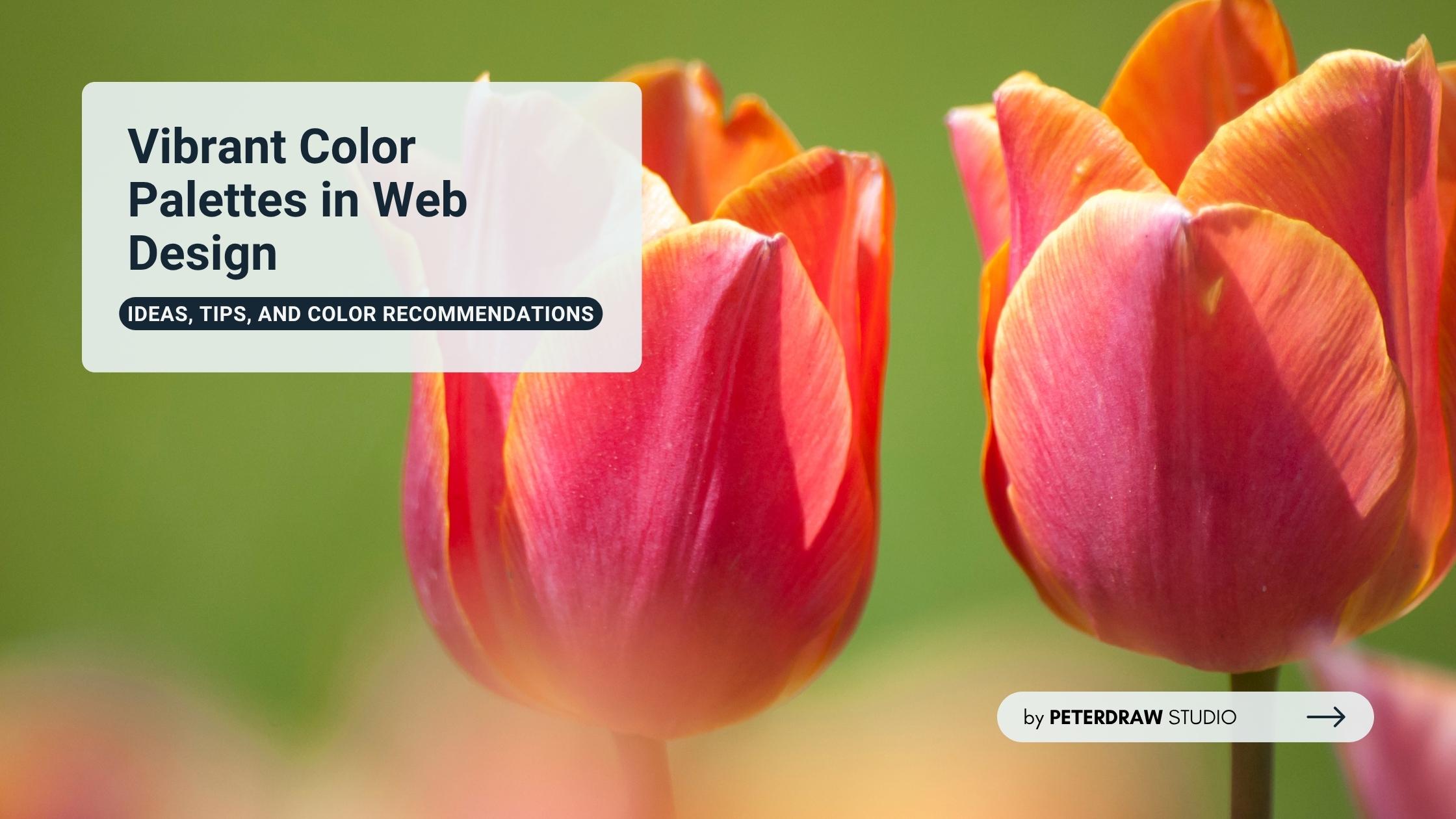
Bold Typography: Mastering Impactful Design for Maximum Engagement
Master bold typography with expert tips on where to use it, the best font recommendations, plus practical techniques to make your designs more impactful and memorable.

Your website’s first impression isn’t just important. It is everything. At the core of that impression lies the website layout. Think of it as a guiding blueprint that shapes every visitor’s journey. A thoughtful layout not only arranges visuals but also tells a story, builds trust, and inspires users to stay and explore.
Poor structure pushes visitors away faster than you expect. Intuitive design, however, invites engagement and boosts visibility. A clear, balanced layout enhances the user experience and strengthens credibility. Every element should serve a purpose and guide users naturally through your content.
We’ll explore how strong design structure can transform your site’s performance. You’ll discover essential layout types, proven practices, and strategies to boost both appearance and function. By the end, you’ll be equipped to craft digital experiences that blend beauty, clarity, and measurable results.
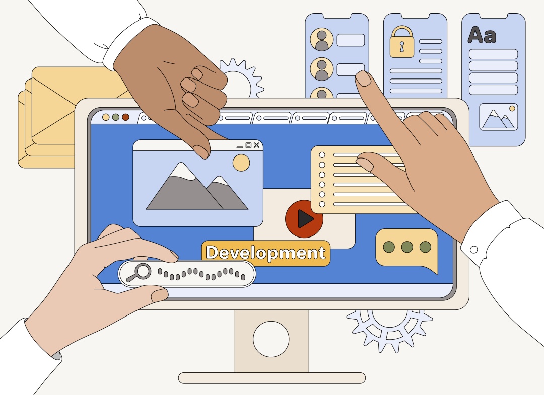
A website layout is the structured arrangement of elements that shape each page. It organizes headers, navigation, content blocks, images, and CTAs with intention. Its job is guiding users smoothly without confusion. Though often unnoticed, a well-crafted layout directs attention, supports clarity, and strengthens every digital experience.
A strong page structure balances beauty with function. It uses hierarchy to highlight key points. It relies on whitespace to keep visuals breathable. It maintains alignment to create order. These choices follow design principles that support human perception. When applied well, the layout feels natural. When ignored, frustration grows quickly.
Effective visual arrangement also connects closely with user behavior. Strategic placement influences decisions and boosts engagement. A clearly positioned action button can lift conversions significantly. Therefore, modern digital markets demand thoughtful structure that supports growth. As online competition intensifies, mastering layout design becomes a major advantage.
No two websites are alike, so why should their layouts be? From minimalist portfolios to bustling news portals, different website layout types cater to specific goals. Let's break down some popular varieties, each with its strengths and ideal use cases.
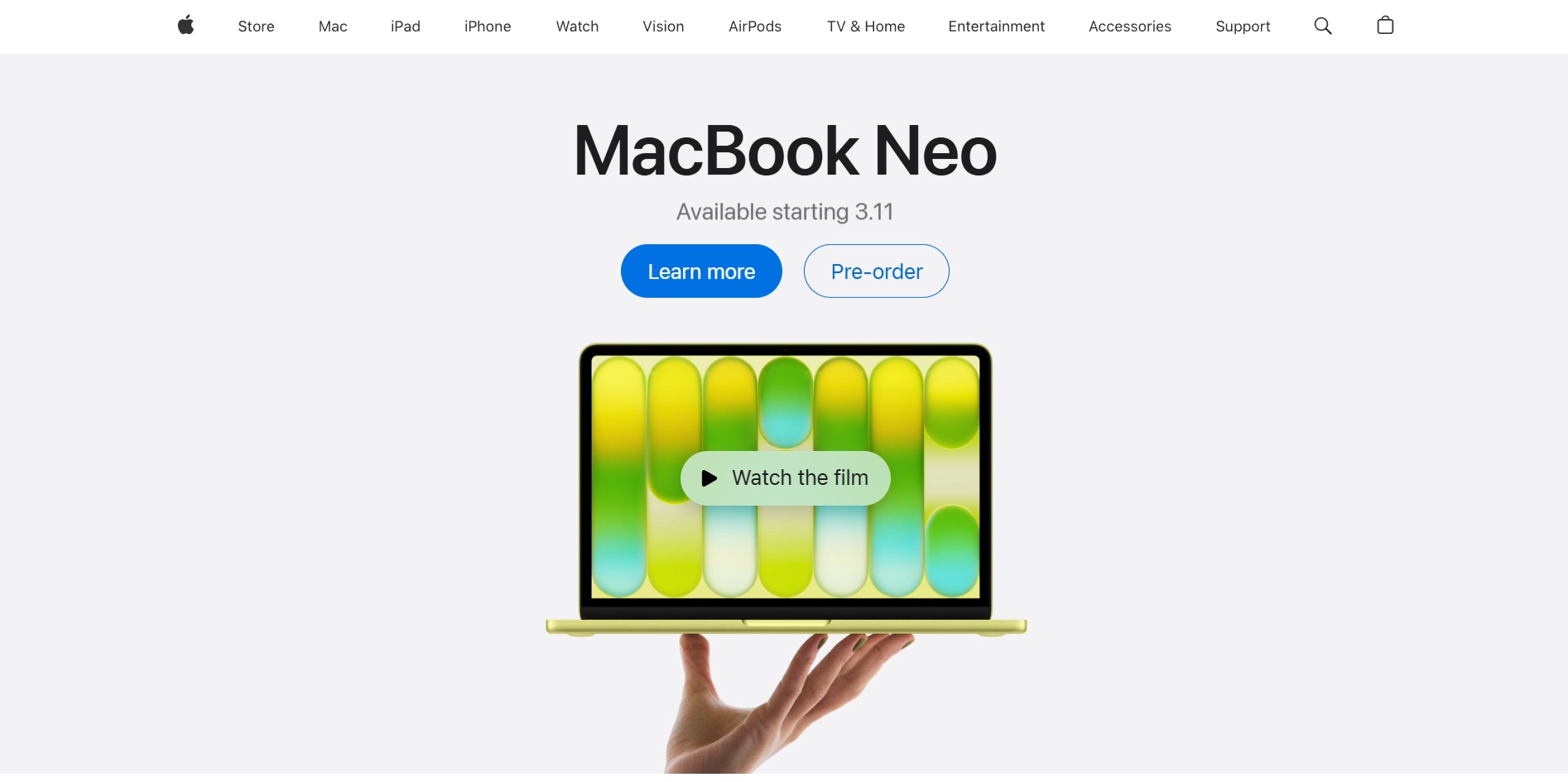
The single-column website layout creates a clear, linear reading experience. It presents content in one vertical flow that supports smooth scanning. This structure works well for mobile devices because elements stack naturally. Many personal blogs use this layout to guide readers gently through the narrative.
The strength is its clarity and speed, especially on mobile screens. The weakness is reduced flexibility for dense information. Apple often uses clean single-column sections for focused storytelling. This format excels when simplicity is the priority for users.
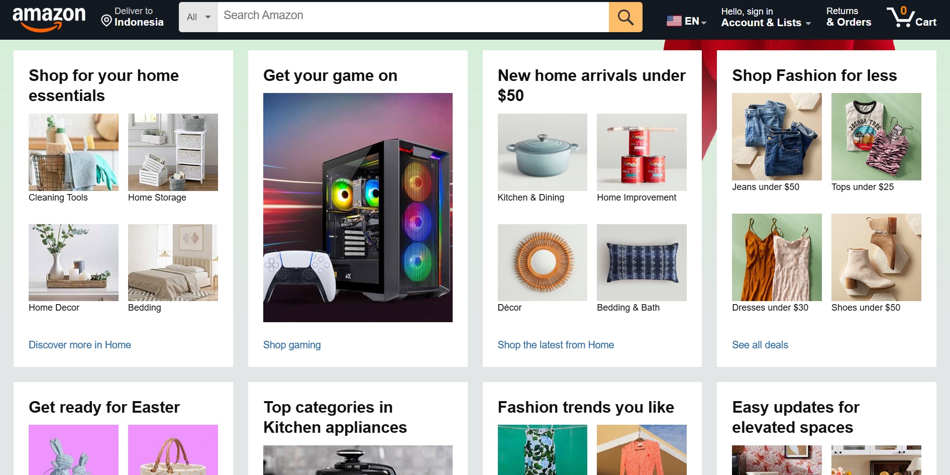
The multi-column website layout arranges several content areas side by side. It helps users compare items quickly without scrolling endlessly. This approach fits platforms that deliver heavy information. News blogs, retail stores, and directories often use this structure for convenient browsing.
Its advantage is efficient information grouping that supports quick exploration. Its drawback is potential clutter if spacing feels inconsistent. Amazon sets a strong example by using sidebars and central content areas. This arrangement benefits users who need multiple data points instantly.
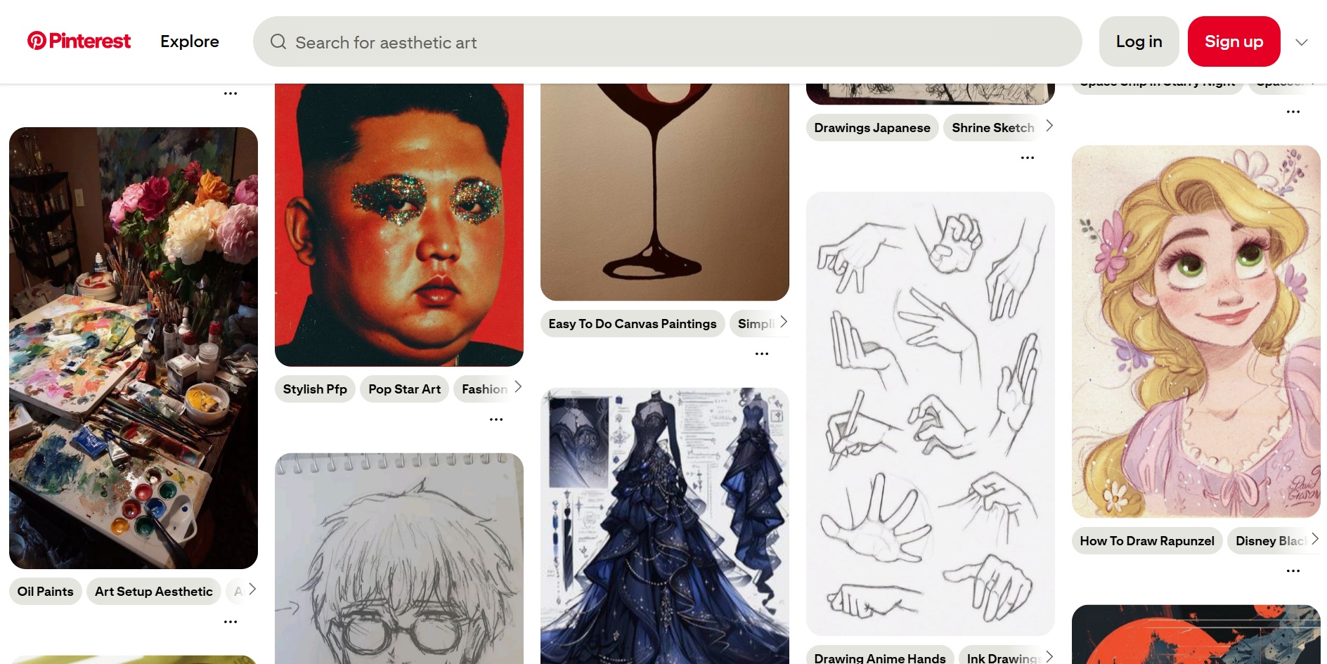
The grid-based website layout uses structured rows and columns to organize elements. It provides clean alignment that feels modern and controlled. Designers rely on grids to create consistent spacing and rhythm. Pinterest popularized this approach through its visual boards and modular presentation style.
Its benefit is flexibility for mixed-size content blocks across devices. However, its disadvantage appears when grids feel repetitive or dense. Pinterest showcases adaptive grid behavior during endless scroll. This structure helps creative platforms display many pieces attractively.
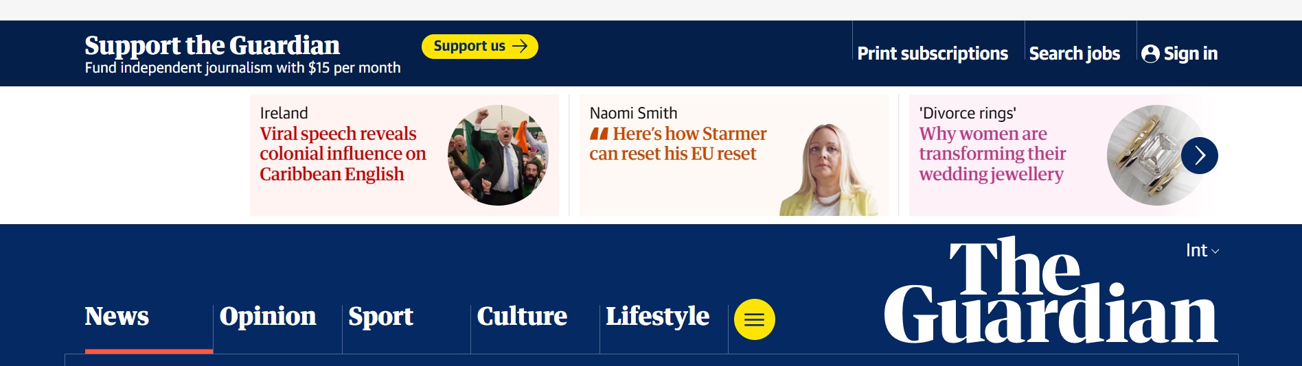
Magazine-style website layout brings storytelling energy through bold visuals. It uses asymmetry, large banners, and layered elements for emotional impact. This style echoes print publications by combining images with text in dynamic ways. Major news portals use it to highlight important stories.
Its strength is exciting engagement through strong visual hierarchy. Meanwhile, its weakness is potential overload when elements compete. The Guardian demonstrates this structure well with striking hero areas. This approach supports brands needing dramatic presentation.
Hybrid website layout mixes several structural ideas into one cohesive experience. Designers blend single-column areas with grid sections for flexible storytelling. Full-screen formats deepen immersion through large visuals or motion backgrounds. These choices support bold and memorable interactions.
Their advantage is creative freedom that enhances brand personality. As for their downside is complex responsiveness that requires careful testing. Early-stage startups often use full-screen hero videos for impact. These formats suit brands seeking distinctive digital expression.
An effective website layout uses structured elements that support clarity and flow. Below are essential elements that support strong structure and smooth user experience.
Creating a strong design requires clear structure and thoughtful decisions. These guiding tips help you refine flow, strengthen clarity, and support better user experiences across devices.
A thoughtful layout demands continuous attention as user expectations evolve. Designers must observe shifting behaviors and refine structure intentionally. Small improvements can create meaningful impact. Treat layout as a living framework that adapts with growth. Strong design responses today shape better interactions tomorrow.
The future of website layout design moves toward deeper personalization. Interfaces may adjust based on habits and context. Responsive patterns will grow smarter with new tools. Designers should embrace flexibility and anticipate emerging needs. Staying adaptable ensures layouts remain effective as digital experiences transform.