
.jpg)
Web Design Trends 2026 Part 2: 6 Emerging Styles Shaping the Year
Stay updated with web design trends 2026, featuring TL;DR experience, 2.5D design, and more, plus useful implementation tips.


Color is a standout design element that instantly attracts visitors to your website. Among all visual tools, vibrant color palettes, bold, high-saturation schemes, pack the biggest punch. They inject life into digital interfaces, elevating landing pages, e-commerce sites, and portfolios, especially on responsive designs viewed across mobiles and desktops in bustling spots.
Why settle for muted tones when vibrant color ****can make your site unforgettable? can transform a website from bland to bold, grabbing attention and boosting engagement. They're especially useful in UI/UX design for creating energy, guiding user focus, and evoking emotions without overwhelming the interface.
Vibrant colors aren't just eye candy. They serve strategic purposes in modern web design. Traditional grayscale or pastel schemes work for minimalism, but vibrant color palettes thrive in competitive niches like fashion, tech startups, fitness apps, and creative agencies.
First, they command attention. In a sea of sameness online, saturated hues cut through scroll fatigue. A 2025 Nielsen Norman Group study found that bold colors increase time-on-page by 20-30% on mobile-first sites.
Second, vibrant colors align with responsive design principles. They scale well across devices. Using tools like Figma or Webflow, you can ensure a fiery orange CTA button pops on a 4-inch phone screen or 27-inch monitor without clashing.
Third, they reflect brand personality. Energetic brands like Spotify or Duolingo leverage vibrant color palettes to convey fun and innovation. Neutrals provide balance, but vibrancy drives the narrative.
Finally, SEO benefits indirectly: Eye-catching designs reduce bounce rates, signaling quality to Google. Pair this with fast-loading Lottie animations in vibrant schemes, and you boost dwell time, a key ranking factor.
Understanding the science elevates vibrant color palettes from guesswork to precision. Colors trigger subconscious reactions rooted in biology and culture.
Balance is key, pair 60% neutrals, 30% secondary vibrants, 10% accents (60-30-10 rule) to avoid overload.
Ready to implement? Here are curated vibrant color palettes, from Peterdraw Creative Director and Chief Design Officer, for websites, with hex codes, use cases, and tips.
Neon colors dominate 2026 web design trends, guaranteed scroll-stopping power. Using vibrant neon on websites delivers instant winning energy. This approach enhances contrast and keeps users engaged longer across modern digital experiences.

Vibe: Futuristic, playful, tech-forward
Best for: SaaS dashboards, gaming sites, creative portfolios
Deep forest greens meet fiery orange and amber tones. This palette creates strong contrast while staying grounded and organic. It brings a bold, adventurous feel with natural warmth and striking highlights.

Vibe: Wild, primal, appetizing
Best for: Food delivery, fitness apps, adventure travel
Cool blues blend with coral pinks and deep greens for a layered look. This mix feels immersive, colorful, and slightly surreal. It adds depth and movement, perfect for visually rich interfaces.

Vibe: Underwater adventure, vibrant ecosystem
Best for: Eco-brands, wellness, tropical e-commerce
A lively mix of sunset reds, warm yellows, and soft pinks. This palette feels cheerful, vibrant, and full of energy. It creates a friendly atmosphere while keeping visuals bright and balanced.

Vibe: Party-ready, warm celebration
Best for: Events, fashion retail, restaurants
Bold electric blue pairs with neon orange and soft lavender tones. This combination feels playful, edgy, and highly expressive. It delivers strong visual impact with a fun, modern twist.

Vibe: Hyper-modern, addictive energy
Best for: Tech startups, music streaming, youth brands
A bright mix of lively greens, sharp lime tones, and clean neutrals. This palette feels crisp, energetic, and refreshing. It creates a modern atmosphere while keeping the visuals bold and balanced.
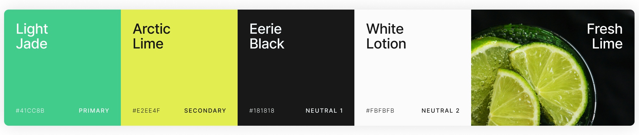
Vibe: Fresh, energetic, modern, crisp
Best for: Wellness brands, eco products, fresh food websites, fitness apps
A soft blend of rosy reds, warm pinks, gentle greens, and clean neutrals. This palette feels delicate, calming, and naturally elegant. It creates a warm, inviting atmosphere while keeping the visuals light and harmonious.

Vibe: Soft, elegant, natural, calming
Best for: Beauty brands, skincare products, floral websites, lifestyle blogs
A cool mix of pale lavender, airy blues, and subtle neutrals with deep charcoal contrast. This palette feels clean, modern, and slightly futuristic. It brings a sleek, minimal look while maintaining clarity and softness.

Vibe: Clean, modern, minimal, futuristic
Best for: SaaS platforms, tech products, dashboards, modern portfolios
Responsive vibrant palettes work best when every color choice supports clarity, comfort, and brand impact. A strong palette should adapt smoothly across screen sizes, while keeping content readable and visually balanced. With the right process, vibrant colors can feel exciting without overwhelming the user experience.
Avoid common pitfalls. Too much vibrancy can quickly create fatigue and weaken hierarchy. The goal is to guide attention, not compete with your content. Balance is what makes the palette feel polished.
Strong color choices work best when they support the message instead of competing with it. When every tone feels intentional, the design becomes more memorable, easier to navigate, and more trustworthy. That balance helps a website feel polished, modern, and inviting from the first glance to the final click.
Vibrant color palettes can leave a lasting impression when they feel balanced, purposeful, and human. The right finish encourages visitors to stay longer, explore more pages, and connect with your brand naturally. It turns visual energy into a clearer experience, making the website feel lively without losing structure or comfort.