
Web Design Trends 2026 Part 2: 6 Emerging Styles Shaping the Year
Stay updated with web design trends 2026, featuring TL;DR experience, 2.5D design, and more, plus useful implementation tips.
.jpg)

As attention spans continue to shrink and AI-generated content floods the internet, web design trends 2026 are shifting toward greater clarity, authenticity, and intentional depth. Designers are moving past pure visual novelty to focus on experiences that genuinely respect users’ time. The goal is no longer just to stand out, but to feel both distinctive and thoughtfully human at the same time.
This second volume explores six emerging directions that are gaining real traction this year. From quick-scan summary experiences to curated, gallery-like layouts, each trend reflects a deeper change in user expectations. Together, they show how modern websites can cut through digital noise while remaining clear, approachable, and performance-conscious.
People no longer have the patience to dig through long pages of text. They want the most important information right away. The TL;DR Experience answers this shift by placing key points at the forefront. Users can quickly grasp the core message. They then decide whether to explore further details.
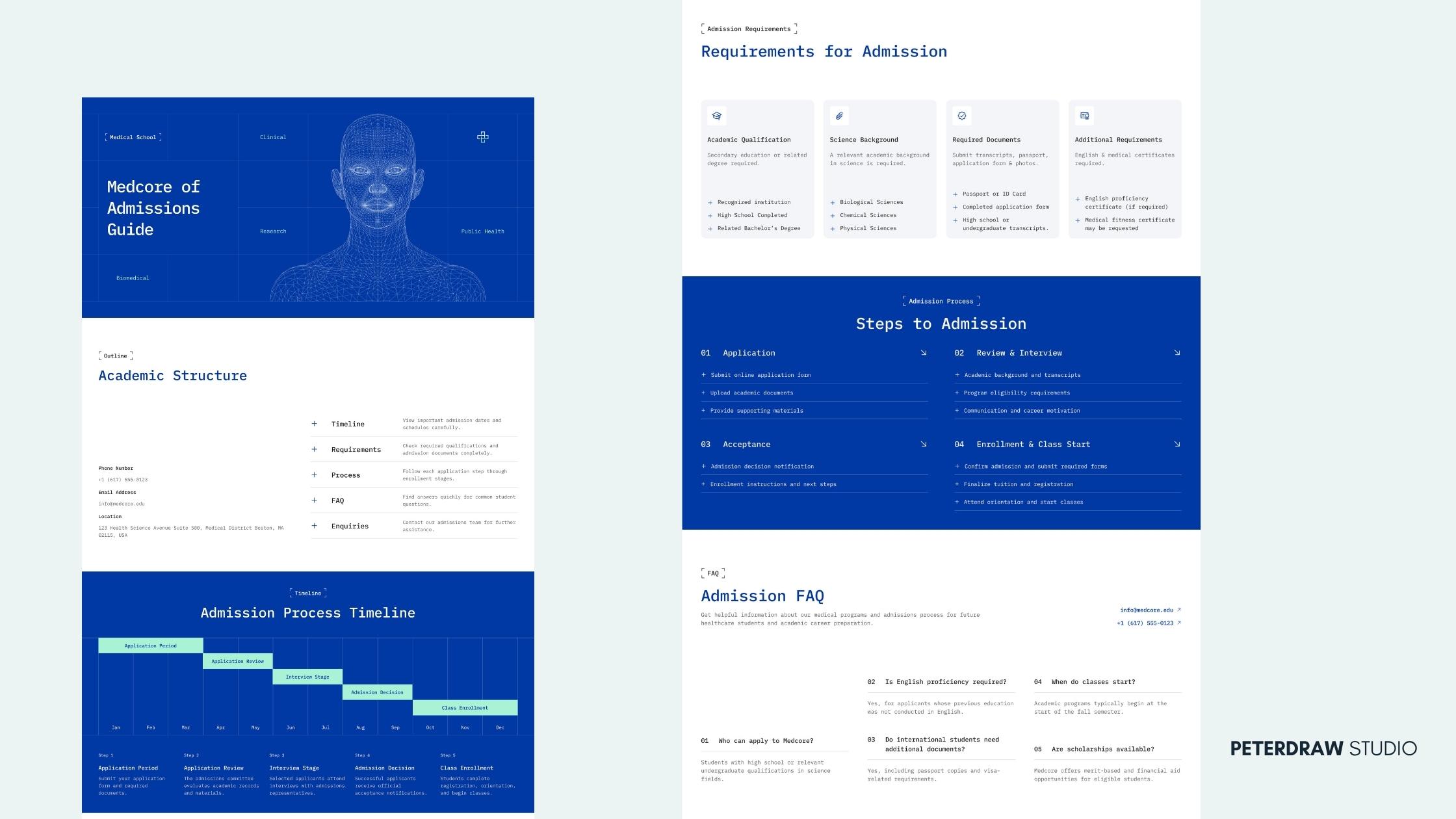
This approach improves scannability and lowers bounce rates. It also makes content more readable for both humans and AI agents. The overall experience feels helpful rather than pushy. Essential details are delivered without unnecessary friction. Visitors feel respected instead of overwhelmed.
Medcore, a Medical School Website Template, shows this clearly. The template includes dedicated TL;DR Admissions Guide and Preview pages. These pages surface essential information such as timelines and requirements. Users can understand the key points without long scrolls. The rest of the site remains structured and professional, so the summary layer feels natural.
Blueprint Style remains one of the most distinctive web design trends 2026. It draws inspiration from architectural and engineering drawings. Clean linework, precise grids, and exploded views are commonly used. Annotations and monospaced typography further reinforce the technical feel. The result is calm, structured, and trustworthy.
This style works especially well for architecture, education, and SaaS brands. It also suits any brand that wants to communicate craftsmanship. Transparency and precision become part of the visual language. The interface feels carefully engineered rather than decorated. Visitors sense clarity and intentional design.
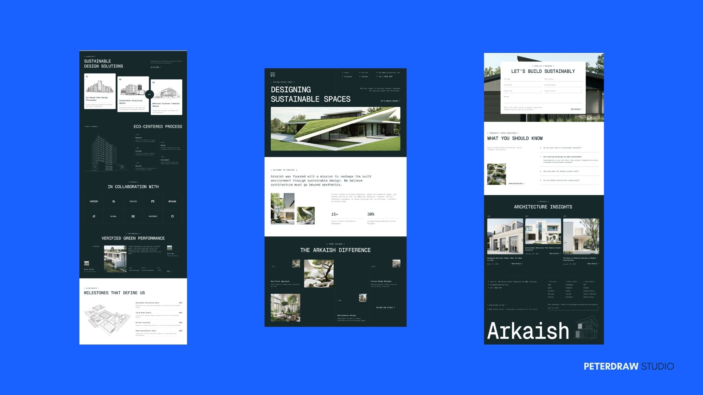
Arkaish, a Sustainable Architecture Firm Website, embraces this trend effectively. It uses structured project showcases and a clear visual hierarchy. The refined minimal system lets the work speak with quiet authority. Technical clarity supports the brand’s professional image. The overall experience feels both precise and approachable.
Full 3D can be visually impressive but often demands more performance and processing power. 2.5D (or pseudo-3D) offers a smarter alternative. This approach adds spatial depth on flat screens through layered cards, soft realistic shadows, subtle parallax, and depth cues. Influenced by spatial computing, it turns ordinary pages into more engaging experiences while staying fast and accessible.
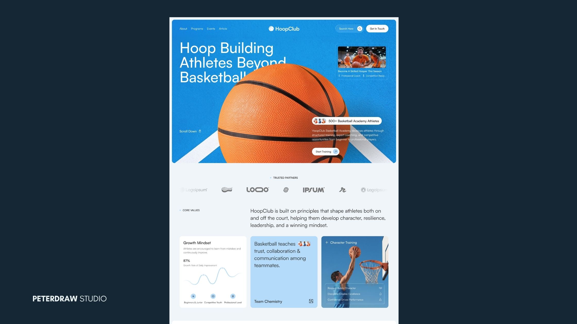
HoopClub, a Basketball Academy Website, uses dynamic imagery and layered layout hierarchy to create a sense of movement and depth that matches the energy of sports training. Soft shadows and subtle overlapping elements further enhance the 2.5D effect without compromising performance.
After years of abstract gradients and generic stock photos, designers are returning to expansive landscape and nature imagery. Mountains, open skies, forests, and soft natural light now appear as full-bleed heroes or atmospheric backgrounds. These visuals create emotional breathing room and give websites a stronger sense of place. The result feels more open and less confined than purely digital aesthetics.
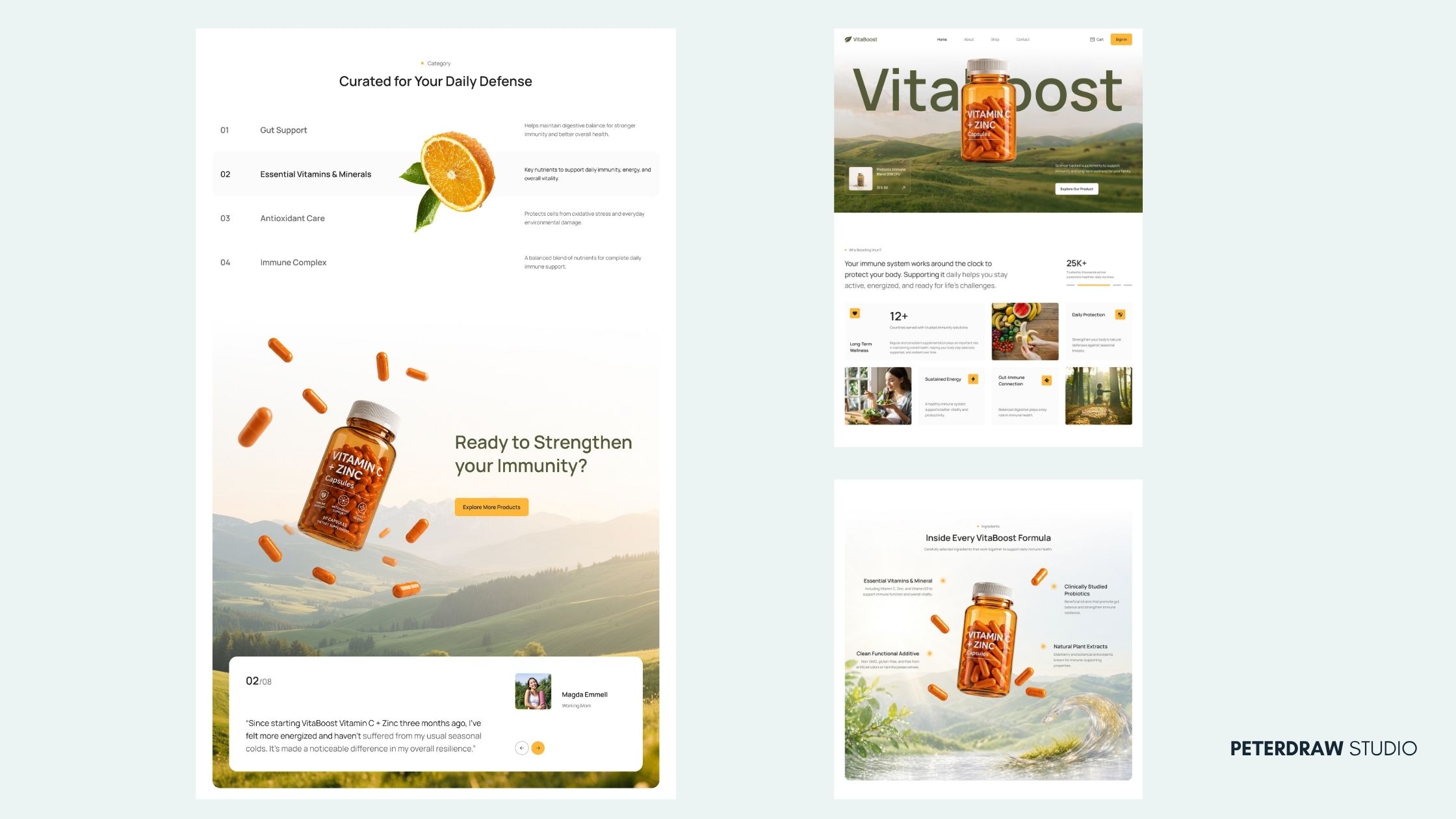
When paired with clean UI, landscape imagery makes digital products feel grounded and restorative. It works especially well for sustainability, wellness, and lifestyle brands. The natural elements help build a calm, trustworthy mood that supports the overall user experience. This approach turns the interface into a more inviting and human space.
VitaBoost, a Health & Nutrition Website Template, uses calm, nature-inspired visuals to support product storytelling, creating a trustworthy and refreshing atmosphere. Soft lighting and organic imagery help the products feel approachable while reinforcing the brand’s wellness focus. The overall composition stays clean and easy to navigate.
Museum Core treats the website like a carefully curated gallery. Content is presented with generous whitespace and refined typography. The pacing feels deliberate and unhurried. A sense of permanence replaces temporary visual trends. The overall impression is calm, considered, and quietly authoritative.
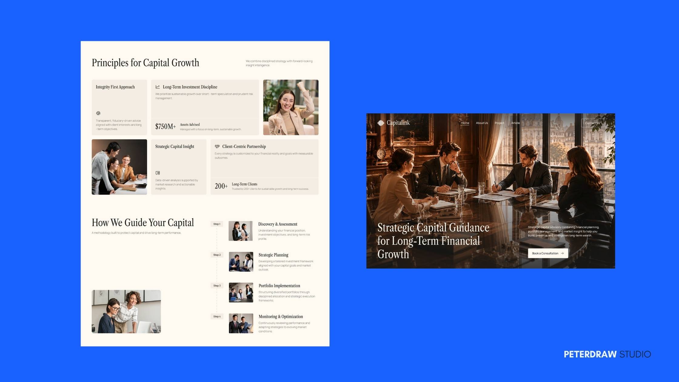
The palette often includes stone neutrals, archival creams, deep charcoals, and subtle material accents. These choices create a timeless rather than trendy atmosphere. Hierarchy is clear and intentional, almost like an exhibit. This aesthetic builds long-term trust with visitors. It works especially well for advisory, educational, cultural, or high-end service brands.
Capitalink, an Investment Advisory Firm Website, demonstrates this approach effectively. Its executive editorial aesthetic uses spacious layouts and strong visual hierarchy. Portfolio case studies are presented like carefully selected exhibits. The result feels professional and considered rather than sales-driven. Visitors are guided through the firm’s expertise with quiet confidence.
In response to the flood of perfect AI-generated visuals, Naive Design celebrates intentional imperfection. It embraces uneven lines, hand-drawn lettering, and simple doodles. Flat perspectives and warm colors are also common. The overall spirit feels like a sketchbook rather than a polished render. This style signals that a real human created the work.
The trend feels warm, approachable, and authentic. It works particularly well for wellness, creative, community, and lifestyle brands. These brands often want to build an emotional connection with their audience. Naive Design helps them stand out from overly perfect digital environments. The imperfect details make the interface feel more personal and inviting.
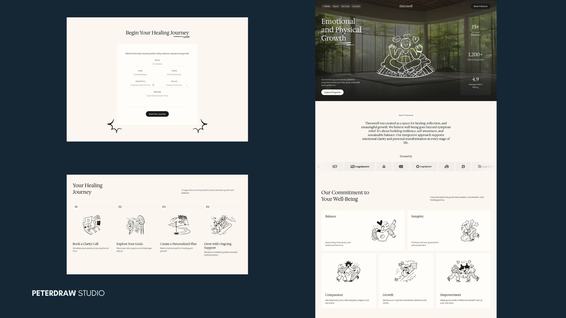
Therawell, a Wellness & Therapy Website Template, captures this feeling effectively. It uses soft neutral tones and human-centered illustrated accents. The visual language remains calm and supportive rather than clinical. Small imperfect details add warmth without reducing professionalism. The result feels approachable, trustworthy, and genuinely human.
Although the styles might seem different from one another, they are not meant to be used in isolation. A single website can open with a TL;DR summary, use blueprint annotations on process sections, add subtle 2.5D depth to cards, rest on landscape photography, present case studies with museum-like restraint, and soften key moments with naive illustration.
The strongest web design ****share one common principle: intention. Choose only the directions that reinforce your brand’s real personality. Keep performance and accessibility non-negotiable at every stage. Always test new elements with real users before finalizing the design.
The Figma templates above give you practical, production-ready starting points. Explore these ideas quickly and adapt them to your own projects with care. The web design trends 2026 belongs to designers who create digital experiences that feel both contemporary and genuinely human.