
Bold Typography: Mastering Impactful Design for Maximum Engagement
Master bold typography with expert tips on where to use it, the best font recommendations, plus practical techniques to make your designs more impactful and memorable.
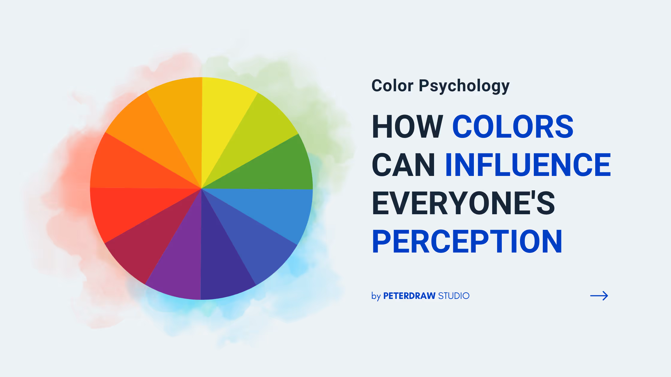

Color plays an important role to steal the spotlight to make your brand perceived. How? It’s not a secret anymore that color is a design element that can attract people’s attention. It holds a key point that influences their behavior, decision, and psychology. Thus, choosing the right colors for your brand is important to build your brand identity. But, have you chosen the right ones? Do they speak out the messages you want to deliver? Well, in this article, we will share all the things you need to know about the color psychology and how it works in marketing.
Color psychology is a study of how colors can effect human’s emotion and behavior. No wonder some colors can give the audience certain feeling that is completely different from the others. Whether bright or dark, happy or sad, common or exclusive, feminine or masculine, each color can create particular perception. Besides, it can be incorporated with people’s wellness routines as well as their mood. At the end of the day, colors can be a powerful weapon to embrace the messages you want to carry on.
In marketing field, you can use color psychology to create the right brand colors. It can enhance your brand perception, like what kind of image you want to create. Along with that, the colors that represent your brand can create certain emotion like how they feel about your brand. Besides, it aims to making your brand more accepted as well as recognized. The right colors can make your brand more remarkable, while the bad ones can make your brand blend in the crowd. Or in the other hands, people may not remember your brand.
Many marketers use color psychology to optimize their strategy. Besides making you stand out, it also can help your audience to decide what’s important. Along with that, it also can influence your customers’ decision, whether they want to buy your products or not. In a further step, colors can be a tool to translate any kind of information.
Sometimes choosing the right colors to introduce your brand can be a great challenge. The right colors can steal the spotlight, while the bad ones can turn your brand off. There are many factors that can influence people’s perception related to colors, like the past experience and cultural background. Nonetheless, it doesn’t mean that you can’t take the advantages of this element. Otherwise, you can collect some benefits as long as you know how to use it. Thus, you need to know the meaning behind each color that may suit your brand voice. Below is the list of the color meaning that you can take a note.

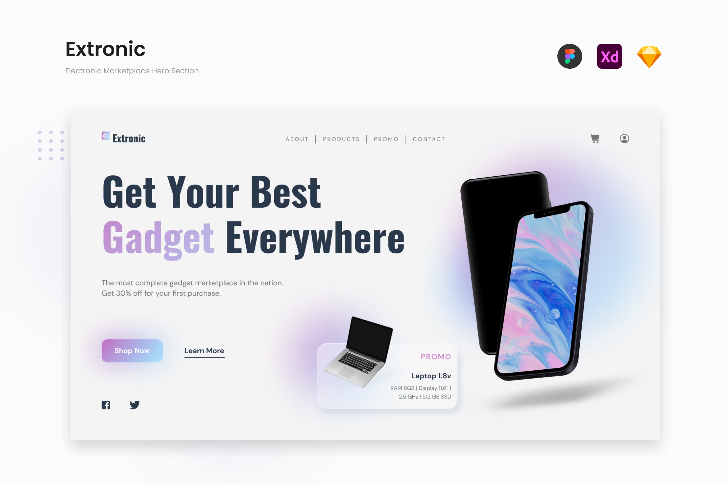
This color embraces innocence and purity. In other meaning, it represents goodness, and humility. No wonder that this color also the signs of intelligence, simplicity, futuristic, and cleanliness. Also, this color can give spaces and add the highlights. That’s why it is like the perfect match with minimalism concept that can compliment each other. As a result, there are many various businesses using this color to convey their messages. It can work with medical, education, fashion, beauty, even the technology.
How about applying white color tone for website? Well, if you are one of those who plays in the industries, technology especially, you can use one of our template, Extronic, for your landing page. This template has a clean and minimalist layout design that is perfect for gadget marketplace. You can use this template to promote the products you have at the most pleasant way. Besides, with a little touch of gradient color combination, this template looks even more eye-catchy and futuristic.
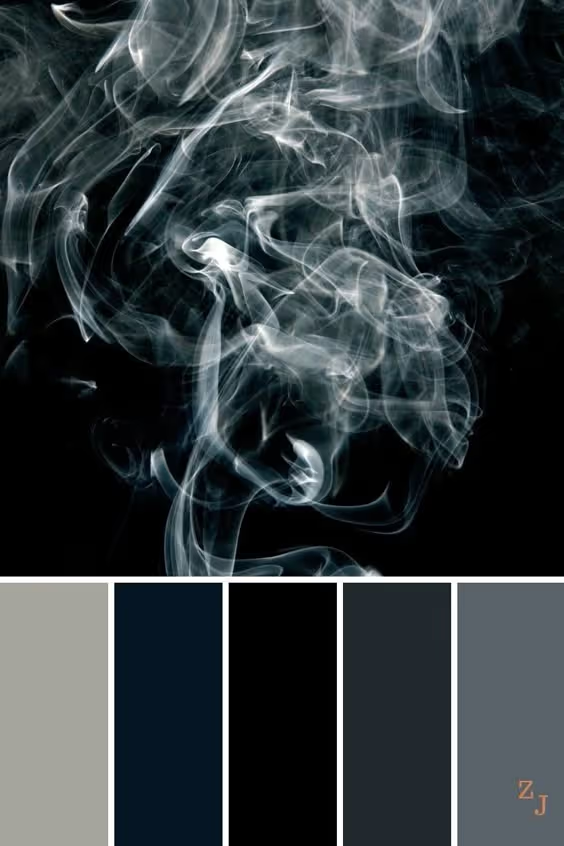
In contradiction with white, black color tone carries mysterious and luxurious image. It is such a powerful color that embraces elegance, authority, maturity, modern, and masculinity. Moreover, black and dark color tones can leave a deep impression that attracts your audience better. It has numerous advantages that you can get like we have mentioned before in our previous post.
Besides white, many luxurious brands also use this color to highlight sophisticated feeling. High-end brands like Dior, Prada, Gucci, Louis Vuitton, and Chanel use black as their primary brand color and combine it with white. Those two colors can effortlessly create ‘less is more’ concept that suits their luxury image.
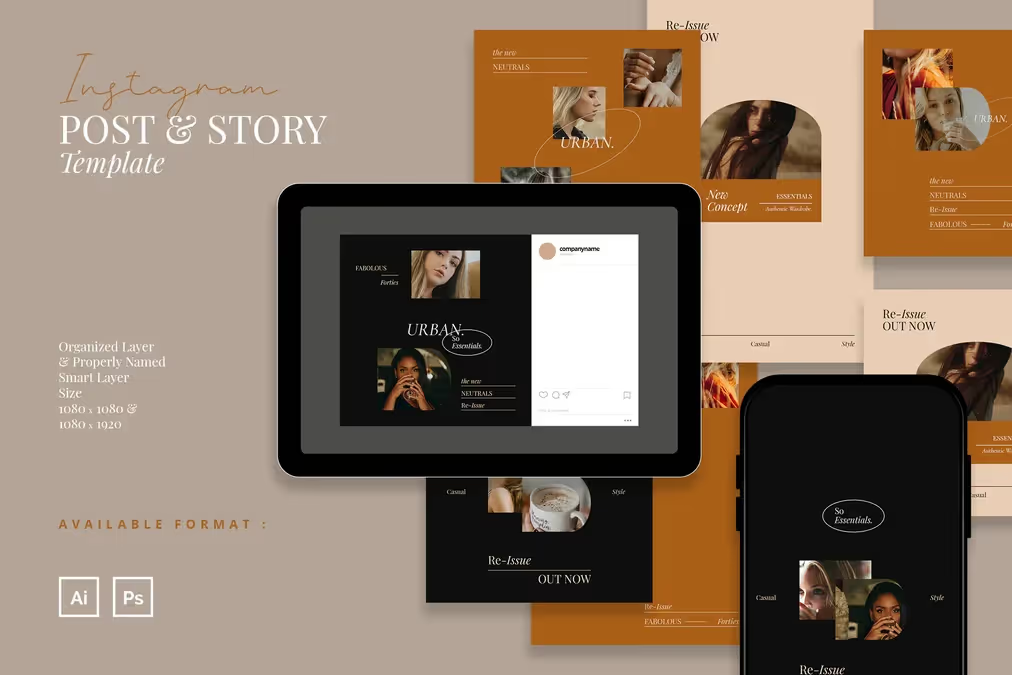
You can also play with this color to promote your brand in social media. For example, you can use one of our products, like this Classy and Elegant Fashion Instagram to promote your fashion brand. It has a simple yet fascinating design that evokes your elegance. Besides black, this template also has other sophisticated colors like caramel, salmon, and white.
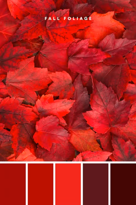
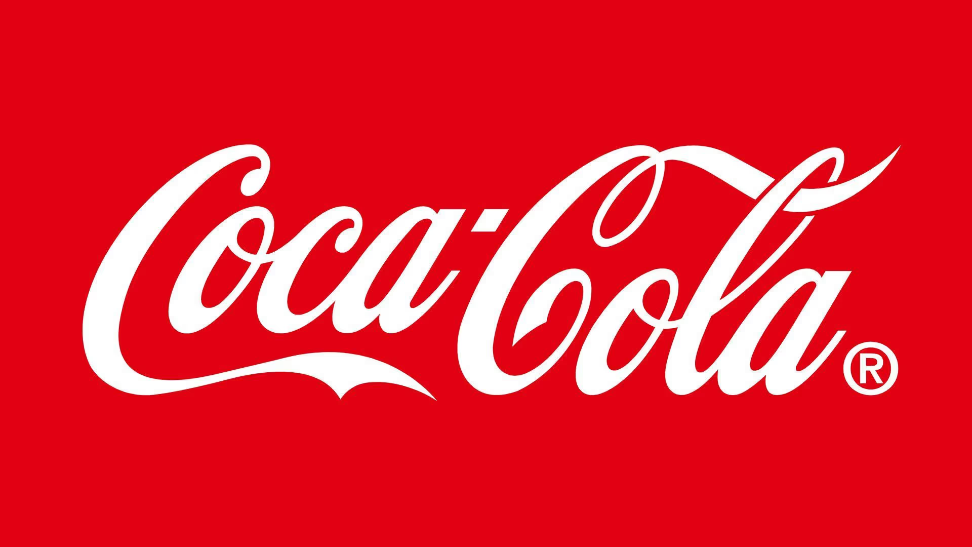
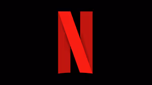
Red is associated with excitement, passion, love and desire. Among the other colors, it is one of the most attractive ones. This color can attract people’s attention easily, even from afar. Brands like Coca-Cola and McDonald use this color to promote their happiness campaign. Meanwhile brands that provide pleasant services like Netflix and YouTube also use this color to highlight joyful time that their audience will get.
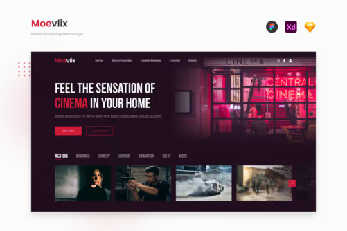
Some of our products that follow this concept are Moevlix and Screenz. Those two templates have sophisticated landing page designs that combining red and black together. As a result, the audience can feel the excitement through the red strokes used as the highlight. Moreover, they are well-arranged that build professional-yet-still-casual look for your brand.

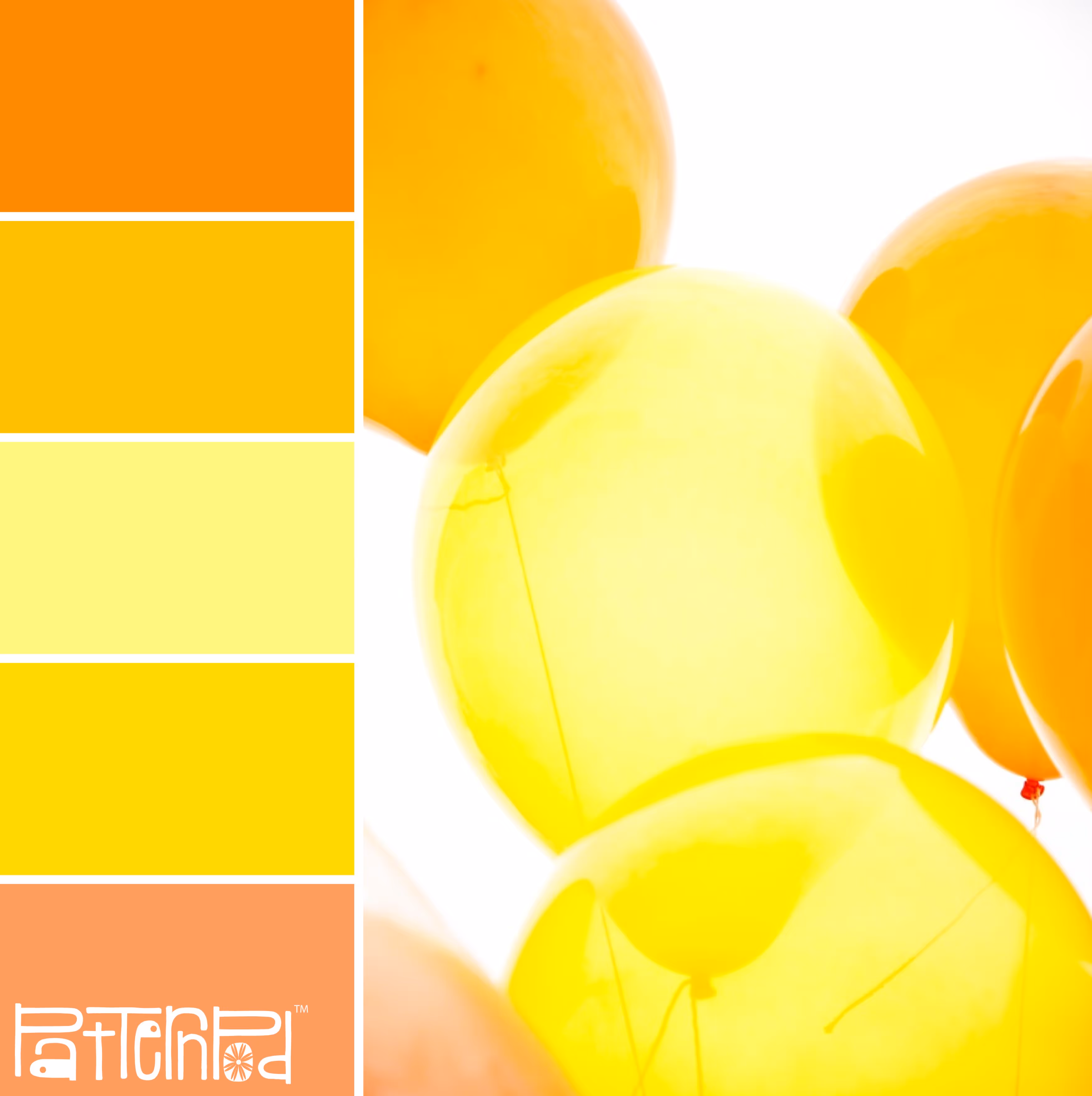
Another color that is attractive enough to catch people’s attention is yellow. This color has a bright side that evokes happiness, positivity, and optimism. Many brands choose this color as the background of their logo or simply put it as the highlight of their design. Besides logo, this color also perfect to apply in the website. A little touch of yellowish thing can spread positive mind to those who see it. Ikea and Amazone, for example, uses this color to persuade their customers to buy their products once they visit their website.
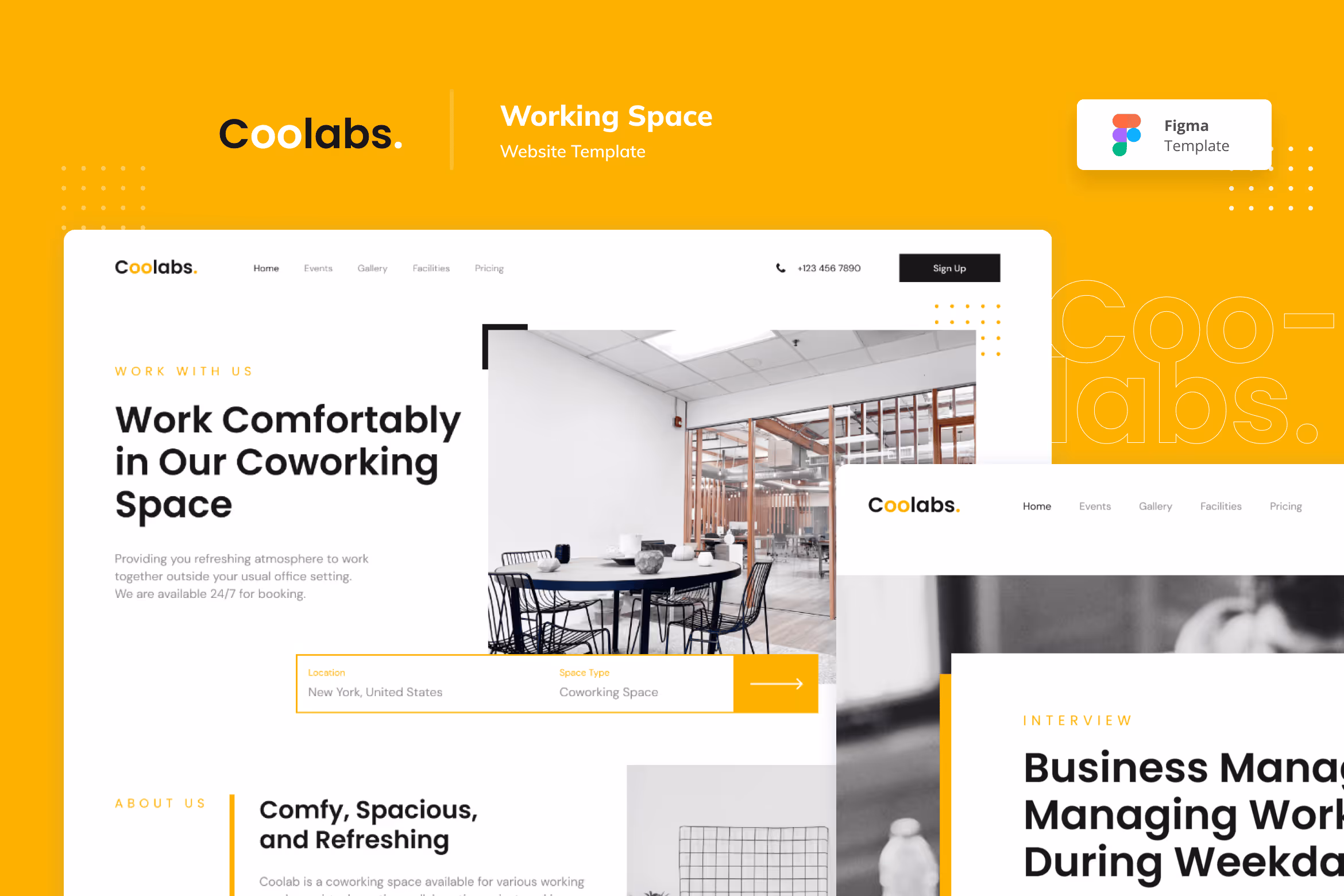
Does it only suit marketplace brands? Well, we don’t think so. Previously, we have ever worked on creating a co-working space landing page with this color as well. And the result is pretty good. As we have mentioned before, this color carries positivity which is good to evoke a positive workplace. As the result, our work, Coolab, can comfort the audience through the charm of the yellow color when it is applied on the page.

Blue is a natural color that is commonly associated with the sky and sea. This color represents spaces, freedom, intuition, imagination, and somehow sensitivity. That’s why many popular applications like Twitter, Traveloka, and Skype use this color to represent their brand voice. Others also believe that blue has meanings of loyalty, honesty, trust, and responsibility. No wonder that finance brand business like Paypal and Visa also use this color to show their credibility.
We also adopt this concept to our product, NaToure, to spread chilling and freedom energy. This template is perfect for travel agency business since the blue color palette makes it more alive. Besides, the layout is designed neatly and simply that can increase the trust of your customers.

At this point, it is important to have a right strategy to choose your brand color. Be wise to choose your brand color since it could create your brand identity. You can make your brand standout work, or in opposite, turn it off.
Get along with us in social media and find numerous refreshing graphic design contents regularly!

