From Web2 to Web3: How Web3 in Web Design Is Redefining Online Ownership
See how web3 in web design blends blockchain, wallets, and UX to create secure, decentralized, user-first digital experiences.
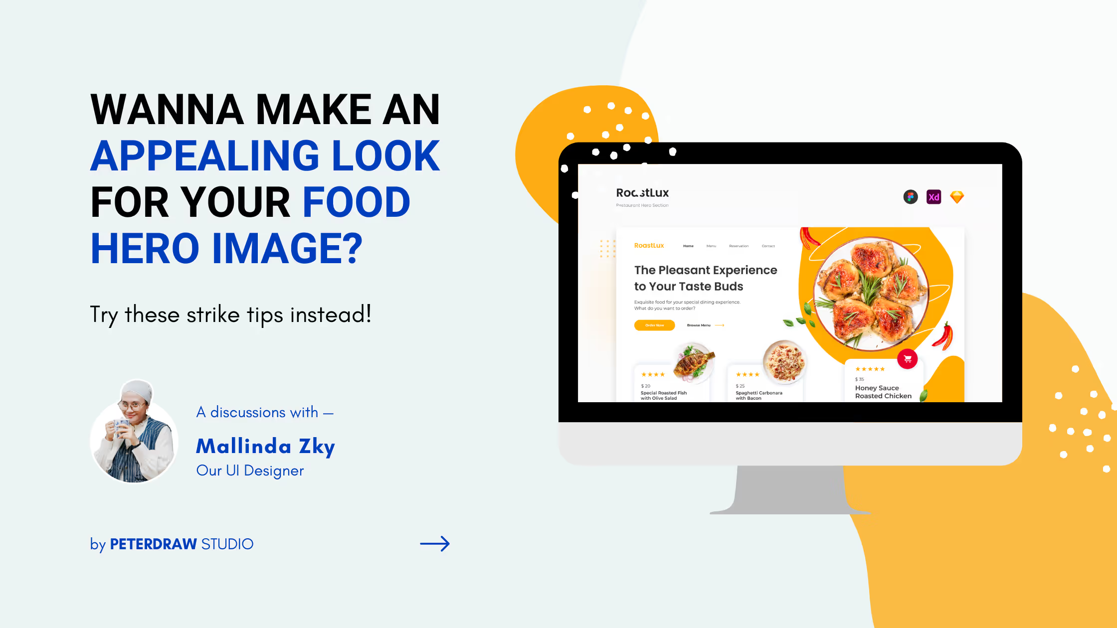
As the saying goes, we eat with our eyes first. That’s why the header of the food website becomes the key to catching the attention of the visitors. It becomes the face of the brand since it will be the first view to have a look at. But, have you made your food website header as appealing as your menu? Do you know what elements you should put there? Well, in this article we will look at what makes it important and how to create an attractive website header for your restaurant.
It is important to have an attractive hero image or webiste header since it’s like the first gate before we explore the website.”
Mallinda Zky, Peterdraw’s UI Designer
Basically, the website header is an area at the top of the website that will be seen first by the visitors. “Thus, it should be attractive enough to make the audience keep scrolling. It can also help you to build a connection with your visitors as well as brand awareness,” Mallinda explained. As a result, you can put your logo, tagline, and colors to introduce your brand. In addition, a well-designed website food header can give an impeccable experience for the users before exploring your site.
Along with that, it can give a positive impact on your website’s SEO. You can optimize the traffic by applying the keywords in the navigation menu and header text. As a result, the search engine can understand your website content better and help the users to find yours.
Creating an appealing food website hero image can be tricky sometimes. However, it doesn’t mean that you will never nail it. “There is no specific rules for one concept only. The good hero image not only look aesthetic but also informative,” Mallinda added. Thus, you can employ several tips below to make your header stand out.
According to its purposes, a hero image should be representative of a brand. For a website that is running a food business, the ultimate image in the header should remind the quality of the product itself. Hence, you need to pay attention to the images used there. Make sure that you will only use high-quality images to emphasize the quality of your food products. There are many websites providing millions of high-quality images like Envato Elements, Pexels, or Unsplash.
Besides the high-quality ones, you need to pay attention to the details as well. Avoid using photos that have a heavy composition. In contrast, you can pick minimalist ones that are still informative. Aside, they can increase the elegant look of your food website header. Along with that, you can also activate interactive features or motion graphics to make your hero image more attractive.
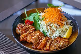
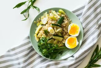
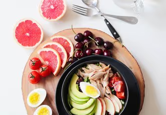
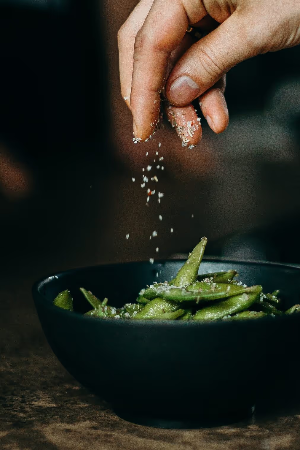
Different colors have different impressions on those who see them. Thus, you need to take note of which colors can create a more appetizing look and which are not. For example, red can stimulate appetite as well as hunger, and create a sense of urgency. This color is also fit for you who run a restaurant that provides spicy food as your signature dish. Besides red, orange, and yellow also can be other options to create an appealing look. These colors convey friendliness that creates joy and warm feelings as well.
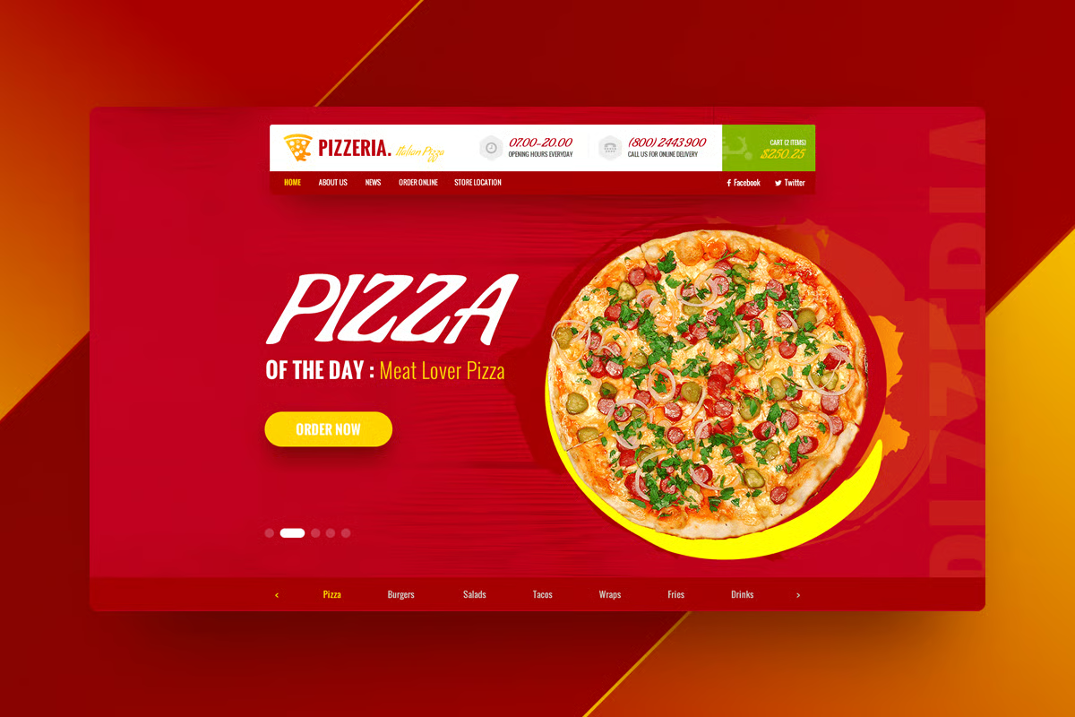
However, when you want to promote your healthy food business, you can choose natural colors like green and yellow. Those two colors are mostly associated with fresh and healthy ingredients that are perfect for your health-concept restaurant.
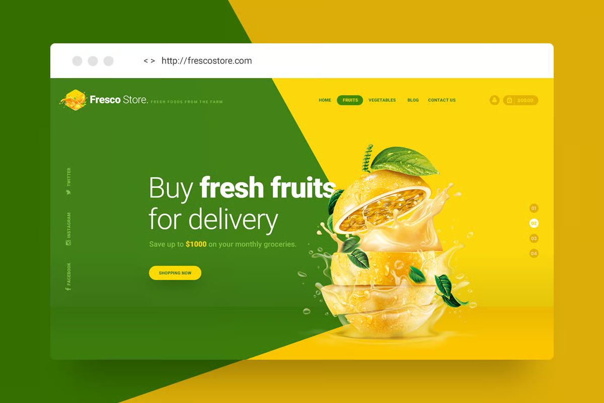
How about colors that you have to avoid? Well, some colors like blue, purple, and grey are believed to have dull and unappetizing senses. But, when it comes to dessert bars, don’t worry to play with those colors since sweet restaurants mostly adopt some playful colors to steal the spotlight.
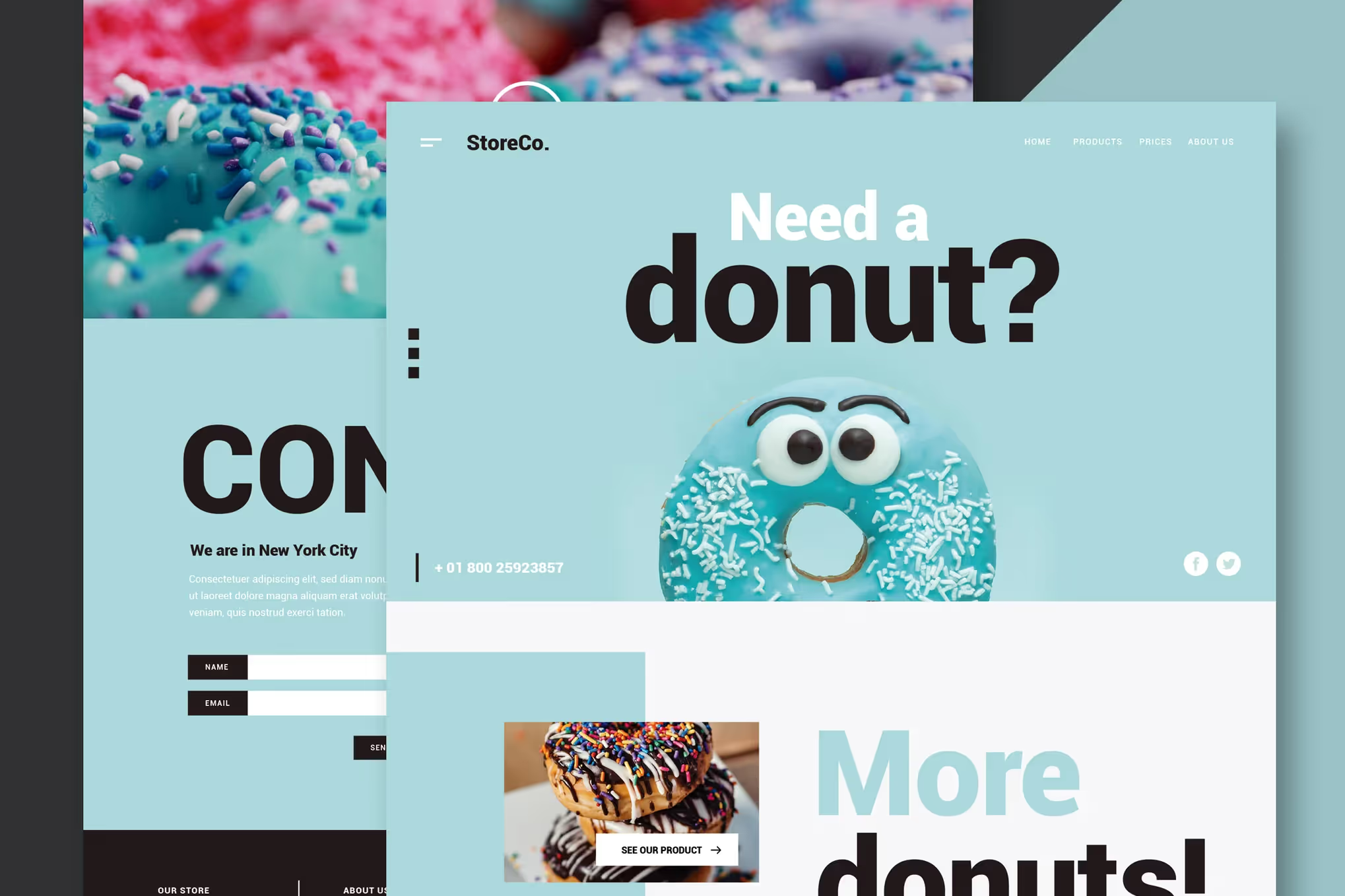
Your food website header should have a clear visual hierarchy, from the most important element to the least informative one. This kind of arrangement can give them information about your website. Thus, you have to consider the size of the elements, the contrast, whitespace, and the typography. The more important the information, the more it should draw attention.
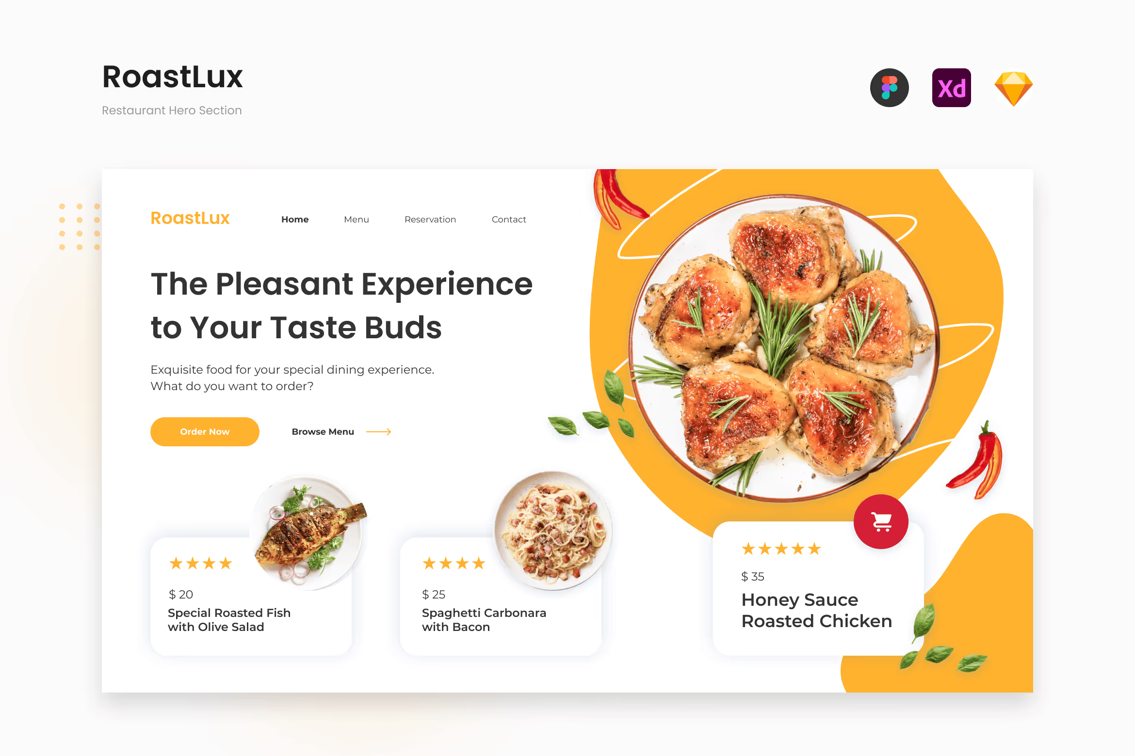

In summary, designing an appealing food website header needs a thoughtful approach. The design must be both aesthetic and informative. A great and engaging design can draw attention that makes people wonder to explore your website. At the end of the day, it can affect the decision of the users whether they want to stop or keep scrolling. By following the tips above, you have one closer to creating a food website header as appealing as your menu.
Need more engaging and unique website designs that meet your needs? Contact us to visualize your ideas with our UI designers!