From Web2 to Web3: How Web3 in Web Design Is Redefining Online Ownership
See how web3 in web design blends blockchain, wallets, and UX to create secure, decentralized, user-first digital experiences.
Many people today leave their interior design work to an expert for efficiency and convenience. Moreover, they can consult online first before they get the work done for real through the interior design website. You have to make sure the browser they use will appoint your website in the first option. How to do it?
Many things you can do to make your website at the top of the search. Improve the use of SEO rules, show your best products, build reputation, and so on. However, as a part of the design industry, you must consider your website look to attract more audience. No one cannot deny that most people will consider using the service after seeing the website’s appearance.
Regardless of the reason mentioned above, there are various purposes that a hero image can serve to your benefit. It has the purpose to build people’s trust in your website and make them interested in what you offer. The wrong hero can drive people away.
Since it also serves as a landing page from the link you or others share, you can maximize its usefulness as direct visitor engagement. Put a CTA button with the particular action your visitor will do, display your unique selling points (USP), or perhaps ask them to sign up for your free consultant session trial.
As much as the good design will attract a lot of visitors to come by your website, you still have to consider what is best for your company’s image and needs. You can display the same hero over the years or change it regularly in a few months based on the marketing or promotional needs.
Like the best story serve to the reader, show what you are without having to tell who you are. It applies to a hero image you use on your website. The components like image, headline, CTA, responsiveness, and clear branding can be good supports to what you call showing than telling.
Knowing the components is not enough to select the best hero, you also have to know which combination can give you the most result. It is indeed tricky and there is a lot of work to do, but once you can get the landing page you need, you have done a big part in digital marketing for your interior design company website.
It needs some trial and error to find what best design that will work best for the website. However, you don’t need to be discouraged if you fail on your first try. Some examples below can give you an idea of what design or type of hero image design will suit your company and agency.
Images take the most of the website hero and will be the most eye-catching. Putting a relevant image is something you have to do if you want your website to gather your target market or target audience. As it is a company that runs a business interior design service, putting one of your portfolios from the last projects is a good choice, too. You also can put other relevant images such as spaces, rooms, furniture, or buildings that can represent you.
One thing you have to make sure of when you use an image on your landing page is to use a high-resolution one. It can give the best experience for the visitors when they browse your website. Besides, it influences the visitor impression of your website and company image.
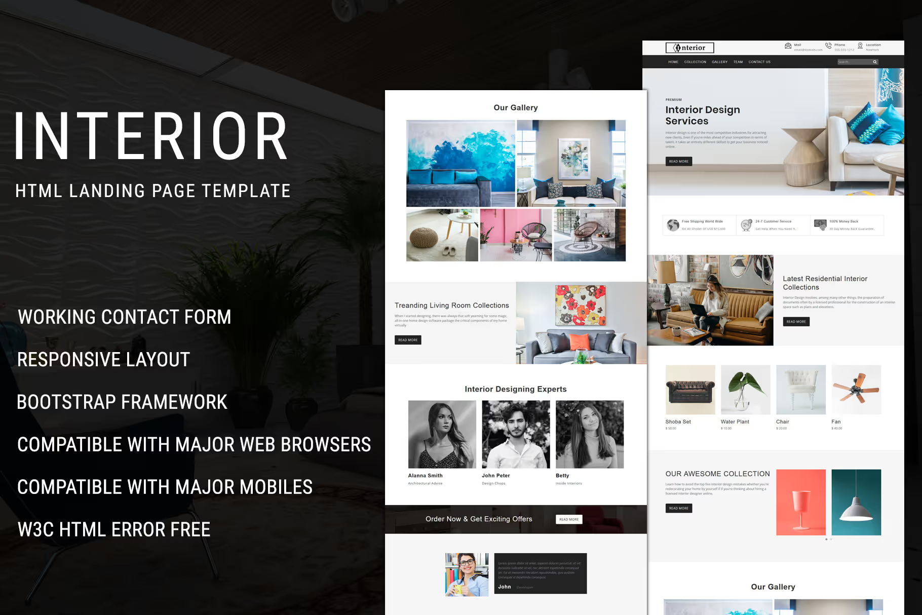
Take a look at this Interior – Landing Page Template design from Pennyblack Templates. The image occupies the top part of the page with some explanation of the service provided by the company. The design may look simple, but it has served its purpose as a relevant image to the website.
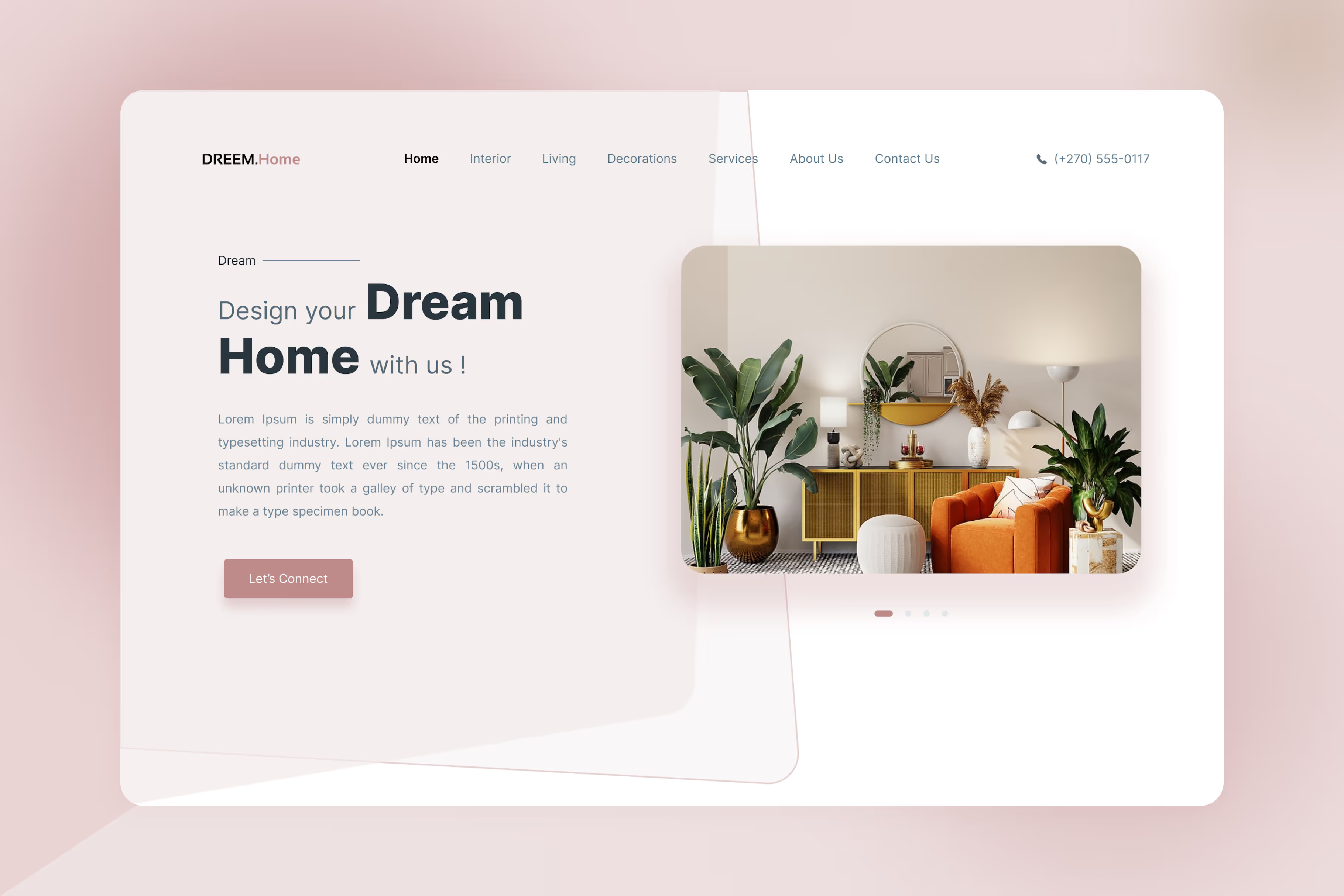
The same concept with different applications is also used by the_ajdzine in the Dream.Home Landing Page design. The image takes half of the portion, while the other half is a brief explanation of the company and a CTA. Simple but it is a nice touch for a design interior company that prefers minimalism with a soft touch.
Having an interior design website doesn’t mean you can only depend on the high-resolution image relevant to the business. Playing with a headline is a good strategy to invite more visitors. Decora Space, Clean Minimalist Interior Design Website Hero Material UI, from Peterdraw.co is one of the hero image designs with a striking headline.
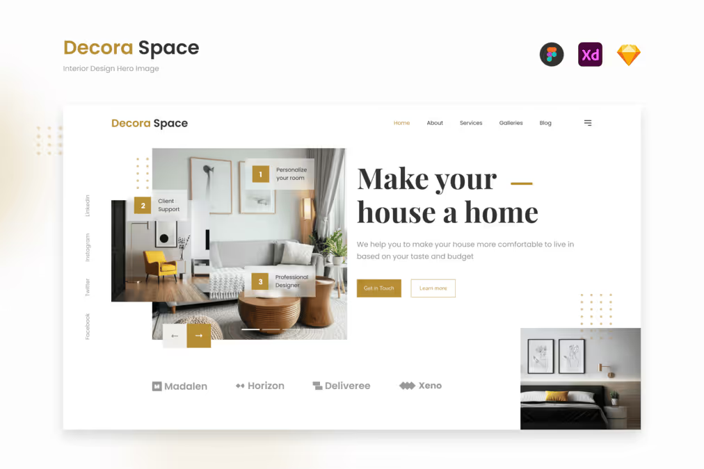
The words are so simple, yet they can easily attract people to find out more about what you offer. Uniquely combined with USP placement make it looks clean and neat. No one will doubt your professionalism.
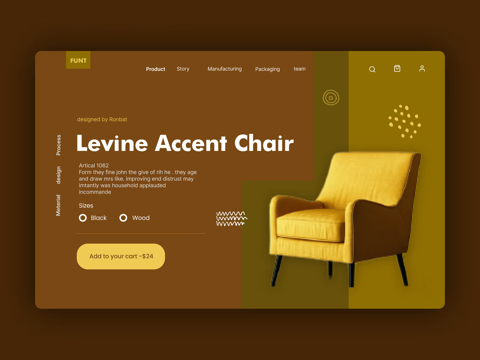
Interior design companies or agencies today not only focus on design services. Many provide the products to sell, design, or create. If yours is one of this many, focusing on the products on your hero website is a great choice.
The design from muneezahussain with Funt, the Interior – Product Header, is a good example you can use on your website. This UI design focuses on the products, a brief explanation, choices, and a CTA to buy. The warm vibe offered by this brown template makes it perfect for an interior design company and furniture store website.
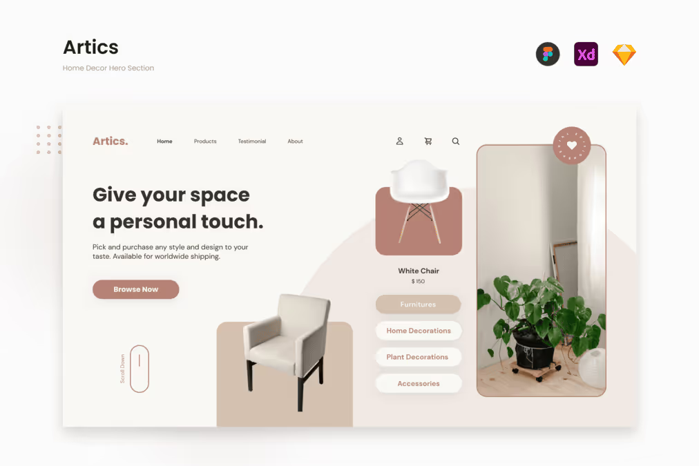
If you prefer something a little light and soft, Artics, offered by Peterdraw.co is worth trying. The plus point of this product is providing category choices that can direct visitors to other product selection. It is an effective way to increase sales by attracting people to click on the options.
No one put their trust in their first visit unless you try to make them. Hero image you use can give the influence you need to make your visitors trust your service on the first visit. You have to show the company’s credibility, quality, and ability to generate their trust.
Remember that you have to show, not tell? These words apply at this very moment. Archidez, the minimalist modern interior design website hero section, created by Peterdraw.co, is a proof of showing, not telling.
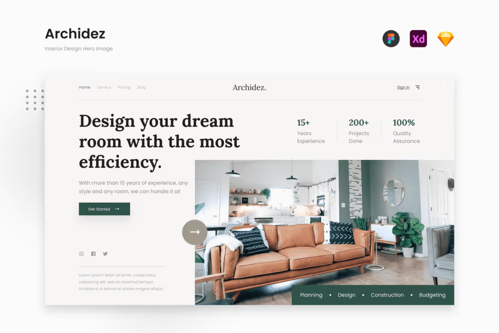
Although many people trust the expert to handle their interior design, it doesn’t mean they will easily trust the first website appeared on their search page. The numbers on the page can make your visitors curious and want to prove also learn more about your company and services.
You eventually have to choose what can reflect your interior design website the most. No matter how clear the image, intriguing the headline, or appealing the design, that hero image will not work if not relevant to your company’s needs.