
In practice, males and females can use the design tone according to their wishes or tendencies. However, this is something to think more deeply about when designing something for others. Others have a predetermined target market to consider. Since the audience generally is divided into these two groups, it’s no wonder that the debate over masculine vs. feminine design types eventually emerges. Even so, it does not need to be debated at length but rather be used as best as possible to get the design your client wants and needs.
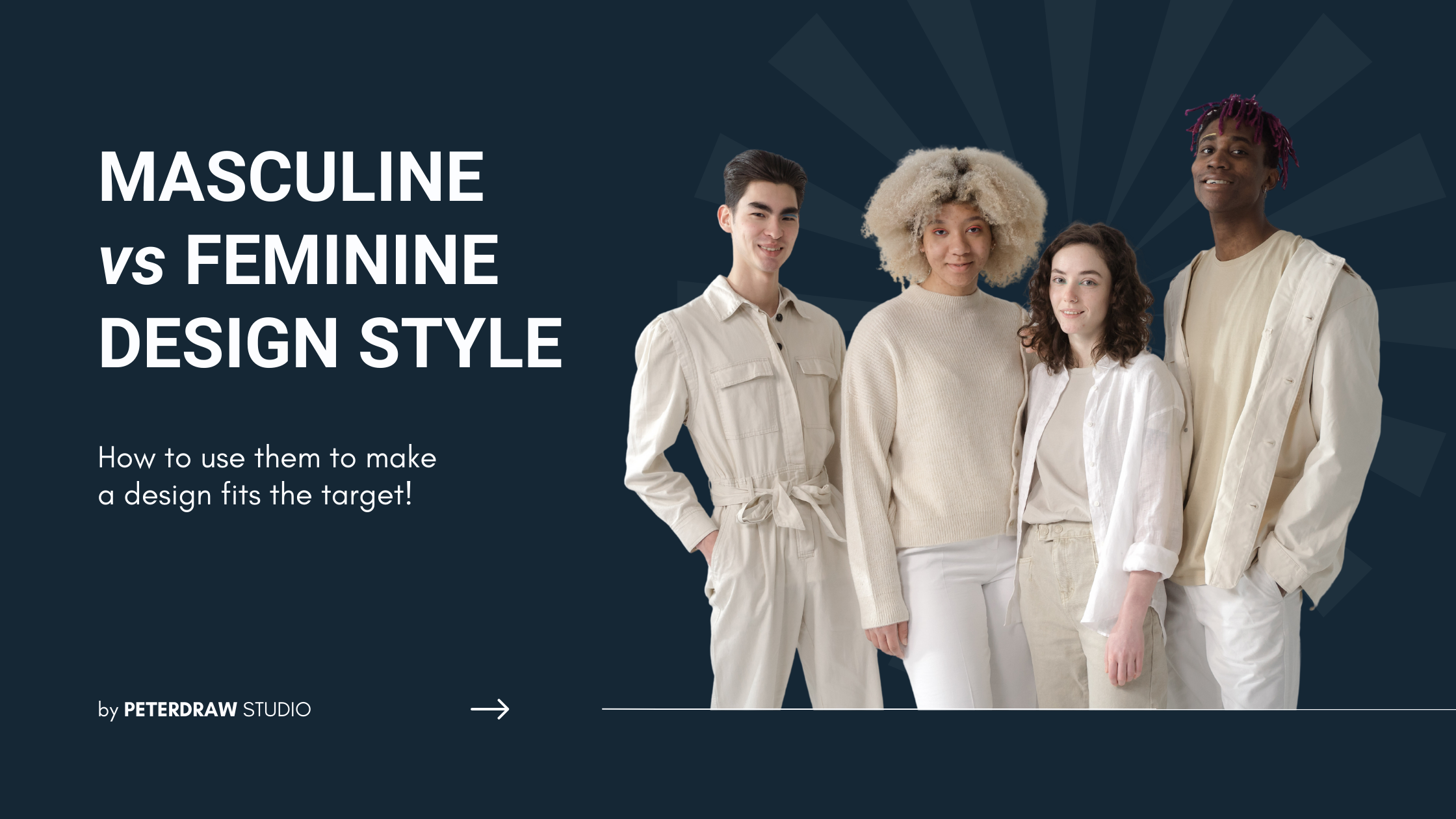
Creating a Masculine vs Feminine Design
Someone’s gender can influence design assessment, whether a product, website, or other visual designs. It will also determine the steps to be taken by the target next. If the target is interested, the target will take further steps. If not, then the target will stop there and then. It only means that the design is not corresponding with the target audience or market. Then, how do you apply this gender tendency to the design you make? What do you need to pay attention to when you already know your target audience?
Color Selection
Designing something for marketing, advertising, or branding will surely include color selection for recognition. It is also one of the most gender-stereotypical things you usually see. Bold, dark, and solid colors are often associated with masculinity. Meanwhile, bright, soft, vivid colors are commonly associated with femininity. Although most people assume blue for a boy and pink for a girl, the color perception is more complicated than that. Color saturation, hue, shade, and tint also influence the choice of colors for masculine vs feminine designs.

If we follow the result of Joe Hallock’s experiment on color perception, men and women love the blue color. This statement is supported by a 2007 study by Anya C. Hulbert. The difference is in their shades. Women prefer blue with red shades while men prefer blue with green shades. So, when you choose blue as your color identity, it will be safe for both genders.
For more general guidelines, you could apply this concept. Use dark, saturated colors to create a masculine design. Black, navy, and dark green is the best choice. To create a more feminine design, you have more options. Use pastel, pink and purple colors to get the feminine vibe. However, when you want to create a neutral gender color tone, beige, pale yellow, green, and blue are the color choices you can consider.
Fonts & Typefaces
Getting the correct fonts or typefaces for masculine vs feminine design is relatively easy. Thanks to their stylistic effects, slant, stroke, and details, it’s all.
The cursive and script typefaces usually include the feminine category. Besides, feminine fonts tend to have smooth and thin stroke lines. Fortunately, many typefaces these days cover various fonts in one set. Thus, even if you use one font family, you can still get two types of designs. Both feminine and masculine vibes. Then, what about masculine fonts?

Most serifs tend to have a more masculine characteristic, square, sharp, blocky edge. Other characteristics of masculine fonts are geometric and straight lines. The impression of the fonts tends to be more rigid. Therefore, there are very few masculine fonts in the ornamental fonts category. Most of them are in the feminine category since they have more frilly lines and tails on every edge of the letterforms.
Image Usage
For some designs, especially websites, images become a crucial part of the attention grabber. Audiences will be more attracted to the picture that represents them, mainly if it contains people. It also includes age, race, and gender. But, when the image presents a product, you must create a display composition to attract your target’s interest. Combining it with a supportive color or background choice will help.

Other images appeal to gender. For example, the picture of babies, cute animals, or other cute things will appeal more to a female audience. Meanwhile, sporty things, action, gadgets, and electronic images appeal more to a male audience. One thing you have to keep in mind is to consider the design purpose and then pick your picture.
Icons, Shapes & Other Decorative Elements
One little thing that is also quite crucial in making a masculine vs feminine design is decorative elements. With their functions, these elements can have their tendencies. Feminine icons and shapes have more smooth and curve lines. They also use feminine colors. Circles, wavy lines, and repeating patterns include in the feminine category. Masculine icons and shapes most likely have sharp and straight edges, along with masculine colors. Squares, triangles, and trapezoids are some shapes you can adapt for masculine design.
Have a Catch in Your Masculine vs. Feminine Design Style?
The debate about masculine vs. feminine design style is not something that needs to be a problem. Each has its importance and necessity according to circumstances. Since both men and women have different responses to the choice of colors, fonts, images, and other design elements, this will affect their acceptance of the design. You can shift wisely between those two styles if needed. Or, you can consider a gender-neutral design.
Wanna make a very customized visual design? Kindly contact us to get the best graphic designs that meet your needs.