Design Without Designing: The Bold Future of No-Design Web Design
Master no-design web design to build clear, user-focused websites fast without expert design skills or complexity.


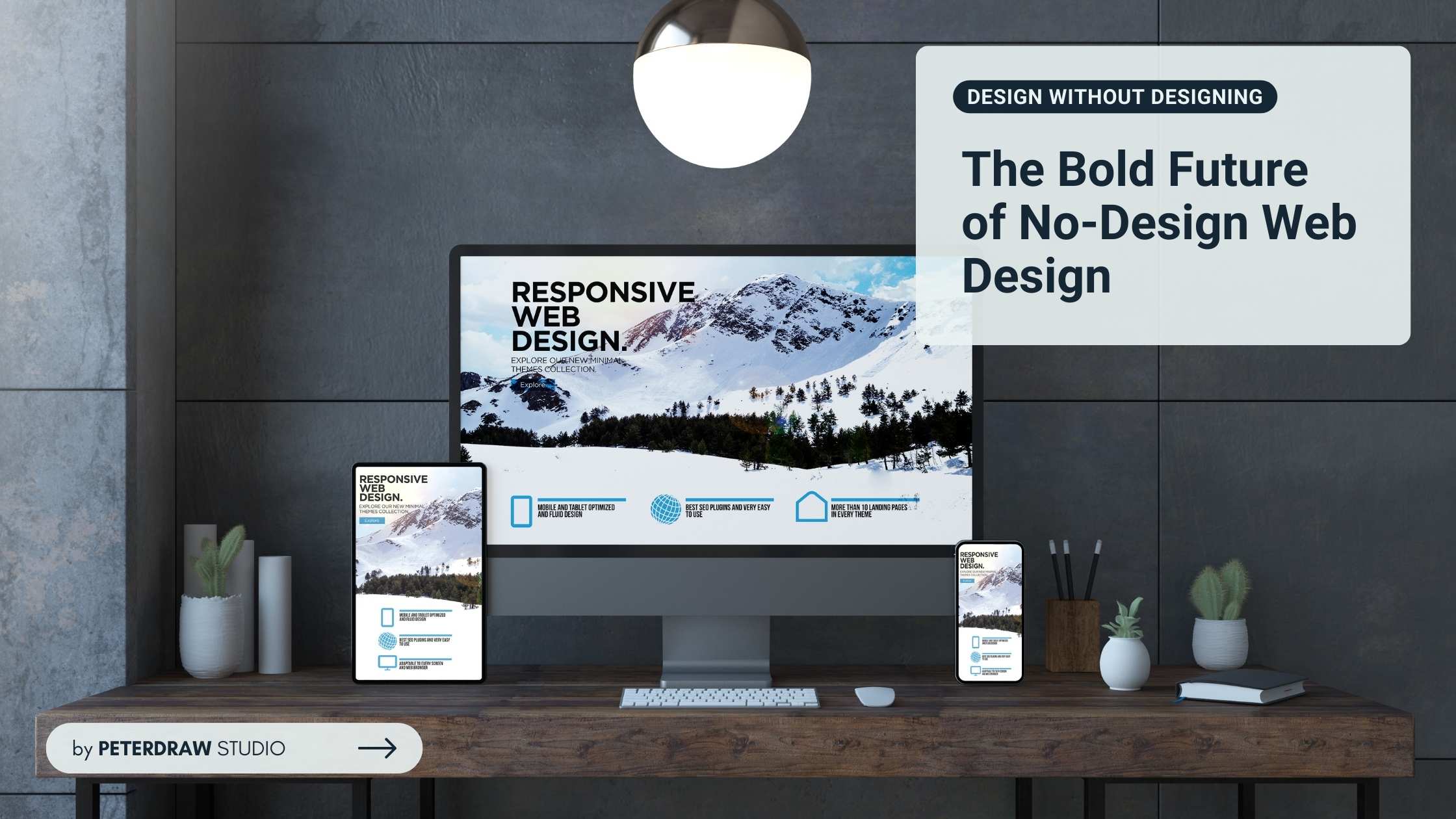
People prefer to access websites from their mobile phones since it is more practical. It is also why many people, even business owners, try to apply a more flexible web design. The purpose is to provide the same quality on desktop or mobile screens. To get this quality appearance, website owners need a responsive web design. What responsive web design features to consider to get the design?

Responsive design is actually an approach in web designing. It aimed at crafting sites to provide an optimal viewing and interaction experience across various devices. A website can maintain its optimal usability and appearance with the design. Using flexible grids and layouts, responsive images and media, and CSS media queries are the key features to create it.
Designers have to make some adjustments to have a responsive website design. The purpose of this adjustment is to avoid messy displays on different screen sizes. The key points of the adjustment are as below.
A good foundation is what everything needs to have a good build. So does building a responsive design. The foundation of this design is flexible layouts. As the backbone, they use relative units, like percentages, rather than fixed units, like pixels, for widths and margins. Therefore, it ensures the layout can stretch or shrink to fit the screen size.
Besides, it also implements fluid grids. They also ensure the layout can adapt to the screen width by structuring the content into columns and using relative width instead of fixed width. Designers also employ breakpoints within these fluid grids to further refine the adaptability of designs to the myriad of devices available. Breakpoints set markers that trigger a change in the layout once the viewport reaches certain sizes.
The content must have the same adaptability as the layout to have a fully well-worked responsive web design. CSS technology allows the content to adapt to different conditions. Media queries, as a feature in CSS, allow the application of different CSS styles based on the device’s characteristics.
The website content will give the response by applying some specific points, known as breakpoints. They provide users with the best layout to consume the information. Common breakpoints are set for mobile (under 768px), tablet (768px to 1024px), and desktop (above 1024px) devices. Both users and designers should pay attention to those sizes.
The last key point of responsive web design is flexible images and media. CSS has the role of making the images and media to be flexible. It is done to ensure that visual content scales harmoniously across different screen sizes and resolutions. The aim is to prevent images, videos, and other media types from overflowing their containing elements. If the worst case happens, it could disrupt the layout and negatively impact the user experience.
In managing images and media, pay attention to its scalability and aspect ratios. SVG (scalable vector graphic) images are ideal for this need. SVGs retain their clarity at any size. So, they will remain sharp across all resolutions and screen sizes. However, they also pose potential performance issues. The same high resolution may cause unnecessary data usage and longer loading times. As a solution, designers can apply responsive image solution techniques.
Besides those three key features, there are some advanced considerations to address since they significantly impact user experience and site performance. These advanced strategies go beyond the basic structure of responsive web design. They are focusing on the finer details that make a website not just functional, but exceptional on every device.
Applying responsive typography means to ensure text is not only legible but also comfortable to read on all devices. This approach to typography acknowledges the diversity of devices and user settings, offering a more personalized and accessible reading experience across the board.
After ensuring all the basic construction of the website is responsive, you can consider optimizing the performance. It plays a pivotal role in delivering a smooth and enjoyable user experience. Incorporating techniques such as image optimization, lazy loading, and conditional loading of resources are several ways to optimize it.
Responsive web design is imperative in today’s mobile-first world. It ensures websites deliver consistent functionality and aesthetic quality across all devices. By implementing flexible grids, media queries, and scalable media, designers can create seamless user experiences. Whether on a desktop or a phone, responsive web design maintains usability without sacrificing style.