From Web2 to Web3: How Web3 in Web Design Is Redefining Online Ownership
See how web3 in web design blends blockchain, wallets, and UX to create secure, decentralized, user-first digital experiences.

There are many important aspects to talk about in the graphic design world. A logo and icon, for example, those two elements hold an important role to build brand presence. At a glance, they have a similar look that makes people get them wrong and interchangeable. Those two elements have different messages and purposes. In this article, we will unleash the difference between a logo and an icon. And it will not stop right there, because it will also show you how to optimize your design with those two.
A logo is a visual representation of a brand or business. It can be the face of your business that depicts your brand values. It consists of a combination of shapes, colors, and typography. This combination should create a unique design that connects your brand and your audience. Thus, a good logo must be simple, memorable, and versatile. Additionally, it has to stand out no matter where it’s placed. Whether in printed or digital media, your logo should speak louder to represent your brand.
Let’s take a big brand logo for example. Coca-Cola has a simple design with memorable color hues and typography. Its simple design takes people to remember the brand easily. Moreover, the color combination of white and red creates a strong connection with the audience. The red color represents the happy moments that we can see in their campaign. Besides, consistency is the key to brand identity. And this company has consistently used its logo for more than 130 years.

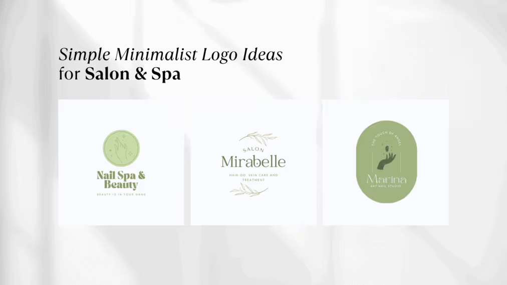
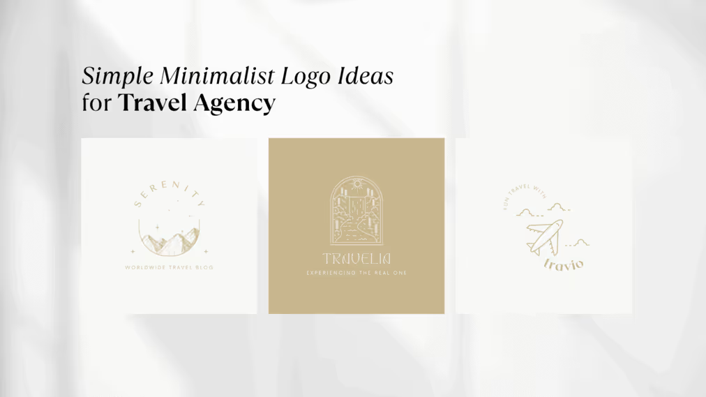
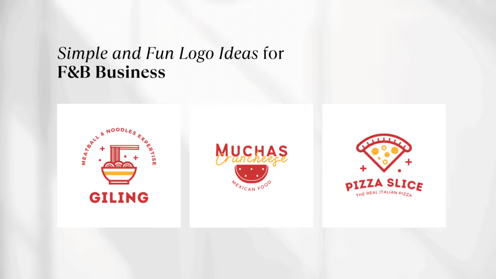
Are you looking for a logo that can be the face of your business? Or some iconic logos that can steal the attention of the crowd? Well, below is a list of logos and icons that you can use as inspirations for your brand identity.


Different from a logo, an icon is a simplified representation of an object, idea, or action. Its aim is to communicate a specific message in a very clear and concise way. That’s why most icons are designed in graphical symbols that represent the messages. They have a square shape and specific dimension that makes them scaleable to use even in small sizes. In addition, they are essential in user interface design. Thus, you can use icons in apps, social media, web designs, and other spaces that allow you to interact with your audience.

As an example, you can have a look at the design above. We use several icons like website, email, and location to tell our audience our contact details. We use the globe shape as the representative of our website, and the envelope shape to tell our email without writing the word email. And so does the map pin to tell our location. In short, icons can help our audience to catch concise information in the most interesting way.
Logos and icons play an essential role in visual identity, even tho they have several points that make them different. Technically, logos are more complex compared to icons. Their aims are to deliver the brand values and convey a border message. On the other hand, icons are simpler and less detailed. The specific purpose of this element is to emphasize the actions that the audiences need to take.
Design-wise, logos often incorporate typography and a variety of colors, while icons only play with monochromatic colors. Besides, logos usually have a larger size than icons. They are more prominent since they have to catch the attention.
When we talk about the right time to use logos and icons, it depends on the message a brand wants to convey. For example, when you want to establish a strong visual identity, using logos can be the best option you can take. Meanwhile, using icons is the best way to persuade the audience to do such an action. In the most common situation, logos are used on larger branding materials like websites, business cards, and billboards. However, when you use smaller platforms like social media profiles, app icons, and buttons.
Logos and icons are equally important in visual identity as well as branding. Both of them hold essential roles to make a design more aesthetic without leaving the core message that a brand wants to deliver. Thus, you need to understand the purpose of your designs first before deciding to use one of them. By choosing the right visual elements, every brand can build a strong visual identity that distinguishes them from the crowd. Furthermore, they can still speak out their brand voice as well.
Need more graphic design inspirations that meet your preference styles and needs? We are open to all the possibilities to work together with your brand to make your presence even stronger!