
Bold Typography: Mastering Impactful Design for Maximum Engagement
Master bold typography with expert tips on where to use it, the best font recommendations, plus practical techniques to make your designs more impactful and memorable.

The use of a term can sometimes be confusing. We are familiar with the term font when talking about the type of letters used in writing. However, when we involve in the graphic design industry, especially typography, we come across the term typeface. Both of them are not synonymous, yet they are used interchangeably. Typeface and font have distinct definitions, especially when we analyze them on a technical level.
No one can deny that the word font is more familiar than typeface to public ears. Only people who learn or are involved in graphics, typography, or type design will understand the distinction between typeface and font. Also, the word processing app and software, especially Microsoft Word, help popularize the font term. The software provides you with a Font Menu bar to compose your document.
The use of the term makes sense since composing a document uses one font at a time, regardless of the multiple fonts you use later. For example, you use 14 pt Times New Roman bold in the title, while for the body text, you use 12 pt Times New Roman. It means you have used two different fonts with the same typeface. People who only use it will never care about the difference between the terms. They only care about how the text will be good to look and appear to the reader.
Whether typeface or font has the same importance level in design and branding. Some people will not even care about the difference. Most of them tend to use the two terms interchangeably. But, as a designer, you should understand the difference between the two to produce proper and better work.
Speaking in classification level, typeface can be considered as a type family. It is a set or collection of related fonts (letters and other characters) with the same style and features/characters. These characters include the presence and lack of serif, the letter’s weight and balance, spacing, the height difference between the uppercase and lowercase, and so on. From those characteristics, we usually use four of the most common typeface styles, serif, san serif, decorative, and script.
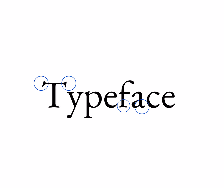
Among typeface styles, serif is the oldest one. Serif means every letter in the typeface has an extra stroke on the ends, making them have a sophisticated and classic feel. It was developed in the 15th century by Nicolas Jensen. Meanwhile, Garamond is the most well-known old serif style, named after the 16th-century Parisian engraver Claude Garamond. This typeface generally appears on body text and book publishing.
Times New Roman is another example of a serif typeface with a more transitional style. You find it in the plain text reading for its efficiency in using space. Compared to old-style serifs, these transitional serifs tend to have more contrasts between stroke thickness and wider.
In contrast with serifs, san serifs are typefaces without serifs or extra strokes at the ends, making them more modern, informal, and minimal. Thus, they tend to look clean yet relaxed. Helvetica and Arial are well-known and commonly used typefaces. While both are san-serif, they have very different characteristics. Arial is fuller and softer, with terminal strokes cut on the diagonal. Meanwhile, Helvetica is dense with high x-high and tight spacing between the characters.

Decorative typefaces are more fun and relaxed without the standard rule applied to serif and san serif. However, the fonts of this family are not suitable for use in body text. They can be distracting and hard to read, especially in small sizes. Even so, they will be the attention grabber you need for headlines, outdoor signs, or typographical art. However, never use them on menus or brochures.

To imitate handwriting strokes in your text, you can pick one of the fonts in script typefaces. Scripts are the best choice to communicate a handcrafted and personalized type for the brand because they look like cursive handwriting. Scripts are like decorative typefaces that are not suitable for body text. The best use for scripts is for logos, headlines, or signage. Try to use Kuenstler Script for a formal script or Brush Script, Kaufmann, and Mistral for a casual script.
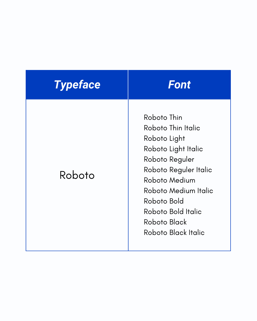
Font refers to printable and displayable typography in a specific style, size, and weight. When you find a typeface followed by the word italic, bold, roman, regular, thin, light, etc., that’s a font. The quickest way to see the difference between typeface and font is just by opening your front bar. However, this is the easy way to differentiate them. Let’s check the table below!
Even though we use the same typeface, it’s not necessarily the same type of font used. Therefore, when you design, especially for clients, make sure you don’t choose the wrong font because each font can give a different impression.
Regardless of the terms typeface and font difference, when you design, you still have to decide what type is right for your work. You have to open up to many possibilities by experimenting and practicing. However, you can’t dwell on that too long. You will never finish the job you have begun otherwise. To make it easy for you to decide, follow this guide.
Scope. Is it for digital-only or print, too? For a limited time or indefinitely? Those questions can help you choose fonts to use in your work.
Mood. Just like every design you create has a mood, so does the typeface and font. Consider whether the fonts will reinforce or clash with the design.
Functionality. Consider each size of the font you may use. Some can be good in good size or small size only. However, some are good in any size.
Versatility, Readability, Legibility. When the font you choose cannot communicate the message in the text, you have failed in choosing the right typeface. The font you pick has to adapt to the media you use, is easy to read, and can be distinguished by each letterform within the font.
Style. Remember the typeface styles above! Consider where you use that font, whether as a headline, subheading, title, or body text also the message you want to deliver.
Combination. Trial and error is one way to find the perfect typeface and font combination since not all can pair well with each other. Or, you can find some combinations or inspirations from others.
Rule of No Rules. There is nothing right or wrong in choosing fonts for your work eventually. However, knowing the basics can help you develop skills in choosing the right types.
Some people may say typeface when what they mean is a font, and most people say font what they mean is a typeface. In the end, when you understand what they mean, the work will do. However, for people involved in the design, knowing the difference in the meaning of the terms typeface and font will really help in producing better work.
Need fabulous and very customized visual designs? Contact us to get your unique graphic designs for marketing and branding.

