Micro-Interaction: Why Tiny UI Moments Make a Big UX Impact
Micro-interaction guide for web UI/UX: learn key types, real examples, and best practices to boost clarity, trust, and engagement.


Functionality is one of the aspects to consider when creating a usable design. Therefore, designers must not only place elements that provide aesthetic value but also consider functional elements such as buttons. Buttons are very important in graphic design, especially in creating UI/UX design. A good UI/UX button design can significantly enhance the usability and aesthetics of a digital product.
A button is an interactive element. Users can either click, tap, or press it to perform further action. Many buttons also navigate to another page or screen, based on what it’s needed. It is an essential component to provide clear, actionable items to engage with the content. Although it is commonly found in user interface design, other graphic design products, such as interactive ads, digital presentations, and email campaigns, also use it.
There are certain characteristics every UI/UX button design has for its functionality. They show how crucial a button is to have an effective and intuitive design. Its presence can enhance the overall user experience. Here are the button characteristics to consider.
Interactive: Since buttons mean to be clicked, tapped, or pressed, they have an interactive design, triggering a specific action or response.
Visual Clarity: This specific characteristic allows buttons to stand out from other elements that naturally attract users’ attention.
Functionality: When a button has no function, it already lost one of its characteristics, and a button without function is useless.
Feedback: Buttons provide visual feedback, such as changing color or animation, indicating the action has been registered.
The existence of a button is important to lead users to take further action, and so does the design of the button. It matters to invite action and attention from the audience. Here are some other reasons why button design is crucial.
A well-designed button is visible and stands out from the surrounding content. It makes it easy for users to identify and click. The design will be better by utilizing contrasting colors, appropriate sizing, and distinct shapes. Considering the visual appeal of a button that aligns with the overall design theme can enhance the aesthetic appeal. At some point, it makes users more likely to engage.
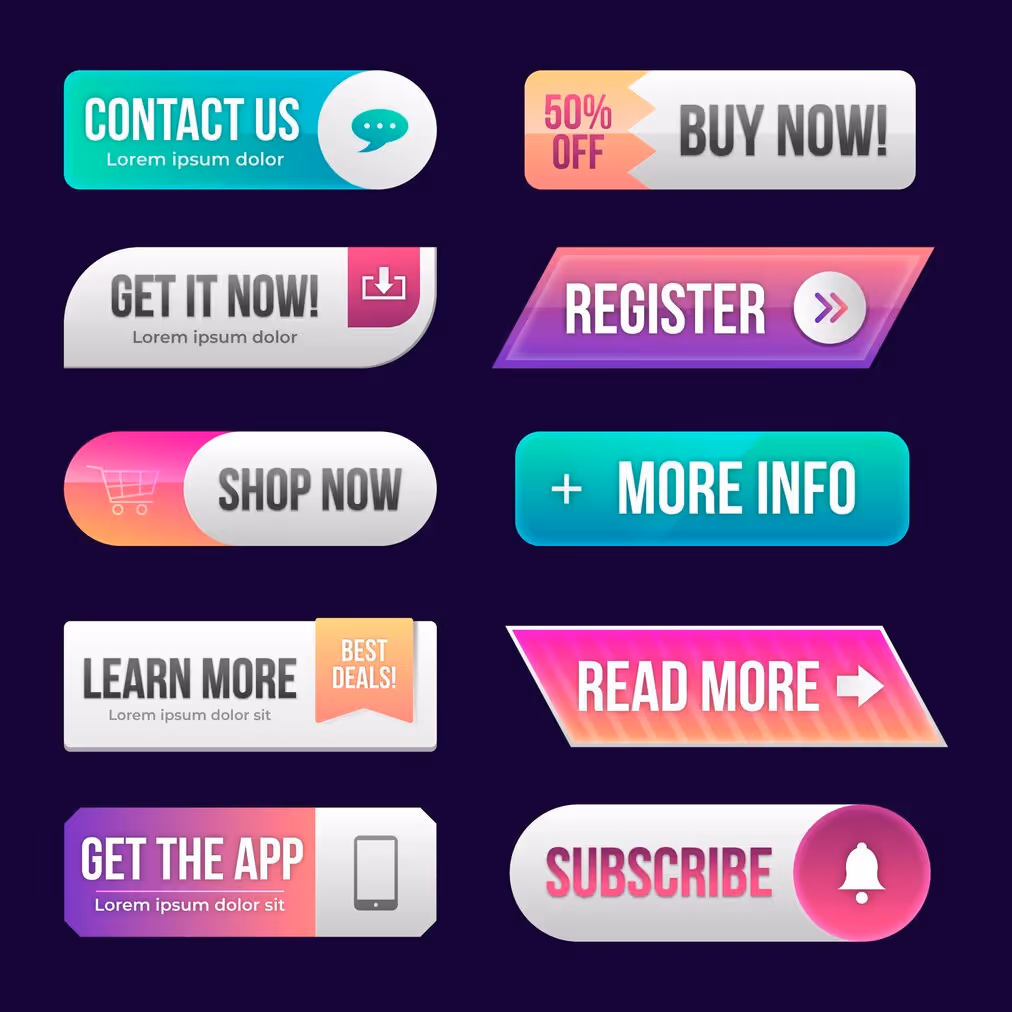
Shape is not the only aspect that makes a good button design. Clear and concise text on the button helps users understand the action they are about to perform. Labels on a button, like “Buy Now,” “Sign Up,” or “Learn More”, clearly convey the intended action. Adding relevant icons can further clarify the button’s purpose. It is most helpful in minimalist designs where space is limited.
A simple change such as a color shift on hover or a click of a button can build trust and encourage further interaction. It is some kind of reassurance that what users do has been recognized. For unavailable actions, it will be better to display disabled states. Considering this condition in UI/UX button design can prevent frustration, ensuring a smoother and more predictable user experience.
You have to remember that the audiences are diverse. It has become a common practice to consider usability and accessibility for better reach and understanding. Applying the appropriate size and spacing of the button can improve the button’s usability. Features like sufficient contrast, keyboard navigability, and screen reader compatibility, make the button more accessible for all users, even those with disabilities.
Button design includes its positioning. That is why strategic positioning is important. It ensures they are easily found and used by the audience. Differentiating the color, size, and placement can guide users to the most important actions. It is also easier to distinguish the primary and secondary buttons.
Consistency is always a crucial part of design, including button design. Its consistency helps users learn and predict interactions. Users can navigate and interact with the interface more confidently and efficiently. Buttons can even reinforce brand identity and create a cohesive experience when applying the brand’s style and color.
The UI/UX button design encompasses several critical elements that contribute to its effectiveness and usability. Each element plays a specific role in ensuring the button is intuitive, accessible, and visually appealing. Here are the fundamental elements that make up a well-designed button.
Text Label: Typically describes the action that will be performed, such as “Submit,” “Buy Now,” or “Learn More.”
Shape and Size: Rectangular, circular, oval, or other shapes and sizes, chosen based on context and importance, should be large enough to be easily clickable.
Color: Distinguish it from other elements and indicate the type of action, such as green for positive actions and red for destructive actions.
Iconography: Enhance the understanding of the button’s function, such as a shopping cart icon for a “Buy” button.
State Changes: Different visual states (default, hover, active, disabled) to provide feedback and guide user interactions.
Effective UI/UX button design invites user action and attention. So, it must be visible and clear to enhance user experience. Focusing on the importance of buttons can help designers create appealing buttons, enhancing the overall user experience and driving engagement. As a result, buttons will guide users through digital experiences, making it easier to navigate interfaces, perform actions, and access content.