From Web2 to Web3: How Web3 in Web Design Is Redefining Online Ownership
See how web3 in web design blends blockchain, wallets, and UX to create secure, decentralized, user-first digital experiences.

An unattractive homepage will only lead you to a lack of visitors. It is bad news for your website’s future. Having an attractive website homepage is not only visually appealing but also effectively usable. Therefore, when you decide to have a website, you must pay attention to its functionality and aesthetics. So, how to get the best homepage design to improve your website performance?
The homepage is an important part of the website. It is a gate to your whole website page. Therefore, the appearance of a homepage can determine whether the visitor will continue to explore or stop there. It will be better if the design can boost the traffic and educate the visitors at the same time. That way, it will invite conversions that have a positive impact on your business.
You can’t design a website homepage just like that, whatever you want. You must include some essential elements to get a good design and fit the purpose. Regardless of what industry you’re in, here are the elements that should be on a homepage.
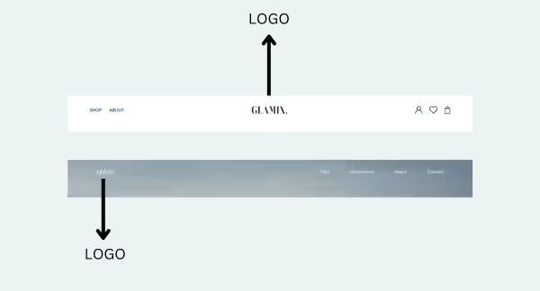
As your website is one of the media for your branding, including a logo is a must. It must be placed in the most visible position. The most common position for the logo is at the top of the website. You can also vary its position by placing it in the middle of the navigation bar. The existence of a logo on a website is not just for identity. It can also be a shortcut to return to the homepage when visitors have explored other pages.

Providing a navigation bar means providing access to other pages. When deciding what to put on the navigation bar, you have to consider what visitors most want to know. Besides, it also must be easy to understand and can be found easily at first glance. The main navigation is above the top of the website page, along with the logo. If it’s necessary, you can include a search bar for those unsure of what they want to find.
A capturing headline can be the factor of determination of your visitors. Its position, which is right under the navigation bar and takes up a fairly large portion, should be able to make visitors want to explore further. So, it should communicate what you have and what to offer. The headline doesn’t need to be too long, but make sure it’s memorable enough. You can complement it with a subheading of two or three sentences that suit your target audience.

What else is most suitable for inviting your visitors to take action if not using a call to action (CTA)? You can put one or two CTA on your website homepage to do some direct actions. One of the possible places to put it is in the hero section, together with the headline. Other CTA can be placed in the later section of the homepage. It usually will lead the visitors to deeper pages, such as contact forms, subscription forms, sales pages, or other pages with more information.

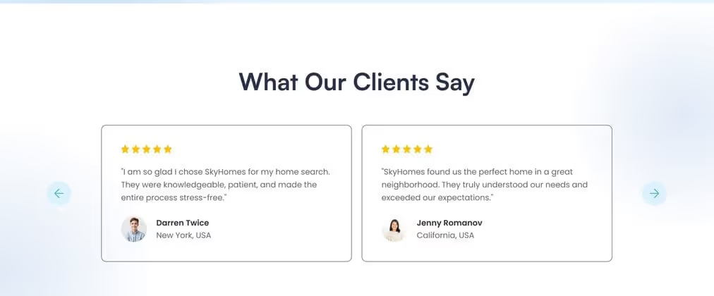
Social recognition can increase potential consumers’ confidence in what you offer. Social proofs are what you have to include to gain more recognition, especially for new visitors. The best proof you can offer on the homepage is customer reviews or testimonials. Another option you can include is a rating, case study, certificate, customer numbers, and more.

It will be such a boring website homepage when you only provide text without supporting images. Use images that portray people using your products, the result of your works, or other related ones. Apart from providing a visual touch, they can add a sense of credibility and integrity. Besides, people will be drawn to something that has a more emotional attachment to connect.
You can put your product or service details on another page. However, it is important to provide an overview or summary to arouse the visitor’s desire to know more. It can be a shortcut to the product or service they are looking for. At the same time, it also helps your page to rank up in the search engine. Add some key features to make them more interested in you. But remember that you have to keep it simple and easy to read.

Lastly, every homepage should have a footer, though, in fact, every page should have it. It contains contact info, a link or quick link, and social media integration. By providing a compelling footer, you can encourage visitors to get in touch, let them explore more pages, and engage in other media.

A well-crafted homepage is your digital storefront and brand ambassador. It needs to balance aesthetics, functionality, and content. Investing in key elements like logos, navigation bars, and CTAs will pay off. An effective homepage not only draws visitors in but also guides them effortlessly towards conversion. Make your homepage a cornerstone of your online success.