
Micro-Interaction: Why Tiny UI Moments Make a Big UX Impact
Micro-interaction guide for web UI/UX: learn key types, real examples, and best practices to boost clarity, trust, and engagement.

Responsive web design works well thanks to its various supporting elements, which are equally responsive. These elements are not only colors, images, or shapes but also typography. Without responsive typography, the web design can change dramatically, resulting in less optimal readability. So, how can the typography be more responsive? Is there any particular font to make it?
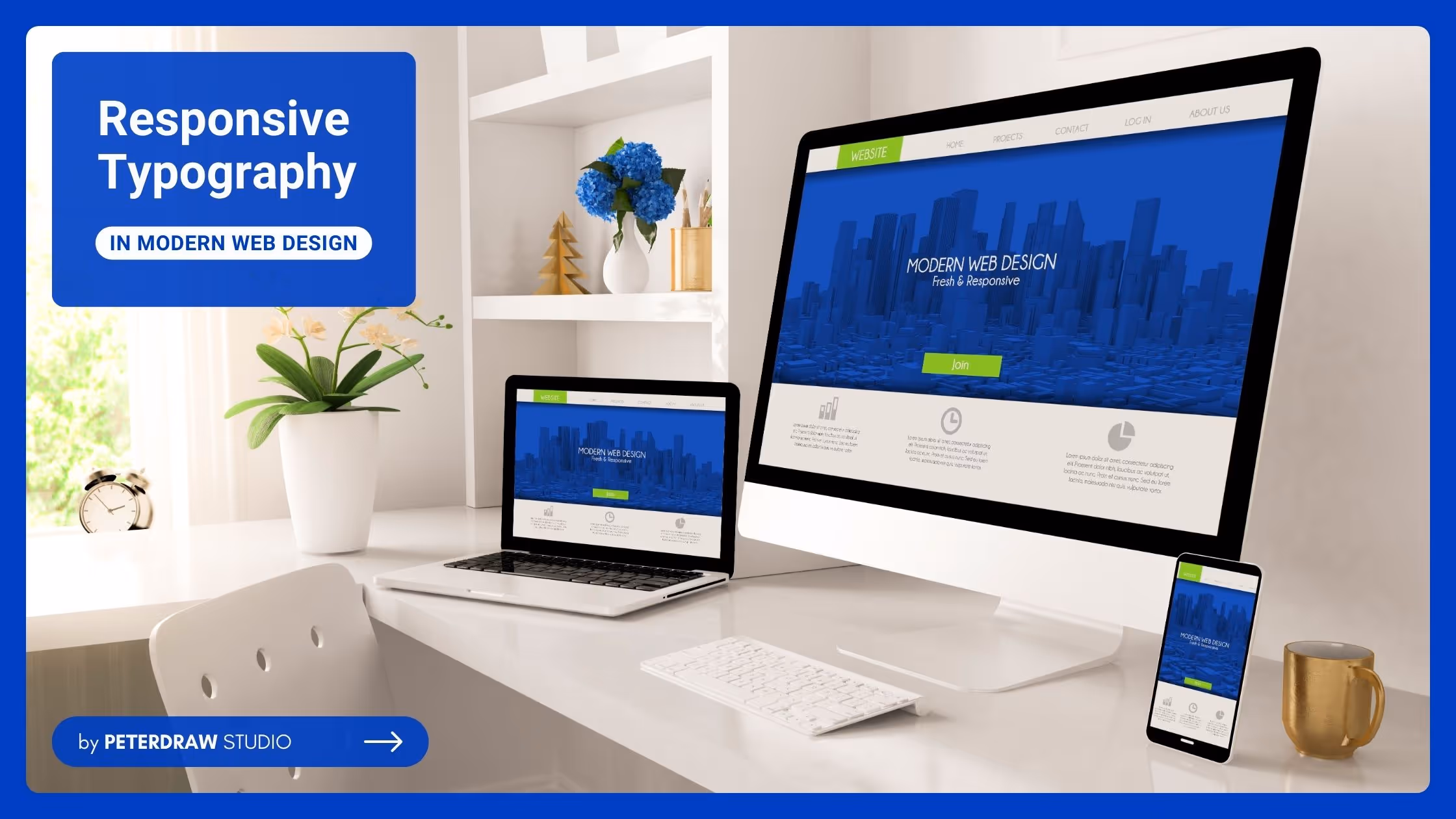
As one of the crucial aspects of responsive web design, responsive typography is a design approach. It ensures text is legible, and aesthetically pleasing and adapts smoothly across different screen sizes and devices. In other words, it prioritizes creating websites that provide an optimal user experience across varying devices like smartphones, tablets, and desktops.
A designer should follow the key principles below to make the typography responsive.
Fluid Typography: Allowing text size to scale based on the screen width instead of using fixed pixel values. It creates a seamless text flow, preventing text from appearing too large on small screens or too small on large screens.
Viewport Units: Frequently used in modern responsive designs to size typography based on the size of the viewport (vw for viewport width and vh for viewport height). It ensures the text grows or shrinks dynamically as the viewport changes.
Media Queries: Allow designers to apply different typography styles at specific breakpoints based on screen size.
Line Length and Height: Adapting the line length (characters per line) and line height (space between lines) to avoid excessively long or short lines, which can strain the reader’s eyes. An ideal line length is between 45 and 75 characters.
Modular Scale: A mathematical progression of font sizes. The modular scale adjusts dynamically, using a ratio that fits the visual hierarchy across devices.
Readability and Scalability: Ensure the text remains legible for all users, especially those with visual impairments. Sufficient contrast, larger text options, and clear font choices contribute to making the design accessible.
Font Weight and Style Adjustments: To enhance clarity, switching to heavier or bolder fonts can be an option since using lightweight fonts or thinner styles might reduce readability.
Regardless of one of the crucial aspects of creating a responsive design, responsive typography has a particular role in the website. Of course, the end is to improve the user experience, readability, and accessibility across different devices. Besides those purposes, here are other reasons for its importance.
Responsive typography ensures the design’s look and feel remain consistent across different devices. It includes maintaining the appropriate hierarchy of headings, subheadings, and body text while adjusting the text size for the screen. Thereby, it preserves the website’s branding and aesthetic appeal.
Text adjusts fluidly across various screen sizes and resolutions thanks to typography responsiveness. This flexibility ensures the content looks as good on a large desktop screen as on a small smartphone, without breaking or requiring manual adjustments.
Responsive typography works harmoniously with other design elements, such as grids and images. It ensures that text scales proportionally, keeping content well-balanced within the design. So, it prevents layout disruptions like text overflow or uneven spacing.
Since mobile devices often have smaller screens, typography with responsiveness quality is key to making text easily readable. It makes it more readable without excessive zooming or scrolling. It aligns with mobile-first design principles, that prioritize the mobile user experience in today’s digital landscape.
Well-implemented responsive typography keeps visitors engaged by providing an effortless reading experience. When users can easily consume content, they are more likely to stay on the site longer. It will reduce bounce rates and improve overall interaction with the content.
Although there are no specific fonts that are exclusively designed for responsive typography, certain font families are highly recommended. It is all because of their adaptability, readability, and versatility across different screen sizes. Those factors are essential so the typography can perform well on various devices. Here are some recommended fonts that are worth trying.
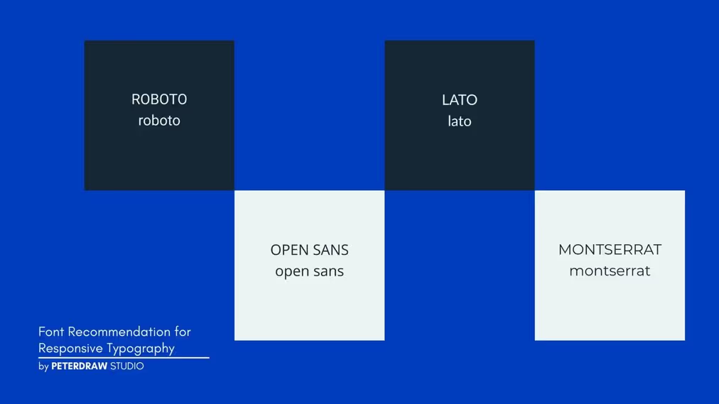
There’s no other font that is most suitable to support a responsive design, but Sans-Serifs. Sans-Serifs are clean, modern, and highly readable on small and large screens. They have a simple and minimalist design, making them more adaptable to varying resolutions. At the same time, it allows them to maintain clarity and legibility across devices, providing a consistent reading experience. These fonts will be a good choice for the upcoming responsive design.
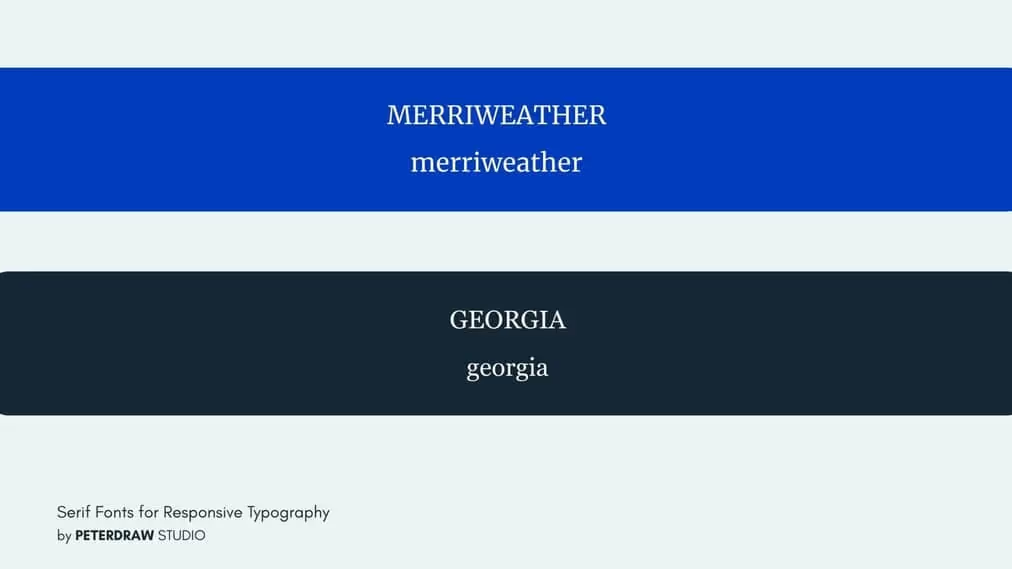
While sans-serif fonts are more common in responsive typography due to their clean appearance, serif fonts can also work well. They work well especially when used for headings or in designs that require a more traditional or formal look. These fonts will be a good start for completing the responsive design.
Compared to Serifs and Sans-serifs, variable fonts are a more recent development. These fonts allow a single font file to offer multiple variations (e.g., weight, width) within it. Thus, it reduces loading times and provides greater flexibility in responsive design. Here are some font suggestions.
One of the most practical choices for responsive typography is using system fonts. System fonts can enhance performance since they are pre-installed on most devices, which reduces page load times. Any responsive design that needs to prioritize speed is suitable for using these fonts.
Responsive typography is crucial for modern web design. It ensures text is readable and adaptable on screens. This typography also enhances user experience and accessibility. Careful font selection ensures readability across all devices. It improves engagement and keeps users interacting longer. Prioritizing responsive typography benefits both users and designers alike. Even though there are currently only a few fonts that are optimized for mobile and web use, maximizing the existing fonts is better than using incompatible ones.