From Web2 to Web3: How Web3 in Web Design Is Redefining Online Ownership
See how web3 in web design blends blockchain, wallets, and UX to create secure, decentralized, user-first digital experiences.
.avif)
The world inherited many things from human civilization. One of them is the Art Deco style that applied to many design aspects, as of today, the graphic design. The style is known for its bold geometric forms, vibrant colors, and lavish ornamentation. Applying Art Deco elements to your design can give a sense of sophistication, glamour, and modernity. Its characteristics make the style suitable for use today. However, have you some art deco element of Design recommendations in mind?

Art Deco elements play a significant role in enhancing the effectiveness and appeal of design works across various mediums. Here are some compelling reasons to use these elements:
You may find that the element names in various styles seem all the same. It is always about the use of shapes, lines, or patterns. However, each has different characteristics that distinguish the Art Deco style from others. Here are some recommendations you can use as your guidance in creating a design project with the art deco touch.
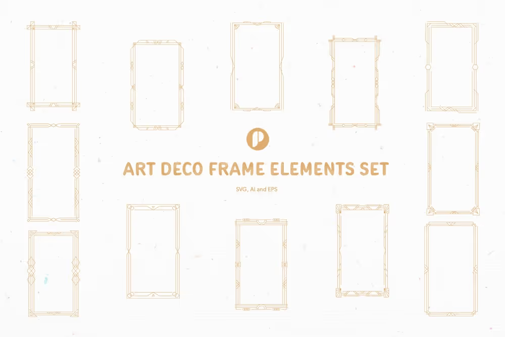
As one of the design styles involving geometric shapes as its elements, Art Deco is famous for its bold characteristics. Most of them are basic, like triangles, rectangles, squares, and circles. Its unique trait is to arrange the shapes in symmetrical patterns that often form hexagons or octagons. These Art Deco elements of Design recommendations are suitable as backgrounds and frames. You also can make it a focal point in the design.

When it comes to Art Deco, no thin lines like in elegant and minimalist design style. Clean, strong lines are often used to create or emphasize symmetry and structure in a composition. In some ways, they add a sense of movement and dynamism. The lines are usually thick and horizontal across the page to emphasize movement. Sometimes they also mimic the look of Art Deco architecture by creating stepped line patterns.
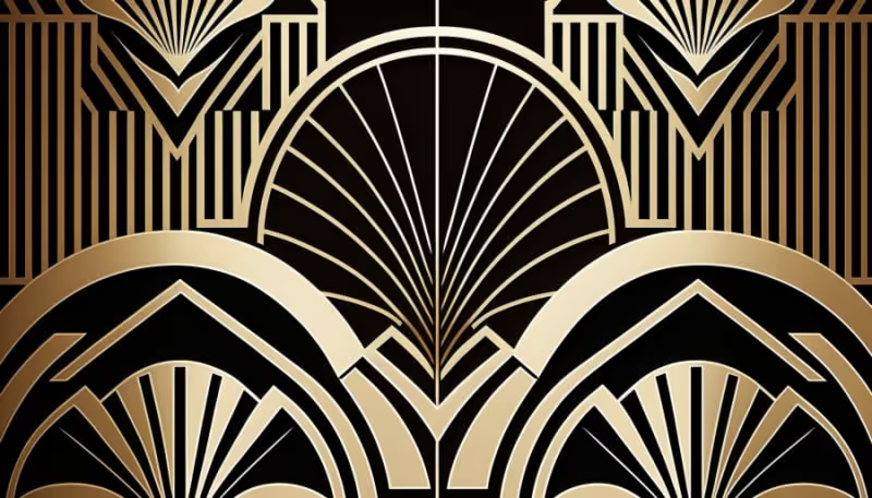
Art Deco is rich with the use of motifs. The iconic one is the sunburst motif, resembling rays of sunlight. It involves thick radial lines or bold shapes to create one. The sunburst symbolizes energy and modernity. Its best use is in backgrounds, as part of logos, or to frame text.
Try to apply zigzags and chevron patterns from the Art Deco element of Design recommendations to bring a dynamic vibe. They bring energy and motion to designs. How to use it in your work? Zigzags are perfect to use as borders around images or text. For simple use, you can make them as dividers. Meanwhile, chevrons are best as background or as a subtle part of letterhead and business cards.
The emergence of automobiles and trains in the 1930s inspired the Art Deco design by applying streamlined forms to portray the technological advances of the era. The elements suggest speed and efficiency, especially with their sleek aerodynamic forms. Incorporating these elements into your design brings elegance and suggests progress.
Art Deco is not only about geometric shapes, lines, and forms as the sign of modernity. It also includes nature motifs as part of the Art Deco element of Design recommendations. The natural elements, such as flowers, leaves, and animals, are stylized and suitable as decorative details. It also plays a role as organic shapes in your designs.
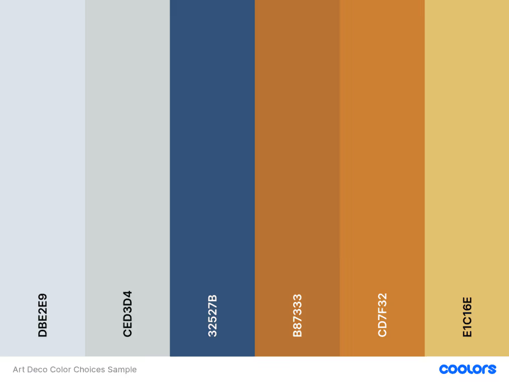
Apart from elements in shapes, motifs, and patterns, color elements also have an important role in strengthening the Art Deco impression in a design project. Art Deco designs are thick with metal colors, such as gold, silver, and other metal colors. These colors convey luxury and sophistication. Incorporate the tones through color choices, or by using textures and gradients.

Creating a design with the Art Deco style involves more than just incorporating specific elements. There are various things to consider to get a well-balanced design worth offering to your clients or audiences. Here they are.
Integrating these art deco element of Design recommendations can elevate your design work. They are seamlessly blending the classic elegance and opulence of the past with contemporary aesthetics. Embrace these elements to craft visuals that speak of grandeur and timeless sophistication. Ensure your creations not only catch the eye but also tell a captivating story of luxury and style.