
Bold Typography: Mastering Impactful Design for Maximum Engagement
Master bold typography with expert tips on where to use it, the best font recommendations, plus practical techniques to make your designs more impactful and memorable.
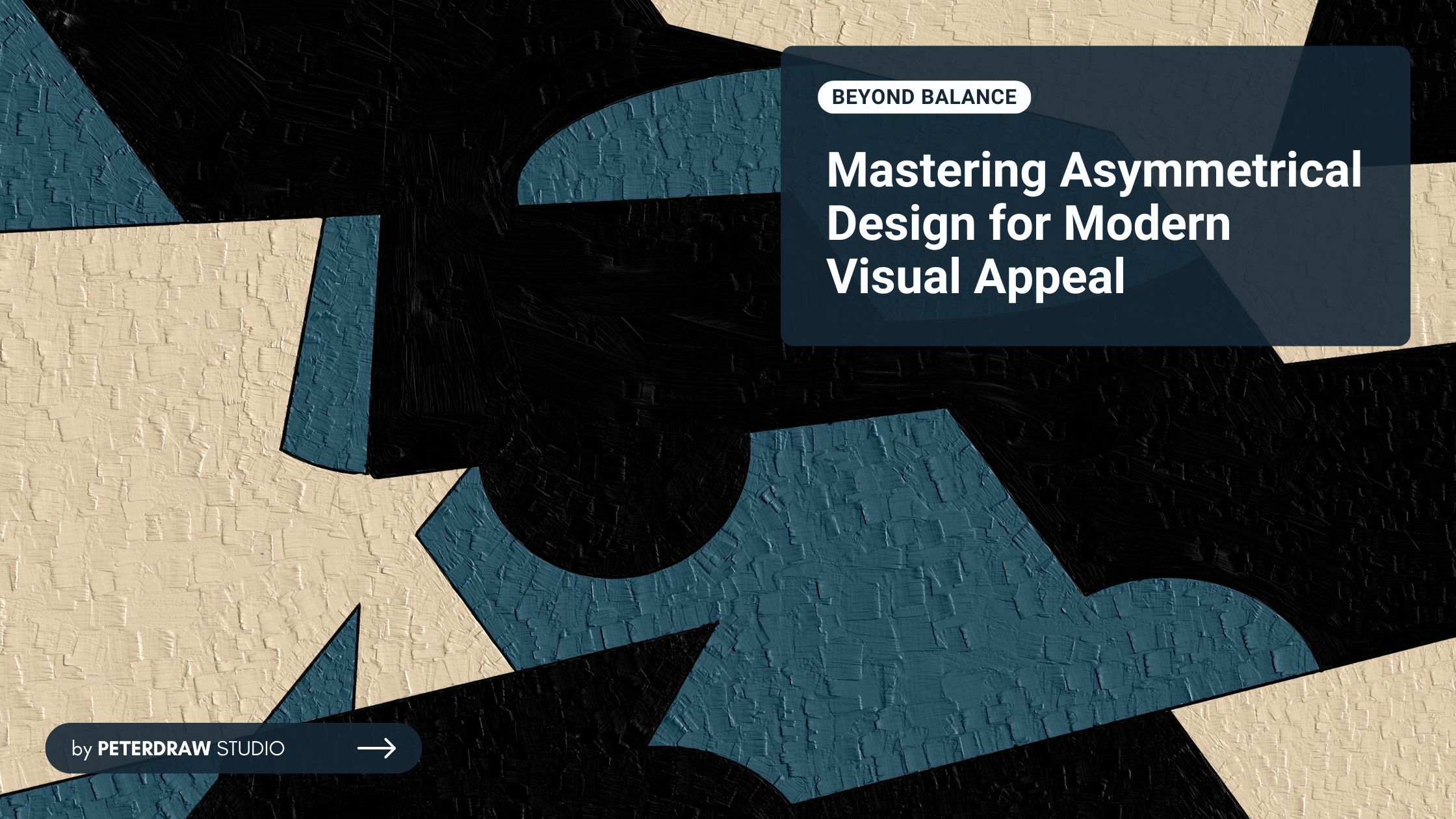

Many designs follow an aesthetically symmetric approach, where both sides carry equal visual weight through elements and spacing. While symmetry is a common practice, designers often experiment with asymmetrical arrangements. But does an asymmetrical design still hold aesthetic value? Can it effectively deliver its message and resonate with the audience? Let’s explore these questions and find the answers here.
A simple way to describe asymmetric design is that it is the opposite of symmetric design. Compositions of asymmetry lack perfect balance or mirror symmetry but still achieve visual harmony through thoughtful arrangement. This proves that asymmetric designs can be aesthetically pleasing, too.
Symmetrical designs distribute elements evenly on both sides of a central axis, creating a sense of order and stability. In contrast, asymmetrical designs use contrast, scale, spacing, and alignment to create a dynamic and engaging visual experience. This approach challenges traditional design norms while uniquely maintaining balance.
Since asymmetric designs break traditional symmetry rules, they offer a more dynamic and visually compelling approach. This design technique allows for greater creativity, making compositions feel more natural, modern, and engaging. Some asymmetric key characteristics below will guide you to create those unique designs.
No perfect mirroring or equal weighting in asymmetrical design. Those positions are highly avoidable. Instead of achieving balance through identical placement, designers rely on contrast, spacing, and alignment to create equilibrium. This approach ensures the composition remains visually engaging while maintaining a sense of order without strict symmetry.
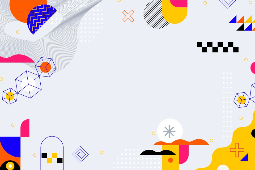
Asymmetry introduces movement and energy into a design, making it feel more organic and less rigid. Thanks to its unconventional layout, designers can create compositions that capture attention and evoke a sense of spontaneity. Its association with modernity, sophistication, and creativity makes it a popular choice for innovative and artistic applications.
Is it hard to keep hierarchy in asymmetric design? It can be challenging, but it is achievable with strategic planning. The design often emphasizes a focal point using variations in size, color, or contrast. The strategic placement of elements helps establish a clear hierarchy, ensuring that key messages or visuals stand out. Furthermore, this approach makes the composition more effective in conveying its intended message.
Being asymmetry doesn’t mean disorder. The design relies on negative space to maintain balance and readability. White space (link to blog white space) is crucial in preventing visual clutter, ensuring each element has room to breathe. Empty areas can counterbalance visually heavy components, allowing the design to feel cohesive and intentional rather than chaotic.
Contrast is one of the fundamental design principles in any design project. It is crucial in asymmetrical design to help create balance and visual appeal. Designers utilize differences in size, shape, color, and texture to establish equilibrium within a composition. For instance, a large element on one side may be offset by multiple smaller elements on the other, resulting in a structured yet dynamic layout that captures attention effectively.
Speaking of the right time, there’s no exact moment to apply the asymmetric design layout. However, certain situations benefit more from asymmetry, especially when designers aim to create a visually striking, unconventional, or highly engaging experience. Below are some key scenarios where asymmetric design works best.
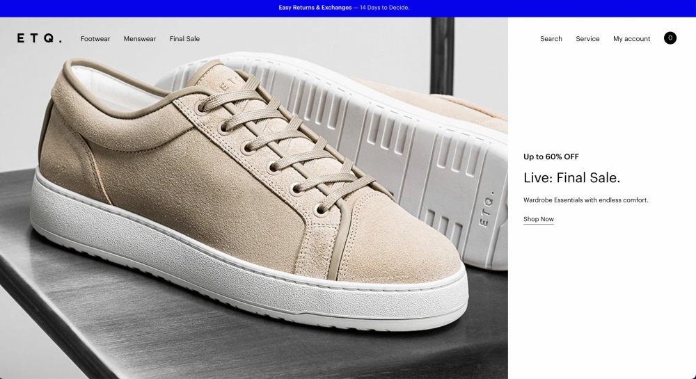
Asymmetry is popular in contemporary branding, websites, and editorial layouts, offering a fresh and non-traditional feel. It helps brands stand out by breaking conventional structures and creating visually compelling compositions. By using asymmetry, designers can craft unique brand identities that feel bold, innovative, and forward-thinking.
Great for creative industries, magazines, art portfolios, and fashion websites that seek a unique and edgy look. Asymmetry adds spontaneity and energy, making the design feel less rigid and more expressive. This approach encourages artistic freedom, allowing unconventional arrangements that capture attention and intrigue audiences.
Asymmetry can guide users’ eyes towards specific elements, enhancing UX/UI design by directing attention to key actions. It creates a sense of movement that naturally leads users through the interface or page flow. When used effectively, asymmetry makes interactions feel intuitive, ensuring a seamless yet visually dynamic experience.
Creating a visually appealing asymmetrical design requires a thoughtful approach to balance, movement, and composition. While asymmetry allows for creativity and uniqueness, it still needs structure to maintain harmony and readability. Here are some tips to help you create effective asymmetrical designs that feel intentional, engaging, and visually compelling.
Use a Grid System – Helps maintain alignment and ensures a structured composition. Grids provide a framework that keeps elements visually connected.
Experiment with Scale & Proportions – Balance large elements with multiple smaller elements. Varying sizes create contrast and add depth to the design.
Incorporate Movement & Flow – Guide the eye naturally using diagonals, curves, and positioning. A well-placed visual path keeps the viewer engaged and focused.
Maintain Visual Harmony – Ensure color, typography, and spacing complement each other. Consistent styling helps unify the design and enhance readability.
Leverage White Space – Avoid clutter and let elements breathe to enhance readability. Empty space helps balance asymmetry and improves visual hierarchy.
While asymmetric design offers flexibility, designers must ensure balance to avoid chaotic layouts. Using negative space and contrast helps maintain structure and readability. Strategic alignment ensures elements feel intentional rather than randomly placed. Testing designs with audiences can refine asymmetrical compositions for better usability and impact.
Asymmetry will evolve as digital interfaces become more dynamic and interactive. AI-driven personalization may make asymmetrical layouts more adaptive. However, designers must balance innovation with accessibility for an intuitive user experience. Thoughtful execution ensures asymmetrical design remains both artistic and functional in future design trends.

