
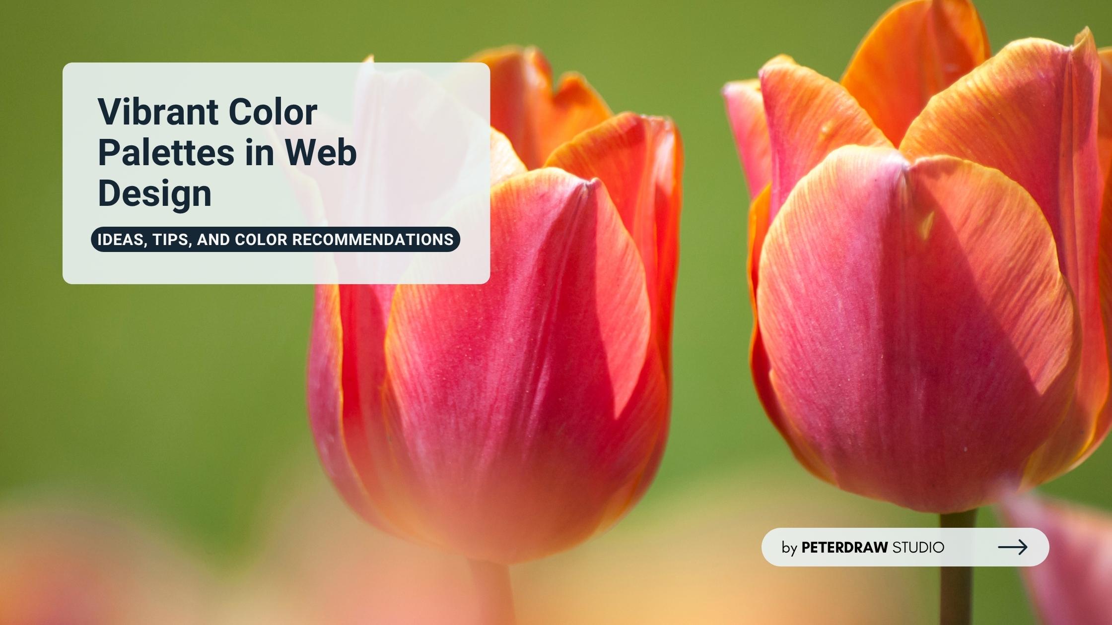
Bold Typography: Mastering Impactful Design for Maximum Engagement
Master bold typography with expert tips on where to use it, the best font recommendations, plus practical techniques to make your designs more impactful and memorable.
.jpg)

People’s attention spans are becoming shorter by the day, while user experience continues to reign supreme. Therefore, achieving equilibrium in your website’s layout is essential. At the heart of this lies text and visual balance. It is a principle that ensures your content doesn’t feel chaotic or overwhelming. Conversely, a well-balanced site flows effortlessly, guiding the eye from one element to the next like a well-orchestrated symphony.
Why does this matter in today’s fast-paced online environment? Mobile traffic makes up more than half of global web visits. That means every design must adapt smoothly across different devices. Poor composition often leads to higher bounce rates and lower engagement. Users quickly leave websites that feel cluttered or visually off-balance. Next, we’ll look at how layout choices shape visual hierarchy. We’ll also share practical tips to create a clear, engaging experience.
Balance in design comes from classical art principles adapted for digital interfaces. It influences how users feel when exploring a website. Two main types exist: symmetrical and asymmetrical. Symmetrical layouts create structure and calm. Asymmetrical layouts add energy and movement. Both depend on text and visual balance to achieve harmony.
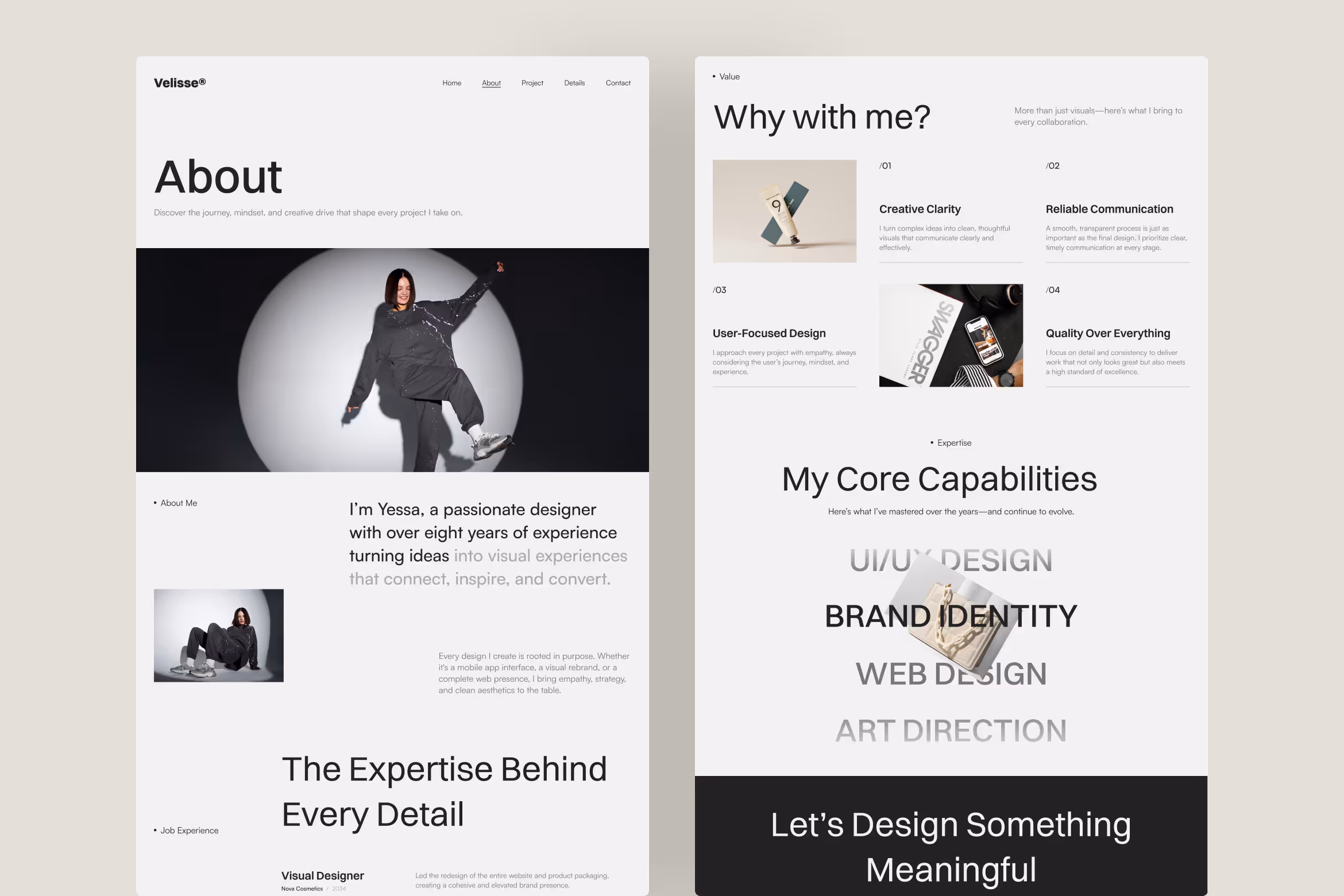
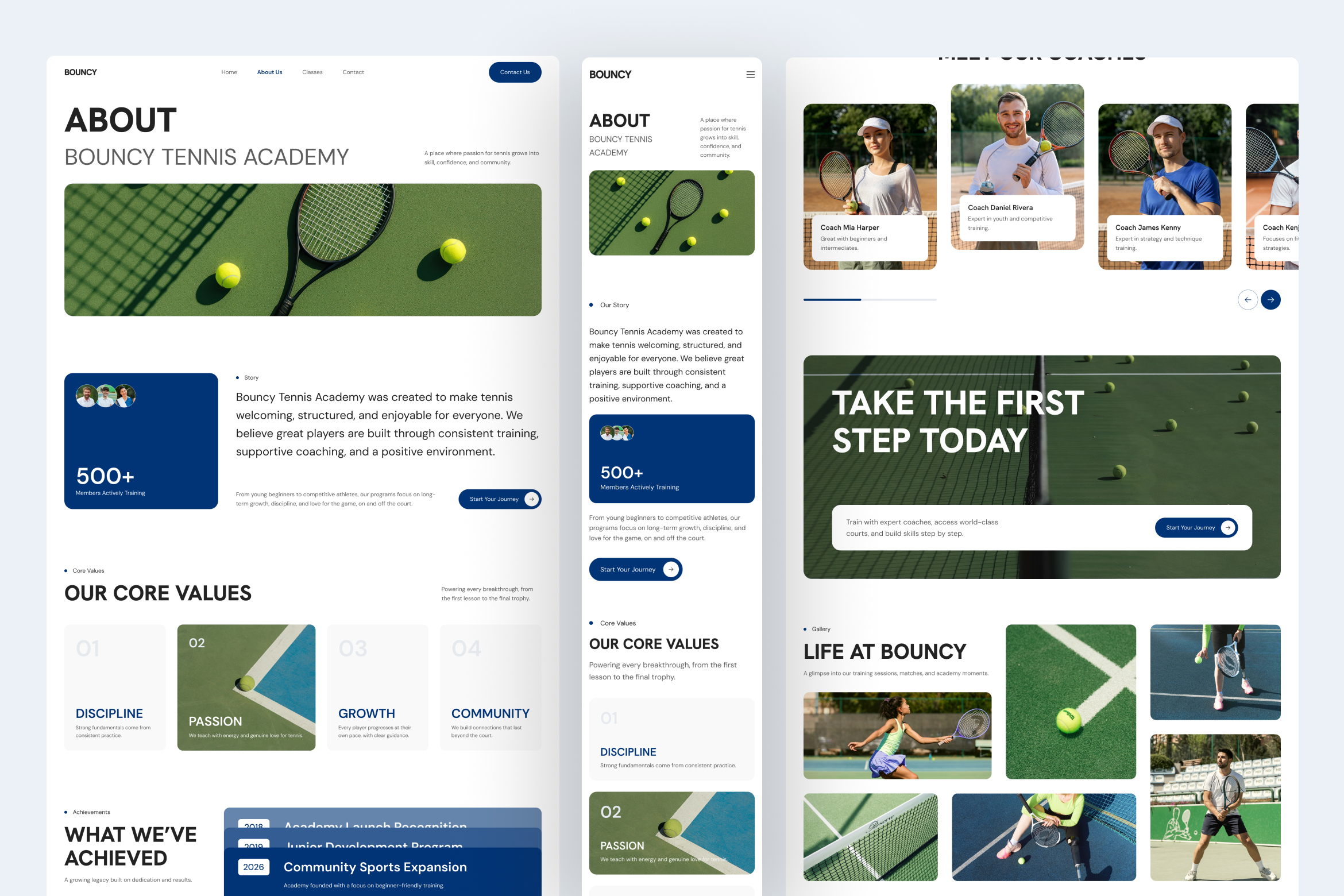
Text acts as the layout’s anchor, setting tone and rhythm across sections. Typography choices, like size, spacing, and weight, define clarity and emphasis. Oversized text can overpower visuals and break flow. Too small, and it fades away. Consistent type treatment keeps design readable and visually aligned with supporting imagery.
Visuals bring life, depth, and emotion to any digital space. Images, icons, or illustrations direct attention and create focal points. However, imbalance between visuals and text can harm usability. A striking photo without context feels empty. Balanced integration ensures every element complements and strengthens the overall composition.
Visual hierarchy closely connects to balance. It arranges elements based on importance and order of perception. Headlines grab attention first, followed by subtext and imagery. In web design, each layer should guide the user naturally. A well-composed hierarchy ensures visuals and copy work together to drive engagement and clarity.
Text and visual balance is about proportion and contrast. Text provides structure and story, while visuals add clarity and emotion. When combined effectively, they enhance comprehension. Imagine a blog post with a centered header image. The visuals ease reading flow, while words deliver context and meaning.
Color theory strengthens the relationship between imagery and text. Warm tones like red or orange energize content-heavy pages but can overwhelm easily. Cooler hues such as gray or blue maintain calm readability. Using palette tools like Adobe Color or Coolors helps designers maintain equilibrium across different layouts and viewing environments.

Whitespace, or negative space, shapes how content breathes within a layout. Ample margins create calm, allowing images and copy to coexist naturally. Tight kerning in headings keeps text sharp and focused. Responsive design adds complexity, as smaller screens demand tighter spacing while preserving rhythm and readability across all devices.
Text and visual balance requires careful attention to proportion and flow. Here are key issues and simple ways to fix them.
Design balance doesn’t happen by accident. Here are actionable tips to weave text and visual balance into your workflow.
As AI-driven platforms like Framer and Webflow automate layouts, visual harmony remains essential. Emerging tools, including AR previews and immersive scrolling, require thoughtful alignment to keep users grounded. Sustainability also plays a role.Well-balanced designs load faster, reduce energy use, and rely on leaner, optimized visual elements.
Mastering text and visual balance transforms websites into engaging experiences. It’s a subtle craft that converts casual visitors into loyal audiences. Whether you’re refining a portfolio or redesigning a storefront, prioritize equilibrium between visuals and text. Keep experimenting, keep iterating, and watch your designs, and results, consistently improve.