
.jpg)
Web Design Trends 2026 Part 2: 6 Emerging Styles Shaping the Year
Stay updated with web design trends 2026, featuring TL;DR experience, 2.5D design, and more, plus useful implementation tips.



Capturing attention in just seconds is crucial to winning the battle for engagement. Bold typography stands out as one of the most powerful tools designers and marketers can use. According to FontFabric, with their thick, commanding letterforms, bold fonts instantly grab attention, convey confidence, and improve readability when applied thoughtfully.
Bold typography refers to typefaces or font weights with increased stroke thickness and heavier visual presence compared to regular or light variants. It goes beyond simply making text bigger; it strategically uses weight to create emphasis, establish hierarchy, and inject personality into your design.
Designers achieve bold effects through:
Historically, bold type gained prominence in the 19th-20th centuries, with advertising and posters needing to stand out. Today, it thrives in minimal and maximalist designs alike, helping brands cut through noise in crowded feeds and screens. Psychologically, bold text feels assertive, trustworthy, and important. It draws the eye first, guiding viewers through content logically via visual hierarchy.
Bold typography plays a crucial role in shaping clear and impactful visual communication. It helps guide users effortlessly through content while establishing a strong visual presence. This typography excels at:
It boosts memorability and brand recall. In UI/UX, it enhances navigation by making key labels and actions prominent. However, overuse can create clutter. Balance its use to keep designs decisive and powerful.
Since bold typography is very distinctive and striking, you can’t apply them whole. It shines in contexts needing impact and clarity, like:

It's ideal for brands wanting to appear modern, authoritative, or energetic. Pair it with lighter text for contrast, never apply it to long paragraphs, as it reduces readability. For best practices:
Websites benefit enormously from bold typography because users decide to stay or leave in seconds. It improves user experience (UX) by creating intuitive navigation and stronger visual cues. Top places to use bold typography on websites:
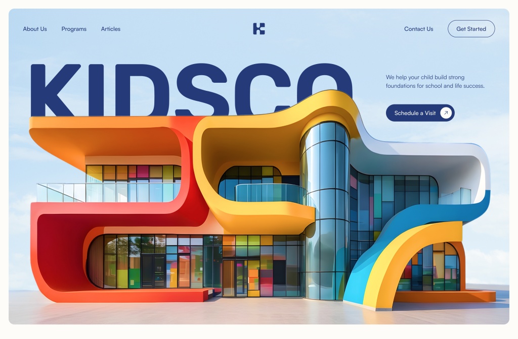
On websites, prioritize web-safe or optimized fonts that load quickly. Use CSS font-weight properties (e.g., 700 for bold) and test across devices. Bold type pairs well with high-contrast backgrounds and responsive scaling.
SEO Bonus: Using <strong> tags (semantic bold) on key phrases can help signal importance to search engines, though it's secondary to quality content.
Selecting the right fonts elevates your bold typography. Strong typefaces deliver maximum impact and clarity. Choose families with multiple weight options. Many excellent choices are free on Google Fonts.
2026 trends: look for versatile geometric sans and high-contrast options that work across light/dark modes.
Getting bold typography right takes more than just picking a heavy font. The real magic happens when you apply it with intention and restraint. These practical tips will help you use it effectively across projects.
Experiment in tools like Figma or Adobe XD before implementing.
Good design often comes from small, intentional decisions that shape how people experience your work. Subtle adjustments in weight and contrast can completely shift how content feels, making it easier to read, navigate, and remember. Instead of focusing on dramatic changes, try refining how emphasis appears across your layouts.
Notice how spacing, alignment, and proportion work together to create rhythm, allowing important elements to stand out without overwhelming everything else. Over time, these small refinements build a stronger visual voice. When applied with clarity and purpose, bold typography becomes a reliable way to guide attention and elevate the overall impact of your designs.