


UI Testing Checklist: 7 Key Areas for Flawless Interfaces
Use this UI testing checklist to validate layouts, interactions, devices, browsers, and accessibility before launch.


Typography is one of the elements that can help in building user experience. Whether you’re building a blog, an online store, or a corporate site, choosing the right fonts can dramatically affect how visitors feel about your website. But what happens when those beautiful custom fonts fail to load? That’s where web-safe fonts become your best friend.
A web-safe font is any typeface that is already installed on most devices. This includes Windows, macOS, Android, iOS, and even older systems. Because these fonts don’t need to be downloaded, your website loads faster. It also looks consistent no matter who visits or what device they use. In today’s world, page speed affects SEO rankings and conversion rates. That makes this reliability very valuable.
Think of web-safe fonts like the “universal clothes” in everyone’s digital closet. Instead of asking visitors to download a fancy custom font, you simply use something they already have. These fonts became popular in the early days of the internet. Back then, bandwidth was limited and browsers could not easily load external files.
Even today, with high-speed internet everywhere, web-safe fonts solve two big problems:
Web-safe fonts are grouped into three main categories. Each category has its own strengths and best uses.
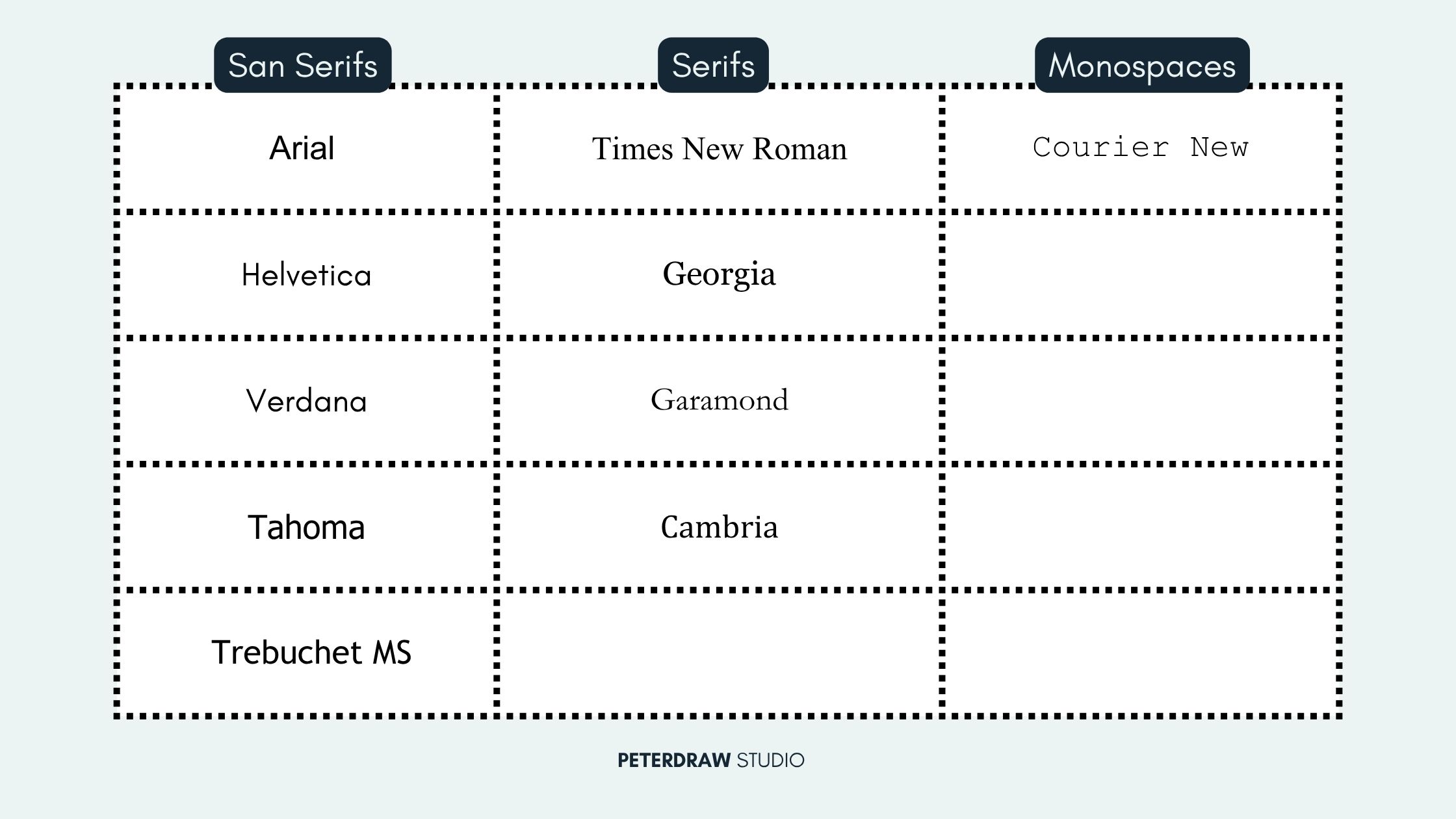
Some extended lists also include Calibri, Century Gothic, and Segoe UI. However, the core group above remains the safest choice across all platforms and devices.
You might think custom web fonts have made web-safe fonts obsolete. Not quite. In 2026, nearly 70% of consumers say page speed influences their buying decisions. Every extra font file you load can add precious milliseconds to your site’s loading time.
They shine in these situations:
Using a web-safe font brings many practical advantages to your website. These benefits go beyond just appearance and directly improve performance, user experience, and SEO. Here are the top reasons why smart designers still rely on them.
Of course, no solution is perfect. The main limitation of web-safe fonts is the smaller selection. You won’t find ultra-modern or highly stylized options like some Google Fonts. This can make branding feel a bit “standard” if you rely on them exclusively.
The fix? Use smart font stacks in CSS. A typical stack looks like this:
CSS
body {
font-family: "Helvetica Neue", Helvetica, Arial, sans-serif;
}
This tells the browser: “Try Helvetica Neue first. If that’s missing, fall back to Helvetica, then Arial, and finally any sans-serif font the device has.”
You can also combine web-safe fonts with modern system fonts like system-ui for an even more native feel:
CSS
font-family: system-ui, -apple-system, BlinkMacSystemFont, "Segoe UI", Roboto, Arial, sans-serif;
Using web-safe fonts effectively takes a bit more care. The right approach can make your website faster, more readable, and consistent across all devices. These practical tips will help you apply them confidently and avoid common mistakes.
Many big brands still rely on web-safe fonts across their websites. They choose them for speed, consistency, and reliable readability. News websites often use Georgia or Times New Roman for article text. These serif fonts work well for long-form reading on screens. For example, The New York Times uses Georgia for clear, professional presentation.
E-commerce platforms often prefer Arial for its clean, simple appearance. It keeps attention on product visuals without adding unnecessary distractions. Major platforms like Amazon, Facebook, and Google use similar system fonts widely. These choices help maintain fast loading and consistent user experiences. They also ensure interfaces look familiar across different devices and browsers.
Other examples include IKEA, which uses clean sans-serif styles across platforms. Government and corporate websites often rely on Times New Roman for formal communication. Even with custom logos or decorative headings, body text stays simple. Using web-safe fonts ensures content remains accessible and easy to read. It also guarantees consistent performance across devices, browsers, and connection speeds.
A web-safe font is not outdated, but a smart design choice. It delivers speed, consistency, and accessibility across devices and browsers. Custom fonts can struggle with performance, especially on slower connections. Understanding proper font stacks helps maintain visual quality and fast loading times. This approach ensures your website feels stable, readable, and professional everywhere.
Using web-safe fonts can be a simple yet powerful upgrade. They reduce load time while keeping your design consistent across platforms. Start with reliable stacks like Arial, Helvetica, or Georgia in your stylesheet. Small adjustments like this can instantly improve usability and overall experience. Your visitors and search engines will appreciate faster, clearer, and more accessible content.

.jpg)