
Bold Typography: Mastering Impactful Design for Maximum Engagement
Master bold typography with expert tips on where to use it, the best font recommendations, plus practical techniques to make your designs more impactful and memorable.

A website's layout is pivotal in capturing user attention and fostering interaction. A well-designed layout can even enhance overall website performance. Among the many approaches, card-based layouts have emerged as a favorite due to their versatility and user-friendliness. This design approach has become a cornerstone of modern UI, ensuring users stay engaged while navigating bite-sized, easily digestible content. So, what is the card-based layout in web design? What are the benefits of using it? Find out all the answers here.
A card-based layout is a popular design trend in web and mobile interfaces, offering a modular, clean, and user-friendly way to display content. It organizes content into self-contained, visually distinct containers called "cards." This design layout gained its popularity in the early 2010s thanks to Microsoft's Metro Design Language. Cards are usually arranged in grids, lists, or masonry layouts, adapting to screen sizes through responsive design.
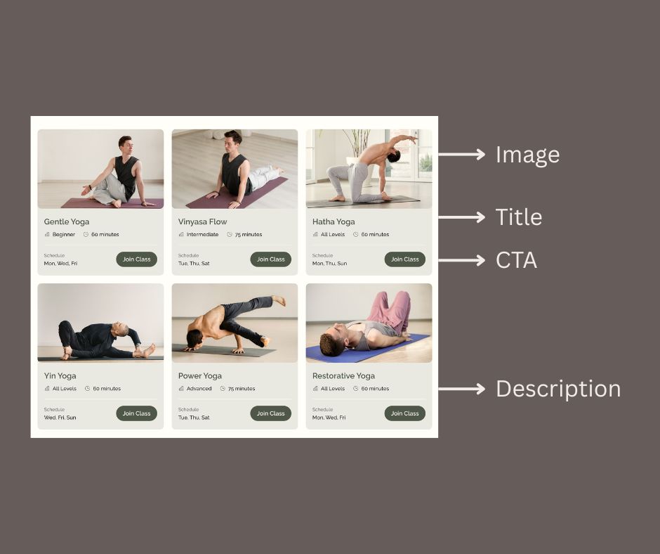
Each card typically includes elements like:
Thanks to their modular nature and visually distinct structure, card-based layouts are versatile and effective tools for enhancing user experience. They offer clarity, adaptability, and interactivity and have become a go-to solution for designers across various applications, especially in responsive design. Below are some of the key benefits that highlight why this design approach continues to thrive in modern UI design.
But, what if you apply the card layout to only specific sections of a page instead of the entire design? Will it still deliver the same benefits as a fully card-based layout? While the application differs, using a card-based layout in specific sections also offers distinct advantages. Here are the key benefits.
While card-based layouts in web design offer numerous benefits, they are not without challenges. Poor implementation or certain design limitations can hinder user experience and the effectiveness of the layout. Below are some common challenges associated with this layout approach, along with insights on how they can impact usability and design quality.
Too much information in a single card can overwhelm users, reducing effectiveness. When cards are overloaded with text, images, or interactive elements, they lose their clarity and purpose, making it harder for users to focus on key content. Striking the right balance between content density and white space is critical to avoid confusion and maintain usability.
Poorly designed cards with mismatched sizes or styles can make the layout look cluttered and unprofessional. Inconsistent alignment, typography, or color schemes within cards disrupt the visual harmony of the page and can frustrate users. Ensuring a consistent design language across all cards is essential to creating a cohesive and polished interface.
Large datasets can make a card-based layout design feel repetitive or monotonous if not paired with engaging visuals or diverse styles. When there is a significant amount of content to display, users may experience "card fatigue," where the uniformity of the design leads to disengagement. Designers should consider grouping content, adding variety, or implementing pagination to address this issue effectively.
Cards that rely too heavily on visuals or animations can exclude users with disabilities, limiting inclusivity. Accessibility tools (such as screen readers) may struggle to interpret complex card layouts, especially when semantic HTML is not used properly. Designers must prioritize accessibility by incorporating proper ARIA roles and alt text for images, ensuring interactive elements are keyboard-friendly and screen-reader-compatible.
Since a card-based layout has a modular structure and visually distinct presentation, it makes it an ideal choice for organizing content in a way that is both functional and engaging. This layout is most commonly applied on various platforms, dealing with diverse and dynamic content. The most common use is on e-commerce platforms. The purpose is to display products with images, prices, and CTAs more effectively.

Social media also apply the layout, showcasing user-generated content, like posts, photos, or videos, such as Instagram or Pinterest. Dashboards also use this layout to organize widgets, analytics, and data visualizations, as the content platforms like Medium and Flipboard, do.
In the content platforms, the layout helps present blogs, articles, or news snippets more conveniently. Another UI design that frequently uses the card layout is apps. The layout can provide compact, actionable information, especially in mobile interfaces.
Then, what about the card layout used in some sections? What are the common applications?
Card layouts are often utilized in specific sections to enhance clarity and engagement. For example, in the hero section, cards can showcase key offerings like features or services with an icon, a short description, and a clear call-to-action (CTA).
Team member sections also benefit from cards, as they effectively highlight profiles with photos, names, and brief bios, making the information easy to digest. Additionally, in testimonial sections, cards structure customer reviews, adding visual organization while emphasizing key feedback.
A card-based layout might be an effective design solution that enhances aesthetics and functionality. However, for a better layout application, focus on simplicity and clarity. Avoid overloading cards with excessive content; instead, highlight key information and maintain sufficient white space. Finally, test responsiveness to ensure cards adapt seamlessly across all devices. That’s how you can create a visually engaging and user-friendly card layout that meets modern UI standards.