
Bold Typography: Mastering Impactful Design for Maximum Engagement
Master bold typography with expert tips on where to use it, the best font recommendations, plus practical techniques to make your designs more impactful and memorable.


Color contrast ratios play a critical role in interface design. They help create layouts that are visually appealing and accessible to everyone. Whether you're building a website, mobile app, or marketing material, they matter. Understanding color contrast ratios can mean the difference between inclusion and exclusion. Poor contrast can unintentionally exclude users with visual impairments.
So, what’s the best contrast ratio when using color in interface design?
A color contrast ratio measures the difference in luminance between two colors. It usually refers to the foreground text or element and its background. It is expressed as a ratio, such as 4.5:1 or 7:1. The higher the ratio, the stronger the contrast. Higher contrast makes elements easier to distinguish from one another.
The formula used by the Web Content Accessibility Guidelines (WCAG) defines contrast ratios. It is based on the relative luminance values of the two colors:
text


(Lighter color + 0.05) / (Darker color + 0.05)
Tools like WebAIM’s Contrast Checker, Axe DevTools, or Chrome’s Lighthouse handle this calculation automatically. So, designers rarely need to do the math manually.
WCAG 2.1 is the international standard for color contrast. It works alongside the upcoming WCAG 2.2. These guidelines define minimum contrast ratios by text size and compliance level. Here’s how the contrast requirements break down for different levels and text sizes.
Level AA (minimum recommended)
Level AAA (enhanced accessibility)
These thresholds come from extensive research on readability and visual accessibility. They are designed to support users with low vision or color blindness. They also improve legibility in bright light, poor screens, and aging eyes.
Many designers initially see contrast requirements as a constraint. However, strong color contrast ratios actually improve the experience for everyone. This is how they work:
Google and other search engines also increasingly factor accessibility into rankings. A site that meets WCAG contrast standards is more likely to perform better in SEO over time.
Despite the existence of standard ratios for interface design, errors can still occur. Even experienced designers trip over these issues. Here’s the common mistakes and practical guide to fix them.
CSS


:focus-visible { outline: 3px solid #0066FF; outline-offset: 2px; }
Run one quick check with these fixes and most contrast errors disappear without sacrificing style.
Getting color contrast ratios right doesn’t have to feel intimidating. With a few practical habits, you can design more inclusive interfaces. Use these tips to check color contrast ratios confidently in everyday projects.
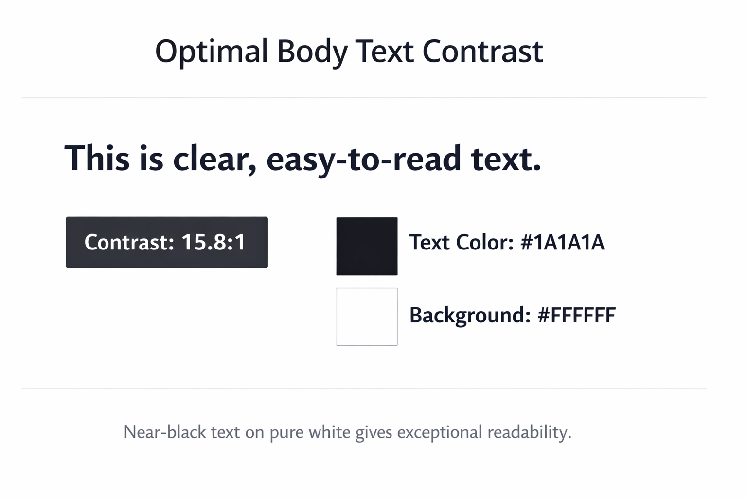
For body text, start with a near-black color against pure white. Values like #1A1A1A or darker consistently create strong, readable contrast. This simple pairing far exceeds 15:1, covering most everyday text needs.
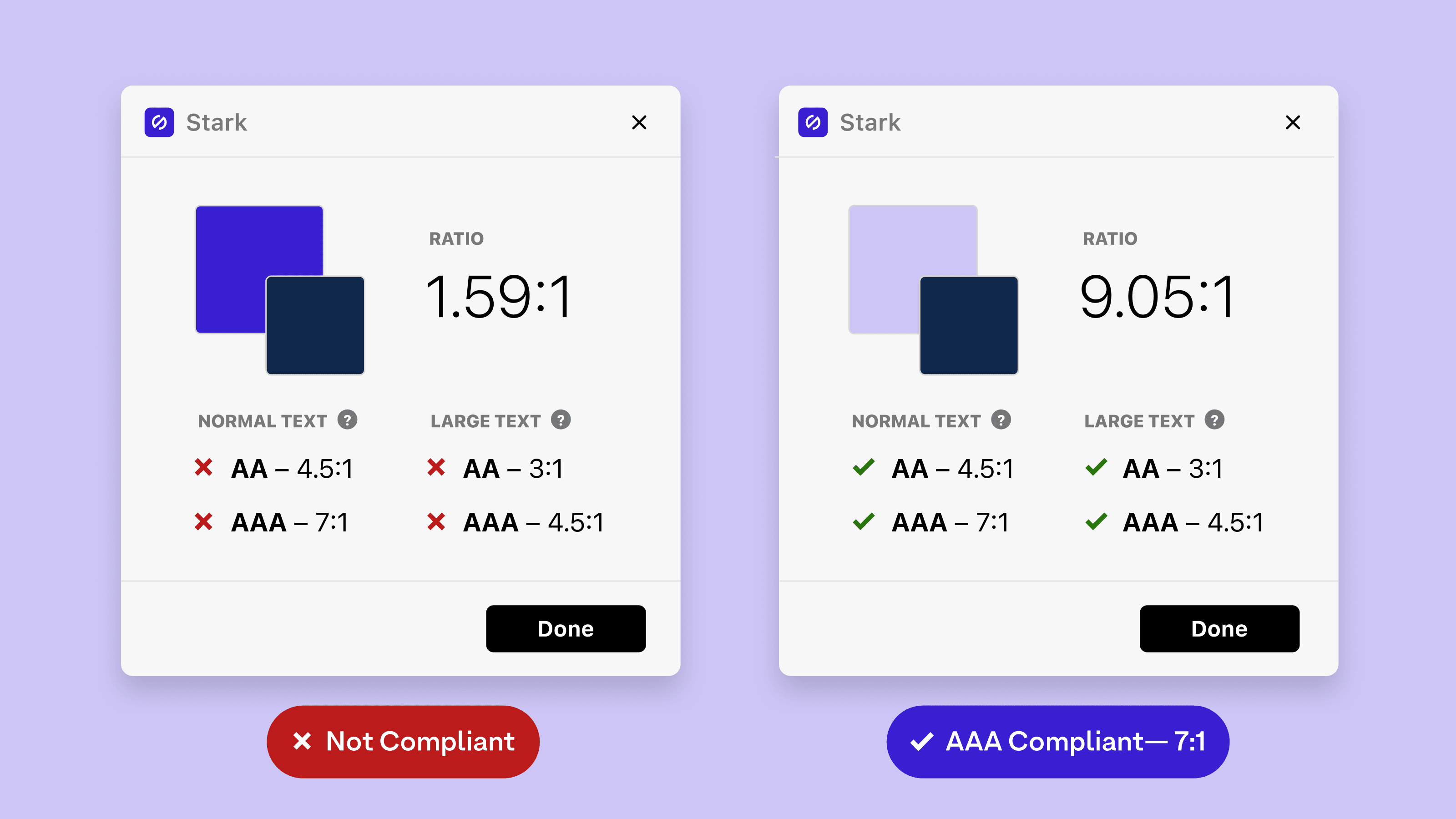
Don’t eyeball color contrast; use reliable tools from your first draft. Start with WebAIM Contrast Checker, Contrast for macOS, or Leonardo online. Figma and Sketch plugins like Stark or Able streamline in-app checks.
Design your brand palette so every color has accessible light and dark variants. Test each combination against key backgrounds, especially white and near-black surfaces. This preparation makes consistent color contrast ratios easier across pages and components.
Large headings technically only require a 3:1 color contrast ratio. In practice, aim closer to 4.5:1 for sharper readability. Extra contrast helps users on small screens, bright sunlight, and tired eyes.
Buttons, links, and inputs often change color on hover, focus, or active. Design every state with accessible color contrast ratios, not just the default. Recheck contrast after design tweaks so interactions stay visible and distinct.
Some users enable system settings that override your carefully chosen interface colors. Windows High Contrast Mode and macOS Increase Contrast may ignore theme palettes. Preserve meaning with clear underlines, icons, shapes, and borders beyond color.
Accessibility standards will keep evolving as design tools and devices change. WCAG 2.2 adds clearer focus indicators and stronger requirements for interactive elements. It also refines expectations for non-text graphics that convey important meaning. Meanwhile, the Accessibility Guidelines Working Group explores more perceptual approaches to contrast. Relative color syntax in CSS and the upcoming APCA embody this shift.
For designers, the goal goes beyond simply passing automated accessibility checks. It is about interfaces that feel effortless for as many people. Each mindful decision about typography, spacing, and contrast strengthens real human experiences. When you consistently respect color contrast ratios, accessibility becomes a natural design habit.