
5 Most Essential Website Pages Every Business Needs
Create a professional site that ranks better and attracts more customers with 5 most essential website pages for small businesses.


Dark mode has evolved from a trendy feature into a user expectation. Furthermore, iOS, Android, Windows, macOS, and most major apps now offer dark themes by default. Thus, ignoring dark mode means risking an experience that feels incomplete and outdated. Done poorly, a dark interface can strain eyes just as much as a bright white one. Done right, it reduces eye fatigue, saves battery on OLED screens, and simply looks sleek.
Knowing the basic principles of dark mode design will help you avoid common usability and accessibility issues. However, to maximize the impact of your interface, you still need practical dark mode design tips you can apply in real projects. Here’s how to turn your design into a clear, polished experience that feels effortless for your users.
Dark mode has become a baseline expectation that shapes user satisfaction, retention, and even battery life. Recent data reveals that over 82% of smartphone users now prefer or actively use dark mode. That number continues to rise across both iOS and Android devices.
On OLED and AMOLED displays, true dark themes can reduce power consumption by 30–50% compared to light interfaces. It makes it a practical choice for mobile users who spend hours on their screens daily. Hence, that’s not just a nice-to-have feature anymore.
Beyond technical benefits, a poorly executed dark theme can seriously hurt your product. It can drive higher bounce rates, trigger accessibility complaints, and make your interface feel dated or careless. Users now judge apps and websites not just by whether dark mode exists, but by how refined and thoughtful it feels.
Dark interfaces demand more than inverting colors and hoping for consistency. These essential dark mode design tips protect readability, accessibility, and hierarchy. Ready to elevate your dark interfaces from “acceptable” to “exceptional”?
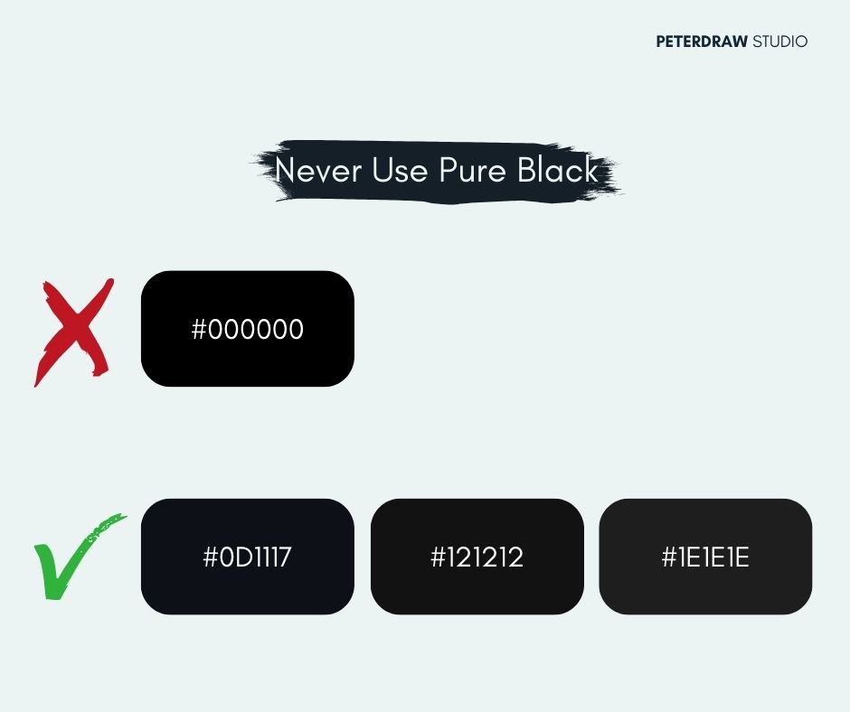
Pure black (#000000) can feel harsh on OLED screens and amplify glare. It often creates glowing halos around bright elements and fatigues the eyes faster. Instead, choose softer elevated grays like #121212, #1E1E1E, or #0D1117 for a richer, more comfortable dark theme.
Accessibility doesn’t disappear in the dark. WCAG still demands 4.5:1 contrast for text. Use near-white body text (#E0E0E0+), light gray secondary text (#BBB–#CCC), and check every state with tools like Stark. Your users with low vision will thank you.
Vibrant light-mode colors turn blinding when simply darkened. Reduce saturation 20–50% and lift the lightness slightly. A bright #0066FF blue becomes a calmer #5D9CFF or #4C9EFF. They are still recognizable, yet gentle and sophisticated in dark mode.

Flat dark backgrounds can feel lifeless. Create hierarchy with subtle surface layers: main background #121212, cards #1F1B24, elevated elements #25232A. Add faint 1px borders or soft inner shadows. So, users instantly know what’s clickable and what sits in the background.
Photos optimized for white backgrounds often look flat or foggy on dark interfaces. To keep them sharp, prepare dark-mode-specific assets tailored to deeper backgrounds. You can also apply a gentle overlay or multiply blend in CSS to bring back vibrancy and depth.
Thin fonts and tight line spacing that work on light backgrounds can vanish in the dark. Switch to Medium weight (or slightly increase stroke), and add 10–15% more line height so text breathes and stays crisp and readable.
The same bright blue focus ring that looks great on white can feel intense at night. Soften it with gentler hues like #7878FF and lower glow or opacity levels. Maintain clear focus cues so keyboard and screen-reader users still get comfortable, accessible feedback.
Dropping icon opacity from 100% to 60% makes everything look disabled. Use distinct color states instead: inactive #666666–#888888, active #FFFFFF, or your accent color. This keeps hierarchy crystal clear while feeling intentional and polished.
Figma and browser previews lie. Colors bloom, blacks crush, and halos appear only on actual OLED/AMOLED screens. Always test final designs on real iPhones, Pixels, or Galaxy devices, especially the difference between pure black and elevated gray.
Detect prefers-color-scheme automatically. So, most people start in their expected mode. Then add a clear toggle in settings for quick manual control. Some users prefer light at night or dark during the day, so always let them override the default.
Putting these dark mode design tips into practice gets much easier with the right tools. Here are some of the most reliable resources designers use every day. They’ll help you fine-tune contrast, catch accessibility issues, and preview real dark environments. Lean on them to build dark theme UIs that feel polished and consistent.
Dark mode will keep evolving as devices, displays, and environments change. Designers will balance personalization, accessibility, and brand expression across every context. Expect smarter systems that adjust contrast, saturation, and lighting automatically for comfort. Staying curious, testing often, and learning from real users will matter.
The next competitive edge won’t be simply offering a dark theme. It will come from tiny details: motion, microcopy, focus states, and feedback. Keep refining your guidelines, documenting patterns, and stress-testing edge cases over time. Treat these dark mode design tips as living tools, not fixed rules.