
5 Most Essential Website Pages Every Business Needs
Create a professional site that ranks better and attracts more customers with 5 most essential website pages for small businesses.


Mobile devices now drive over 60% of all web traffic. Thus, it’s essential to build websites that are responsive. Responsive design principles ensure sites adapt seamlessly across every screen size. Ethan Marcotte introduced these ideas back in 2010. They center on fluid grids, flexible images, and media queries. Together, they form the backbone of modern web development.
Responsive design principles created one flexible codebase for all devices. This eliminated the need for separate mobile sites completely. These provide the foundation for any implementation environment. They work from raw CSS code to modern visual platforms.
Fluid grids replace fixed pixel widths with relative units like %, vw, and rem. This helps layouts reflow smoothly as the viewport size changes. For example, a fixed 960px layout often breaks on smaller phone screens. But a fluid layout using width: 90% scales cleanly across devices. With CSS Grid, repeat(auto-fit, minmax(300px, 1fr)) adapts automatically.
.container {

display: grid;

grid-template-columns: repeat(auto-fit, minmax(300px, 1fr));

gap: 1rem;

max-width: 1200px;

margin: 0 auto;

}
This creates a responsive card grid: 1 column on mobile (375px), 2 on tablet (768px), 4+ on desktop (1440px+).
Flexible Images and Media: No More Overflow
Images should scale within their containers using max-width: 100% and height: auto. This prevents overflow and avoids unwanted horizontal scrolling on smaller screens. Videos and embeds need responsive wrappers to keep their proportions consistent. Using an aspect-ratio container helps media resize smoothly across devices.
img, video { max-width: 100%; height: auto; }

.video-container {

position: relative; padding-bottom: 56.25%; height: 0;

}

.video-container iframe {

position: absolute; top: 0; left: 0; width: 100%; height: 100%;

}
Advanced: HTML5 srcset serves optimized images: <img srcset="small.jpg 480w, large.jpg 1200w" sizes="(max-width: 768px) 100vw, 33vw">.
Media Queries: Conditional Styling
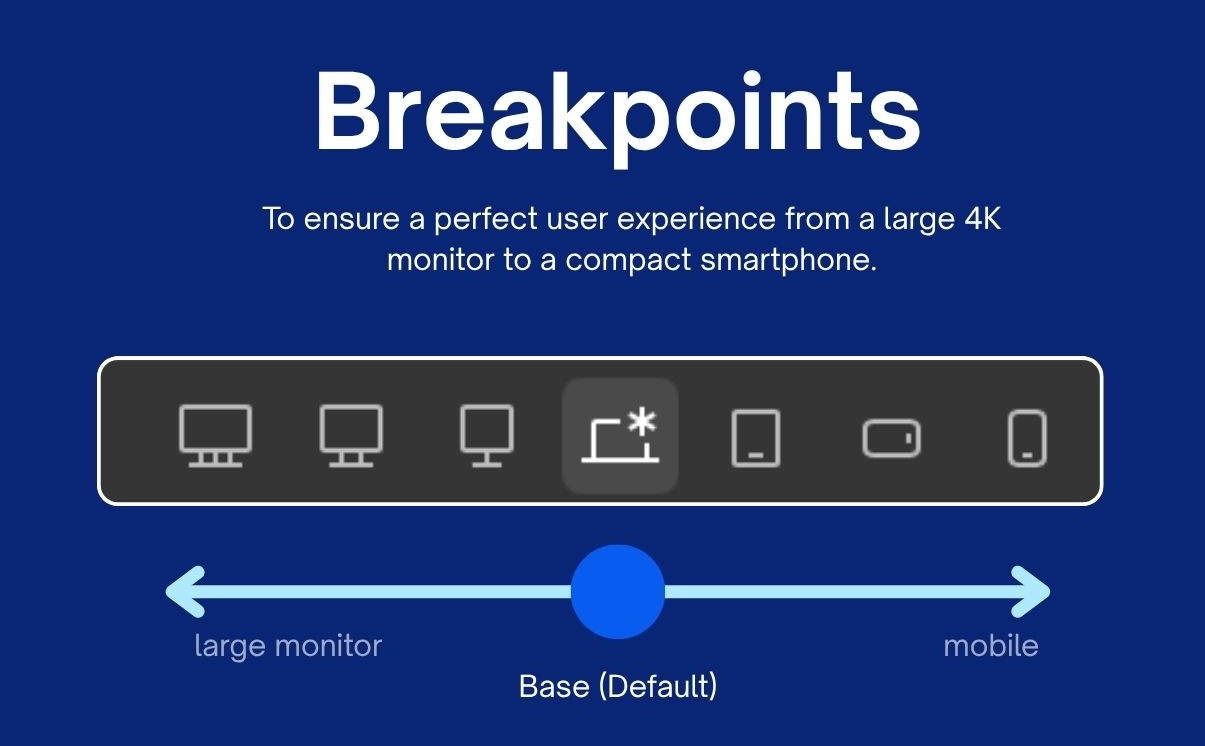
Media queries apply breakpoint-specific styles, letting layouts shift at defined screen widths. They help adjust typography, spacing, and components for better readability across devices. A mobile-first approach starts with base styles for smaller phone screens. Then you progressively enhance the design for tablets and larger desktops as needed.
/* Mobile-first base */

.navbar { flex-direction: column; gap: 1rem; }

/* Tablet and up */

@media (min-width: 768px) {

.navbar { flex-direction: row; }

}

/* Desktop */

@media (min-width: 1024px) {

.container { padding: 2rem; }

}
Common breakpoints mirror device realities:
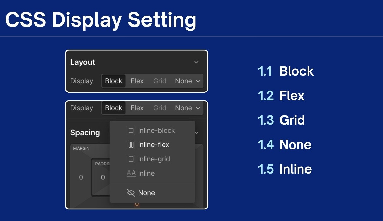
Modern design platforms abstract CSS complexity into visual controls while generating identical code under the hood. Even so, responsive design principles remain unchanged. Figma excels at prototyping, Webflow builds production sites, and Framer bridges design-code with React integration.
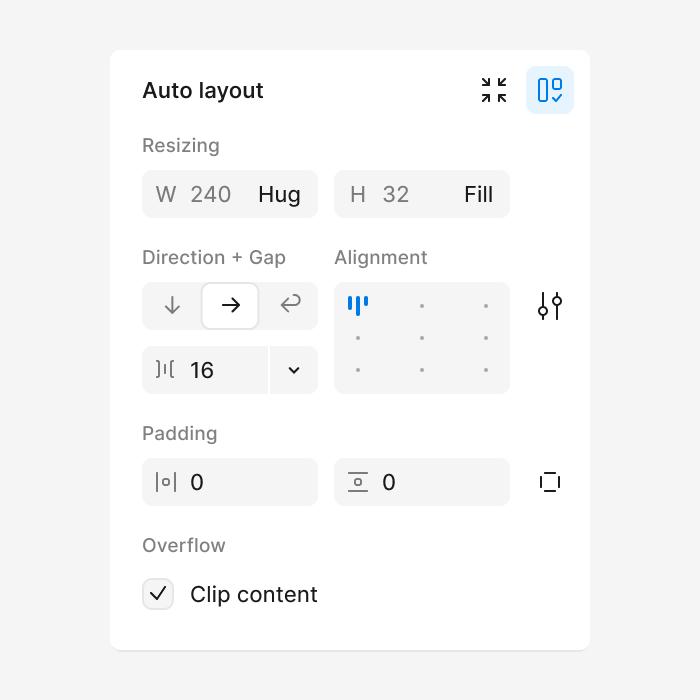
Figma supports fluid grids with Auto Layout frames that work like CSS Flexbox and Grid. Start by creating device frames, such as 375px for mobile and 1440px for desktop. Then build horizontal or vertical stacks using Fill container, Hug contents, or fixed sizing. Add gaps and padding to keep spacing consistent as the layout adapts. Use constraints like pin left or right, and scale, for responsive image behavior. When you resize frames, the content adjusts proportionally without breaking the structure.
In Figma, media queries are often shown as separate device frames in prototypes. You can link frames to simulate reflow, like a desktop grid becoming a mobile stack. Export plugins can generate Tailwind or CSS that follows familiar hand-coded patterns. For example, a navbar stays inline on desktop and becomes a hamburger via variants.
Webflow's mobile-first canvas auto-applies responsive classes as you drag elements. Fluid grids use visual Grid/Flexbox panels, set columns to 1fr, widths to %/viewport units (w-unit-12 = 100%/12). Breakpoint toolbar (mobile <479px, tablet 768px) functions as live media queries; override spacing/padding per view.
Flexible images gain max-width: 100%; object-fit: cover automatically; Aspect Ratio divs create CSS padding-bottom containers for videos. Publish compiles production CSS with lazy loading, matching custom code performance.
Framer's infinite canvas uses Stacks (Flexbox equivalents) with relative sizing (min/max-width, % gaps). Design primary breakpoint (mobile-first), add overrides via selector, content inherits fluidity unless explicitly changed.
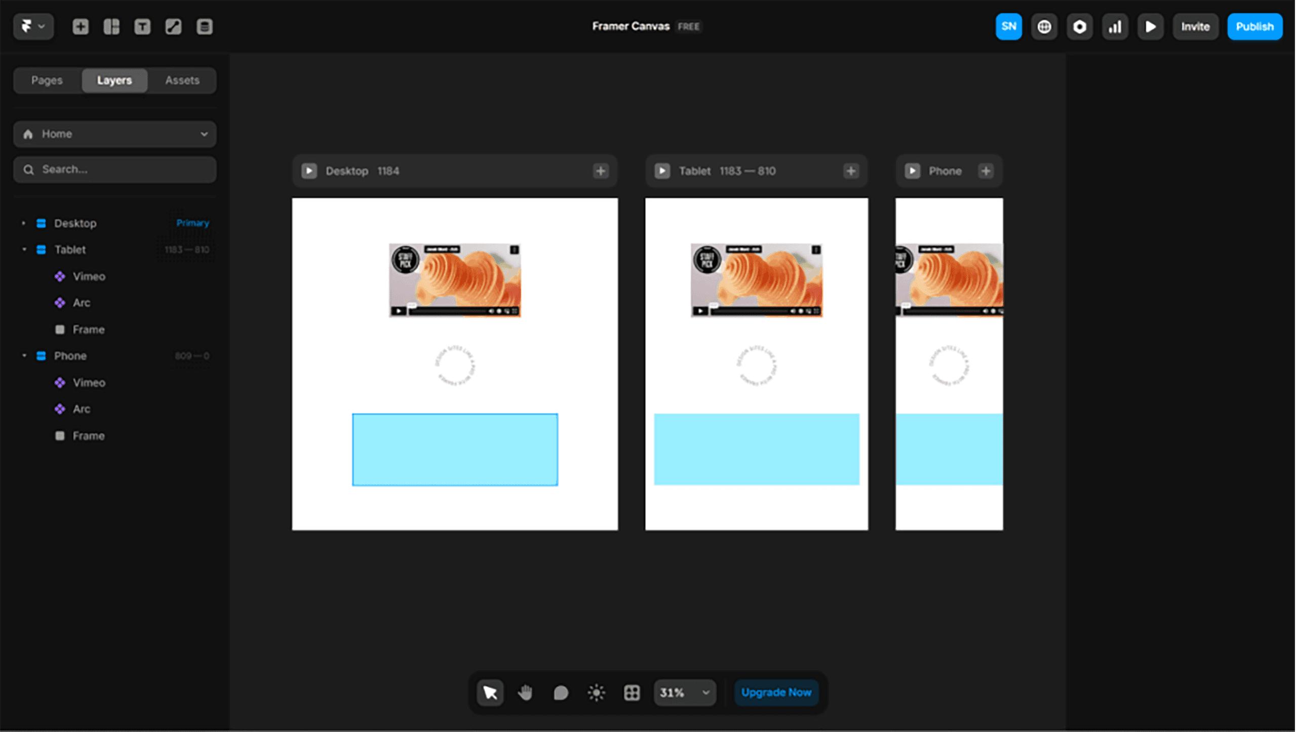
Flexible media leverages intrinsic sizing; custom CSS/React adds srcset or focal-point cropping. Media queries work through breakpoint inheritance: the desktop navbar row becomes a mobile hamburger via override. Container queries and code components enable advanced patterns.
Responsive design principles only work when your implementation stays consistent. No consistency, no responsive design. These tips will help you keep the principles intact across breakpoints, devices, and real-world builds.
The most common responsive problems show up after design moves into development. Most issues come from rigid sizing, hidden layout constraints, or skipped previews. Watch out for these common pitfalls:
Building for many screens is really about reducing surprises during real use. Treat every breakpoint as a chance to improve comfort and clarity. Push your layouts until they almost break, then refine spacing and hierarchy. Keep testing in real contexts, not perfect mockups. Small adjustments add up to a smoother experience.
As tools evolve, the mindset matters more than the interface. Responsive design principles stay strong when teams share clear rules. Document choices, reuse components, and review changes together. When something feels off, trace it back to sizing or constraints. Consistency makes iteration faster and results more dependable.