
5 Most Essential Website Pages Every Business Needs
Create a professional site that ranks better and attracts more customers with 5 most essential website pages for small businesses.


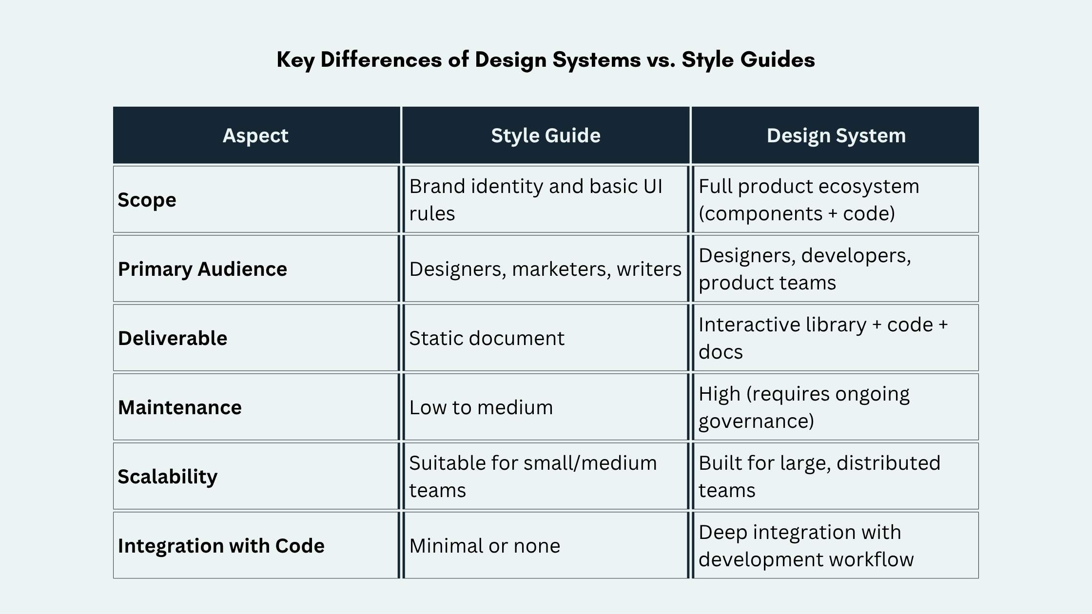
When teams discuss creating consistent, scalable, and beautiful user interfaces, the conversation inevitably turns to design systems vs. style guides. While both tools bring order and alignment to UI design, they serve different purposes. Each offers distinct advantages, depending on your organization’s size, maturity, and goals.
How to achieve the harmonious balance between those two? We’ll explore how design systems and style guides differ, what each is best for, and how they fit into your process to keep teams aligned.
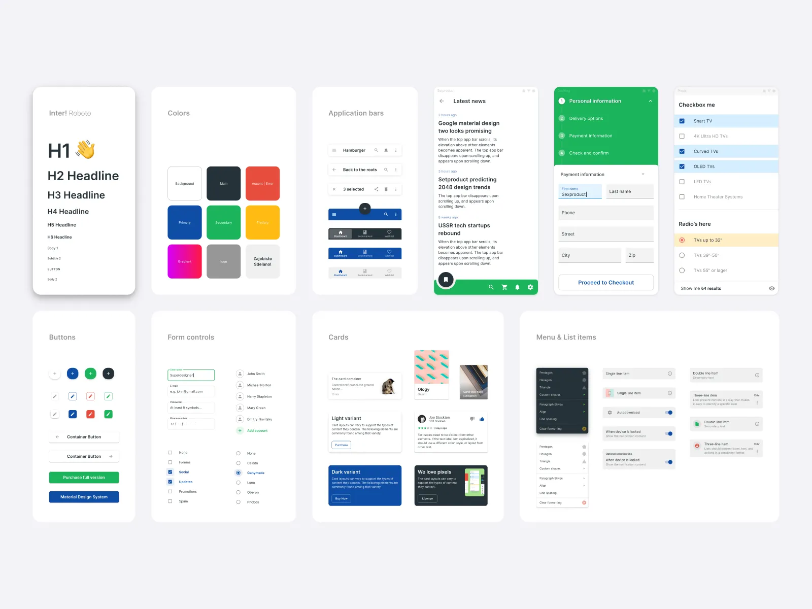
A style guide is a documented set of rules for consistent visual and written branding. It covers typography, colors, logo usage, iconography, imagery style, and tone of voice. The guide may also include basic UI patterns, like buttons and form layouts.

Usually, it’s a static PDF, web page, or design file teams reference regularly. Marketing teams, copywriters, and designers use it for brand assets and campaigns. It’s lightweight, easier to maintain, and keeps everyone aligned around one clear source of truth.
A design system, on the other hand, is a living ecosystem of reusable components, patterns, and guidelines. It also includes tools that help teams build and scale products efficiently. It goes far beyond visual rules to include:
Popular examples include Material Design (Google), Fluent Design (Microsoft), Carbon (IBM), and Lightning Design System (Salesforce). Design systems are typically built and maintained by cross-functional teams of designers, engineers, and product managers.
Style guides have been a staple of brand and design teams for decades. They provide a simple, effective way to maintain visual and tonal consistency. However, they also come with clear limitations, especially as products grow more complex.
Pros:
Cons:
Design systems have become essential for modern product teams building complex, multi-platform experiences. They offer powerful benefits but demand significant effort to create and sustain.
Pros:
Cons:
If your organization is small and needs brand consistency, a style guide works well. It’s especially useful for marketing materials and a single product with limited UI complexity.
However, once your team grows or works across multiple products, needs change quickly. Investing in a design system becomes essential to ship faster with fewer inconsistencies. Many companies start with a style guide and later evolve it into a full design system as they scale.
Balancing a style guide and a design system is key to achieving consistency without chaos. Start small and grow intentionally. These practical tips will help you keep both tools aligned and effective.
Use a style guide as the foundation. It’s easier to create and help establish core brand principles before diving into component development.
Define design tokens (colors, spacing, typography, etc.) in one place and make them the single source of truth. This way, both your style guide and design system stay aligned.
Reserve the style guide for brand-level guidelines (logo usage, color psychology, tone of voice) and let the design system handle product-specific UI patterns.
Use tools like Figma’s Dev Mode, Storybook, or Zeroheight to keep documentation up-to-date automatically. This reduces the risk of drift between design and code.
Appoint a design system team (even if part-time) to own updates, review contributions, and decide when to evolve components. Without governance, both style guides and design systems can quickly become outdated.
Create clear contribution guidelines and review processes. Allow teams to propose new components or patterns, but ensure they align with the core system.
Track metrics like component usage, time saved on design and development, and bug reduction. This data helps justify investment and guide future improvements.
The system you choose isn’t a one-time decision. It is a relationship you keep shaping. Treat standards like product features, not static documentation. Make room for experimentation, and let teams propose improvements. When people feel ownership, consistency stops feeling restrictive and starts supporting better work, faster collaboration, and a healthier design culture.
The real advantage shows up when guidance stays close to everyday decisions. Build habits around review, reuse, and refinement. Make answers easy to find, and keep examples practical. When you set that rhythm, design systems vs. style guides becomes less about “either-or” and more about clarity, speed, and confidence.