
Bold Typography: Mastering Impactful Design for Maximum Engagement
Master bold typography with expert tips on where to use it, the best font recommendations, plus practical techniques to make your designs more impactful and memorable.
.jpg)

First impressions matter more than ever. The hero section, that prominent area at the top of a webpage, serves as the digital handshake for visitors. It’s where users decide in seconds whether to stay or bounce. Effective hero section design can captivate audiences, convey brand messages, and drive conversions. But getting it wrong? That could mean lost opportunities.
To help you avoid common pitfalls, we’ll highlight key strategies for success. We'll explore the dos that elevate your site and the don'ts that might undermine it. Whether you're a designer, marketer, or business owner, these insights will guide you toward creating a lasting impact. By focusing on user experience and visual appeal, you can turn casual browsers into engaged users.
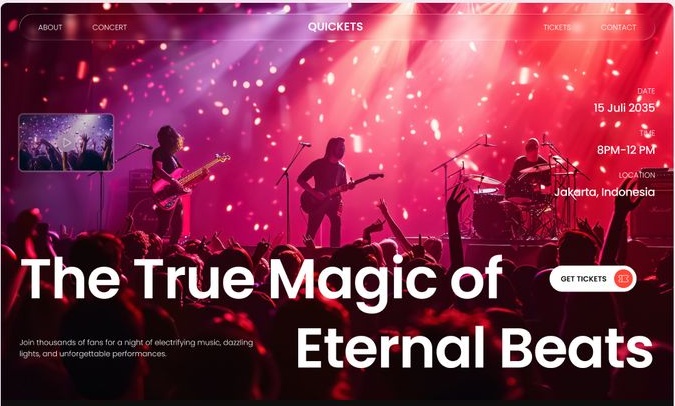
Before we jump into the guidelines, let's clarify the basics. Hero section design refers to the creation of that eye-catching banner or full-width area right below the navigation bar. It typically includes a headline, supporting text, a call-to-action (CTA) button, and imagery or video. The goal? To communicate value quickly and encourage further exploration.
In today's mobile-first era, hero sections must adapt seamlessly across devices. They set the tone for the entire site, reflecting brand identity while addressing user needs. Poor hero section design can confuse visitors, while a well-executed one boosts engagement metrics like time on page and click-through rates.
Statistics show that users form opinions about a website in under a second. That's why hero section design isn't just about aesthetics. It's a strategic tool for business growth. Now, let's break down the dos to make your hero section shine.
A well-crafted hero section acts as your website’s first storyteller. It should instantly communicate purpose, spark interest, and invite exploration. When designed effectively, it combines clarity, aesthetics, and function in perfect balance.
One of the cornerstones of strong best practices for hero section design is keeping things straightforward. Start with a concise headline that captures your unique value proposition. For instance, use bold, readable fonts and limit text to a few lines. This approach ensures visitors grasp your message instantly.
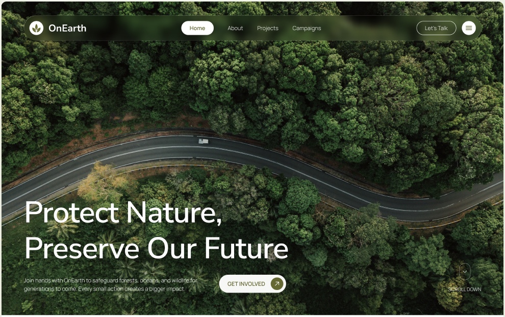
Pair it with high-quality visuals that align with your brand. A clean layout reduces cognitive load, making it easier for users to focus on the CTA. Remember, simplicity doesn't mean boring, it’s about purposeful design that guides the eye naturally.
Visual elements are pivotal in hero section design. Choose images or videos that evoke emotion and relate directly to your content. High-resolution photos of real people or products can build trust and connection.
Consider using subtle animations to draw attention without overwhelming. For example, a gentle fade-in for text can enhance engagement. Always optimize for speed; compressed files prevent slow loading times that frustrate users.
With over half of web traffic coming from mobiles, hero section design must be responsive. Test how elements stack on smaller screens, headlines should remain prominent, and CTAs easy to tap.
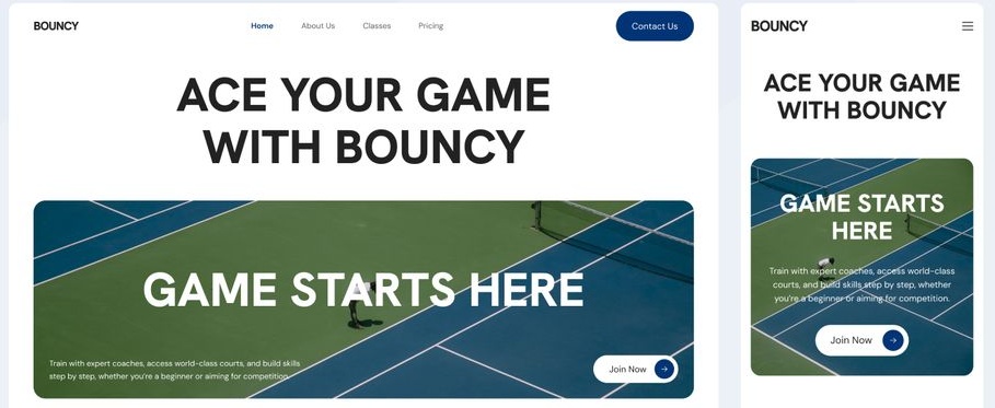
Use media queries in your CSS to adjust layouts dynamically. This ensures a consistent experience, preventing users from pinching and zooming. Mobile-friendly hero sections can significantly improve bounce rates on handheld devices.
A standout CTA is non-negotiable in hero design. Make it action-oriented, like "Get Started Today" or "Shop Now." Position it prominently, often centered or to the right for natural reading flow.

Use contrasting colors to make the button pop against the background. Track performance with analytics to refine wording and placement over time. An effective CTA can increase conversion rates by guiding users to the next step seamlessly.
Consistency breeds familiarity. Incorporate your brand's color palette, typography, and tone of voice. This reinforces recognition and builds credibility from the outset.
If your brand is playful, opt for vibrant hues and fun illustrations. For professional services, sleek lines and muted tones work best. Alignment ensures the hero section feels like an extension of your overall branding strategy.
Hero section design isn't set-it-and-forget-it. Use A/B testing to compare variations, swap headlines, images, or CTAs to see what resonates. Tools like Google Optimize can provide data-driven insights.
Gather user feedback through surveys or heatmaps to identify pain points. Iteration based on real data keeps your design relevant and effective in a changing digital landscape.
While you trying every mean, not every approach to hero section design creates a positive impression. Some mistakes can instantly damage trust and drive visitors away. Overcomplicated layouts, slow loading speeds, or cluttered messaging often frustrate users.
A common pitfall in hero section design is cramming too much content. Avoid lengthy paragraphs or multiple CTAs that dilute focus. Visitors shouldn't have to sift through clutter to find the essence.
Instead, aim for brevity. If you must include more details, save them for sections below the fold. Overloading leads to higher bounce rates as users feel overwhelmed right away.
Slow-loading hero sections can kill user interest. Heavy images or unoptimized code are frequent culprits. Don't assume high-speed connections; many users browse on slower networks.
Compress assets and use lazy loading techniques. Prioritize above-the-fold content to render quickly. Tools like PageSpeed Insights can help diagnose and fix speed issues.
Stock photos that look staged can undermine authenticity in hero section design. Steer clear of overused clichés like handshakes or generic landscapes.
Opt for custom visuals or authentic stock that fits your narrative. This builds a genuine connection, making your site stand out in a sea of sameness.
Accessibility is crucial in hero section. Don't forget alt text for images or sufficient color contrast for text. Screen readers rely on proper markup, so use semantic HTML.
Test with tools like WAVE or Lighthouse to ensure compliance with WCAG standards. Inclusive design broadens your audience and avoids legal pitfalls.
While visual, hero section design impacts search visibility. Don't overlook heading tags or keyword integration in headlines. However, avoid keyword stuffing—keep it natural.
Incorporate schema markup if relevant, like for products or events. This can enhance rich snippets in search results, driving more targeted traffic.
Hero sections should address user pain points, not just boast about features. Don't make it all about you; highlight benefits like "Save Time with Our Easy Tools."
Conduct user research to understand needs. This shift from ego-centric to user-centric design fosters deeper engagement and loyalty.
Crafting a hero section is never a one-time task. Trends evolve quickly, and user expectations constantly shift across devices. Regular testing helps identify what truly resonates with your audience. Keep refining copy, visuals, and CTAs to maintain relevance. Treat your hero section as a living asset, not a static design.
Following best practices for hero section design means balancing clarity and impact. It’s about more than aesthetics; it’s a strategic engagement tool. Strong headlines should guide attention, while visuals evoke authentic emotions instantly. Accessibility and speed must remain priorities to ensure inclusivity. When executed thoughtfully, your hero section becomes a lasting driver of growth.

