
Bold Typography: Mastering Impactful Design for Maximum Engagement
Master bold typography with expert tips on where to use it, the best font recommendations, plus practical techniques to make your designs more impactful and memorable.

It is indisputable that people love something faster, especially when browsing information on the internet. No matter how sophisticated a web design is, visitors will ultimately enjoy more, which provides a smooth experience. Flat design is a solution most users pick to provide the best web performance to their visitors. But what is a flat design on websites? Is it similar to flat design in general graphic design?
Flat design is one of the design styles. This style is minimalist and modern, emphasizing simplicity, usability, and clarity while ensuring optimal performance across devices. The same principles apply to flat web design. It results in clean, visually appealing websites prioritizing functionality and user experience.
To emphasize its simplicity, flat designs usually use clean shapes and minimalist elements. It prioritizes usability with intuitive interfaces guided by typography and bold colors. Solid colors replace gradients or shadows for a flat appearance. Typography and efficient space usage enhance clarity, making flat design user-friendly and visually appealing.
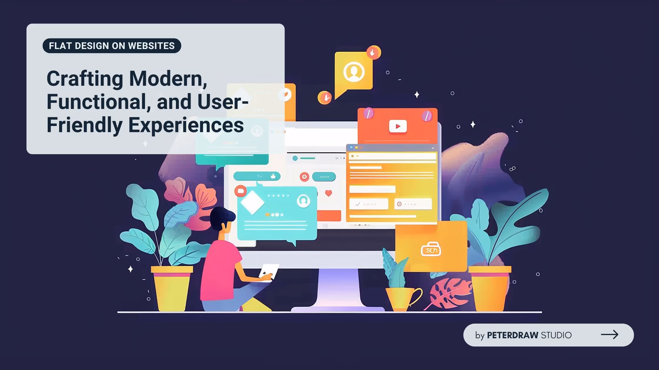
Flat design on websites has transformed the way digital interfaces are crafted, focusing on creating visually engaging and user-friendly experiences. Its approach combines modern aesthetics with practical usability, ensuring websites are appealing and functional. The key features below will help you understand how this design style achieves its simplicity and effectiveness.
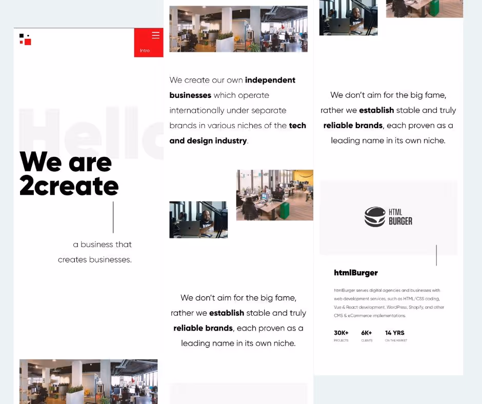
A flat website design emphasizes simplicity by focusing only on the essential elements. Extraneous decorations and complex visuals are avoided to create a clean and distraction-free interface. Layouts are well-organized, dividing content into clear sections that make navigation intuitive and visually appealing.
A flat design palette features bold, vibrant colors or soft pastel shades to create visual interest. These solid colors replace gradients and textures, creating a uniform look. Contrasting colors are strategically used to highlight important areas, such as call-to-action (CTA) buttons, drawing users' attention effectively.
For consideration, avoid low contrast, clashing combinations, and excessive neon for readability. It is better to limit colors and stick to flat, solid hues to maintain a clean and cohesive aesthetic. Also, adhering to accessible contrast ratios is another way to ensure readability and usability.
Incorporating simple, geometric shapes is a hallmark of flat design. These shapes not only enhance the visual appeal but also improve usability by creating clear and easily recognizable elements. Common applications include buttons and icons with sharp-edged or smooth-curved designs. Basic forms maintain a modern, approachable aesthetic while prioritizing functionality.
Typography plays a central role in reinforcing the structure and functionality of the design. So, flat design on websites emphasizes this role by using clean, sans-serif fonts to enhance readability and maintain a professional appearance. Besides, designers must also maintain font hierarchy. Clear font hierarchies guide users through content effortlessly, ensuring they can easily locate key information.
Roboto, Open Sans, Lato, Poppins, and Monserrat are the most popular fonts in flat web design. They have a clean and modern look that meets the criteria for creating visually appealing, highly readable, and user-friendly interfaces. Of course, they align with minimalist design principles.
Skeuomorphic elements are a no-go in flat designs since they mimic real-world materials and objects. So, elements like 3D effects, shadows, and textures are very avoidable. As options, designers use flat icons, solid colors, and minimalistic illustrations. This minimalist approach reduces visual noise and keeps the interface clean and easy to interpret.
Previous key features have emphasized that functionality is what drives flat design. Every element is designed to be intuitive and purposeful, ensuring users can navigate the interface effortlessly. Buttons, links, and interactive components are clearly defined, making the website easy to use and enhancing the overall user experience.
Responsive flat design combines the aesthetic simplicity of flat design with the adaptability of responsive layouts. It creates a future-proof, user-friendly web experience. By leveraging grid systems and flexible structures, it ensures seamless adaptation to different screen sizes. This makes flat websites particularly effective for mobile-first and multi-device accessibility.
Flat website design thrives on simplicity and functionality. However, achieving an effective flat design requires careful attention to detail. By following best practices, designers can create visually stunning websites. These websites are not only aesthetically pleasing but also user-friendly and highly functional. Here’s the best practice of flat design on websites to follow.
The potential of flat design on websites continues to grow as technology evolves. Designers should explore integrating subtle animations and micro-interactions to enhance user engagement. Additionally, prioritizing accessibility and performance ensures websites remain inclusive and fast. Embracing these advancements will keep flat design innovative, functional, and impactful in delivering exceptional user experiences.