

UI Testing Checklist: 7 Key Areas for Flawless Interfaces
Use this UI testing checklist to validate layouts, interactions, devices, browsers, and accessibility before launch.
.jpg)


Glassmorphism style has become one of the most captivating trends in modern web and UI design. It creates the illusion of frosted or translucent glass panels layered over vibrant backgrounds, adding depth, elegance, and a premium feel to interfaces. Also known as the "frost glass" or "frosted glass" effect, this style uses transparency, blur, and subtle borders to make elements appear to float above the content behind them.
Glassmorphism style mimics the look of real frosted glass. UI elements like cards, buttons, navigation bars, or modals feature:
The result is lightweight, ethereal elements that let colorful gradients, images, or animations in the background peek through softly. Glassmorphism creates visual hierarchy without overwhelming the design. It works especially well on dark or vibrant gradient backgrounds.
The roots of glassmorphism go back further than many realize. Precursors appeared in Microsoft's Windows Aero (Vista/7) with transparent window borders, Apple's iOS 7 with blurred notification centers, and macOS vibrancy effects.
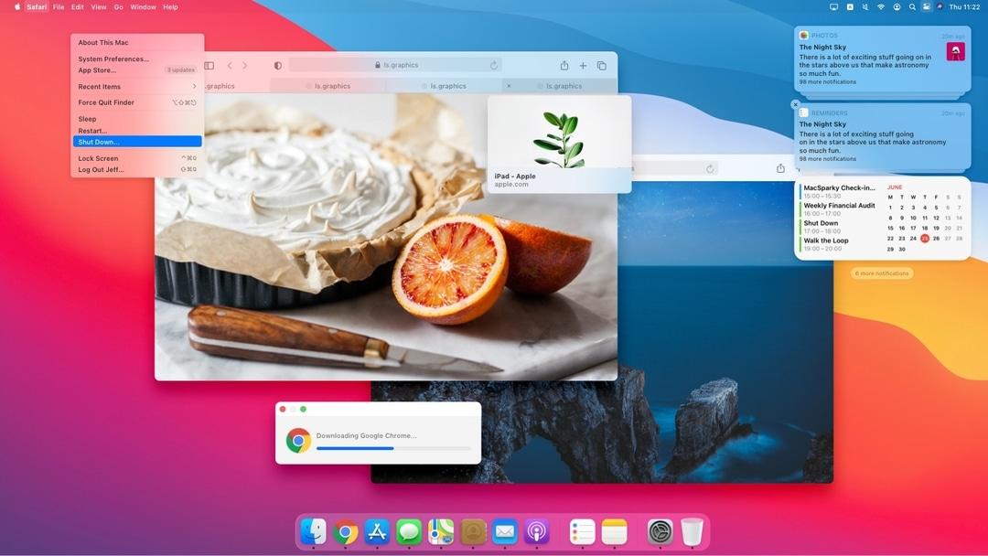
The modern term "glassmorphism" was coined around 2020 by designer Michał Malewicz of Hype4 Academy. It gained massive popularity on platforms like Dribbble and Behance as designers sought fresh alternatives to flat and neumorphic styles. Apple's macOS Big Sur and Microsoft's Fluent Design System (with its Acrylic material) helped push it into the mainstream.
By 2025-2026, glassmorphism remains relevant, evolving with better browser support for backdrop-filter and refinements for accessibility and performance. It's no longer just a trend. It is becoming a staple for premium, tech-forward interfaces.
To appreciate glassmorphism style fully, compare it to its siblings:
Glassmorphism stands out by blending transparency and blur for layered depth. It feels lighter and more futuristic than neumorphism while offering more visual interest than strict flat design. Many projects now mix elements, for example, glassmorphic cards on a neumorphic or gradient background.
Creating the frosted glass effect has never been simpler. Many user-friendly tools now make it accessible for everyone. Designers and developers can achieve stunning results with minimal effort. From visual generators to no-code platforms, excellent options are available today.
Hype4 Glassmorphism Generator, ui.glass, and css.glass let you adjust opacity, blur intensity (10–30px), borders, and shadows, then copy clean CSS code instantly.
Figma stands out with dedicated glassmorphism plugins. Designers can apply transparency and blur effects directly on the canvas for realistic previews. Figma also offers built-in glass effects and layer styles that make creating glassmorphism style fast and intuitive. It allows smooth handoff to developers with accurate specifications.
Tailwind CSS makes it simple with utility classes like bg-white/15 backdrop-blur-2xl border border-white/30. This works perfectly in React, Next.js, and other modern stacks.
Bringing glassmorphism to life is easier than you might think. Modern CSS gives you full control over the frosted effect. You just need to combine a few essential properties. Here’s a basic example:
CSS

.glass-card {

background: rgba(255, 255, 255, 0.15);

backdrop-filter: blur(20px);

-webkit-backdrop-filter: blur(20px);

border-radius: 16px;

border: 1px solid rgba(255, 255, 255, 0.3);

box-shadow: 0 8px 32px rgba(0, 0, 0, 0.1);

}
Pair it with a vibrant parent background. Test different blur values and always include solid color fallbacks for broader compatibility.
Glassmorphism style shines when used strategically. It works best for secondary or supporting elements rather than primary content.
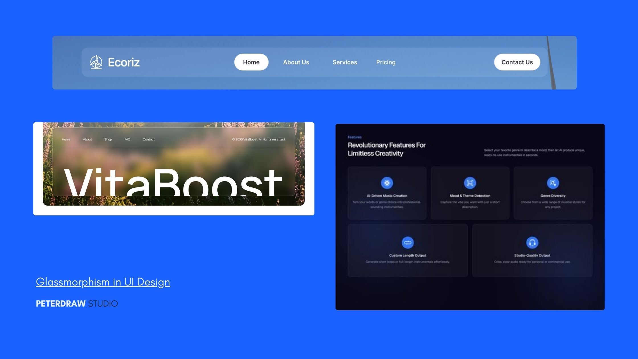
Ideal Applications:
Where to Avoid It: Avoid using it for long body text or critical call-to-action buttons, as low contrast can hurt readability. It is also less effective on very light or busy backgrounds without proper adjustments.
Using glassmorphism selectively creates better visual focus and improves overall user experience.
Do’s: Prioritize accessibility with sufficient text contrast. Use the effect strategically rather than everywhere. Test on mobile devices and combine with clean typography and whitespace.
Limitations in 2026: While backdrop-filter enjoys strong browser support, older browsers and some Firefox setups may need fallbacks. Performance can suffer on low-end devices if overused (limit to key elements). Minor rendering differences exist across browsers, and accessibility requires manual checks. No-code tools sometimes simplify options, limiting advanced customization.
Always use graceful degradation:
CSS

.glass {

background: rgba(255, 255, 255, 0.2); /* fallback */

backdrop-filter: blur(20px);

}
The frosted glass effect adds real elegance to modern interfaces. It creates beautiful depth while keeping designs light and airy. Many professionals now use it to elevate user experiences. With the right tools and careful application, anyone can produce professional results. The technique continues to grow in popularity across different industries.
Testing on real devices helps ensure smooth performance. Good contrast and proper fallbacks remain essential for success. Designers who use the effect wisely often see higher engagement from visitors. Small details like blur intensity and border strength make a big difference in final quality.
Glassmorphism style offers an excellent way to create premium, futuristic interfaces. It balances beauty and functionality when applied thoughtfully. Start experimenting with this trend today and transform your web projects with sophisticated frost glass elements.
.jpg)