404 Pages: Turning Dead Ends into Opportunities for Better User Experience
Encountering a 404 page is almost inevitable. Whether due to a broken link, a mistyped URL, or a page that's been removed, these "Page Not Found" errors pop up regularly. Far from a mere technical nuisance, well-crafted 404 pages are crucial touchpoints. They can frustrate visitors or delight them and guide them back.
What are 404 Pages?
A 404 page is a standard HTTP response code. It appears when a server cannot find a requested resource. The number "404" means "Not Found." Users may encounter it after clicking outdated links. It can also appear from incorrect addresses or broken redirects.
Without customization, visitors often see a plain technical message. These messages provide little context or guidance. As a result, the experience can feel like a dead end. Custom 404 pages transform this moment into a branded experience. They reassure users the site still works. They also help visitors navigate to relevant content.
Why Does a Website Need Custom 404 Pages?
Users encounter 404 pages on almost every website. A plain default error page may simply say the content is missing. However, a thoughtful custom 404 page keeps visitors engaged and prevents them from leaving. Websites need robust error pages for several compelling reasons:
Maintaining Brand Consistency
Every website interaction influences user perception. A polished 404 page reflects professionalism and attention to detail. Consistent branding creates a more trustworthy experience. It turns a frustrating moment into a positive one.
Handling Real-World Issues
Websites constantly change as content is updated or removed. Users may also enter incorrect URLs. Custom 404 pages help guide visitors back on track. This becomes especially important for larger websites.
SEO and Technical Benefits
Proper 404 responses help search engines understand missing pages. This prevents confusion caused by soft 404 errors. Custom pages can also include useful internal links. These links support navigation and overall site health.
Conversion Opportunities
A smart 404 page can keep visitors engaged longer. It may highlight products, services, or popular content. Search features help users quickly find alternatives. Even light humor can encourage visitors to stay.
How to Make 404 Pages Effective
Creating a strong 404 page takes thoughtful design and user focus. It should feel helpful rather than disappointing. Smart choices here can greatly improve visitor experience and retention.
Be Clear and Empathetic: Use friendly language, "Oops! We couldn't find that page" instead of cold technical jargon. Acknowledge the issue without blaming the user.
Incorporate Navigation and Search: Add a clear search bar. Include main menu links. These help users find content quickly.
Add Personality and Humor: Match your brand tone. Light humor works well for most sites. It makes the page memorable.
Keep It On-Brand: Use consistent colors and fonts. Include your logo. This maintains a seamless feel.
Optimize for Mobile: Ensure fast loading. Make it fully responsive. Users browse on phones often.
Include Strong Calls to Action: Add helpful buttons. Guide visitors to key pages. This encourages continued exploration.
Track and Analyze: Monitor 404 errors regularly. Fix broken links fast. This improves overall site health.
Prioritize Accessibility: Use proper headings. Ensure good contrast. This makes the page usable for everyone.
Design Structure and Format for 404 Pages
While no universal template exists, successful 404 pages often follow a logical structure for usability:
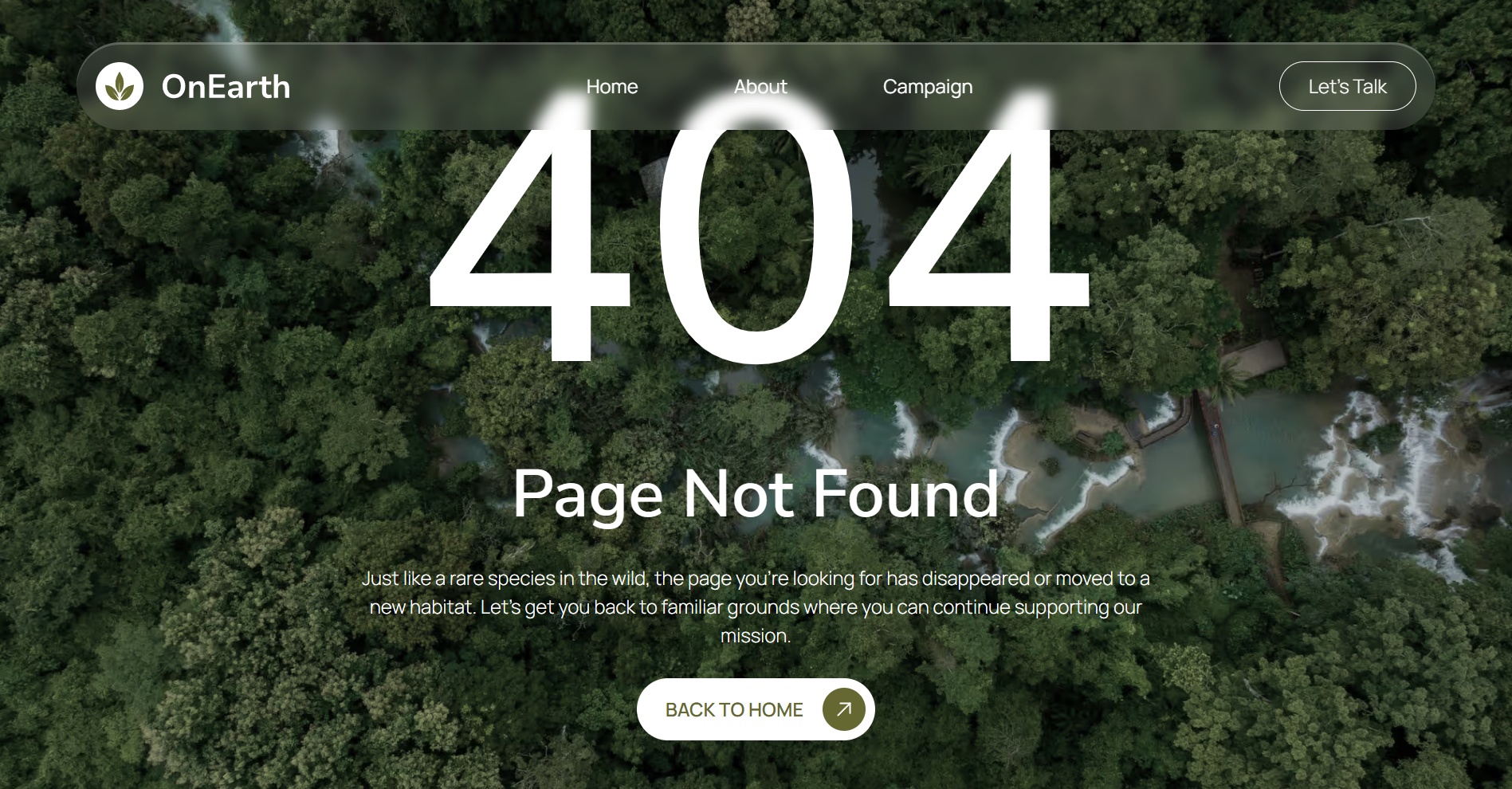
Hero Section with Error Message: A large, noticeable heading (e.g., "404 – Page Not Found") paired with a friendly explanation and perhaps an illustration or mascot.
Visual Element: Engaging image, animation, or illustration that fits the brand—humorous, abstract, or thematic.
Helpful Tools: Search bar, suggested links, or popular content carousels.
Navigation/Footer: Consistent site navigation so users feel oriented.
Call-to-Action Buttons: Prominent links to key sections.
Keep the design clean and uncluttered. Avoid overwhelming users with too many options. The goal is quick recovery and continued browsing. Many draw from UI/UX principles: clear hierarchy, ample white space, and intuitive flow.
For technical implementation, most CMS platforms (WordPress, Squarespace, etc.) allow easy custom 404 setup via templates or plugins. Ensure the server returns a true 404 status code, not a 200 OK with error content.
Inspiring 404 Page Examples
Many top brands have mastered the art of turning error pages into engaging experiences. These creative 404 pages demonstrate how to balance usefulness with personality. They not only help lost visitors but also strengthen brand connection. These examples succeed by blending utility with delight, often resulting in shares and positive mentions online.
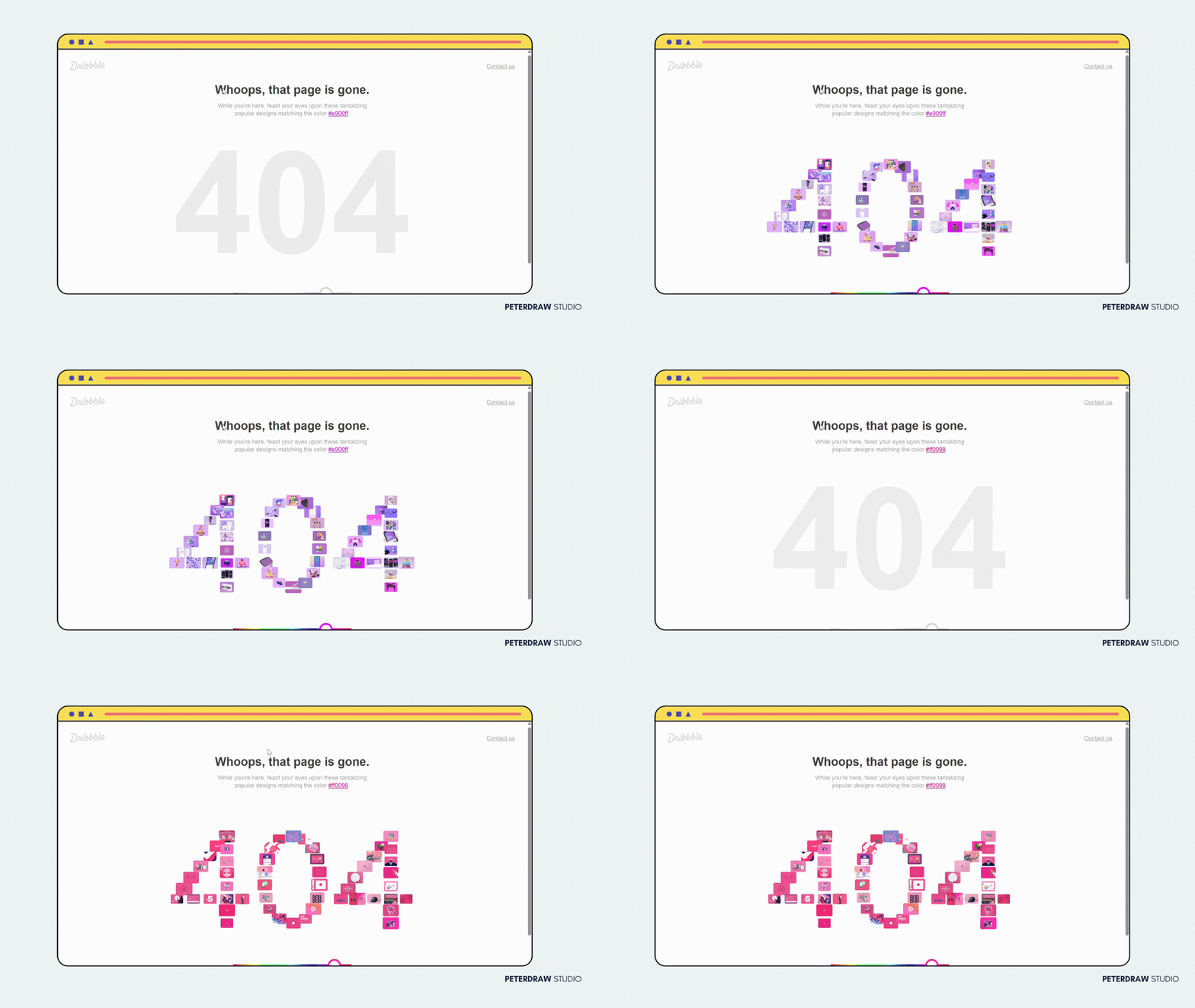
Dribble iconic 404 page
Pixar: Their 404 page features beloved characters from movies like Inside Out. Warm, colloquial messaging captures the brand’s storytelling magic. It transforms errors into fun and emotional moments.
Airbnb: Airbnb offers multiple recovery options with search and category links. It maintains a helpful, exploratory vibe. This aligns perfectly with the brand’s travel discovery spirit.
GitHub: GitHub uses a playful octopus mascot illustration with a search bar. It also provides useful suggestions. The tech-savvy yet approachable tone fits developers perfectly.
Dribbble: Dribbble features an interactive element for users to play or explore designs. This distracts positively from the error. It effectively showcases the creativity central to the platform.
Amazon: Amazon includes cute puppy photos that tie into its company culture. It lightens the overall mood for visitors. Strong navigation helps users return to shopping easily.
Wix: Wix delivers a playful and fully branded design with clear guidance. It proves that even website builders follow their own advice. The page remains both helpful and engaging.
Pro Tips for Creating Effective 404 Pages
Context always matters when designing effective 404 pages. E-commerce sites often highlight current deals and popular products. Creative agencies prefer strong visuals and interactive elements. Testing different versions with heatmaps reveals what truly works for your audience.
Avoid common mistakes that damage user experience. Never use slow or overly complex designs. Skip generic stock images that do not match your brand. Always include clear navigation and never auto-redirect without clear user consent.
404 pages offer great opportunities to impress visitors and reduce bounce rates. They turn potential frustration into continued engagement when handled well. Invest proper time in creating a thoughtful custom page. This small effort shows you truly value your audience and builds stronger brand loyalty.




.jpg)