
Bold Typography: Mastering Impactful Design for Maximum Engagement
Master bold typography with expert tips on where to use it, the best font recommendations, plus practical techniques to make your designs more impactful and memorable.

Within modern web design, hover effects have become essential for shaping interactive and engaging experiences. These visual cues activate when users place their cursor over an element. The result is a transformation of static layouts into dynamic spaces, naturally guiding attention, sparking interaction, and making websites feel alive.
The effects in web design utilize CSS properties to animate elements seamlessly. From subtle background color changes to complex 3D transformations, they elevate both aesthetics and usability. These visual cues also improve clarity, ensuring users receive immediate feedback. Designers, whether beginners or experts, benefit from mastering hover effects to build modern, user-friendly interfaces.
Hover effects are triggered by the :hover pseudo-class in CSS. They activate when a user’s pointer interacts with a webpage element. These effects range from simple color changes to complex animations. In web design, they act as signals, showing clickable or interactive items. For example, links may underline or glow to guide users.
The versatility of interactive styling makes it valuable in modern design. Animations can be applied to menus, images, cards, or icons easily. Tools like CSS transitions and keyframes ensure the motion feels smooth. Instead of abrupt changes, these animated transitions provide elegance. As experts explain, adding subtle animation creates a dynamic and engaging user experience.
This interactivity highlights why hover effects in web design remain important today. They combine functional clarity with appealing motion for user-friendly interfaces. When executed carefully, these micro-interactions build stronger engagement and visual interest. Users find content easier to explore while enjoying a seamless journey. The right balance keeps designs modern, intuitive, and memorable across platforms.
Incorporating interactive effects offers advantages that extend beyond decoration. They encourage interaction by making elements appear more approachable. A button that scales or shifts color invites clicks. This increases engagement, boosting conversions on e-commerce platforms or blogs. Subtle interactions make websites feel active, engaging, and visually dynamic for users.
The real strength of hover effects lies in guiding users effectively. Tooltips can reveal information when needed without disrupting layouts. This keeps interfaces clean while improving usability and clarity. Users feel directed through content without confusion. Experts confirm these effects boost engagement by encouraging valuable interactions.
These interactive details also reinforce branding while improving site memorability. Playful brands might prefer bouncy animations, while professionals choose subtle fades. Each choice reflects personality while supporting consistency across platforms. Immersive effects keep visitors engaged, increasing return rates naturally. Higher engagement signals quality content to search engines, indirectly supporting rankings.
There are countless variations of hover effects, each suited to different design needs. They range from subtle micro-interactions to bold animated transitions that capture attention. Designers often choose based on branding, usability, and overall site goals. Here are some popular types:
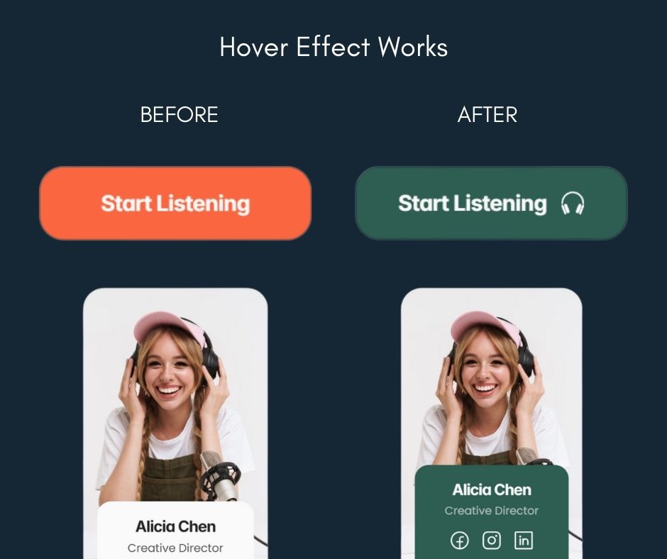
Advanced options, like holographic cards or 3D flips, use pseudo-elements (::before, ::after) for layered visuals. Exploring libraries or no-code platforms can simplify creation of these hover effects in web design.
Hover effects can significantly enhance user engagement when applied thoughtfully. To maximize impact, follow these best practices.
Accessibility is non-negotiable in modern web design. Hover effects must comply with WCAG standards, particularly Success Criterion 1.4.13, which requires content on hover to be dismissible, hoverable, and persistent. For example, tooltips should close with the Escape key and remain visible if hovered directly. "If pointer hover can trigger the additional content, then the pointer can be moved over the additional content without the additional content disappearing."
For mobile, where hover doesn't exist, avoid hiding essential info behind it. Instead, use :focus or :active for keyboard and touch users. "Avoid putting essential functionality behind hover." This ensures inclusivity for all, including those with disabilities. Test with screen readers and keyboard navigation to confirm usability.
Real-world examples inspire great designs. On sites like Bastien Gervasoni, menu hovers reveal pop-up images, while LUCI uses angle changes on product images. Tutorials abound: Webflow's guide covers zoom and filter effects step-by-step, starting with scaling an image 1.2x. Prismic offers 40+ demos, like holographic cards (CodePen: various links available online).
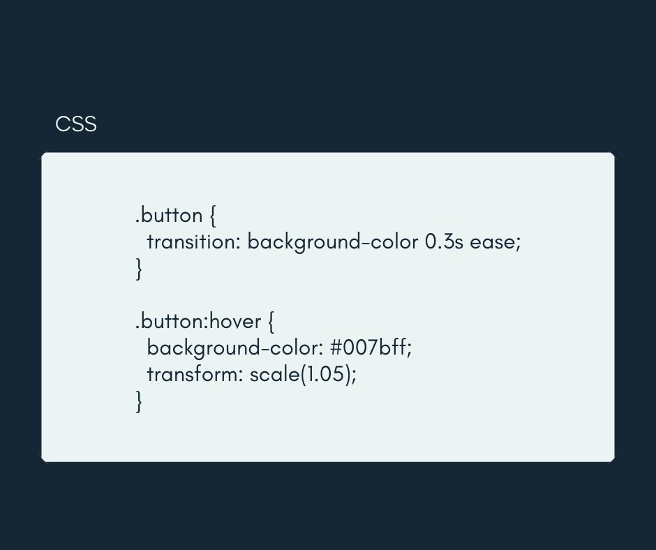
For a tutorial, try this basic CSS for a button hover:
Experiment with these to master hover effects in web design.
However, thanks to no-code platforms today, using those effects is easier. Most builders provide visual panels where hover states can be styled directly. Designers simply select an element, adjust its hover state, and preview instantly. Prebuilt animation libraries make adding interactions faster. This accessibility empowers anyone to craft engaging, dynamic, and user-friendly websites.
Thoughtful use of interactive elements ensures websites feel modern and engaging. Subtle transitions create clarity, while advanced animations build memorable experiences. Designers should experiment with different styles to find the right balance. Accessibility and usability must remain central, ensuring every visitor enjoys a smooth, inclusive interaction.
When applied with care, hover effects elevate design beyond aesthetics. They guide users intuitively, reinforce branding, and encourage meaningful engagement. No-code platforms now make these techniques accessible to everyone, regardless of technical background. By blending creativity with strategy, designers can craft experiences that feel alive and keep audiences returning.