
Web-Safe Font Guide: Boost Speed, Consistency, and Readability on Your Website
Explore the power of web-safe font, including real brand examples, smart font stacks, and practical tips for 2026 web design.
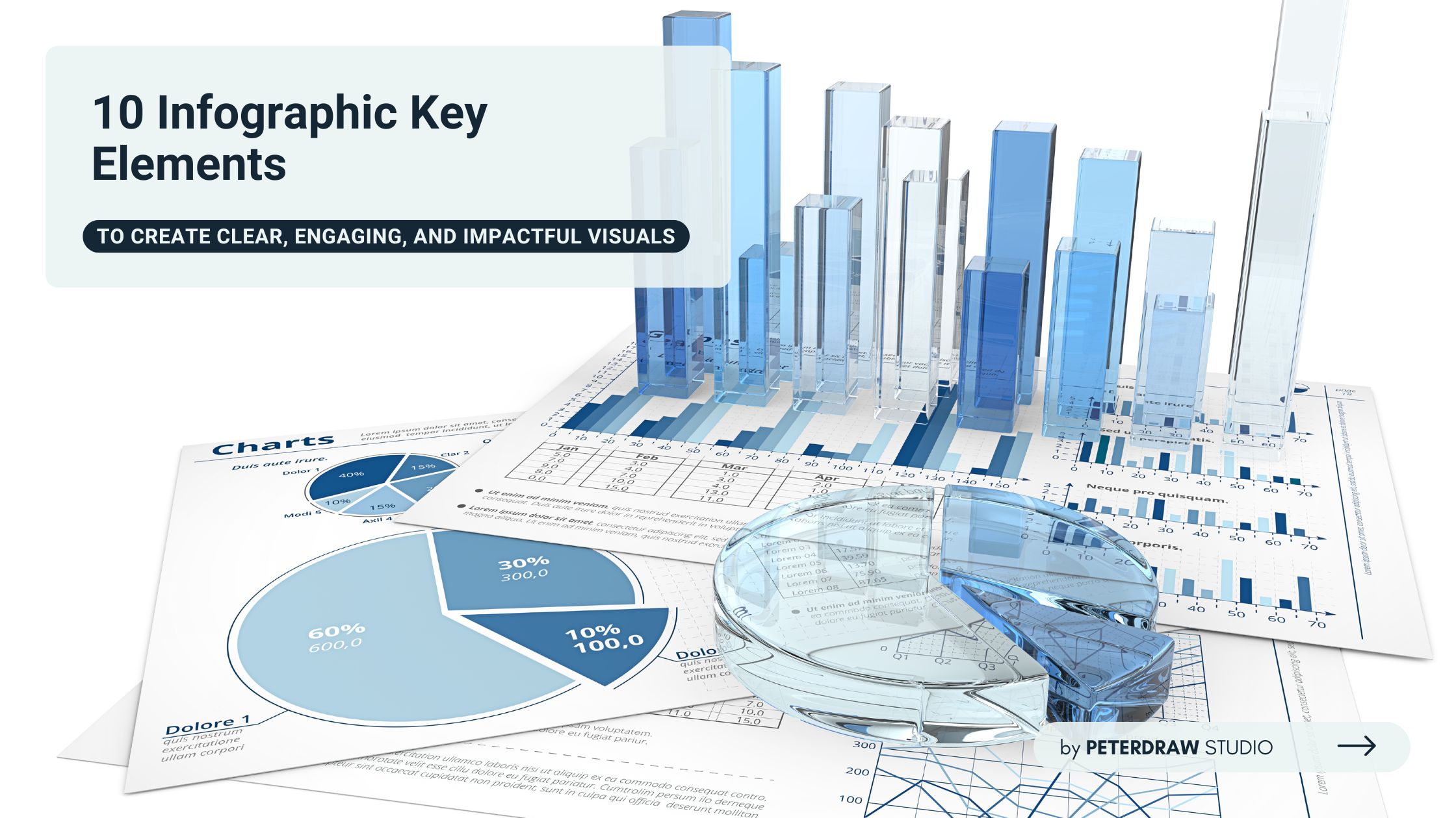

Infographics have become an indispensable tool in modern communication. They transform complex data into visually engaging and easily digestible formats. Hence, mastering the art of infographics can significantly enhance your ability to convey information effectively. It is essential to learn the infographic key elements to create them impactfully. Here, we’ll start.
An infographic is a visual representation of information and data. It combines elements like imagery, charts, graphs, and minimal text to provide a clear and concise overview of a topic. Infographics are widely used across industries for their ability to simplify complex ideas, making them accessible to a broad audience.
Infographics are particularly effective in education, marketing, and data-driven storytelling, as they cater to the human brain’s preference for visual information. They also help improve information retention and boost audience engagement. Furthermore, infographics can be easily shared across social media and digital platforms for wider reach.
You must consider several key elements to create an effective infographic. These elements work together to ensure the infographic is not only visually appealing but also functional and easy to understand. Below are the most important infographic key elements.
A well-structured visual hierarchy is crucial for guiding the viewer’s eye through an infographic. It ensures the most important information is seen first. Use size, contrast, and placement to emphasize headlines or key visuals. Titles should be bold and large, while supporting details are smaller and more subtle to maintain readability.
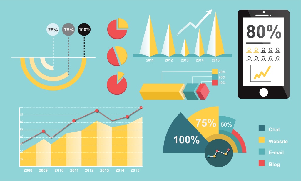
Solid data is the foundation of any effective infographic. Presenting reliable, accurate, and well-sourced information builds credibility and clarity. Use graphs, charts, and timelines to make complex data easier to understand. Always include data sources to reinforce trust and support your visual storytelling.
Among the essential infographic key elements, visuals like icons and illustrations play a powerful role. They help convey messages quickly and enhance overall design appeal. Choose visuals that support your content without overwhelming it, and use icons to symbolize ideas clearly and consistently.
Thoughtful use of color and typography improves both aesthetics and functionality. Limit your palette to two or three complementary colors and use one or two legible font styles. Consider color psychology to guide emotional response and apply hierarchy in text sizes to maintain clarity throughout the layout.
Clarity is a defining trait of impactful design. Infographic key elements like concise text help keep your content easily scannable. Use short phrases, bullet points, and headings instead of full paragraphs. The aim is to highlight important takeaways without overwhelming the viewer with too much reading.
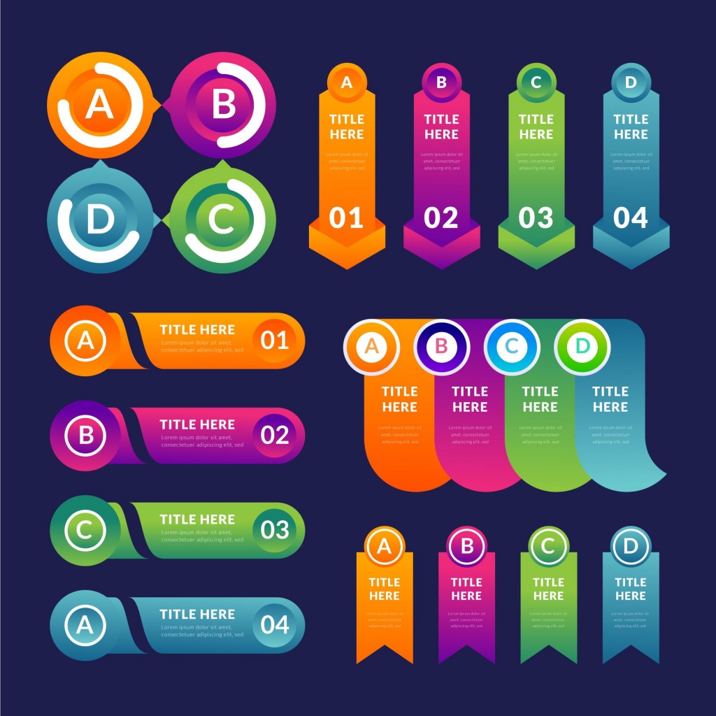
A compelling infographic goes beyond data, it tells a story. Determine the message you want to communicate and organize the content in a logical flow from beginning to end. Visual cues such as arrows, numbered steps, or timelines guide the viewer smoothly through the narrative.
Balance between all elements, text, data, and visuals, is critical for a cohesive design. Use grids and consistent spacing to align content, and apply uniform styling across fonts, icons, and colors. A clean layout ensures your message comes across professionally and is easy to follow.
An engaging infographic captures attention and encourages interaction or sharing. Use high-quality images, bold contrasts, and creative design to maintain interest. This not only increases its effectiveness but also boosts its performance on platforms like social media and content hubs.
One of the most impactful infographic key elements is simplicity. The design should strip away clutter and focus on delivering a single core message. Break information into digestible chunks, use simple language, and rely on visuals to support rather than complicate the message.
Understanding the purpose and audience behind an infographic helps you tailor content effectively. Choose a tone, structure, and style that resonates with your viewers—whether professionals, students, or the general public. Matching your design to the audience ensures relevance and increases impact.
A well-designed infographic not only informs but also engages and guides the viewer through a clear narrative. To help you apply these infographic key elements, here are some practical tips for creating infographics that stand out.
Creating a great infographic goes beyond just visuals and data. To truly enhance its effectiveness, it’s important to think about how people see, interpret, and interact with your design. The following considerations can help you create infographics that are not only visually appealing but also accessible, inclusive, and easy to understand.
Creating infographics is both a creative and strategic process. When done well, they can educate, inform, and persuade all at once. By combining thoughtful design, accurate data, and visual storytelling, you can make your message more accessible. This approach helps ensure it’s memorable for your audience, no matter the topic or platform.
Remember, applying the right infographic key elements ensures your design is not only visually engaging but also purposeful and effective. From clarity and structure to accessibility and branding, each component plays a vital role. As you refine your infographic skills, keep these elements in mind to craft visuals that truly resonate and deliver lasting impact.