Web-Safe Font Guide: Boost Speed, Consistency, and Readability on Your Website
Explore the power of web-safe font, including real brand examples, smart font stacks, and practical tips for 2026 web design.


As a designer, we must agree that all graphic design elements play crucial roles on their own. It also goes to typography and its kerning, tracking, and leading. With its basic key spacing, they play an essential role to control the readability of the text. But, many people still get them wrong and are confused with those three. Thus, in this article, you will find their differences, what makes them important, and how to create a pleasant graphic design using typography.
At a glance, Kerning and tracking seem alike. They focus on giving a free space between letters. However, there is an absolute point that makes them completely different, especially the effect that they can give.
Kerning refers to the adjustment of space between two letters manually. This key spacing aims to create an equal balance between characters. Thus, it can help the audience to read the text better. It becomes important because it can break the legibility of the text. With poor kerning, people will find it awkward to read the text. In the worse case, it can lead to eye strain, decrease readability, and lack of aesthetic appeal. No wonder, most designers use this key spacing to adjust the space between letters in a larger size like for the heading or logo.

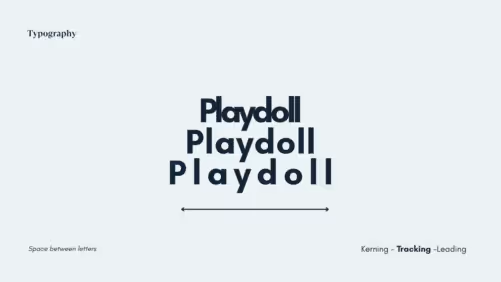
If kerning focuses on the spacing between two or a group of letters, tracking gives more space for each character in a block of text. Most people use tracking to adjust the overall density of text blocks, either to make them more compact or more spacious. Other than that, tracking is also important to improve the readability of the text. Besides, well-executed tracking can make the design looks more pleasant.


Previously, we have talked about the spacing between letters, now it’s time to know everything about leading. You can also call leading in typography “line spacing”. Like its alias name, this key spacing is aimed to give a free space between lines in the text box. It becomes important since it controls the readability and legibility of the text, particularly in larger font sizes.
The right amount of leading put in by the designer can affect the overall look of the design. When the size of the line spacing is too wide or too little, it can make the text pretty hard to read and create a less appealing look.
Kerning, tracking, and leading have their roles to add to the aesthetic values of your design. However, there are a couple of things that you need to pay attention to while working with those three. Below is a list of tips that you can use to arrange your text with these key spacing typography.
When you have decided to elevate your design by optimizing the spacing, sometimes ideas are the things that you do need to improve your design. Here, we have sorted the list of graphic design templates highlighting the use of kerning, tracking, and leading. Check them below!
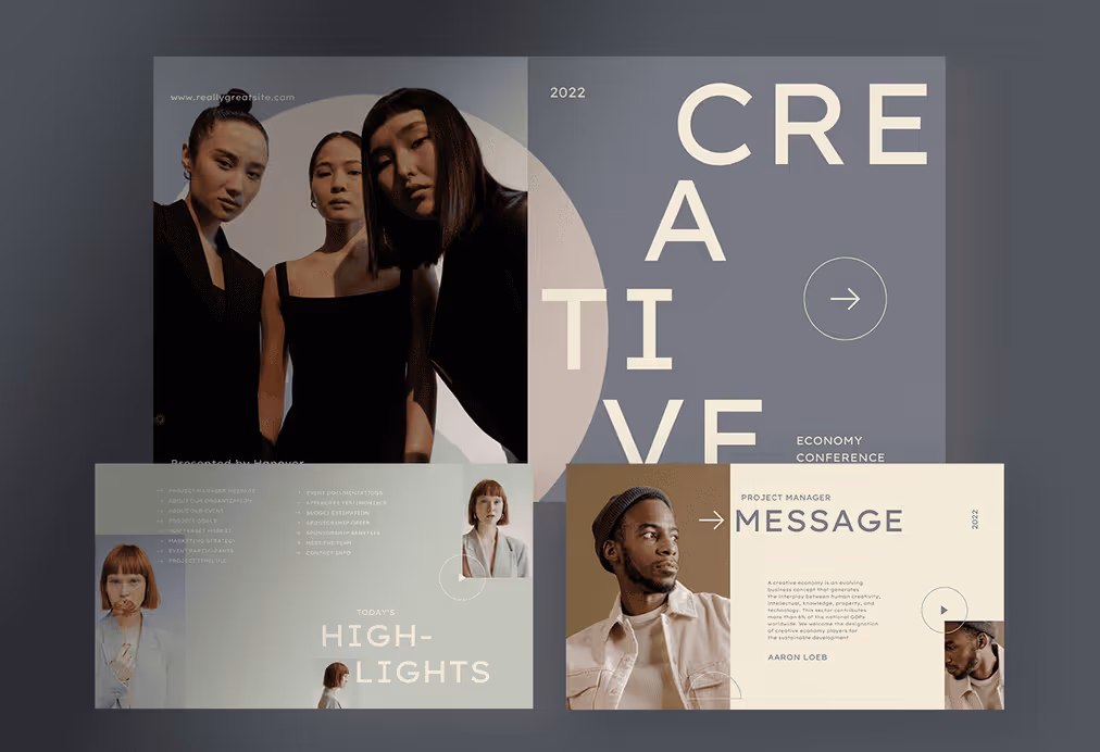
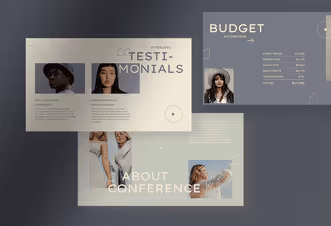
For you who want to optimize the key spacing in typography, the minimalist style is a perfect choice to try. This style emphasizes the white space elements as well as the setting of kerning, tracking, and leading. Aside, you can also play with different font styles and sizes without leaving the points of the minimalist concept.
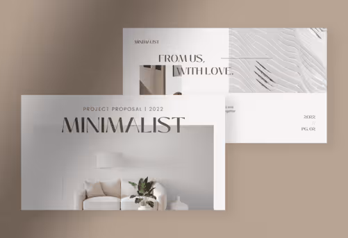
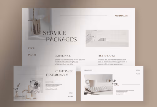
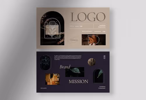
This is like how we go with our products, Pure White and Chloreze. Those two templates have a captivating design layout that spotlights the use of white spaces. Frankly speaking, it can never be achieved without the roles of typography spacing. As a result, you can see the loose feeling created by this template. There is a lot of area letting us breathe and enjoy the design.
Do you want to optimize the key spacing and create a clean look for your design? Well, this one is meant for you then. The geometric template is a perfect choice to build a professional image for your brand through its clean and modern design. Besides playing with key spacing, this style also brings numerous geometric shapes that make the design look even more credible.


You can see it in our products, Orange Copper and Green Lime. Those two templates mostly work with some geometric shapes and highlight the use of typography. With an extra addition of high-quality images, you can make your design look even more alluring. Moreover, you can create a professional look for your brand.
Besides the minimalist design, bold is another style that you must try. Basically, the bold and minimalist concepts can be blent to make an exceptional design without leaving the key spacing aspects. You can play with bold typefaces like Blank Space, Inventing, The Blast, or Aurora that we use in our product, Helios.
Kerning, tracking, and leading are essential elements of typography that can make or break the look and feel of a design. By understanding these concepts and using them effectively, graphic designers can create professional and eye-catching designs that effectively communicate a message.