
Web-Safe Fonts vs Google Fonts: Which One Should You Choose for Your Website?
Compare performance, design options, and expert tips to create fast, beautiful websites with perfect typography using Web-Safe Fonts vs Google Fonts.


Small details often make the biggest impact. One such detail is the micro-interaction, a subtle animation or feedback cue that responds to user actions. A button can gently shift color on hover. A loading spinner can reassure visitors during wait times, keeping the experience clear and engaging.
A UI interaction cue starts with an action and follows a simple set of rules. It delivers instant feedback, and it can loop or change states depending on context. Popularized by designer Dan Saffer, these details support modern interfaces. They make navigation feel smoother and help keep visitors from dropping off.
Micro-interactions aren’t just visual flair. They improve user experience with real-time feedback. They reduce frustration and help users move through tasks with ease. In website design, people expect fast, responsive interactions. These tiny moments prevent confusion and build trust.
Without clear feedback, a clicked button can feel unresponsive. Users may wonder if their action worked. A small response, like a ripple or color shift, confirms it instantly. The interface feels alive and responsive. This improves usability and adds warmth. It can also build an emotional connection.
Research and expert insights show these details reduce cognitive load. They prevent errors and clearly communicate system status. They also soften frustrating moments like submissions or page loads. When done well, they feel satisfying. Over time, that boosts engagement. It also helps increase overall website satisfaction.
Websites rely on various micro-interactions to create smooth UI/UX design flows. Here are some prevalent types:
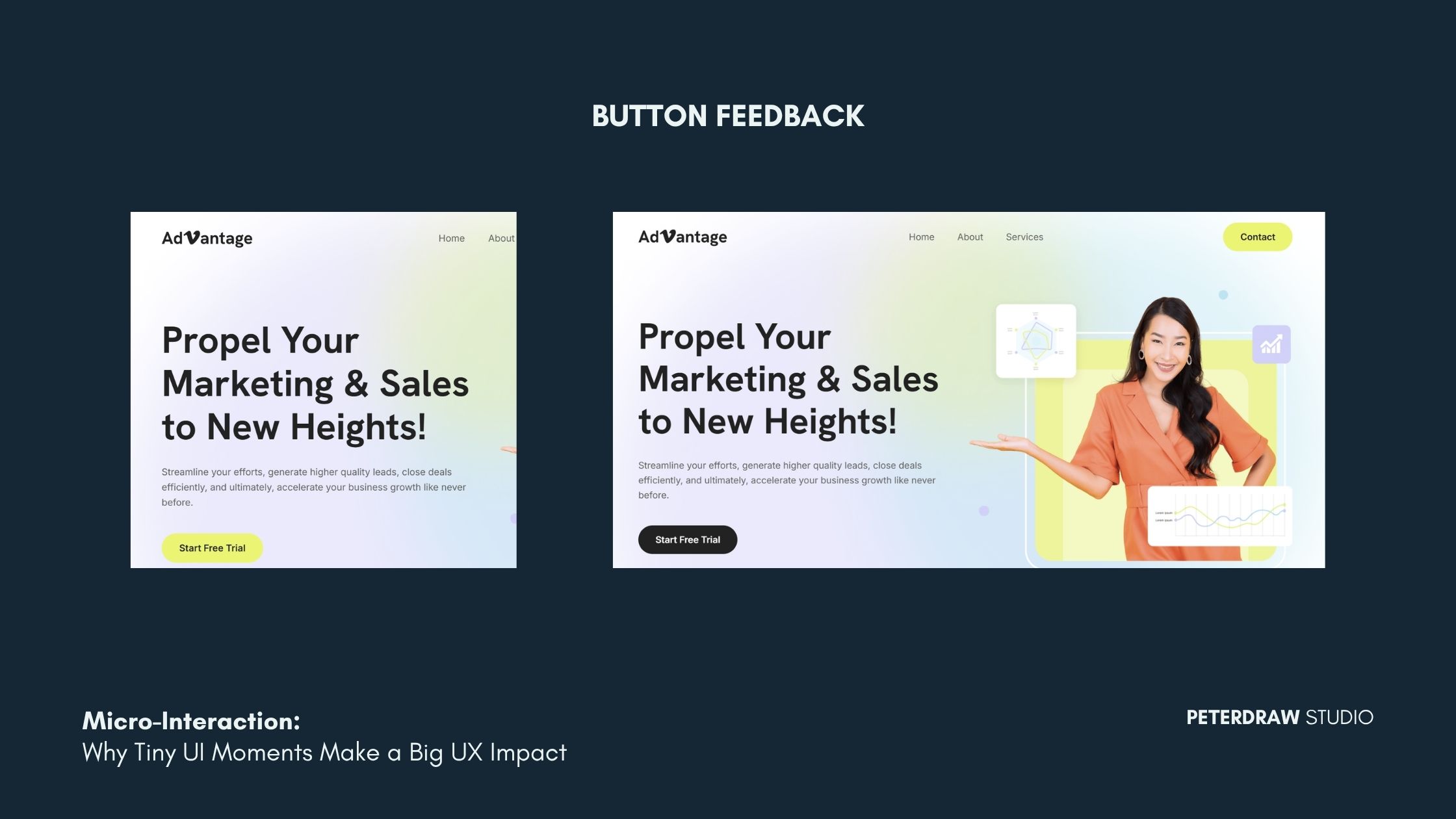
This is the instant response that shows a button is interactive. It also confirms the click has been registered. It can show states like idle, hover, active/pressed, and disabled. These states help users predict what will happen. They also confirm what just happened. Done well, it reduces misclicks and boosts confidence. It also makes CTAs feel responsive.
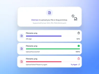
These show the system is working while content is loading or processing. They reduce uncertainty and prevent repeated clicks. They can also reduce drop-offs during delays. Pair them with clear labels like “Saving…” or “Uploading 3 files.” That sets expectations and eases impatience. Wait times feel shorter when users know the status.
This gives users a familiar gesture to request updated content. It works best on mobile-first or responsive web apps. It makes refreshing feel intentional and controlled. Users don’t need to reload the whole page. It should show a clear pull threshold. It should also confirm when new data arrives. That builds trust in the refresh action.
Real-time validation helps users fix errors as they type. It prevents frustration after hitting “Submit.” It also clarifies what’s required for each field. This includes format, length, and allowed characters. Strong validation messages are specific and helpful. They should also be accessible for everyone. Don’t rely on color alone. Use clear text and consistent placement.
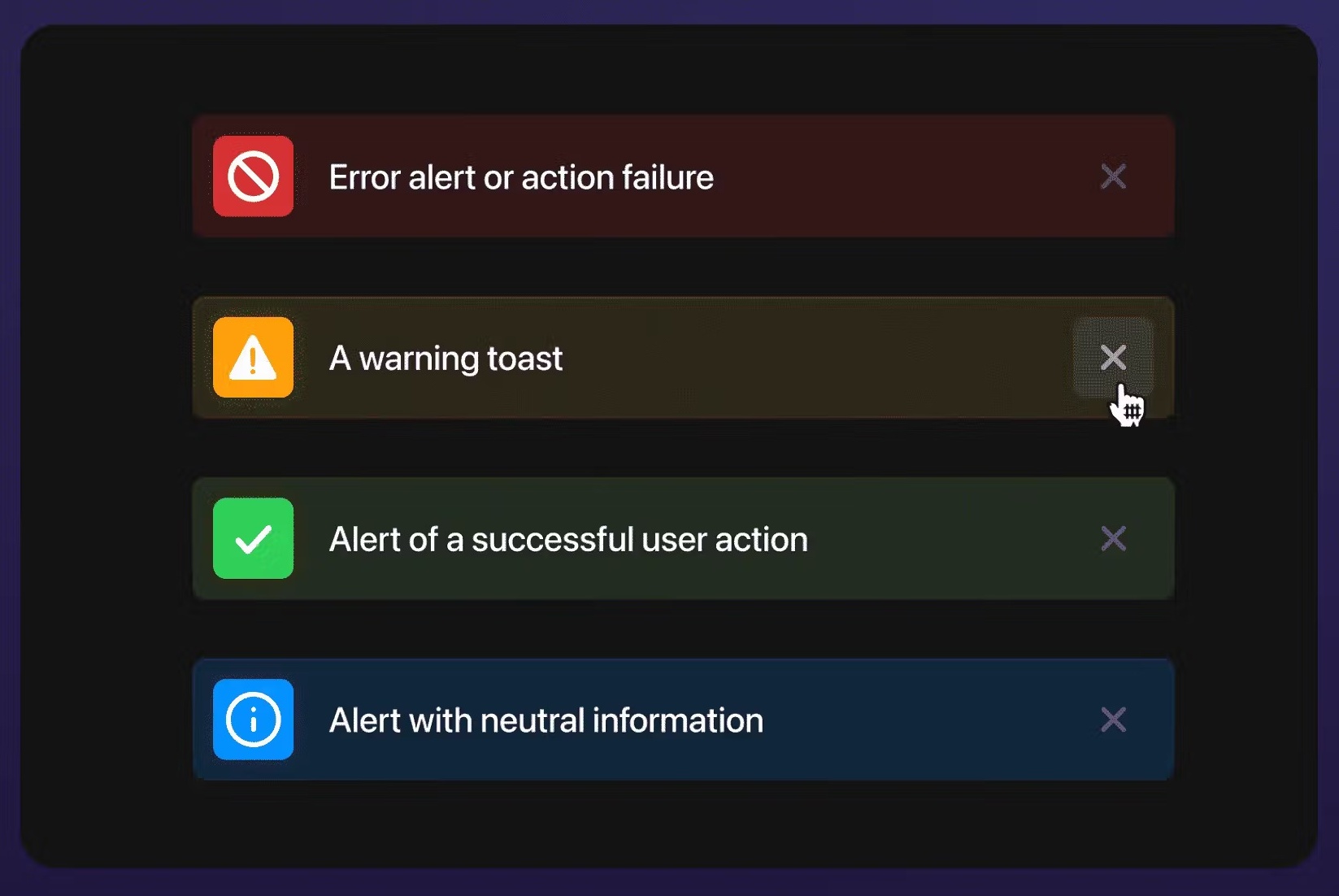
These confirm actions and outcomes without breaking the flow. They work well for success, warnings, and quick guidance. They can also offer a next step, like “Undo.” A good message is short and easy to scan. It appears long enough to notice. It also disappears at the right time. Consistent placement helps users recognize it fast.
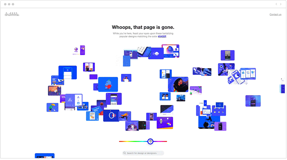
Leading websites master micro-interactions to stand out. Dribbble’s creative 404 error page is a great example. It assembles “404” from design snippets with playful animation. This turns a potentially frustrating moment into a more engaging experience.
Figma and Userpilot use colorful progress bars during loading, reassuring users and adding personality. Social platforms like Facebook enhance "likes" with burst animations, encouraging more interaction.
In e-commerce websites, hover effects on product cards reveal quick views or add-to-cart buttons smoothly, guiding purchases without overwhelming the page.
Micro-interactions shape how users feel while navigating your website. They reduce doubt and confirm actions in real time. They also guide users through steps with less effort. With AI personalization and haptic feedback evolving, websites feel more adaptive. To maximize their value in UI/UX design, follow these guidelines:
Every interaction should solve a small problem. It can confirm an action or prevent errors. It can also guide the next step. If it adds no clarity, remove it.
Keep motion quick and responsive. Aim for under 300ms for most actions. Long animations can feel like lag. They can also slow down task completion.
Match the tone of your brand and UI style. Use the same easing and timing patterns. Keep states predictable across pages. Consistency builds trust and reduces learning time.
Choose lightweight solutions that load fast. Prefer efficient CSS and minimal scripts. Use Lottie only when it’s worth it. Always test on slower devices and networks.
Support reduced-motion preferences when possible. Make sure feedback isn’t color-only. Ensure keyboard navigation works end to end. Add clear focus states for interactive elements.
As web technologies advance, micro-interactions will play an even bigger role. Expect AI-driven adaptations that personalize feedback based on behavior. You’ll also see more immersive motion across pages. Scroll-triggered effects will make transitions feel smoother. Together, these upgrades can make experiences feel more responsive and user-aware.
Websites that embrace these details often see higher engagement. Bounce rates can drop as pages feel clearer and faster. Brand loyalty can also grow through consistent, polished interactions. Mastering these moments turns static pages into dynamic experiences. It also keeps the interface centered on real user needs.
At the end of the day, the micro-interaction is a quiet powerhouse. It strengthens modern website UI/UX design in practical ways. Focus on the details that improve clarity and flow. Build interfaces that function smoothly and feel delightful. Use them thoughtfully, and usability rises. Appeal and trust often follow too.