

UI Testing Checklist: 7 Key Areas for Flawless Interfaces
Use this UI testing checklist to validate layouts, interactions, devices, browsers, and accessibility before launch.


Your dashboard UI for SaaS is often the make-or-break factor for retention and value perception. After users sign up, the dashboard becomes their daily command center. It should clearly show progress, highlight wins, surface issues, and guide next steps. When designed well, it builds confidence and encourages consistent product use.
A poorly designed SaaS dashboard creates confusion, lowers engagement, and increases churn. A strong experience proves ROI quickly and supports habitual workflows. However, SaaS dashboard is a bit different than internal BI tools or consumer apps. What makes them different? And how can you design one that feels fresh and effective?
SaaS operates on recurring revenue. Users must see continuous value to justify monthly or annual payments. The dashboard bridges that gap by answering critical questions fast:
Unlike one-off software, SaaS dashboards drive daily/weekly logins. They blend monitoring, analytics, alerts, and workflows into one screen. When done right, they reduce support tickets, increase feature adoption, and lower churn.
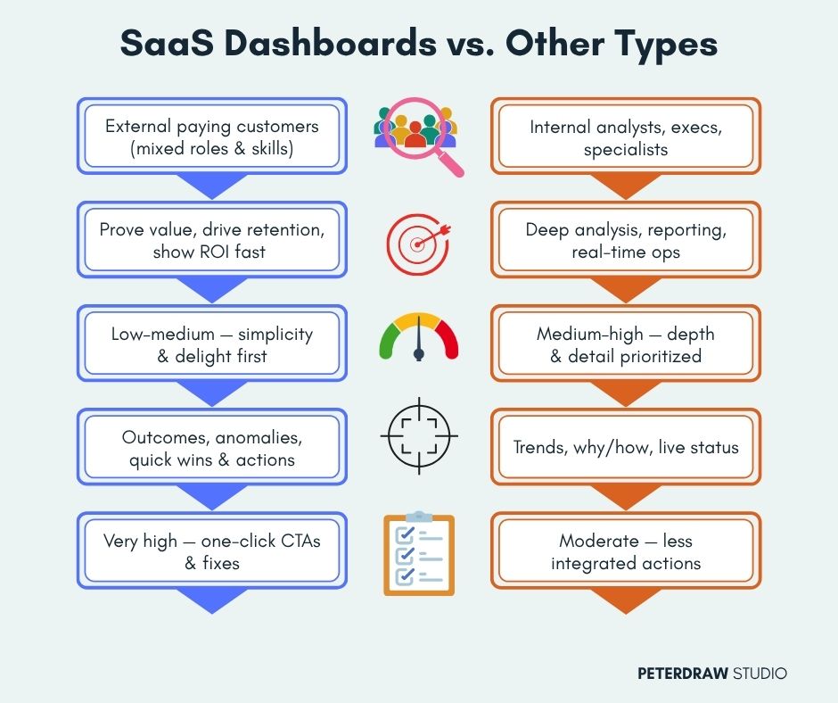
While universal dashboard principles (clarity, hierarchy, data storytelling) apply everywhere, dashboard UI for SaaS stands apart:
In essence, SaaS dashboards prioritize speed-to-insight, emotional satisfaction, and business outcomes over raw data depth.
Designing an effective SaaS dashboard takes more than arranging charts and numbers. It requires clarity of purpose, strong visual hierarchy, and thoughtful user flow.
Start with user research to pinpoint the top 3–5 questions users ask most. Align metrics to business and user success. Ruthlessly prioritize and avoid “kitchen-sink” dashboards full of unnecessary clutter.
Place hero metrics like KPIs and health scores above the fold in large cards. Use size, contrast, and positioning to guide attention naturally. Keep trends and details below for clean scanning.

Use generous white space, a limited 3–5 color palette, and clean sans-serif fonts. Hide complexity behind progressive disclosure (filters, expanders, drill-downs) to lower cognitive load and speed up understanding.
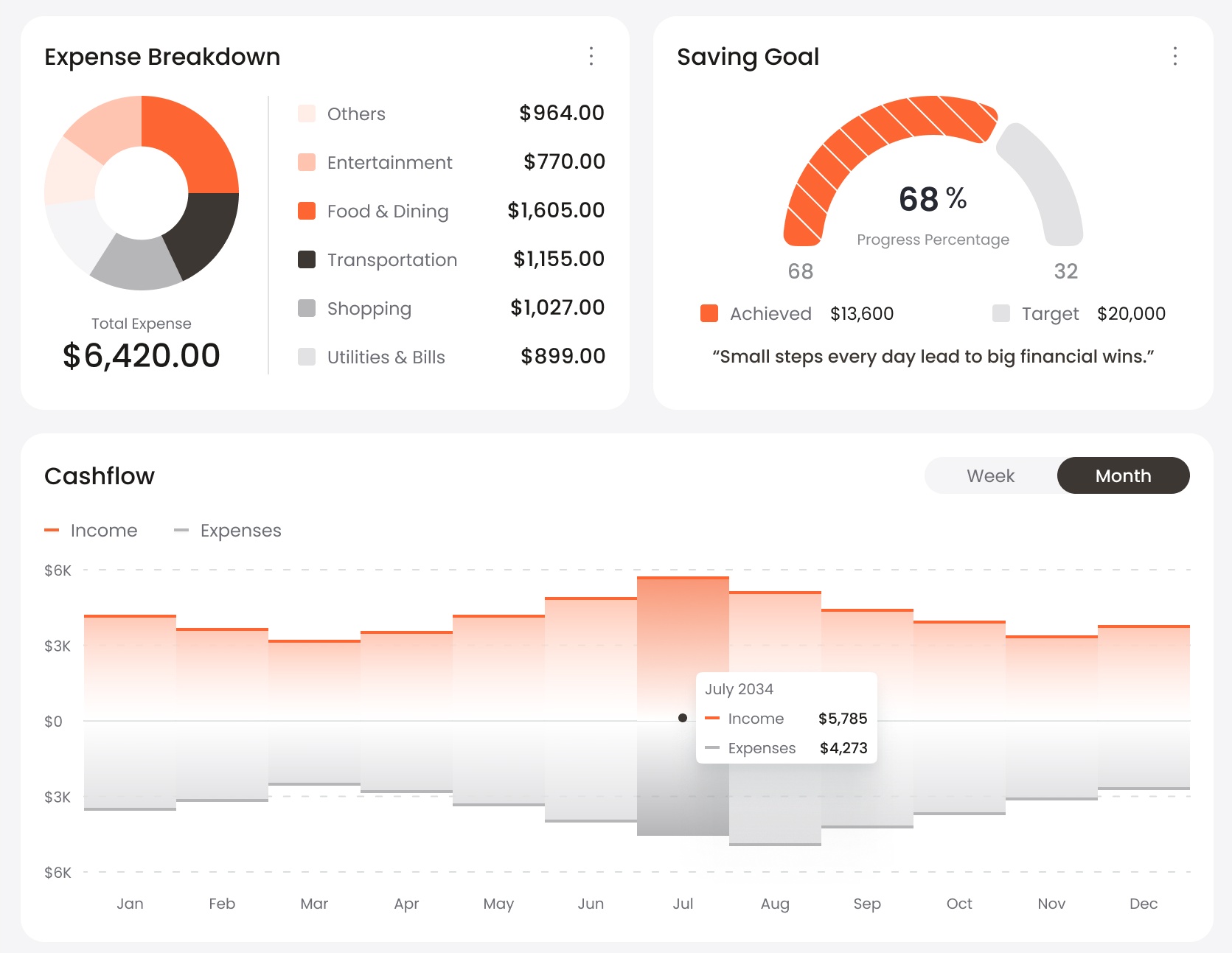
Match charts to data: sparklines for trends, bars for comparisons, gauges for health scores. Add interactivity (hover tooltips, clickable segments) plus context like change indicators and benchmarks.
Offer drag-and-drop widgets, role-based defaults, and saved views. This adapts the dashboard to different roles and workflows, giving users control and greatly improving long-term engagement and satisfaction.
Pair insights with one-click actions like color-coded alerts, “Quick Fix” buttons, and personalized recommendations. This turns passive viewing into active problem-solving and shortens time to resolution.
Design mobile-first since many users check dashboards on phones. Follow WCAG standards with high contrast, keyboard navigation, alt text, and screen-reader support to ensure inclusivity for all.
Show live updates for critical metrics and add subtle AI hints (e.g., “Anomaly detected: 32% drop”). These deliver timely, proactive insights that help users stay ahead of issues.
The way users interact with digital products continues to evolve rapidly. Expectations are higher, attention spans are shorter, and experiences must feel both powerful and effortless. Designers are now challenged to create interfaces that feel modern without overwhelming users. Current design evolution focuses on intelligence, flexibility, and comfort:
Leading SaaS products demonstrate how strong design principles translate into real user value. These examples highlight clean layouts, smart prioritization, and intuitive interactions that drive engagement. Study these examples closely for smart layout ideas, effective spacing, and strategic action placement.
Turning a good dashboard design into a truly effective one requires more than theory. It demands real-world validation and constant refinement.
Your dashboard is much more than just another screen in the product. It’s the living heartbeat of your SaaS offering. A well-crafted design instantly shows value with every login and gently encourages users to return day after day. Keep the focus on what users truly need, remove all unnecessary clutter, and weave in smart personalization.
In a highly competitive SaaS landscape, a truly outstanding dashboard UI for SaaS stands out and delivers real impact. It transforms raw numbers into fast, confident decisions. It consistently proves ongoing value to every user. It strengthens loyalty and drives steady, long-term growth. Take a quick audit of your current dashboard today; even modest tweaks can unlock meaningful results.
.jpg)