
Bold Typography: Mastering Impactful Design for Maximum Engagement
Master bold typography with expert tips on where to use it, the best font recommendations, plus practical techniques to make your designs more impactful and memorable.

Gradient colors have become a trend in recent years. The vibrant gradient even reached its peak around 2018-2020. However, in the next year, muted color gradients became mainstream, appearing in diverse industries and design media. Their rise signals a shift toward more sophisticated, calming aesthetics, making them an essential trend to explore in modern design. Let’s learn more about the trend!
Muted colors are toned-down versions of vibrant colors. They are achieved by adding white (tints), black (shades), or gray (tones). When applied in gradients, these colors create smooth, harmonious transitions that feel elegant and understated. Contrary to bright color gradients, which are often bold and attention-grabbing, muted gradients evoke a sense of calm and sophistication. It makes them ideal for modern, minimalist, or nature-inspired designs.
Muted color gradients offer a fresh alternative to the bold and dynamic trends of recent years. Their gentle transitions and understated tones reflect a shift toward designs that prioritize harmony and subtlety. Hence, they offer these benefits.
Subtlety and Elegance: Muted gradients are less overwhelming and visually noisy, making them ideal for professional and minimalist designs.
Versatility: They work well in various contexts, such as backgrounds, overlays, and user interface components.
Emotional Impact: Muted tones evoke calmness, trust, and warmth, making them suitable for wellness, healthcare, or luxury brands.
Each combination of gradient colors can bring a distinct mood and character to designs. This concept is applied to any combo, including the muted color gradients. Furthermore, designers can evoke emotions, tell stories, and create harmonious visuals that resonate with their audience. Among color pairs to develop the mute gradients, here are the most popular and common combinations.
Soft pastel gradients feature light, desaturated colors with a gentle and airy appearance. These gradients often include hues like muted peach, lavender, mint green, and baby blue. The smooth transitions create a calming and approachable vibe, making them ideal for designs that need a friendly, fresh, or youthful tone.
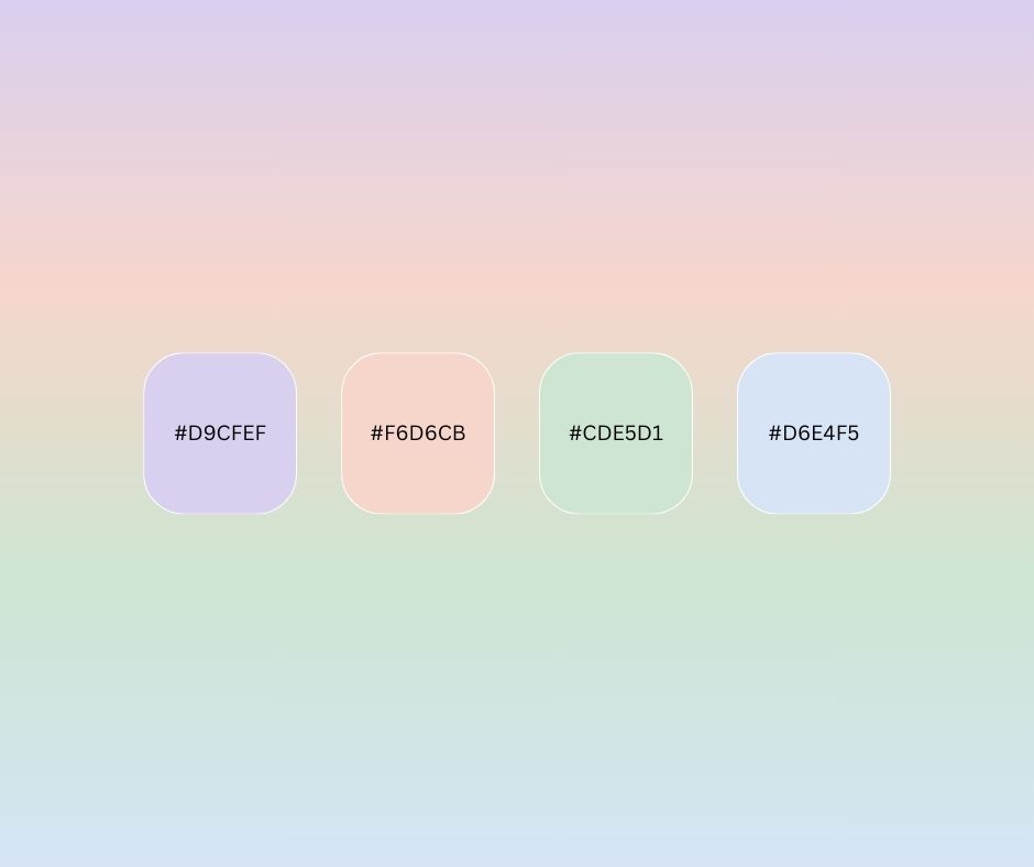
Soft Pastel Gradient
Use Cases:

Emotional Impact: Soft pastels evoke tranquility, optimism, and warmth. They’re perfect for brands that want to exude kindness and approachability.
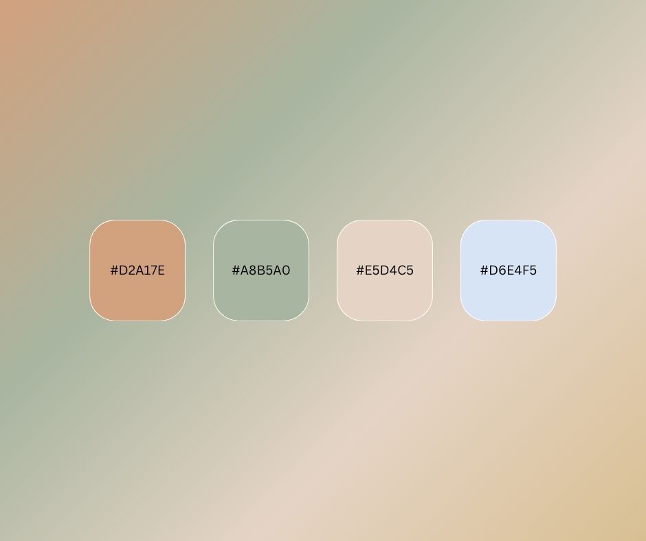
Earthy tone gradients use colors inspired by nature, such as terracotta, olive green, beige, and muted gold. These colors feel grounded and organic, often associated with sustainability and timeless elegance. The transitions in earthy tone gradients are warm and inviting, offering a natural sophistication.
Use Cases:
Emotional Impact: Earthy tones bring stability, warmth, and authenticity. They’re often linked to eco-friendliness and a connection to the natural world.
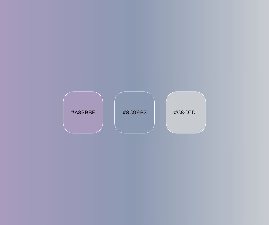
Dusky shade gradients are inspired by the soft, dreamy colors of twilight. These gradients combine muted purples, blues, and grays to create a moody and sophisticated aesthetic. Dusky gradients are often darker and more contemplative compared to other groups.
Use Cases:
Emotional Impact: Dusky shades evoke introspection, calm, and elegance feeling. They’re well-suited for designs aiming to be subtle yet impactful.
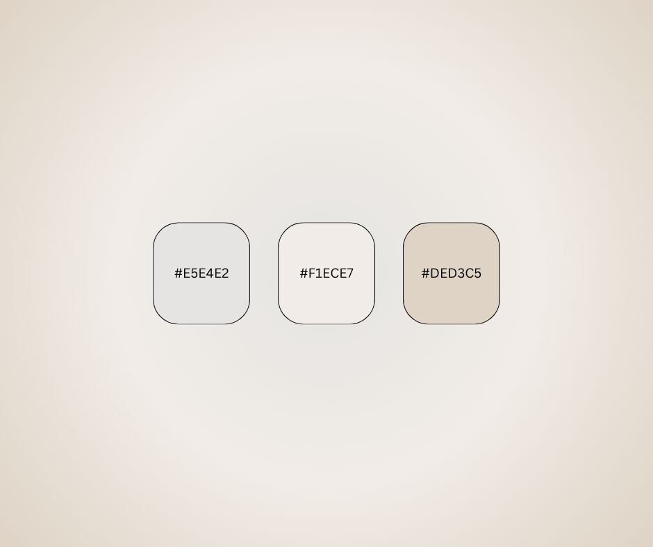
Neutral tone gradients feature a palette of light grays, creams, and sands. These gradients are subtle and refined, offering a modern and clean look that complements design styles. Neutral tones are especially versatile and timeless, often used to create minimalist aesthetics.
Use Cases:
Emotional Impact: Neutral tones create feelings of calm, balance, and sophistication. They’re ideal for designs seeking to convey professionalism and a timeless appeal.
Thanks to their versatility, muted color gradients can be seamlessly applied across various design projects. Their subtle transitions deliver a visual experience that is both modern and approachable, making them a preferred choice for designers aiming to create polished and captivating compositions. These gradients integrate effortlessly into different design styles, enhancing both aesthetics and functionality with their understated charm, as showcased in the examples below.
Backgrounds: Ideal for creating depth and softness without overpowering other design elements. By using muted gradients, designers can achieve a professional look while subtly guiding the viewer’s attention.
Buttons and CTAs: Provides a modern look when combined with contrasting text or borders. These gradients bring a touch of elegance, enhancing visual interest without becoming too distracting.
Illustrations and Icons: Adds a natural and organic feel to vector art and illustrations. They also work well to evoke specific moods or themes, making visuals more engaging and relatable.
Branding: Enhances a brand's identity by conveying maturity and sophistication. Incorporating muted gradients helps establish a cohesive visual language that leaves a lasting impression.
Creating muted color gradients requires the right tools to bring your vision to life. Whether designing for digital platforms or print, various software and resources make it easier to experiment with soft, harmonious palettes. Below are some popular tools to help you create stunning muted gradients with ease.
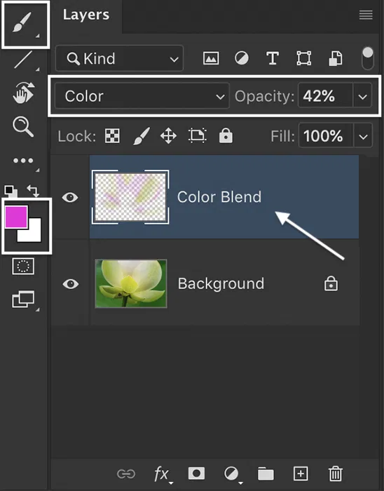
In Illustrator, the Gradient Tools allows precise control over color stops and blending modes, perfect for achieving subtle transitions. Meanwhile, Photoshop's layer styles and gradient overlays let designers customize opacity and texture, adding depth and softness to muted gradients.
Figma’s intuitive interface enables easy adjustment of gradient directions, angles, and color stops, making it ideal for creating sleek and polished designs. Conversely, Sketch’s ability to combine gradients with vector shapes and symbols makes it a go-to for responsive design workflows.
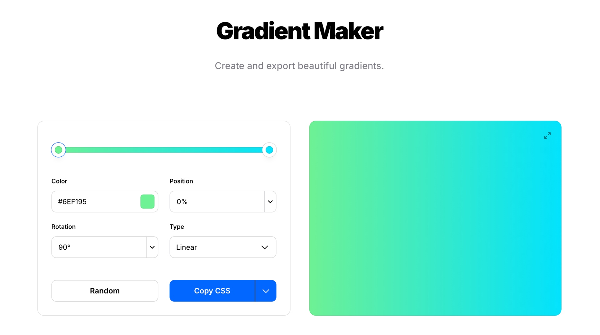
Designers can effortlessly generate gradient combinations, adjust colors to suit their projects, and export them for use in various tools. Its user-friendly interface is perfect for both beginners and professionals.
This platform offers a curated collection of gradients ready to use in digital and print designs. It helps save time while sparking creative ideas. Its simple browsing feature makes finding the perfect gradient quick and efficient.
Muted color gradients offer endless opportunities for designers to craft visually appealing and emotionally resonant designs. To enhance their impact, experiment with layering gradients or adding subtle textures. Combining muted gradients with bold typography creates a striking balance that captivates attention, too. As design trends evolve, muted gradients will remain a timeless choice, blending sophistication with versatility in modern design projects.

