
Bold Typography: Mastering Impactful Design for Maximum Engagement
Master bold typography with expert tips on where to use it, the best font recommendations, plus practical techniques to make your designs more impactful and memorable.


Color choice is quite important in determining the delivery of a design's message. Some pick colors from their brand color palette. Some prefer the most related colors to the business. However, there are times when people take some inspiration from their surroundings, like nature. Those nature-inspired color palettes can look very unique when applied to a design.
Natural colors are truly unique, capturing the essence of natural beauty in ways that resonate deeply with audiences. These palettes create harmonious and visually pleasing combinations. It makes them perfect for various design projects, from branding and marketing to promotional materials. Here are the key properties that make nature-inspired colors so effective and appealing.
Organic Harmony: Nature-inspired color palettes blend smoothly, creating a cohesive look. This harmony brings balance and visual appeal.
Calming and Restorative: Soft natural colors, such as soft greens, blues, and browns, evoke relaxation and calm. Ideal for wellness and stress-reducing designs.
Timelessness: Nature’s colors are classic and enduring. They suit designs that aim for longevity and timeless appeal.
Connection to Sustainability: Earthy tones convey eco-friendliness and sustainability. Green and environmentally conscious brands will be perfect with the colors.
Emotional Warmth and Comfort: Nature offers warm tone colors, like ochre and terracotta, that feel cozy and inviting. Perfect for creating approachable, comforting spaces.
Natural Contrast: Nature-inspired palettes often use soft, natural contrasts. This subtle contrast adds visual interest while keeping the design gentle and pleasing to the eye.
Evocative of Positive Experiences: Natural colors evoke happy, relaxing outdoor memories. Great for brands wanting to inspire positive emotions.
With the availability of many choices of color combinations from nature, designers can experiment to get the best results. Mostly, nature-inspired color palettes offer a refreshing and harmonious way to enhance design projects. For a starter, here are some recommended nature-inspired palettes from Peterdraw’s creative director and head designer for you.
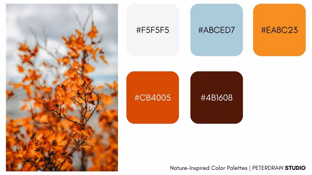
A warm vibe from an autumn color combination is always comforting, like this one. This image captures the rich, warm tones of the autumn leaves and evokes a sense of seasonal beauty. The combination of golden orange and earthy brown of the season makes it suitable for various fields that aim to evoke warmth, comfort, and a connection to nature, like hospitality and the fashion industry.
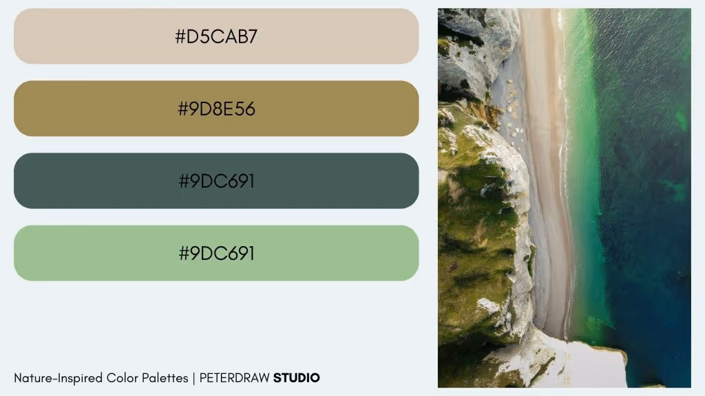
Looking for a more soothing yet refreshing color combo? This nature-inspired color palette will be suitable for your design. The ocean blues, earthy greens, and sandy neutrals from the inspirational scenery are perfect for conveying freshness and tranquility. Wellness, spa, travel and tourism, and outdoor brands will be suitable for using the color combo in their marketing or branding materials.
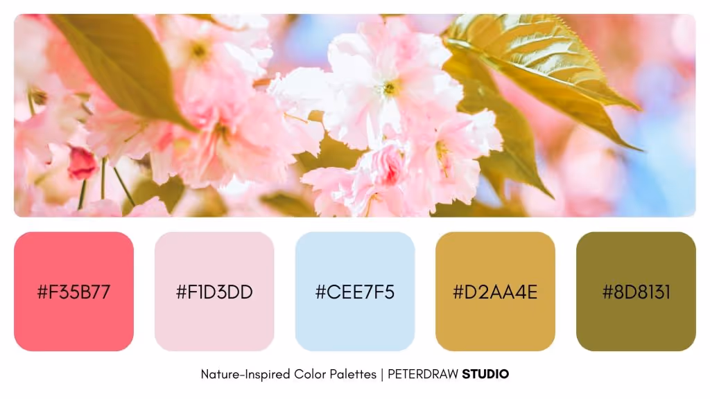
Spring color combos constantly bring new energy, like this color palette emits. The delicate pastel tones of pink blossoms against lush green leaves create a light, refreshing, and spring-like color palette. This combination embodies elegance and the essence of new beginnings. Some ideal uses for the color palette are in beauty & skincare brands, children's products, spring-themed events, and florist & garden services.
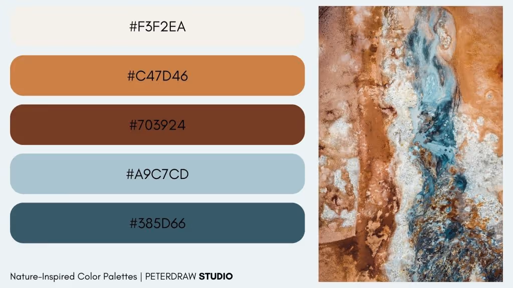
You can’t miss using the element colors of the earth when using natural colors. Look at this earthy, warm ochre combined with cool, mineral-like blue. This combo evokes a sense of raw, rugged landscapes shaped by natural forces. It reflects the untamed beauty and texture of geological formations, ideal for creating a grounded and elemental aesthetic. So, applying the colors for interior design & home décor business, travel & tourism marketing, or art & photography projects will be outstanding.
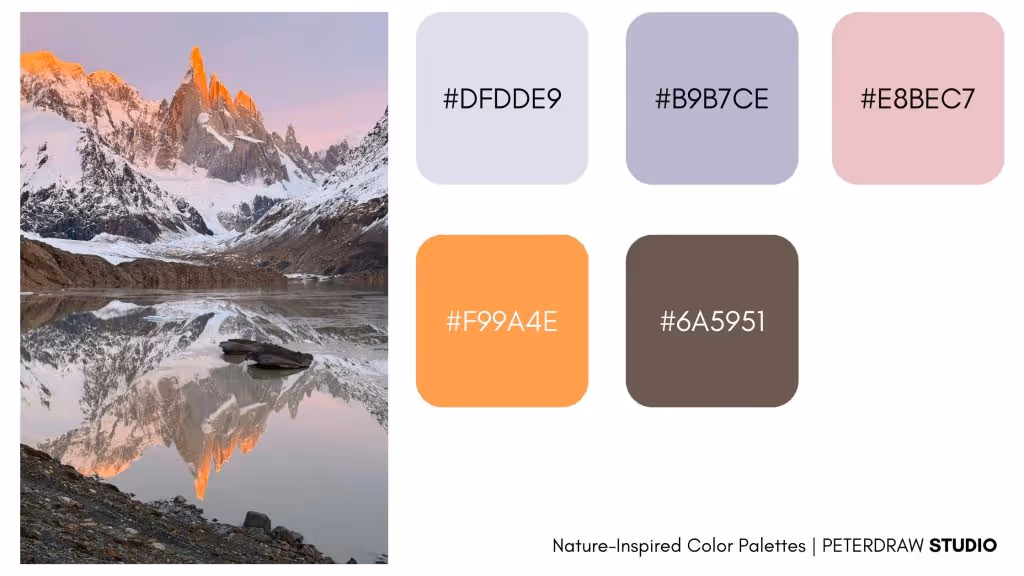
Frosty yet warm, that’s the impression this image emits. Combining the icy whites and grays of the mountains with the warm, fiery glow of the sunrise or sunset shows a beautiful contrast. This combo reflects off the peaks, creating a dramatic, awe-inspiring landscape that embodies strength and tranquility. It is perfect for winter and ski resort businesses, luxury and high-end products, or wedding-themed designs and events.
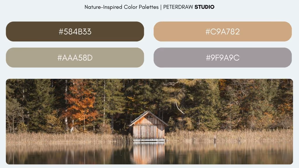
Another autumn vibe with a more earthy color combo is offered to you. It has a serene and inviting feeling, evoking warmth and a peaceful connection to nature. The color palette is best applied as brand identity in food & beverage businesses or eco-friendly & sustainable brands. This natural palette also is a suitable choice for seasonal marketing campaigns in many fields, especially hospitality businesses and event organizer services.
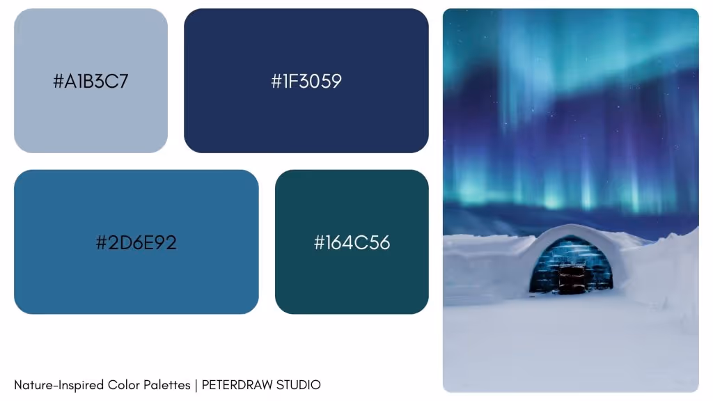
Ethereal and mysterious is the first impression people get from this color combo. The deep blue and green combination from the aurora at the north pole also brings a wonder feel to the design. This rich blue natural color is best for technology & futuristic branding or science and space-themed projects. However, it is also suitable for the jewelry and accessories business, especially those that focus on crystals, gems, or iridescent materials.
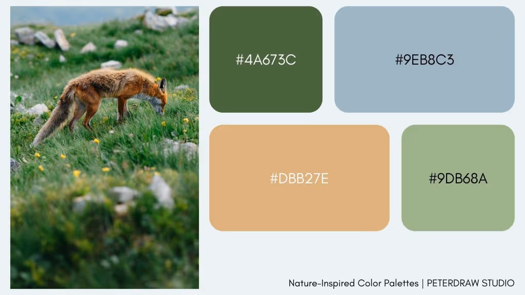
Mountain's life has its own charm as one of the nature-inspired color palettes. It is simple yet can capture the beauty of nature really well. This combo is the right choice for brands and projects that want to emphasize authenticity, warmth, and a deep connection to nature. So, outdoor and wildlife brands or pet and animal care are perfect for using the palette.
It is a sight to behold to watch a field of tulips in full bloom. The color combo this scenery offers gives off freshness, joy, and beauty. This palette will be perfect for any project or brand to celebrate femininity, freshness, and vibrancy. The best application is on seasonal marketing and events focus on springtime. The combo also is ideal for the fashion and apparel business, even for children's products. Not to mention beauty and wellness business, the colors create a soothing and uplifting vibe.

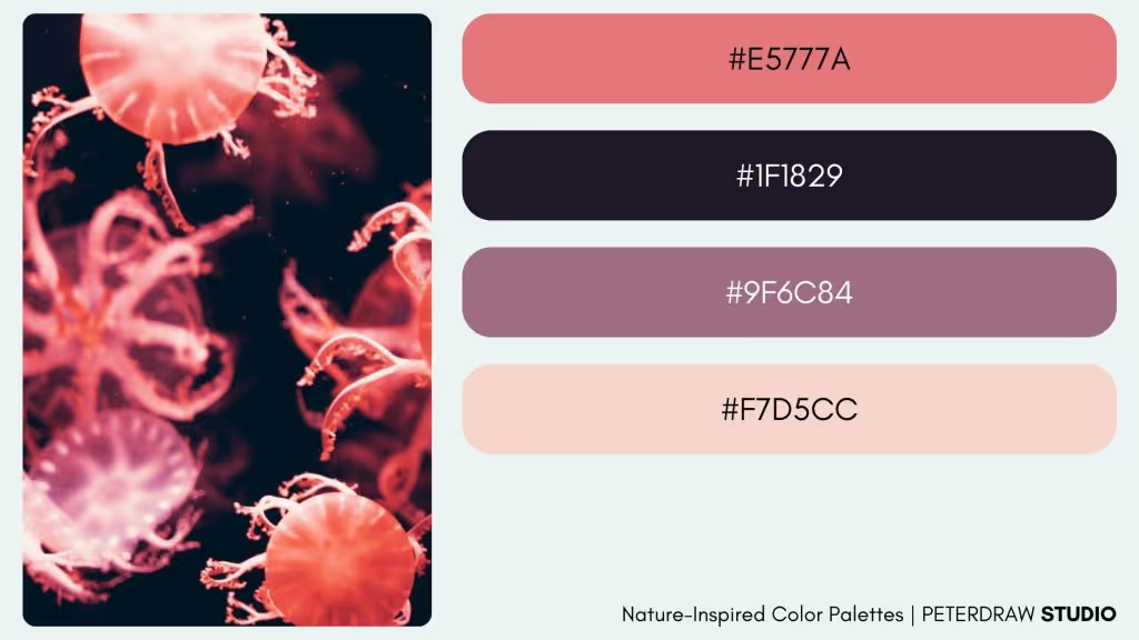
The deep sea is filled with mystery, mystique, and allure, just like this scenery. The contrast between the dark ocean depths and the vibrant, floating jellyfish creates an intense, mesmerizing palette. This versatile color combination is ideal for projects aiming to stand out with bold, captivating, and slightly mysterious vibes. It’s perfect for luxury and high-end fashion brands that want to convey sophistication, as well as for the nightlife and entertainment industry, where it can capture attention and add a touch of excitement.
Nature-inspired color palettes bring a unique depth and emotion to design. To incorporate them effectively, consider the mood and message you want to convey. Pair vibrant tones with subtle neutrals for balance, or use high contrast to make elements pop. Experiment with these palettes to bring warmth, freshness, or mystery to your designs, ensuring each color choice resonates with your brand’s values and audience.

