
Bold Typography: Mastering Impactful Design for Maximum Engagement
Master bold typography with expert tips on where to use it, the best font recommendations, plus practical techniques to make your designs more impactful and memorable.
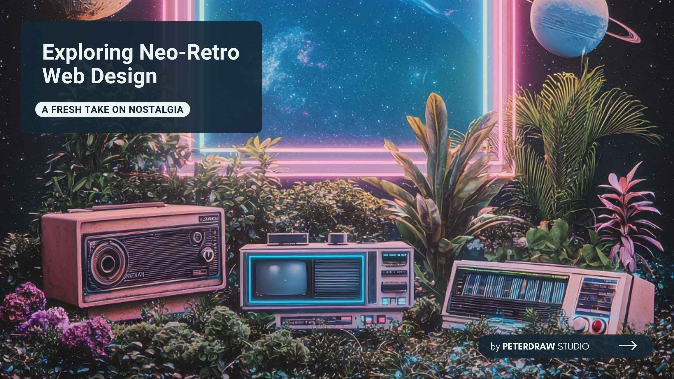

In the ever-evolving world of web design, neo-retro web design stands out as a captivating trend. It merges the charm of vintage aesthetics with cutting-edge modern features. This approach creates websites that feel both familiar and innovative. Neo-retro web design appeals to users who crave a break from sleek, minimalist sites. Instead, it offers a playful nod to the past while delivering seamless functionality.
Neo-retro is essentially "new retro." It takes inspiration from earlier decades but updates them for today's tech. Think of it as a bridge between old-school vibes and contemporary user experience. For instance, elements from the 1980s like neon colors or pixel art get a modern twist with smooth animations and responsive layouts.
This style isn't about copying the past exactly. It reimagines retro elements to fit current needs. Designers use it to evoke nostalgia without sacrificing speed or accessibility. Neo-retro web design often draws from eras like the '60s groovy patterns, '80s arcade games, or '90s internet aesthetics. The result? Sites that feel warm and engaging in a digital age full of cold, uniform designs.
Why does this matter? In a world overwhelmed by information, neo-retro web design helps brands stand out. It taps into emotions tied to simpler times. Users might smile at a pixelated font that reminds them of childhood video games. Yet, the site loads quickly on mobile devices. This balance makes neo-retro web design both fun and practical.
Web design has come a long way since the early days of the internet. Back in the 1990s, sites were simple with basic HTML and flashy GIFs. They had clunky navigation and slow loading times. Retro web design celebrates those roots but often feels dated today.
Enter neo-retro web design. It evolved as designers sought to blend nostalgia with innovation. Around the 2010s, trends like flat design dominated. But by the 2020s, people craved more personality. Cultural shifts, like the resurgence of vinyl records or vintage fashion, influenced this. Neo-retro web design emerged as a response, combining "neo" (new) with "retro" (old).
In recent years, it's gained traction globally. In Japan, for example, neo-retro web design mixes Y2K visuals with Showa-era nostalgia from the mid-20th century. This creates unique sites that feel both futuristic and historical. The trend reflects a broader desire for authenticity in a tech-driven world. As one expert notes, neo-retro provides a comforting escape without misleading users about modern capabilities.
To create an effective neo-retro web design, you need to incorporate some essential components. This way, the style resonates with modern audiences without losing its retro charm. Here are some essential components to include.
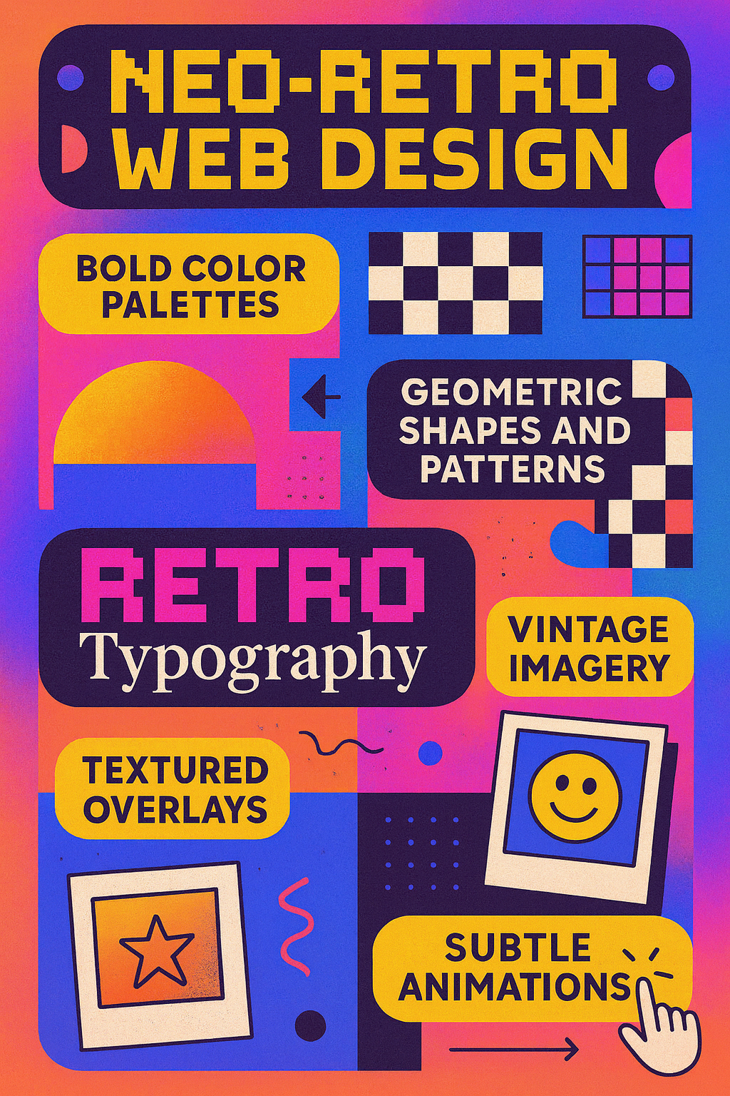
Balance is critical in neo-retro web design. Too many retro elements can clutter the page. Always prioritize user-friendly navigation and fast performance.
Neo-retro web design offers several advantages for brands and users. It continues to grow in relevance as digital trends evolve.
These benefits make neo-retro web design a powerful choice for businesses aiming to connect with users emotionally while maintaining functionality.
Let's look at real-world examples to see neo-retro web design in action. Breakfast's site uses sepia-toned images and '60s music studio graphics. It evokes Hollywood nostalgia with a modern font twist, making navigation effortless.

Klarna's The Checkout features pixelated headers like '90s video games. This playful element gamifies shopping, keeping users hooked. Peachtree Wellness channels '70s swirls and rainbow fades. It ties CBD products to holistic eras, using slogans for emotional pull.
Enigma stands out with '80s pixel animations and floppy disk icons. Its bold palette and custom cursors create an immersive experience. StrategyFolk adds Atari-like characters to a clean B2B layout, proving neo-retro fits professional sites.
In templates, Excess Festival draws from Pac-Man and MTV, offering nostalgic scrolls. These sites show how neo-retro web design adapts to different needs, from wellness to festivals.
Ready to try neo-retro web design? You can start your own design by following these steps.
Explore vintage ads, old-school websites, and retro design references. Use tools like Adobe Color to find palettes.
Select a strong concept, such as an '80s arcade or '60s groovy vibe, to guide your design choices.
Focus on usability while mapping the layout. Use platforms like Webflow or Wix for easier implementation.
Incorporate small touches first, like pixel fonts, textured overlays, or geometric backgrounds, without overwhelming the design.
Test your layouts across devices to confirm functionality and a consistent experience.
Use CSS for gradients and animations, optimize images for faster loading, and apply accessibility best practices.
Experiment by updating an existing site with one retro feature or using ready-made templates from tools like Squarespace.
Keep experimenting and adjusting until you achieve a seamless balance of nostalgic visuals and modern usability.
As digital culture continues to evolve, design trends reflect shifting user expectations. People increasingly seek experiences that feel both personal and memorable online. Neo-retro represents more than just a style; it reflects cultural nostalgia and curiosity. Its adaptability ensures designers can reimagine classic aesthetics without losing modern functionality. This blend allows web design to evolve while honoring its roots.
Looking ahead, the influence of neo-retro web design will only expand. Brands recognize its power to stand out in crowded markets. With the right balance, it provides visual depth and emotional connection. Emerging tools and platforms will make experimentation easier for designers. By embracing neo-retro web design, creators can shape sites that feel timeless and innovative.

