
Bold Typography: Mastering Impactful Design for Maximum Engagement
Master bold typography with expert tips on where to use it, the best font recommendations, plus practical techniques to make your designs more impactful and memorable.


Making mistakes is a natural thing when doing something. However, this does not mean that the error must continue to repeat itself without any improvement. And, when it occurs in the responsive design you are creating, the mistakes can silently destroy the performance. Thus, responsive design mistakes must be avoided as early as possible.
Mobile devices account for more than 62 % of global web traffic. Google has been using mobile-first indexing for over six years, and Core Web Vitals are a direct ranking factor. A site that looks stunning on a 27-inch monitor but breaks, loads slowly, or becomes untappable on phones isn’t just inconvenient. It’s a competitive disadvantage.
Mobile-first layouts, optimized images, and touch-friendly interactions are no longer optional extras. Together, they form the backbone of modern, high-performing websites across every device and screen size. Even small mistakes can quietly raise bounce rates, shrink engagement, and cost you valuable conversions. The upside is that most issues come from a few common, completely avoidable mistakes.
Repeating the same responsive design mistakes can happen to anyone, even seasoned developers. These seemingly small oversights create frustrating mobile experiences, hurt SEO performance, and drive visitors away before they ever see your content. The good news? Each one has a straightforward, modern fix that takes minutes to implement once you know what to look for.
Nothing makes users abandon a site faster than buttons they can’t tap without zooming or multiple attempts. Links and buttons smaller than 44–48 px feel like trying to thread a needle while wearing gloves.
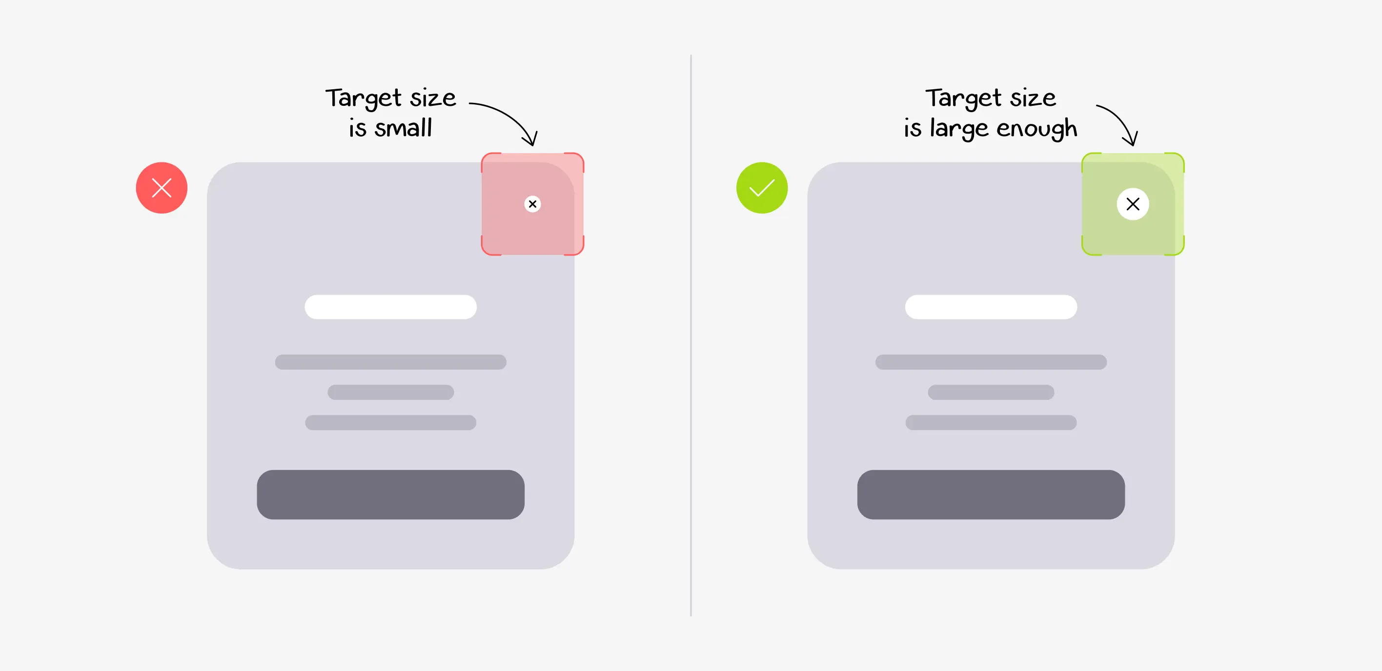
Fix: Set a minimum tappable area of 48 × 48 px and add generous padding. Always preview your layout in Chrome’s touch-simulation mode or directly on real phones. Your thumbs will thank you.
Hard-coding width: 800px or height: 500px might look perfect on your laptop. However, it forces horizontal scrolling on phones and awkward empty space on ultra-wide monitors.

Fix: Use max-width: 100%, and height: autofor images and containers, then control proportions with the nativeaspect-ratio` property. Let content breathe and flow naturally.
Slapping display: none on entire sections just to “save space” is lazy and costly. That hidden content still downloads, wastes data, and can even confuse search engines.
Fix: Embrace accordions, progressive disclosure, off-canvas menus, or smart CSS Grid reordering. That way, the same valuable information stays accessible. It’s just presented differently.
A 3000 px-wide hero image looks great on desktop but can weigh 4–6 MB. On mobile networks, that heaviness can cause 10+ second loads and wreck Core Web Vitals.
Fix: Use srcset + sizes with the <picture> element and next-gen formats like WebP or AVIF. Pair native lazy-loading with an image CDN so each device gets perfectly sized versions automatically. This is responsive image optimization done right.
Honestly, 12 px fonts, tight line spacing, and 100+ character lines turn reading into punishment. They quickly push users away and send them straight to the back button.
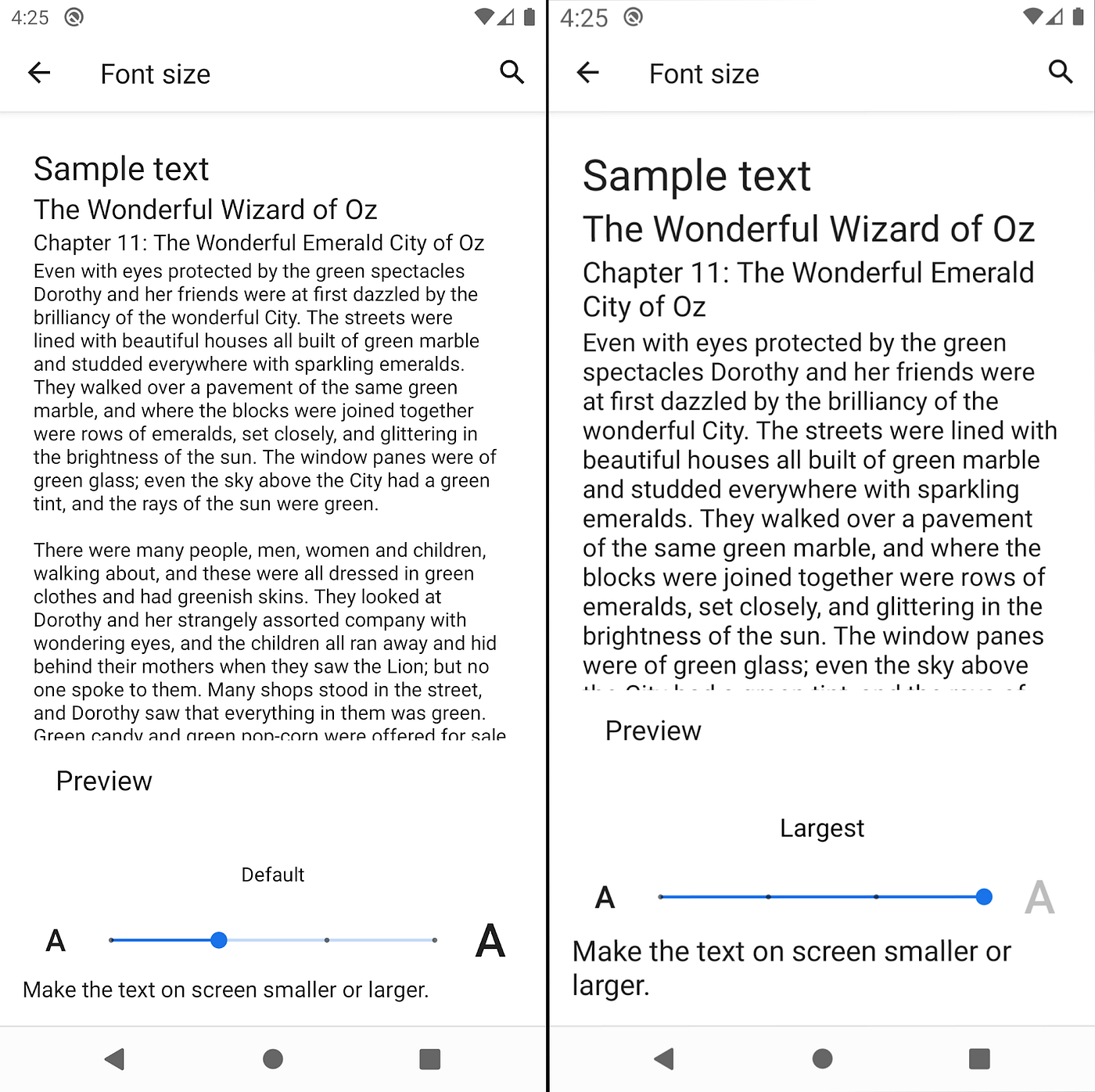
Fix: Aim for a line height between 1.5–1.8 and keep lines around 70 characters on mobile. Then use clamp() for beautifully fluid, scalable typography that grows smoothly with the viewport.
Relying only on @media (max-width: …) queries forces you to constantly override desktop styles and bloat your CSS. It also almost guarantees a sub-par experience on the smallest screens.
Fix: Flip the script with true mobile-first responsive design. Write clean base styles for phones first, then progressively enhance for tablets and desktops using (min-width: …) breakpoints.
Navigation menus, tooltips, and image zooms that only trigger on :hover simply don’t translate to touch. They become effectively invisible to the 60 %+ of users browsing on phones and tablets.
Fix: Design every interaction to work with touch or click first. Then layer in hover enhancements as progressive enrichment with @media (hover: hover). It gives desktop users extra polish without ever breaking the core experience.
Launching a site without <meta name="viewport" content="width=device-width, initial-scale=1"> forces phones to render the page at 980 px and zoom out. That makes everything look tiny and almost impossible to use.
Fix: Add the correct viewport tag to the <head> of every single page. It’s one line of code that prevents 90 % of mobile layout disasters.
Chrome DevTools is great for quick checks and debugging layouts. But it can’t replicate real-world touch latency, GPU differences, network throttling, or how far a user’s thumb actually reaches.
Fix: Build a small device lab or use BrowserStack/LambdaTest throughout the project. One round of real-device testing will reveal issues no emulator ever shows.
Throwing a 300 KB framework at the problem because “Flexbox is hard” turns a fast, flexible layout into a sluggish experience.
Fix: Master native CSS (Flexbox + Grid) first. Use JavaScript only for true enhancements, never as a crutch for basic responsiveness.
Treat every layout glitch as a chance to refine your craft, not a reason to panic. Build simple checklists and test early on real devices throughout the entire project. Keep designers, developers, and marketers aligned on how your site should feel on phones. Over time, responsiveness becomes a habit, not a final checklist item.
Start small: audit one key page, fix the most obvious friction points, then roll those learnings into your design system and future projects. When you do this consistently, you’re not just avoiding responsive design mistakes. You are building faster, friendlier experiences your users can trust on any device.