
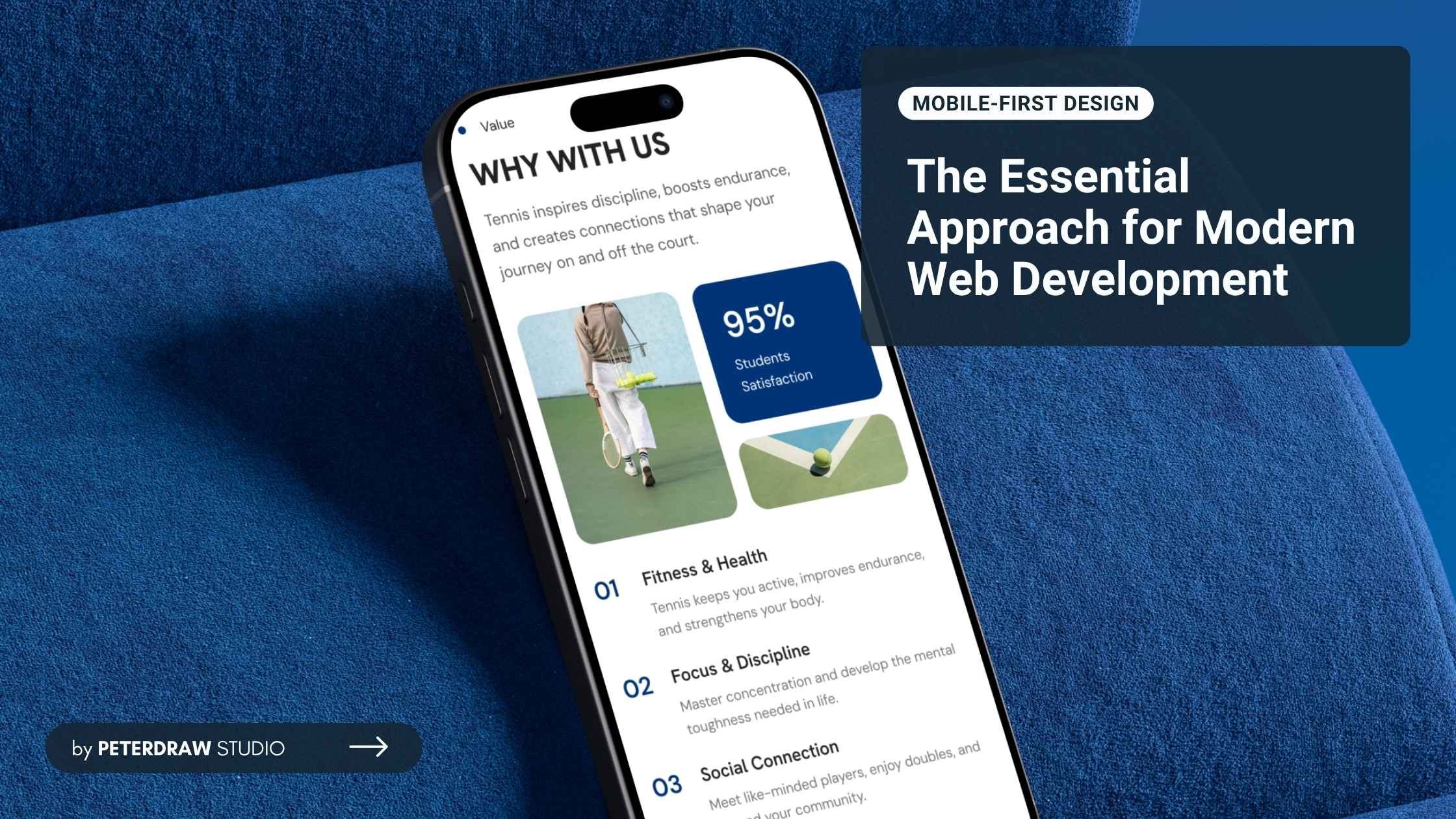
Web-Safe Fonts vs Google Fonts: Which One Should You Choose for Your Website?
Compare performance, design options, and expert tips to create fast, beautiful websites with perfect typography using Web-Safe Fonts vs Google Fonts.

Mobile devices now dominate global internet usage across nearly every region. Recent data shows mobile accounting for around 52-63% of web visits. StatCounter reports ~52% as of early 2026, while Statista noted peaks near 62-63% in 2025. Hence, adopting a mobile-first design strategy is essential today. It is no longer optional for creating fast, intuitive websites and apps that truly serve users on their phones.
Mobile-first design is a web philosophy focused on designing for small screens first. It prioritizes layout, content, and functionality for smartphones before larger devices. Designers then progressively enhance the experience for tablets and desktops. This approach reverses the traditional desktop-first method, which starts wide and scales downward.

The core idea is progressive enhancement, starting with a solid mobile foundation. It focuses on limited space, touch interactions, and variable network speeds. As screens grow larger, additional features and layouts are introduced. This approach keeps essential elements prioritized across every device.
Unlike purely responsive design, it does not shrink desktop layouts downward. Instead, mobile-first prioritizes mobile needs from the beginning. Responsive design reacts to screen size changes after desktop planning. Mobile-first remains strategic and user-centered for today’s majority audience.
As user behavior continues shifting toward mobile browsing, design priorities must adapt. Smaller screens now shape how people experience digital products daily. Mobile-first design directly responds to these usage patterns and expectations.
Starting with mobile constraints helps designers cut clutter and focus on essential content and features. This creates intuitive touch navigation, readable text, and fast interactions. The clean approach often delivers better experiences on desktops too, as excess elements are removed early.
Mobile-first encourages lightweight code, optimized images, minimal scripts, and efficient loading. Users on slower connections enjoy much faster pages, which lowers bounce rates. Research shows mobile-optimized sites load significantly quicker, leading to higher user retention across devices.
Since 2018, Google has applied mobile-first indexing, meaning it primarily crawls and ranks the mobile version of your site. A strong mobile-first design aligns perfectly with Core Web Vitals (speed, interactivity, visual stability). It boosts search rankings, visibility, and organic traffic in a mobile-dominated search landscape.
Mobile-friendly experiences reduce abandonment, increase click-throughs, and boost conversions. As mobile commerce keeps growing, seamless phone interfaces drive more purchases and actions. Users engage longer and convert better when sites feel natural on their primary device.
Progressive enhancement builds a strong mobile base first, then adds desktop features without breaking the foundation. This method creates flexible, maintainable code that easily adapts to new devices, screen sizes, and future design trends.
Prioritizing mobile essentials from the start minimizes unnecessary features and reduces costly rework later. Teams build upward progressively instead of retrofitting desktop designs for smaller screens. It results in cleaner code, shorter timelines, and more efficient budgets overall.
Implementing mobile-first design requires thoughtful planning and clear priorities. Teams must align layout, content, and performance with real user behavior.
Identify must-have elements: key messages, calls-to-action (CTAs), navigation, and core features. Use a content hierarchy that works on small screens; headlines first, supporting details next. Eliminate non-essential elements early.
Use finger-friendly elements: buttons at least 44x44 pixels, ample spacing to avoid mis-taps, and gesture support (swipes, pinches). Avoid hover effects (not reliable on touch) and favor tap targets.

Compress images, use modern formats (WebP), lazy-load off-screen content, minify CSS/JS, and leverage browser caching. Aim for load times under 3 seconds on mobile networks.
In CSS, apply a mobile-first approach with min-width queries:
/* Base mobile styles */

body { font-size: 16px; }


@media (min-width: 768px) {

/* Tablet enhancements */

}


@media (min-width: 1024px) {

/* Desktop additions */

}
This builds progressively without overrides.
Use hamburger menus, bottom navigation bars, or collapsible sections for small screens. Ensure one-handed use is possible.
Prototype on real devices, use tools like Google's Mobile-Friendly Test, and gather user feedback. Test across iOS/Android, various network speeds, and orientations.
Ensure sufficient contrast, alt text for images, keyboard/touch navigation, and screen reader compatibility from the mobile base.
Provide core functionality without JavaScript first, then layer on enhancements. This ensures graceful degradation on low-end devices.
Implementing mobile-first design brings great benefits, but teams often face hurdles. One key challenge is expanding complex desktop features later. Starting with a minimal mobile version can make it feel restrictive when adding multi-column layouts, rich interactions, or data-heavy elements for larger screens, potentially leading to long scrolling pages or diluted user experiences on desktops.
Another common issue is resistance from teams or stakeholders accustomed to desktop-first workflows. Many organizations still begin with elaborate desktop designs and then adapt downward. Shifting to mobile priority requires changing mindsets, especially when desktop users remain important or projects involve intricate interfaces better suited to big screens.
To address these challenges effectively, start with small pilot projects or single-page redesigns to prove the approach works. Educate stakeholders using current mobile traffic statistics (especially high in regions like Indonesia) and real case studies showing gains in speed, SEO, and conversions. Adopt consistent design systems and conduct regular cross-device testing to maintain quality and adaptability.
Mobile usage keeps rising steadily across every region, industry, and user group. Digital products must evolve to fit smaller screens, touch interactions, and on-the-go habits. By prioritizing speed, clarity, and simplicity from the start, mobile-first builds experiences that stay relevant and effective for years to come.
Whether you're redesigning an existing website or launching a new project, begin with mobile in mind. This strategic choice ensures you reach users where they spend most of their time, on phones during commutes, breaks, or daily routines. It leads to better engagement, higher retention, and stronger overall digital performance.
Adopting mobile-first design isn't just about following trends. It is about future-proofing your work. By making smarter content choices and focusing on core functionality early, you create cleaner, more adaptable products. In a phone-dominated world, this mindset delivers sustainable growth and meaningful results for both users and businesses alike.