
Vibrant Color Palettes in Web Design: Ideas, Tips, and Color Recommendations
See how vibrant color palettes bring energy, clarity, and a more engaging look to modern websites.

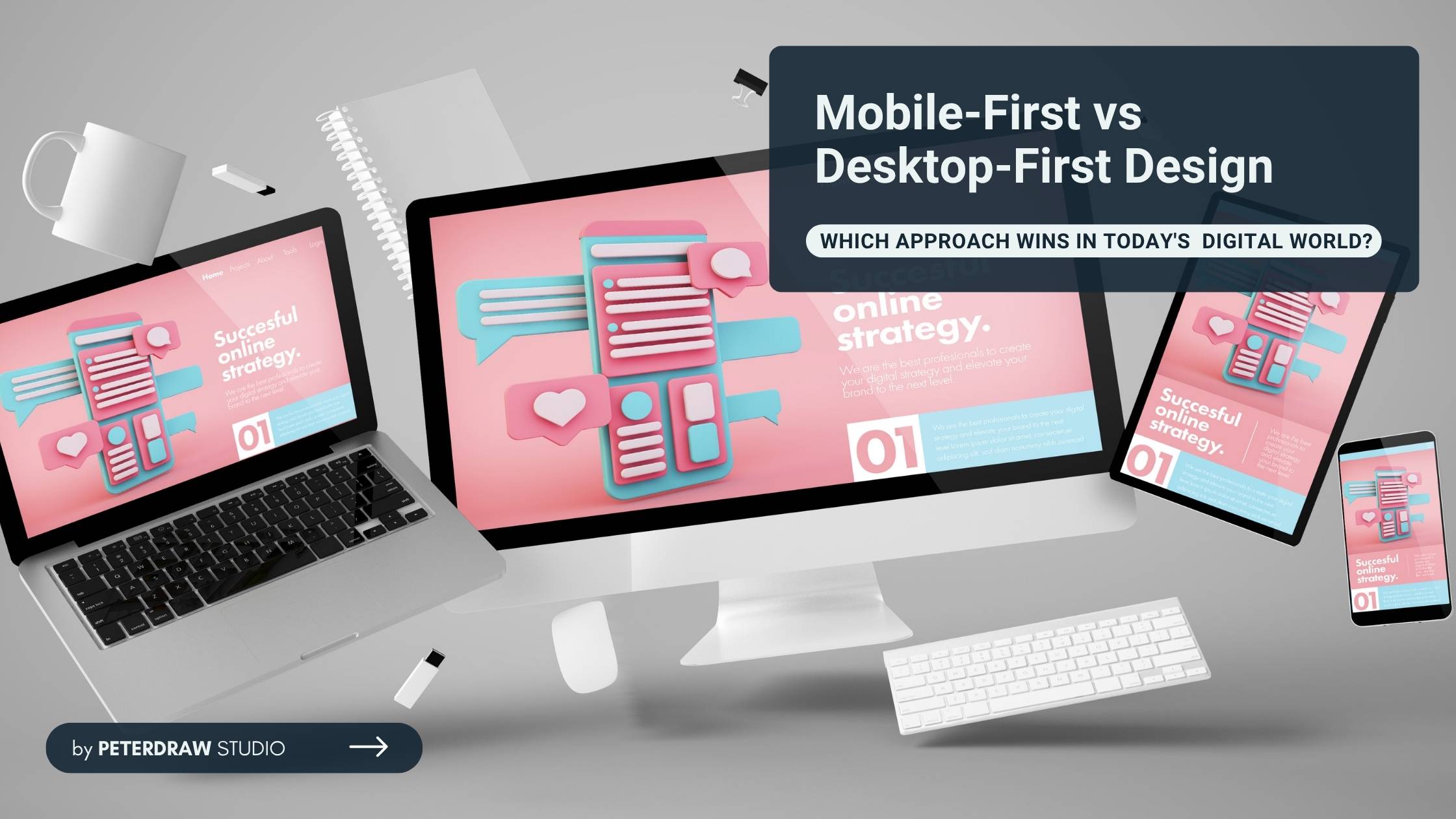
People browse on smartphones during commutes, tablets at home, or desktops for work. With those facts, where should designers start building a website? Mobile first or desktop first? This common question challenges modern web designers and developers. It fuels the ongoing debate of mobile-first vs desktop-first design. The choice greatly impacts user experience, site performance, and SEO rankings.
These two strategies reflect different philosophies in responsive web design. One approach prioritizes small screens first and builds upward. The other begins with large layouts and scales designs down for smaller devices. Understanding these differences helps businesses and developers create better user experiences, improve performance, and support stronger search rankings.
Mobile-first design flips the traditional web design process. Designers start by building websites for the smallest screens, usually smartphones. They focus on essential content, clear navigation, and fast loading performance. This approach ensures the experience works smoothly before expanding to larger devices.

Once the mobile version is stable, designers progressively enhance layouts for larger screens. Additional visuals, features, and layouts appear for tablets and desktops. In CSS, base styles target mobile devices first. Media queries using min-width then introduce rules for larger viewports.
Advantages:
Disadvantages:
Desktop-first design represents the traditional approach to responsive web design. Designers begin by creating layouts for large desktop or laptop screens. These designs often include multiple columns, hover interactions, and visually rich elements. The layout takes advantage of wide screens and powerful devices.
Developers later adapt the design for smaller screens using responsive techniques. Elements may be hidden, stacked, or simplified for better mobile usability. In CSS, base styles usually target larger screens first. Media queries using max-width adjust layouts for tablets and smartphones.
Advantages:
Disadvantages:
Both approaches aim to create responsive websites, but they follow different design philosophies. The main difference lies in how the design process begins and scales across devices. One approach starts small and expands, while the other begins large and adapts downward.
No matter which strategy you pick in the mobile-first vs desktop-first design debate, success depends on careful planning and attention to several factors. Here are the main things to watch for:
Always start with analytics (e.g., Google Analytics). Check mobile vs desktop traffic percentages, user locations, and behavior patterns. In early 2026, global mobile traffic ranges from 51-64% often higher in Asia and Africa.
If mobile dominates (60%+ in many cases), prioritize mobile-first to match how people actually access your site. Ignoring data risks building for the wrong primary device.
Focus on what’s essential, core message, key CTAs, and must-have info. Mobile-first naturally forces this due to limited screen space, leading to cleaner sites overall. In desktop-first, actively review and cut non-essential elements when scaling down to avoid bloated, cluttered mobile versions that hurt usability and speed.
Mobile users often deal with slower connections and data limits. Build lightweight code, optimize images, use lazy loading, and minimize requests early, especially in mobile-first. Test with tools like PageSpeed Insights. Poor performance kills engagement faster on phones than desktops, impacting conversions and SEO.
Make elements thumb-friendly (buttons ≥44×44 pixels, good spacing, avoid hover-only features). Place key actions in easy-reach zones (bottom of screen on mobile). In desktop-first projects, carefully translate mouse-based interactions (e.g., hover menus) to touch equivalents to prevent frustration. Test on actual devices, not just emulators.
Don’t rely solely on browser tools, use real phones, tablets, and monitors. Cover common breakpoints (e.g., 320–480px mobile, 768px tablet, 1024px+ desktop), orientation changes, slow networks (3G throttling), and accessibility (contrast, screen readers). For mobile-first, ensure progressive enhancements don’t break core functionality; for desktop-first, watch for hidden or degraded mobile elements.
Choose a mobile-first approach when your audience mainly uses smartphones. This is common for e-commerce platforms, news websites, blogs, and social platforms. It also works well when speed and accessibility are important priorities.
Mobile-first is ideal when building a new website or redesigning an existing one. The approach encourages better performance and simpler user experiences. Today, it has become an industry standard for modern web design.
Desktop-first design can still make sense in certain situations. It works well for tools mainly used on office computers. Examples include enterprise software, data-heavy dashboards, and professional creative platforms.
You may also consider desktop-first if analytics show strong desktop traffic. Some projects require complex desktop interactions that are difficult to adapt for mobile. Even then, many experts recommend maintaining a mobile-first mindset for better content prioritization.
In the end, the choice between mobile-first and desktop-first depends on your users and goals. Data shows most people start on phones today. Starting small builds cleaner, faster sites that work everywhere. Testing and prioritizing content make any approach stronger.
The mobile-first vs desktop-first design debate has a clear winner for most projects. Mobile-first delivers better speed, stronger SEO, and happier users across devices. Unless your audience lives on desktops, embrace mobile-first. Build for today’s reality and prepare for tomorrow’s web.