
Bold Typography: Mastering Impactful Design for Maximum Engagement
Master bold typography with expert tips on where to use it, the best font recommendations, plus practical techniques to make your designs more impactful and memorable.
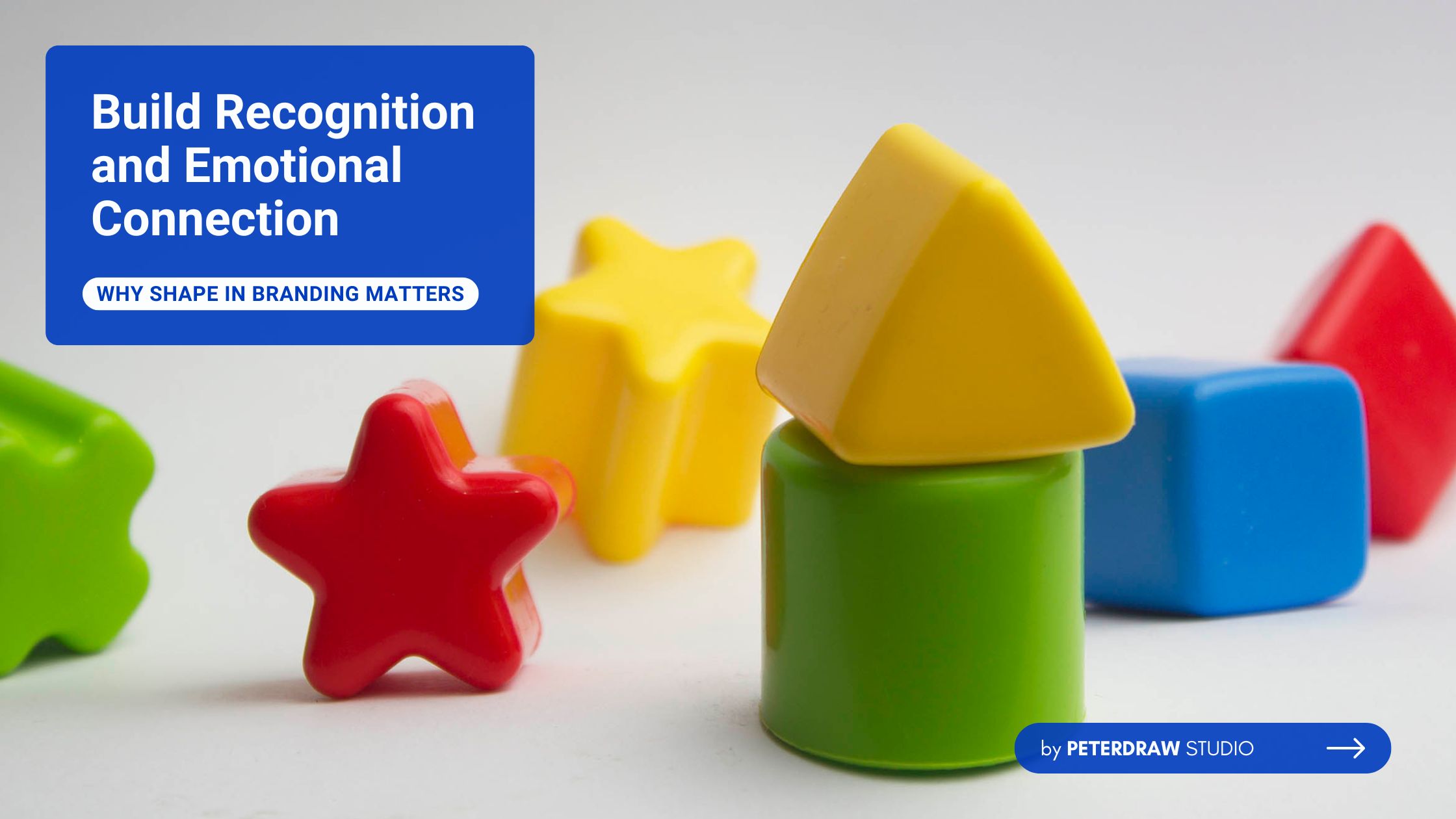

Shape in branding is essential for shaping consumer perceptions and connections. It refers to the deliberate use of circles, squares, triangles, and other forms. These shapes appear in logos, packaging, and brand identities to communicate meaning. Our brains instinctively react to shapes, associating them with trust, safety, innovation, or strength. This makes a shape in branding, both aesthetic and psychological in impact.
Beyond visual appeal, shape in branding builds recognition and brand memorability. A carefully chosen shape ensures logos become instantly recognizable and distinct worldwide. Shapes also help packaging stand out among countless competing options on store shelves. Consistency in shape reinforces identity across platforms and marketing channels. When applied strategically, shapes strengthen brand messages while resonating with audiences more effectively over time.
The foundation of shape in branding lies in the study of shape psychology. This field explores how geometric forms naturally trigger subconscious human responses and emotions. People process shapes more quickly than colors or words, enabling instant visual communication. Shapes create associations from real-world experiences: circles suggest harmony and eternity, while squares symbolize structure, stability, and security in branding.
This psychological impact is backed by studies, such as one from Psychological Science, which found that rounded logos evoke "softness," portraying a company as caring and sensitive. In branding, this translates to emotional connections; shapes can make a brand feel friendly or authoritative without a single word. For example, curved shapes add rhythm and happiness, often linked to waves or motion, fostering positive emotions.
Strategically, incorporating the psychology of shapes in branding for business success creates differentiation. In competitive markets, shapes provide an immediate way to establish recognition and trust. Tech-focused brands often adopt abstract shapes to inspire creativity and innovation. Meanwhile, wellness companies prefer organic forms that communicate comfort, care, and familiarity. This strategy strengthens brand messaging while ensuring visual elements consistently match brand narratives.
When it comes to shape in branding, each geometric form carries distinct connotations. Careful choices can strengthen identity and create meaningful, lasting connections. Let's break down the most common ones, with examples illustrating their application.
Circles are among the most versatile shapes in branding, symbolizing wholeness, unity, and stability. They evoke feelings of community and inclusivity, often associated with femininity and continuity, like the endless cycle of time or planetary orbits. Brands use circles to convey harmony and approachability, making them ideal for social or service-oriented companies.

A prime example is LG, whose red circle logo subtly forms a human face, suggesting approachability and global friendliness. Another is AUDI, defined by four interlocked rings that symbolize unity among its founding companies, blending heritage and modernity. Circles’ soft, continuous lines help these logos remain scalable and instantly recognizable across digital platforms.
Squares and rectangles exude strength, efficiency, and reliability, drawing from associations with structures like homes or safes. These shapes suggest order and professionalism, making them staples in finance and tech branding.

Microsoft's logo, with its dynamic square tiles, communicates dependability and innovation, enhanced by an edgy design. Dropbox also employs squares to evoke security, pairing them with blue tones for trust. In industries like real estate or news, these shapes ground the brand, signaling robustness and balance.
Triangles convey energy, power, and direction, often linked to science, law, or masculinity. Their orientation matters: upward-pointing triangles symbolize growth and momentum, while sideways ones indicate movement.
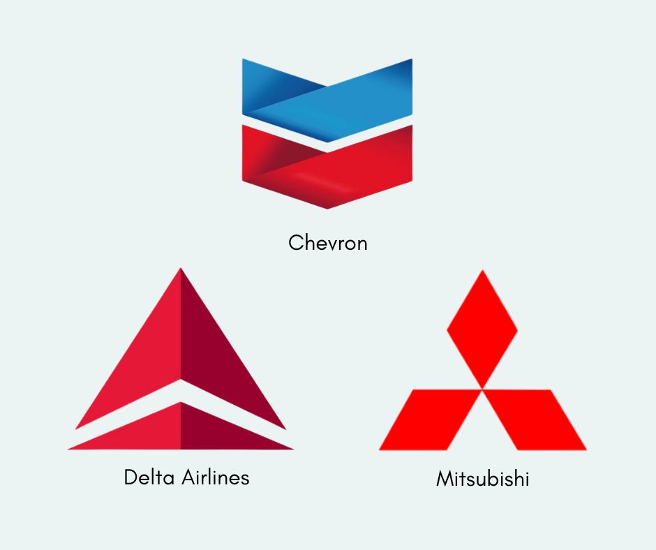
Mitsubishi’s iconic logo uses three red triangles to symbolize reliability, integrity, and success. Delta and Chevron incorporate triangles to show innovation and stability, as triangles show momentum, direction, innovation, and stability. This geometric form suits adventurous or tech brands, adding a distinctive edge that captures attention and communicates forward-thinking values effectively.
Curved shapes introduce motion, joy, and femininity, often seen in entertainment or food branding. Spirals, rarer, represent growth and hypnosis, ideal for wellness.
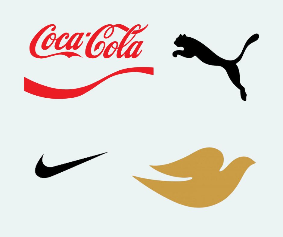
Coca-Cola's wavy script embodies happiness and rhythm, building personal connections. Organic shapes, mimicking nature, offer comfort, think Puma's leaping cat or Dove's bird form. These fluid forms humanize brands, enhancing relatability. Abstract shapes, like Nike's swoosh, blend elements for intrigue, symbolizing speed and motivation.
"Nike’s success is rooted in their recognizable brand identity, which strengthens their brand equity in the mind’s of consumers." - Wix
In today’s digital world, shape in branding must adapt to multiple platforms and screens. Logos need to remain clear and recognizable, whether on a smartphone app, social media profile, or website favicon. Simplicity and scalability are key, as overly complex designs lose impact on smaller displays. The shift toward flat design and minimalism reflects this necessity, ensuring brands remain consistent, modern, and effective in digital spaces.
Selecting shapes requires introspection: start with your brand's personality and audience. For stability-focused brands, squares work wonders; for creative ones, curves or abstracts shine. Considering cultural contexts, shapes like stars may have varying meanings globally.
Test designs through surveys to ensure scalability across various media. Combine with colors and typography for synergy, and avoid complexity to maintain impact. By focusing on "how shapes influence brand perception," you can craft a cohesive identity that resonates.
While shapes are powerful tools, misuse can weaken a brand’s identity. To maintain impact, businesses should avoid these common mistakes:
Shape in branding is more than design; it's a strategic asset that taps into human psychology for profound impact. From circles fostering unity to triangles driving innovation, the right forms can elevate your brand's story. As trends evolve, embracing the psychology of shapes in branding ensures relevance and connection. Invest in thoughtful geometry, and watch your brand geometry transform perceptions and loyalty.

