
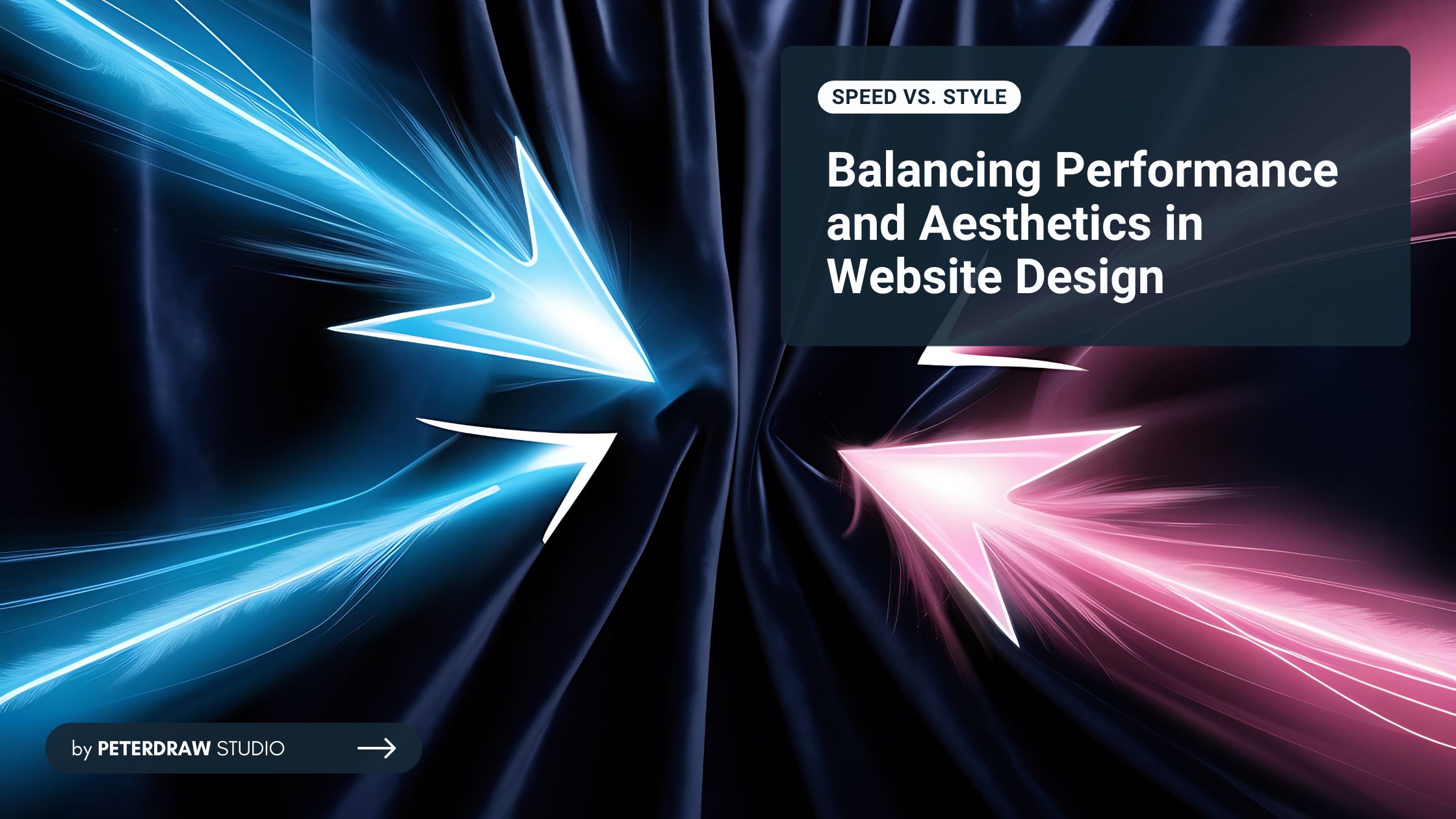
Bold Typography: Mastering Impactful Design for Maximum Engagement
Master bold typography with expert tips on where to use it, the best font recommendations, plus practical techniques to make your designs more impactful and memorable.

In the competitive realm of web development, the debate over speed vs. style defines how designers craft user experiences. Website speed ensures fast load times and smooth interactions, critical for retaining users and boosting SEO rankings. Style, on the other hand, captivates with visually stunning designs and brand-aligned aesthetics that drive engagement. Can you achieve both without compromise?
Fast-loading websites retain users and rank higher on search engines. According to web.dev, "Websites that load quickly and respond to user input in a timely fashion engage and retain users better than websites that are slow to load." Slow sites frustrate visitors, leading to high bounce rates. Google's algorithms favor faster pages in search rankings, meaning poor performance can bury your site in obscurity.
Google’s Core Web Vitals, metrics like Largest Contentful Paint (LCP), First Input Delay (FID), and Cumulative Layout Shift (CLS), set benchmarks for speed. An LCP under 2.5 seconds is ideal, yet many sites struggle due to unoptimized elements. Mobile users, who make up over 50% of web traffic, demand speed vs. style solutions that prioritize performance. Speed also enhances accessibility for users on slower connections, making it a cornerstone of inclusive design in this debate.
While speed gets users through the door, style keeps them inside. A visually appealing website builds credibility, emotional connections, and user trust. Think of Apple’s sleek minimalism or Airbnb’s immersive photo galleries. These designs aren’t just attractive; they reinforce brand identity, guide user journeys intuitively, and improve engagement. This demonstrates the power of style in modern website design for business growth.
Style encompasses color schemes, typography, animations, and responsive layouts across devices. Effective style enhances user experience by making navigation effortless and content digestible. Micro-interactions, such as hover effects, delight users and increase engagement. They also reduce perceived wait times, improving overall satisfaction. These elements work together to elevate performance and strengthen the impact of speed and style.
However, style without restraint can bloat a site. High-resolution images, complex JavaScript animations, and custom fonts add flair but increase file sizes, clashing with speed goals. The key in speed vs. style is intentional design, using aesthetics to complement functionality, not overshadow it. Tools like Adobe XD or Figma allow prototyping stylish interfaces while considering performance implications early.
The speed and style conflict often stems from resource-intensive features. For instance, embedding videos or parallax scrolling effects can make a site visually dynamic but slow it down if not optimized. Inline styles versus external CSS files is a classic debate. Inline styles might render faster initially but hinder maintainability, while external files cache better for repeat visits. Yet, for large sites, external CSS promotes cleaner code and easier scaling.
"The page will load faster if you use inline styles vs style sheets. In some cases much faster." - Stack Overflow
Another pitfall is over-reliance on third-party plugins or frameworks. WordPress themes packed with features can dazzle but inflate load times. Balancing this requires auditing: Does that fancy slider justify the extra 500ms? User testing reveals these trade-offs, eye-tracking studies show stylish elements draw attention, but if they cause delays, frustration ensues.
In speed vs. style, neglecting either leads to pitfalls. A blazing-fast but bland site feels utilitarian and forgettable, while a gorgeous but sluggish one drives users away. The sweet spot? Sites that load in under two seconds while delivering polished visuals, as emphasized in optimization guides.
Achieving balance between speed and style isn’t impossible. With thoughtful strategies, websites can remain visually compelling while performing efficiently. Every decision, from image compression to coding techniques, shapes user experience. Here are some strategies you can follow to balance the website’s speed and keep up the appearance.
Balancing speed vs. style isn’t just theoretical. Real companies have tested these trade-offs in practice. These examples show how brands achieve performance gains without sacrificing visual appeal when style-heavy features backfired.
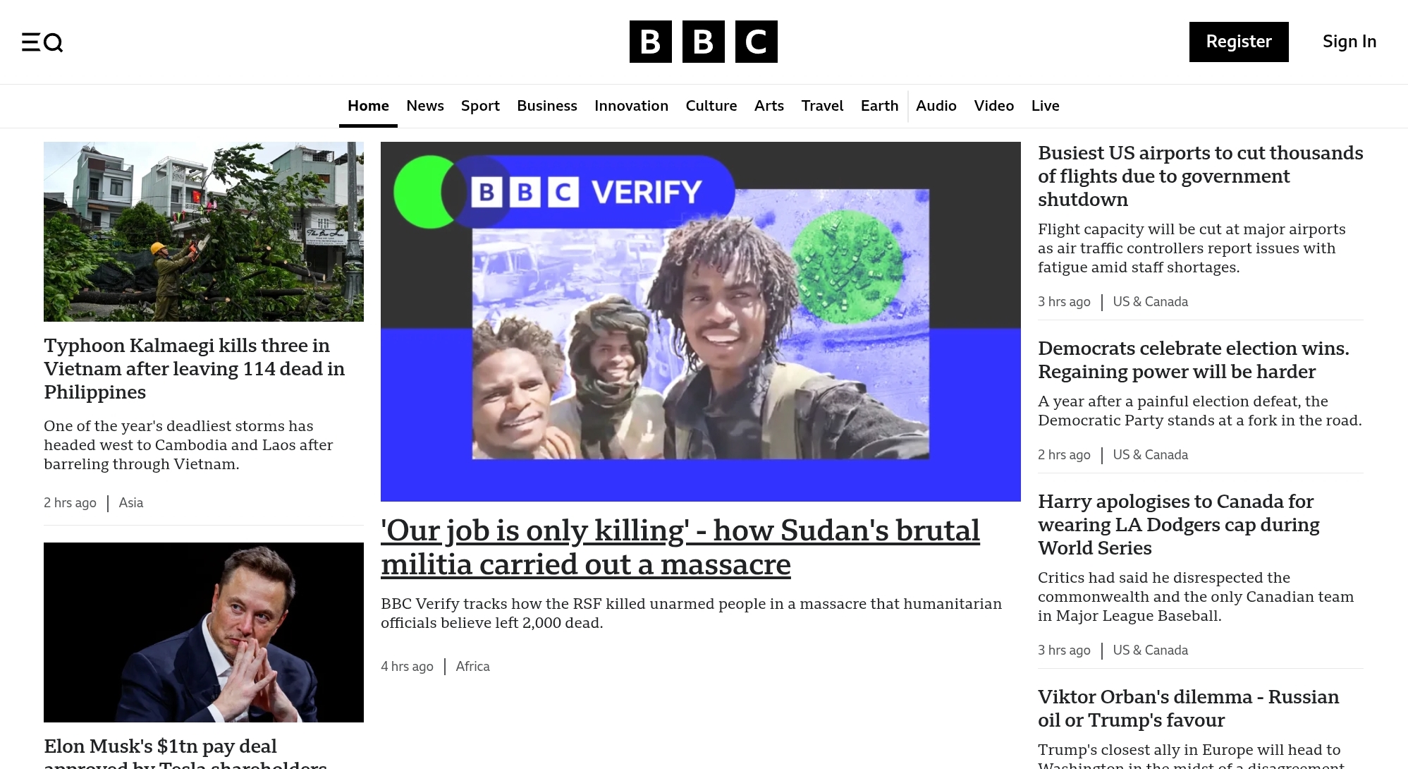
The BBC’s website redesign proves that speed and style can coexist. By simplifying layouts, compressing assets, and using lazy loading, they achieved up to 50% faster load times. Importantly, their clean, journalistic aesthetic remained intact, showing how thoughtful design choices can deliver speed improvements while preserving brand credibility and style.
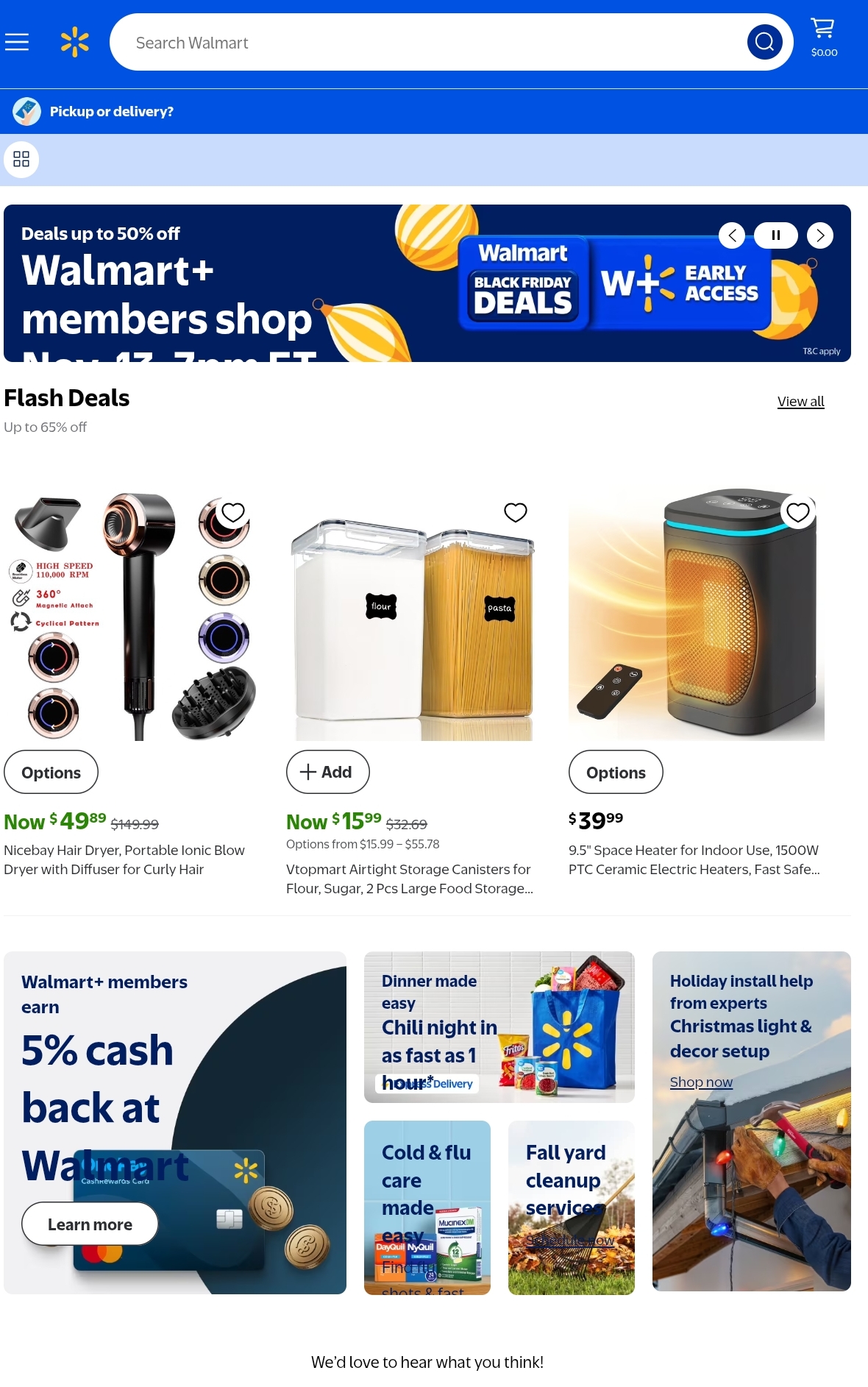
Walmart’s e-commerce optimization highlights the measurable value of speed. Reducing load times from 7.9 to 2.9 seconds led to a 2% conversion increase for every second saved. Even small changes mattered, shaving just 100ms boosted revenue by 1%. Walmart’s case demonstrates how performance improvements can significantly impact business success while maintaining a vibrant, style-driven product display.
Some fashion websites show what happens when style outweighs speed. Heavy animations, oversized images, and complex scripts can create dazzling visuals, but they often drive users away due to long load times. This illustrates the risk of prioritizing aesthetics over performance; style can attract, but if paired with poor speed, it quickly repels.
In the ongoing debate about website performance and aesthetics, the true winner is always the user. A site that loads swiftly and looks inviting maximizes engagement, SEO, and ROI. As Cornish Hue puts it, "Explore how website speed and design impact user experience and sales, and discover effective strategies to optimise both for better conversions." By integrating optimization from the design phase, developers can avoid retrofits and create enduring digital experiences.
Looking ahead, with AI-driven tools and 5G proliferation, achieving this balance will become easier. But the principle remains: Test rigorously, iterate based on data, and remember that great design serves speed, not competes with it. Mastering speed vs. style isn't optional; it’s essential for standing out in a crowded online space.