
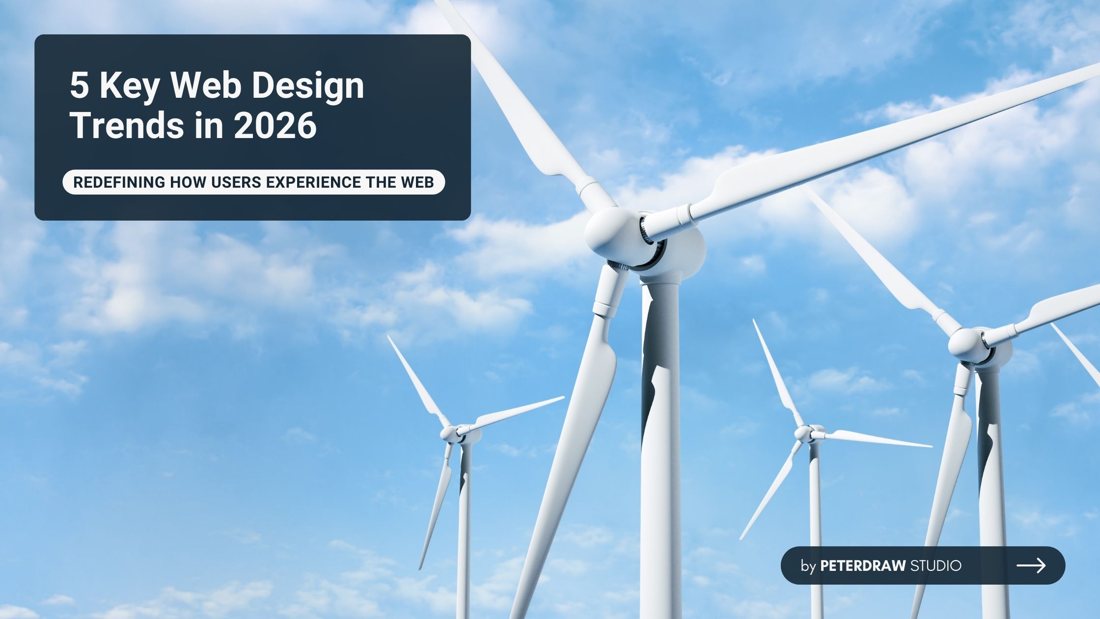
Bold Typography: Mastering Impactful Design for Maximum Engagement
Master bold typography with expert tips on where to use it, the best font recommendations, plus practical techniques to make your designs more impactful and memorable.

Simply being unique and eye-catching no longer suffices for a truly successful website. Today's designs demand bold creativity paired with user-centric focus and top-tier performance. Yet true excellence also requires ethical responsibility. That is why web design trends in 2026 are fully embracing this complete picture.
In 2026, web design strikes a fresh balance between playful experimentation and enduring efficiency. Here, we focus on five trends, each highlighting how designers are reimagining interfaces to be more engaging, responsible, and distinctive.
Navigation is a crucial feature on any website. That's why most designs have stayed simple, familiar, and easy to find. However, traditional menus are fading in favor of creative, immersive alternatives. That's what makes experimental navigation one of the standout web design trends in 2026, definitely worth trying.
This trend transforms navigation from a basic utility into an engaging storytelling element. Designers use radial menus, interactive hotspots, and morphing cursors to reveal content dynamically. Content unfolds through user choices, replacing rigid, link-based navigation structures. The result is discovery-driven, immersive experiences that turn browsing into true exploration.
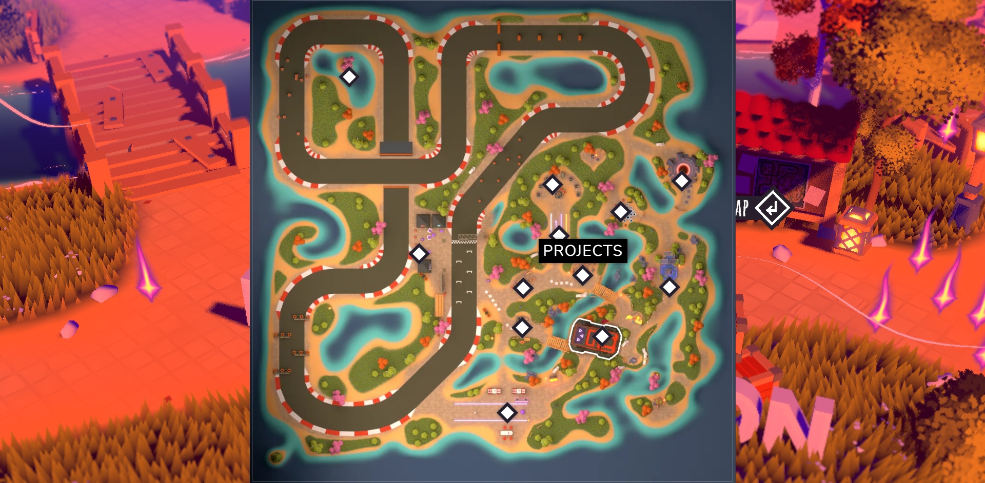
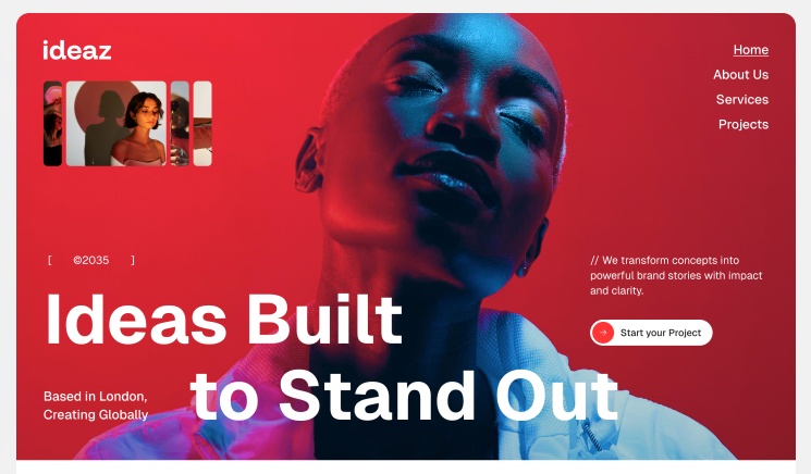
Standout examples include Bruno Simon’s iconic portfolio, a playable 3D world where users drive to explore projects. Sites with tactile unfolding panels like those in creative agency showcases, for seamless, non-traditional flow. Next is Ideaz, Peterdraw Studio’s Framer template, which features bold hero sections and expressive navigation. Balanced with clear cues and fallbacks, this approach boosts engagement, dwell time, and brand recall.
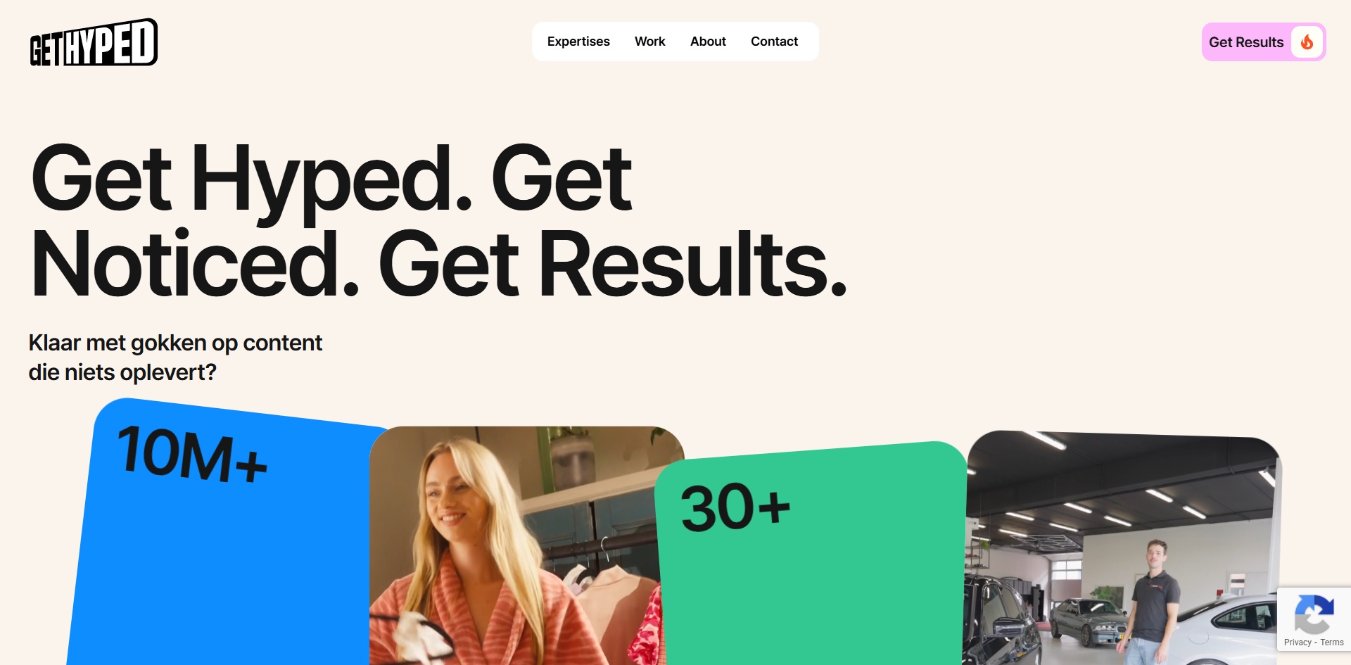
Card-based designs have long been reliable for organizing content clearly and responsively. That's why they've stayed a go-to choice, scannable, mobile-friendly, and straightforward. Today, cards are evolving with more personality, moving beyond rigid grids to feel warmer and more inviting.

In 2026, this trend brings playfulness through rounded corners and subtle hover animations. Asymmetric layouts and stacking effects add motion, making interfaces feel dynamic and approachable. Interactive transitions guide attention without overwhelming the experience. Often paired with bento grids, content is organized into modular blocks with a clear visual hierarchy.
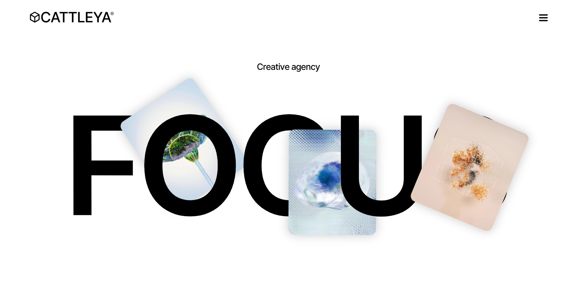
veral Webflow designs already embrace this approach, including Nexacore and Cattleya, which feature modular cards with organic flow and tactile character. Get Hyped adds playful card interactions that bring visual energy. Paired with responsive design and performance tuning, this style improves clarity and engagement. This design is well-suited for creative sites, e-commerce, blogs, and service pages.
Efficiency and speed have always mattered for user satisfaction and SEO. That’s why lightweight, optimized sites remain essential. As awareness of the internet’s environmental impact grows, designers now prioritize lower energy use alongside performance. It’s no longer just about design themes or business fields, but also our responsibility to create more eco-friendly digital experiences.
As a 2026 web design trend, it focuses on lean code, compressed images, and minimal heavy animations. Lazy loading, dark mode defaults, and green hosting further reduce resource usage. It also ties into ethical practices like better accessibility and avoiding manipulative patterns. The result is faster-loading, low-carbon sites that perform well while signaling responsibility.
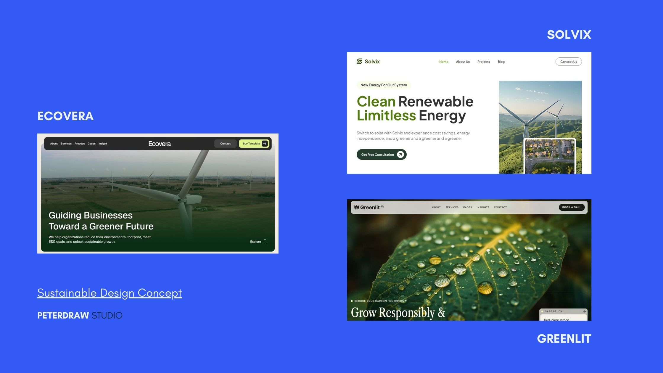
Many designers have applied this sustainability concept to their products, as does Peterdraw with Solvix. Other designs, including Ecovera and Greenlit, are all available in Webflow. They showcase eco-focused brands with clean aesthetics, minimalistic layouts, and optimized assets to minimize digital footprint. For maximum results, combine with strong visuals and functionality to improve rankings, user experience, and brand trust.
Subtle depth effects like blur and transparency have helped create focus in interfaces for years. That's why glassmorphism stuck around, elegant and modern. Over the year, it is maturing into more dynamic forms with adaptive, fluid qualities. Glass variation, especially liquid glass, evolves static transparency into responsive surfaces that shift with context and motion.
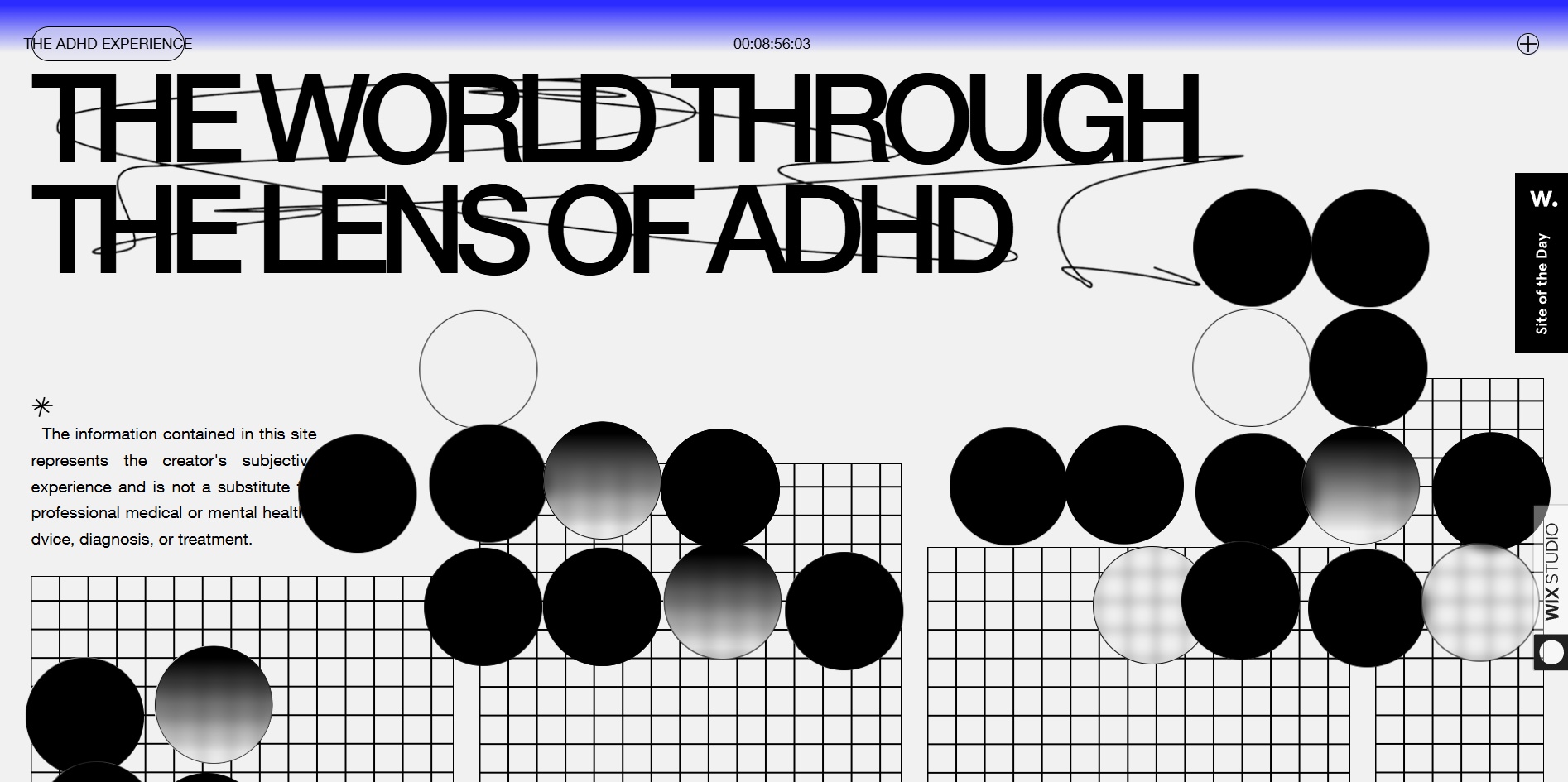
This evolution builds on classic glassmorphism with responsive blurs, refractions, layered opacity that shifts with light or interaction, and subtle animations for a sense of materiality. Often seen in overlays, cards, nav elements, and dark-mode UIs, it adds a sophisticated dimension without clutter. Influenced by advancements like Apple's Liquid Glass aesthetics, it feels premium and futuristic yet performant.
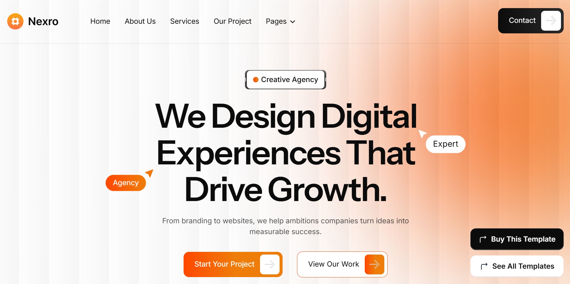
ADHD Experience demonstrates layered glass effects for immersive depth. Other examples are templates from Webflow, Nexro, and Axiolance. They feature polished frosted panels and dynamic translucency for elegant hierarchy in creative and SaaS contexts. Although not all industries can apply this effect, this trend is ideal for apps, portfolios, and brands seeking refined depth.
In an era of AI-smoothed minimalism, users increasingly crave authenticity, transparency, and human thoughtfulness. Blueprint Style emerges as a witty counter-trend to generic digital aesthetics. Inspired by schematics and instruction manuals, it playfully over-explains interfaces using lines, arrows, and labels. This approach conveys precision and trust, making complex products feel clearer and more approachable.
This style uses dotted lines, monospaced text, exploded views, and low-fidelity annotations in place of generic photography. These elements create informative, crafted visuals that feel intentional rather than decorative. The result is interfaces that feel engineered and thoughtfully made, valuing craftsmanship over surface shine.
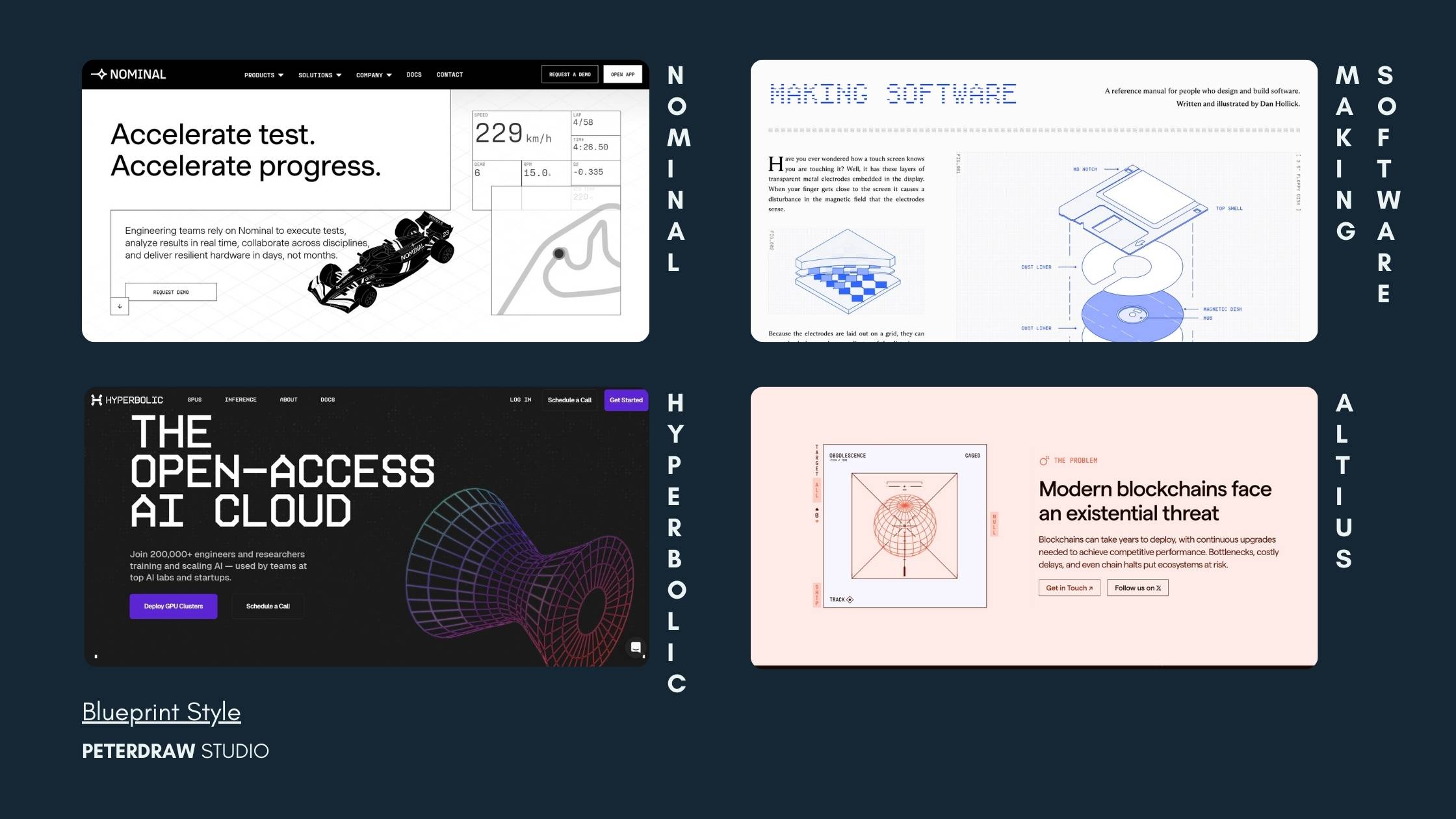
The Tech/SaaS/software industry commonly embraces this style, as seen in Nominal, Making Software, Altius, and Hyperbolic. These sites exemplify witty, detailed diagrams that break down complexity with precision. Balanced with readable typography and strong hierarchy, the approach communicates deep expertise and authenticity, perfect for brands seeking a raw, informative edge over generic polish.
Adopting these trends doesn't require a full redesign. Start smart to maximize impact while keeping things user-friendly and performant. Here are actionable ways to weave them in effectively.
Rather than chasing novelty, web design trends in 2026 encourage meaningful experimentation. Designers are empowered to question defaults, refine interactions, and build experiences that respect users and the planet. The future belongs to teams willing to design bravely, while staying grounded in usability, ethics, and performance.

