
Bold Typography: Mastering Impactful Design for Maximum Engagement
Master bold typography with expert tips on where to use it, the best font recommendations, plus practical techniques to make your designs more impactful and memorable.


Website navigation is the foundation of a seamless digital experience. It includes menus, links, and pathways that guide users through your site. Clear navigation helps visitors find information quickly and easily. If users get lost, they’ll likely leave. That’s why mastering website navigation is vital for engagement and visibility.
A well-structured site makes users stay longer and interact more. In today’s fast-paced digital world, intuitive design builds trust. To achieve it, you have to learn more about the navigation. It includes why navigation matters, discover key types and best practices, and learn how to avoid common mistakes while improving usability across devices..
A well-designed website navigation system is crucial for user experience (UX). When visitors can move effortlessly from one page to another, they’re more likely to stay longer, interact with your content, and convert into customers. Clear navigation builds trust, reduces frustration, and encourages deeper engagement. According to Forrester Research, a strong UX can boost conversion rates by up to 200%, and intuitive navigation is a key part of that success.
From a search engine perspective, clear site structure helps crawlers index your content more effectively. Logical pathways improve discoverability and may lead to better visibility in search results. As highlighted in Google’s SEO Starter Guide, streamlined navigation supports both users and search engines in accessing valuable content.
Mobile responsiveness is another factor tied to navigation. With mobile usage surpassing desktop, adaptive navigation—like hamburger menus or collapsible tabs, ensures that visitors on any device can explore your site smoothly. Inconsistent or broken navigation can lead to high bounce rates, signaling poor quality to search engines.
Moreover, intuitive website navigation impacts first impressions. Users typically decide whether to stay on a site within a few seconds, and poor navigation can drive them away before they even start exploring. Clear labels, consistent layouts, and visual hierarchy help reduce cognitive load, guiding users to the right place with minimal effort.
Understanding the types of website navigation helps in designing an optimal flow for your audience. Each type serves a different function depending on the complexity and purpose of the site.
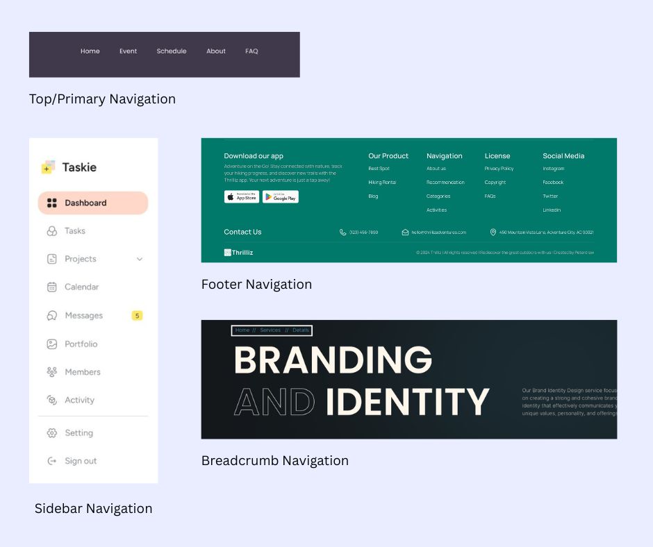
Choosing the right type or combination depends on your audience's needs and your website’s size. For example, a portfolio site may only need top and footer navigation, while a fashion retailer might benefit from mega menus and filters.
Crafting intuitive navigation means creating a clear path that supports user goals and actions. A user-friendly structure helps people find what they need without second-guessing. To implement best website navigation practices, consider the following actionable tips.
Limit top-level menu items to 5–7 to avoid overwhelming your visitors with options. Focus on the most essential pages like Products, About Us, or Contact.
Avoid ambiguous labels like “Stuff” or “More.” Use keyword-friendly, clear terms such as Our Services or Work With Us. This not only improves UX but also supports on-page SEO.
Navigation elements should appear in the same position across all pages of your website. Consistency builds familiarity, reduces friction, and improves overall navigation flow.
Ensure your site meets accessibility standards by including ARIA labels, keyboard-friendly navigation, and alt text for images. Accessible navigation makes your website inclusive for users with different needs.
Implement flexible layouts and use hamburger menus or collapsible accordions for smaller screens. Always test mobile navigation to ensure smooth usability across devices.
On content-heavy websites, a search bar offers a fast, direct way to find specific information. Make sure the search function is easy to locate and delivers relevant results.
Organize menu items in a clear order based on importance and user expectations. Place key pages like Shop or Pricing near the front to guide user actions.
Enhance usability with visual indicators like icons, arrows, or hover highlights. Visual cues make the navigation more intuitive and improve user confidence.
Use tools like heatmaps, A/B testing, and click tracking to gather real user behavior data. Testing reveals what’s working and what’s not in your navigation flow. Regular evaluation leads to informed improvements over time.
Align your navigation with the site’s sitemap to maintain internal structure and link consistency. A clear sitemap ensures all key pages are accessible and organized.
Avoiding common website navigation mistakes helps improve overall site usability. Even small errors can frustrate users and increase bounce rates. Clear, consistent navigation keeps visitors engaged and moving forward.
Take cues from well-established brands to build better navigation. These brands prioritize clarity, structure, and user-friendly design.
Tools like Google Analytics, Hotjar, or Crazy Egg can track user interaction with your navigation to pinpoint friction points or popular paths.
In essence, website navigation is a silent yet powerful tool shaping how users perceive and interact with your site. It drives engagement, supports SEO, and influences conversion. By understanding various navigation types, applying proven design practices, and learning from common missteps, you can craft a website that’s not only beautiful but functional and effective.
Prioritize simplicity, clarity, and accessibility. Whether you’re running a blog, a business site, or an online store, effective website navigation guides users toward meaningful interaction and ultimately, business success.