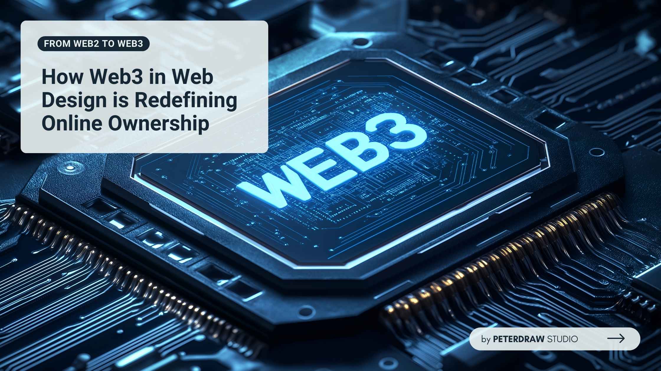
From Web2 to Web3: How Web3 in Web Design Is Redefining Online Ownership
See how web3 in web design blends blockchain, wallets, and UX to create secure, decentralized, user-first digital experiences.
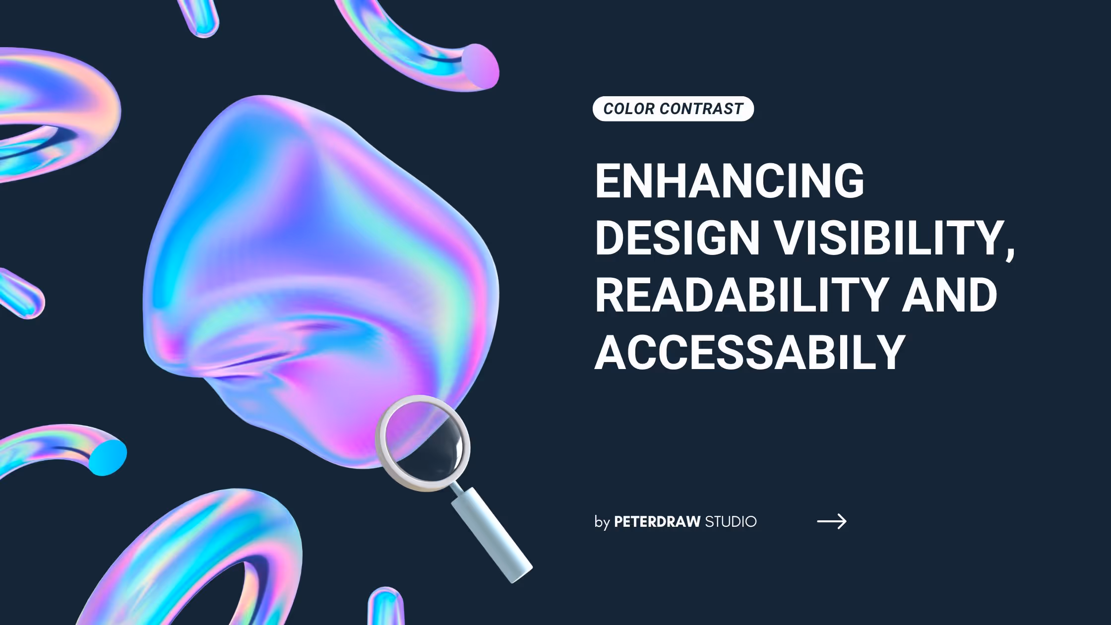

Creating a good and appealing contrast in a design needs a balanced combination of opposite elements. The most evident type of contrast is in color usage. Applying color contrast can enhance many aspects of the design, from readability to overall effectiveness.
Color contrast refers to the difference in light between two colors that makes them more or less distinguishable. The purpose of utilizing the contrast is to draw attention, group or separate elements, and enhance the overall aesthetic appeal and readability. As contrast may be a common practice in design, many still apply it inefficiently and excessively. It results in redundancy and discomfort for the audience.
To avoid redundancy that results in discomfort for the audience, a designer should pay attention to the key aspects of contrast. The key aspects include hue, value, and saturation. They create depth, focus, and visual interest to improve readability and aesthetic appeal.
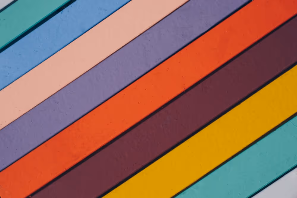
The most common practice of contrast in color is by applying a different color hue. It utilizes differences in color perception evident on the color wheel, like blue and yellow or red and green. Those colors are part apart from each other in the color wheel. They can create a striking contrast that contributes to the visual effect.
Colors have values that determine their lightness and darkness. Contrast can be achieved by adjusting color values by combining the lighter with the darker. Pairing black and white is the most stark and obvious value contrast. Or mixing a dark grey with a light, almost metallic silver will do the trick. All and all, value contrast can enhance the depth and dimension of a design.
If hue is about color perception and value is about lightness and brightness, saturation is about the intensity or purity of colors. The best use of saturation contrast is for drawing attention to specific elements in a design. Lime green and purple can be a good color combination. Another option is the vivid red and gray combination for a more vibrant and eye-catching design.
Color contrast indeed makes design elements different from each other. However, the purpose is not merely to look different. It’s about using those differences to enhance and elevate the design. Besides readability, contrast can influence mood and direct viewer attention. That is why understanding and applying color contrast effectively can lead to more engaging and successful designs. This is how you can do it.
Some designs have text or elements that should be easy to read and distinguish. They need high contrast for those purposes. In some cases, it also helps minimize eye strain, like applying black color for text on a white background. It has become very important, especially in web design and signage. Both of them need quick comprehension. So, visibility and readability is a must.
Different colors have different moods that can affect an audience emotionally. The right color contrast combination can be the best weapon to evoke a specific psychological reaction and set the mood of a design. Just take a look at the red and green combination. Their contrast is full of festivity and energy feeling, making them often used in holiday themes. A calm blue paired with a vibrant orange can be a good choice, too, to create a dynamic yet balanced atmosphere.
Guiding the audience in the right direction is another utilization of color contrast. This strategic use can direct viewers’ attention to substantial areas within a design. High-contrast areas naturally draw the eye, making them excellent places for important information or calls to action. That is why, marketing materials frequently use it since they focus on conversion and guiding the user journey through visual cues.
Applying color contrast in design requires more than just an understanding of which colors pop against each other. A designer must also consider the overall impact on the viewer and the functionality of the design. Following best practices can enhance both the aesthetics and usability of your work. Here are some points to ensure the contrast of colors meets both creative and practical needs.
Balance and Harmony – It’s important to find a balance that attracts the eye without overwhelming it. Ensure not to overly contrasting colors since it can be jarring and unappealing.
Accessibility – Contrast is not only for aesthetic reasons. It is for accessibility, too. It helps people with visual impairments distinguish elements on the screen.
Tools and Resources – Many helpful tools and resources are available today to help designers choose and test contrasts. So, designers can ensure any color they choose is visually appealing and functional.
In addition to visibility, readability, and accessibility, a good practice of color contrast helps build a design hierarchy. It emphasizes key elements, guiding the user’s focus to areas of importance. Effective contrast can also delineate sections within a layout, making the structure of the information clearer. It helps create an intuitive navigation path for the viewer, enhancing the overall user experience.
Effective color contrast elevates any design. It makes elements distinct and enhances viewer engagement. Properly applied, it ensures both beauty and functionality in design. Remember, thoughtful contrast makes your work stand out.
.jpg)