From Web2 to Web3: How Web3 in Web Design Is Redefining Online Ownership
See how web3 in web design blends blockchain, wallets, and UX to create secure, decentralized, user-first digital experiences.

Texture is an element that can add depth and dimension to a design. It usually imitates real material such as wood, rocks, sand, or other surface feel. One of these popular visual effects is grainy texture. What kind of texture is grainy? What is the best application of the texture? Let’s learn more about grainy texture for graphic design.
A grainy texture is a visual effect that incorporates small, irregular specks, particles, or noise into a design element or background. Just like any other texture, it mimics the look of natural surfaces. It may look like film grain, paper fibers, or sand. This visual effect can add not only depth but also warmth and tactile quality to the design.
Using grainy textures, such as grainy, can evoke a sense of authenticity, nostalgia, or ruggedness. They also help soften edges, create contrast, or add visual interest to otherwise flat or minimalistic designs. Applying textures like grainy makes the design more unique than others but keeps its simplicity without exaggeration element.
When using grainy texture for graphic design projects, a designer can choose one from many. Grainy textures are versatile, enhancing the visual appeal of designs since they can be used in various forms. Among the many grainy, here are the common textures for graphic design products.
Hearing the film’s grain texture may seem unfamiliar. However, this texture derives from mimicking the look of old film, often with a fine, even distribution of grain across the surface. Its use in a design is reminiscent of the noise found in vintage photography or cinematography.


Considering its characteristics, this grainy texture can evoke a nostalgic, retro, or cinematic feel. For its application, it’s commonly applied to photos, backgrounds, or entire compositions to add a timeless, analog quality.
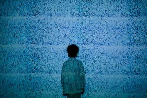
Unlike other textures that usually have the feel of a surface, noise texture is a digital texture. It adds randomized pixelation or grain to an image or design. The level of noise can vary from subtle to intense, affecting the overall sharpness and clarity.


In practice, this texture is often used to add subtle depth to flat designs, backgrounds, or gradients. Besides, it is also popular in UI/UX design. Its application creates a less sterile and more organic look.
Grunge is a grainy texture characterized by its rough, distressed, and worn appearance. To create this texture, designers can include elements like scratches, smudges, stains, and uneven surfaces. It creates an imperfect and raw aesthetic.
This texture evokes a sense of decay, chaos, or rebellion. It makes the texture popular in designs that require an edgy, urban, or alternative look. The texture also is particularly effective in conveying a sense of authenticity or rebellion. Any design that seeks to convey a gritty, underground, or nonconformist vibe will be suitable with this texture.
Halftone is part of the grainy texture for graphic design projects. It is derived from the traditional printmaking process where images are created using dots of varying sizes to simulate gradients and tones. The dots can create different effects depending on their arrangement, from subtle shading to bold graphic patterns.

The dots in halftone texture can bring a vintage, pop art, or comic book style. That is why this texture is suitable for any project with retro or artistic flair, whether in illustration or typography. Plus, its characteristics make it popular in editorial designs, posters, and branding.
One of the most common grainy textures is paper texture. The paper texture replicates the look and feel of different types of paper. It often includes subtle grain, fibers, creases, or imperfections that give a digital design a more tactile and realistic appearance. The textures can range from smooth and fine to rough and coarse, depending on the type of paper being emulated.
The most general use of the textures is in invitations, posters, packaging, and digital scrapbooking. In other words, any project that aims to mimic the appearance of printed materials or create a more organic, handcrafted feel will be suitable with the paper textures. It also goes well for branding projects where a rustic or vintage aesthetic is desired.
Like paper texture, sand texture can vary from very fine and subtle to coarse, but it is prominent, depending on the desired effect. The use of sand texture emulates the look of fine granules or grains of sand, creating a natural, earthy feel in the design. Its slight variations in shading and density can add depth and realism to the design.
Using sand texture will be effective in travel brochures, and nature-themed websites to evoke a natural, beachy, or desert-like atmosphere. It is also a good choice as background elements in designs that emphasize a connection to the outdoors or nature.
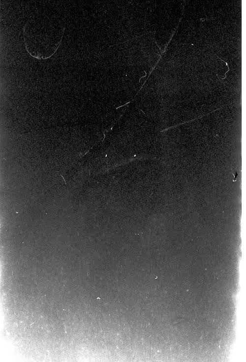
Using dust and scratch texture will work to give a weathered or aged design look. This look mimics the imperfections found on old photographs, films, or surfaces exposed to wear and tear over time. Small specks and dust particles are part of the texture to give the desired effect.
The texture applies to photography or retro-themed designs with an aged or vintage look. It creates a sense of history or decay, too, like in movie posters, especially for thriller and horror genres.
Some fabrics have unique surfaces that give designs a tactile, soft, and realistic feel. Canvas, linen, denim, and burlap are some fabrics that are commonly used. Besides, the weave patterns, threads, and fibers that make up the fabric are part of this texture, too.
Fabric textures are popular in fashion branding, interior design mockups, and rustic-themed projects. Their use in designs aims to evoke a sense of softness, warmth, or craftsmanship. No wonder this grainy texture can emphasize a handmade or artisanal quality.
Using asphalt and concrete texture is more than just using good-condition texture. It also includes specks, cracks, and irregularities that mimic the look of weathered or aged surfaces.
This texture is what designers need when creating urban, industrial, or gritty design themes. The purpose of using this texture is to convey a tough, grounded, or raw aesthetic. Apply the textures for the projects, such as streetwear branding and music festival posters for the best application.
Quite different from other grainy textures for graphic design, the specked texture is more subtle. It features small, randomly placed specks or dots often used to break up flat areas without overwhelming the design.
It is amicable to use on minimalist or modern designs to add a touch of texture to backgrounds, overlays, or illustrations. Moreover, the texture is versatile. So, it can be applied in various contexts. Apply it in web design or print materials and create a more engaging and dynamic visual experience.
Using a grainy texture for graphic design needs so much consideration. It has to consider the overall design context and the message to convey. Like using other elements in any design project, too many will only distract and clutter. The best application of the texture is as subtle as possible and with the purpose in mind.