
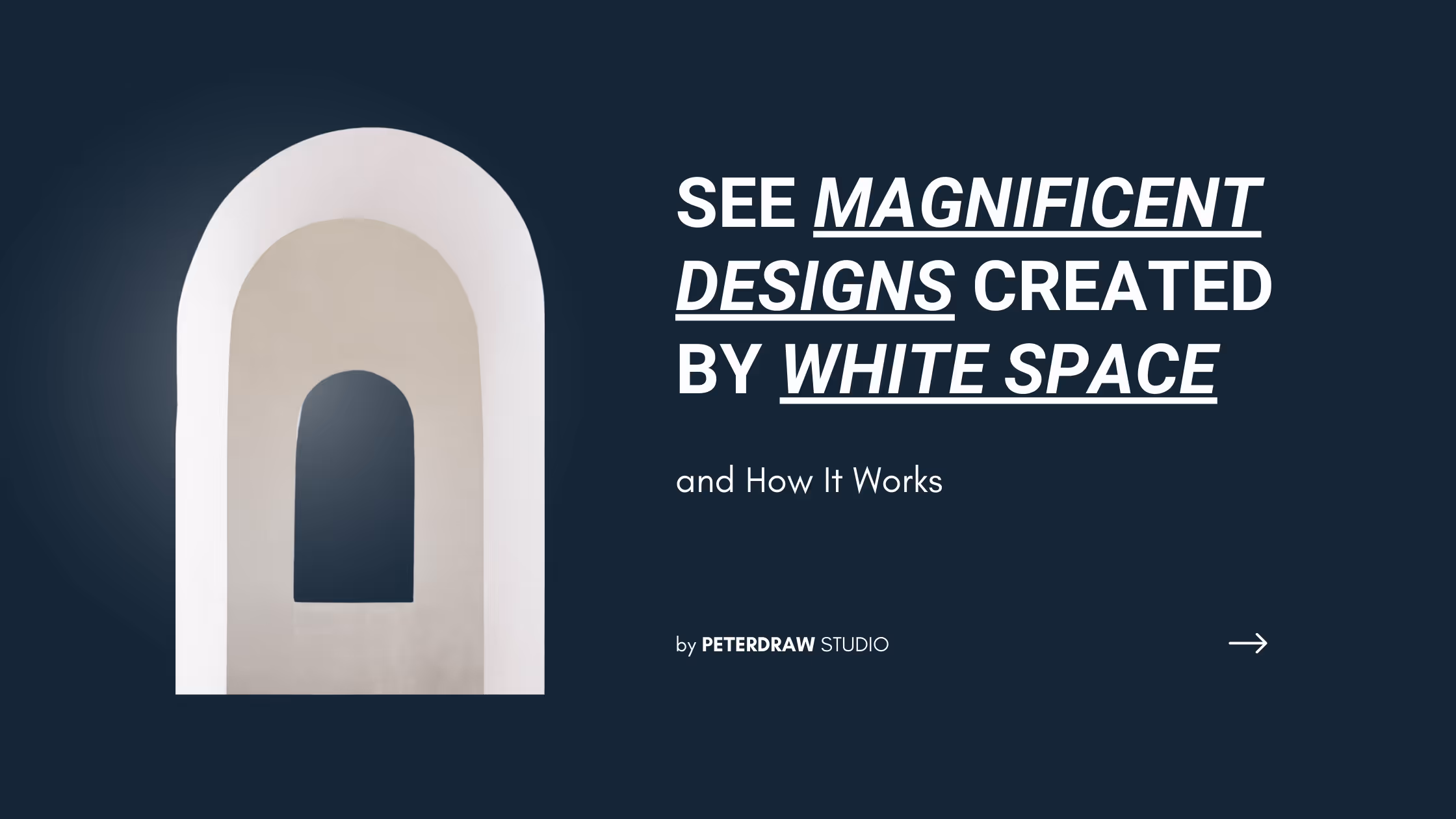
Bold Typography: Mastering Impactful Design for Maximum Engagement
Master bold typography with expert tips on where to use it, the best font recommendations, plus practical techniques to make your designs more impactful and memorable.

Have you ever been satisfied when you see a certain design? Sometimes you can’t even understand where the feeling comes from. In fact, the design is not a complex one that can drop your jaw. In contrast, it is a simple design with a wide space that gives you a loosened feeling. Well, probably you just see a design with a perfect white space. But, what is white space actually? What is it for? And how come it makes you feel this kind of feeling? Find out the answer below!
White space is an empty space between elements in a design canvas. Commonly white space is also called negative space that controls the distance between the layout, lines, paragraphs, and other elements. However, it doesn’t refer to the literal ‘white’ color only. In fact, it can be a different color, texture, pattern, or even a background image. The point is they have to create a space that separates each element. So that, it can create a harmony that lets you breathe. And this is the reason why you can feel such a kind of feeling that we have described in the beginning.
Basically, white space has a powerful impact that can elevate your design. However, you can’t randomly make spaces in every element that can turn your design become meaningless and messy. That’s why you need to understand the types of the white space, and how to apply them on your design.
Micro white space is an empty area between small design elements. You can apply this space to separate characters, lines, and paragraphs. Besides, it is also used to make spaces between grid images and menu links. Other than that, it plays an important role to make the text on your design easy to read. For instance, the marginal white space between lines in a paragraph can affect the comprehension of your readers. Without a proper margin, people will find it difficult to understand the text.

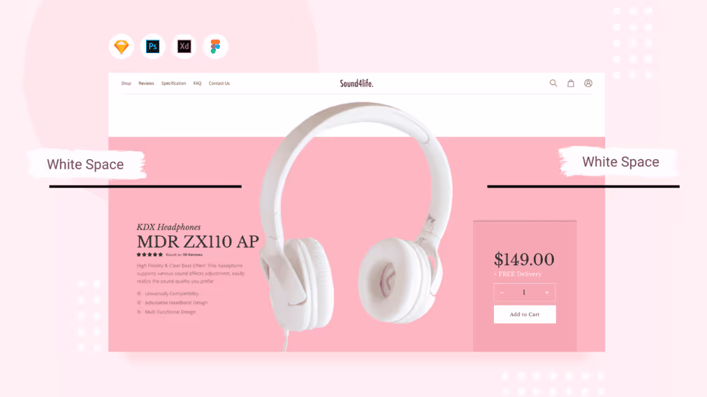
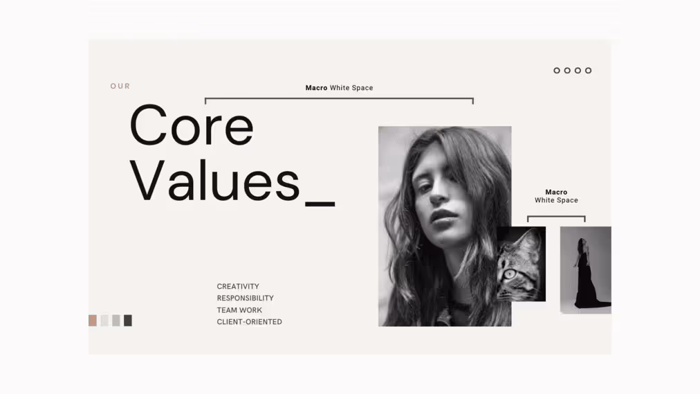
In contrast with micro, macro white space is the large space between major layout elements. You can easily notice this space since it can make you focus on a certain element. Or in other words, it is the ‘big picture’ that you can capture. You can see the example of the use macro white space on the left and right of the blog post.
White space is not like the other design elements. It is invisible but you can notice it. No wonder it plays some essential roles that make your design look way better. Moreover, it can increase functional and artistic values. Along with that, there are a couple of reasons why you will need this element to put on your design.
As we have stated before, the right margin can help the readers to read the text in your design. It is in line with recent studies which state the proper use of micro white space can increase readers’ comprehension by up to 20%. This fact can help you to consider making an appropriate margin for your design.
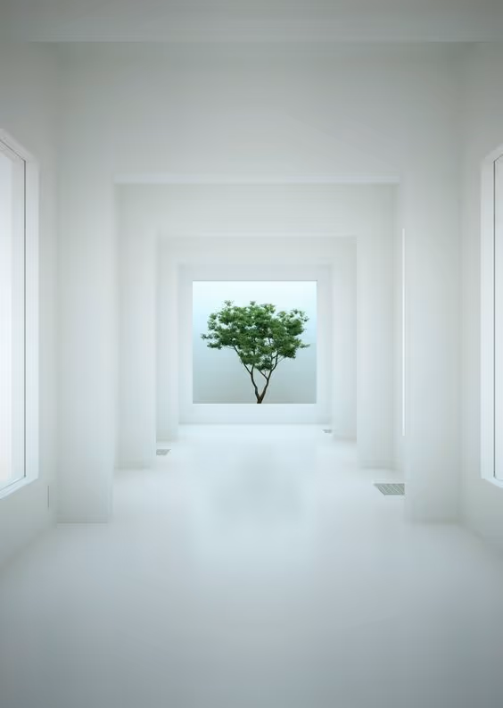
White space gives a wide free area that makes the audiences keep their focus on a certain element. For example, imagine a little tree in the middle of a wide white room. You will automatically pay attention to the tree since the white room enhance the existence of the tree itself. And that’s how the white space works to draw the audience’s focus. Aside, it also avoids the use of unimportant things in the design.
A design full of elements can create a heavy feeling for those who see it. At the worse stage, it can make the design too overwhelming. Thus, as a designer, you will need a free space to breathe. At this point, the white space takes its role to balance that heavy proportion.
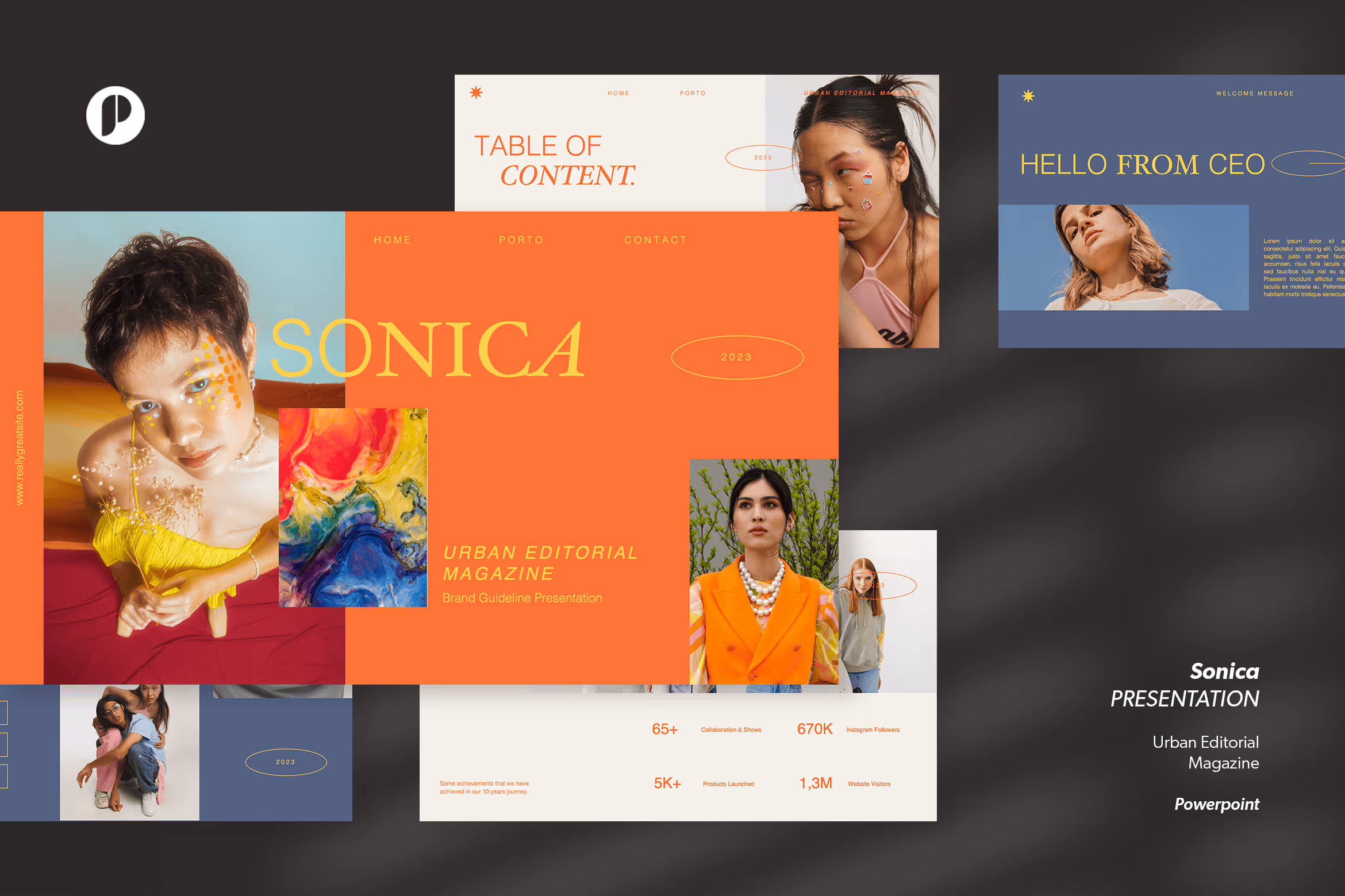


And this is what we have applied to one of our products, Sonica. The template has a very pleasant layout that plays with many white spaces. Every element has a perfect balance that makes them look stand out. Besides, our designer also pays attention to the visual hierarchy, which enhances the overall look of the typeface.
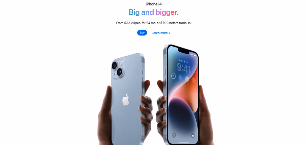
Many luxury brands likely follow the ‘less is more’ concept. As a result, they like to adopt a minimalist style and create a wide white space in their design. Apple brand for example. When you visit their official website, you will be welcomed with a minimalist, clean, and simple landing page that creates a satisfaction feeling.
And this is what we have applied to one of our products, Extronic. If we remove the negative space and make all elements centered, the design will turn out to be super heavy. And the result won’t be as eye-pleasant as it is supposed to be. In contrast, our designer plays with the free space to balance the design. Therefore, you can see that the overall design looks appropriate and captivating.

Like the other design elements, white space is an element that all designers need to consider. It holds multiple crucial roles to increase the artistic values of your design. Moreover, you can achieve sophistication once you are able to combine the micro and macro white space. So, dare to play with this element?
Explore our website to find more fascinating graphic design templates that meet your needs. Stay connected with us on social media, and follow us for more updates. Have a great day and see you in the next post!

