Unlocking Engagement: How Motion Design Transforms Your Website
Turn static pages into engaging experiences with motion design, improve clarity, emotion, and clicks with smart animation.

Running a gym and fitness center doesn’t mean that you will be free from creating a presentation. In some cases, you probably need this type of document for professional matters. For instance, you will need a company profile to introduce your fitness center. Or a business proposal to convince your audience of your business ideas. There are so many probabilities that you can create with a fitness presentation. So, how to shape your fitness presentation that is perfect for your brand voice? Find the answer here!
Visuals speak louder. No wonder your visual design can represent your brand identity as well as your brand voice. You don’t have to write many words to describe your business values. As a result, you can use some styles to resonate with your essence. And this is what you need to apply when you want to create your fitness presentation. Whether you want to highlight your boldness or joy, it all depends on the style you want to apply.
In addition, with appealing visuals and strong branding, they can help you build relationships with your customers. Furthermore, they also can help your fitness center to be fundamental in their workout routine. In short, your fitness center will appear in their top mind whenever they want to build workout routines.
After understanding why you need to firm the presentation with the best style that suits you, now is the time for you to understand how to create it. When you work with the slides, the words you choose should send the right message briefly. Most importantly, it must have on-point visuals that capture their interest at the first sight. Here are several tips that you can try to apply to your presentation.
Before working with the visual of your slides, you need to know the type of presentation that you want to make. It is important to decide the purpose of your presentation, thus you can decide which content you need to put there.
If you want to make a company profile, you have to write some basic information related to your fitness center such as about your gym, the services or classes, the trainers, and the facilities. However, if you want to create a business proposal to make a cooperation with the other parties, you may skip the detailed information and make it even denser. For example, you can add information about your SWOT analysis, target market, and strategy. The clearer you draw your purpose, the better outcome you will make.
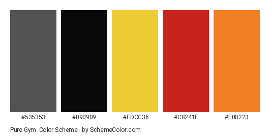
A color palette plays a crucial role to catch people’s attention. When you want to create your fitness presentation, deciding it is as important as the other aspects. However, you can’t randomly choose any kind of colors to visualize your fitness brand. When you want to highlight the word ‘power’ and ‘strength’, black and dark tone colors are the perfect choices. Otherwise, if you want to promote the words ‘dynamic’, ‘joyful’, and ‘positive energy’, bright colors suit your presentation utmost.
Basically, it is the basic element that will be noticed first. As a result, it can increase your brand recognition and affect your customer’s decision, whether they want to use your services or not.
Besides the color palette, the typeface chosen in your fitness presentation also matters. It can be the best media to speak out your values and style. Besides, great typography can make a difference. Why? Because different gym centers have different styles, and so does the typeface you apply.
When you want to create a strong and powerful image, fonts that require a simple and bold stroke with sharp corners can be the best option. For example, you can apply Quicksilver, Quantify, and Name Smile to get the best typography.
However, when your target market is dominated by women or you want to look more dynamic, you can try more feminine yet still firm fonts like Momcake or Coolvetica. In short, matching your typography and your brand values is important to create the most appropriate image.
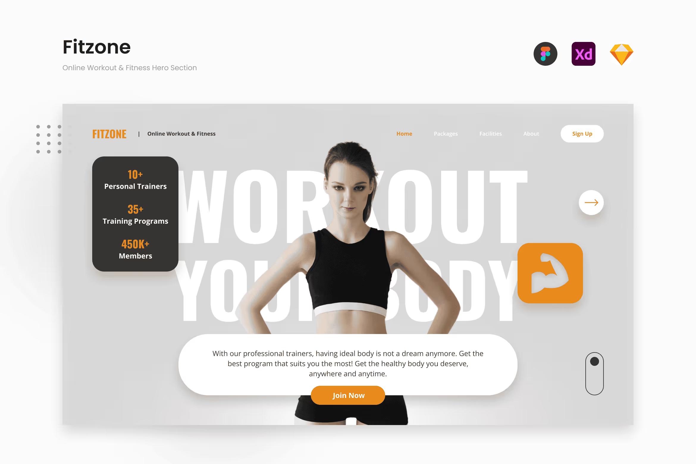
You have already had a complete concept on your mind, but you don’t have enough time to make your own presentation. Chill, guys! You can still nail your work by applying ready-to-use presentation templates that suit your concept. Here are our template recommendations you can try and adjust.
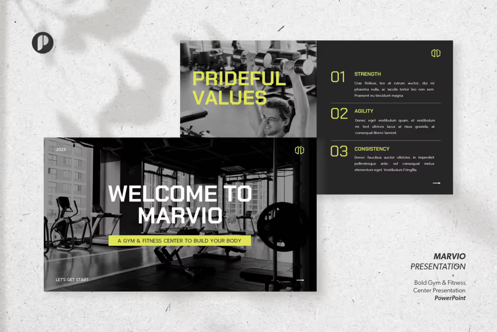
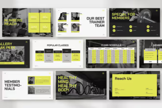

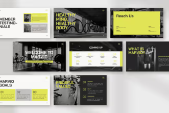
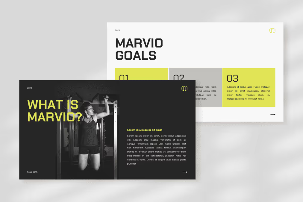
Gym and fitness centers are identical with a black and dark color tone that represent power and strength. Thus, you can try Marvio, the special presentation template brought by Peterdraw Studio. This template provides you with a captivating visual design that people can’t deny. It has a unique color combination that combines black, white, and grey with a little touch of yellow as the highlight. Moreover, its content is pretty varied, starting from the introduction part until the services and membership package. You can introduce your fitness center confidently with this modern template.
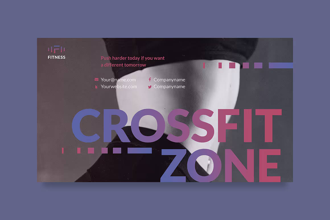
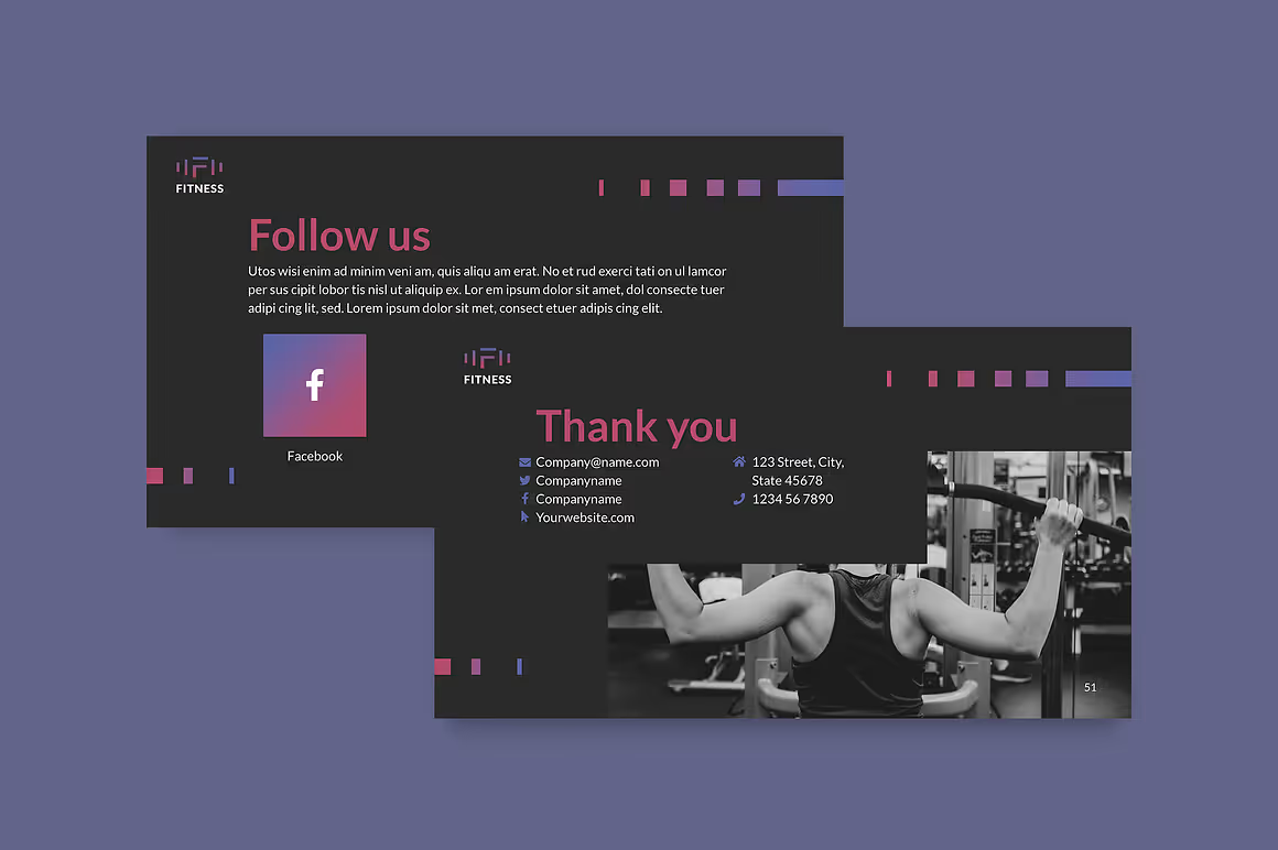
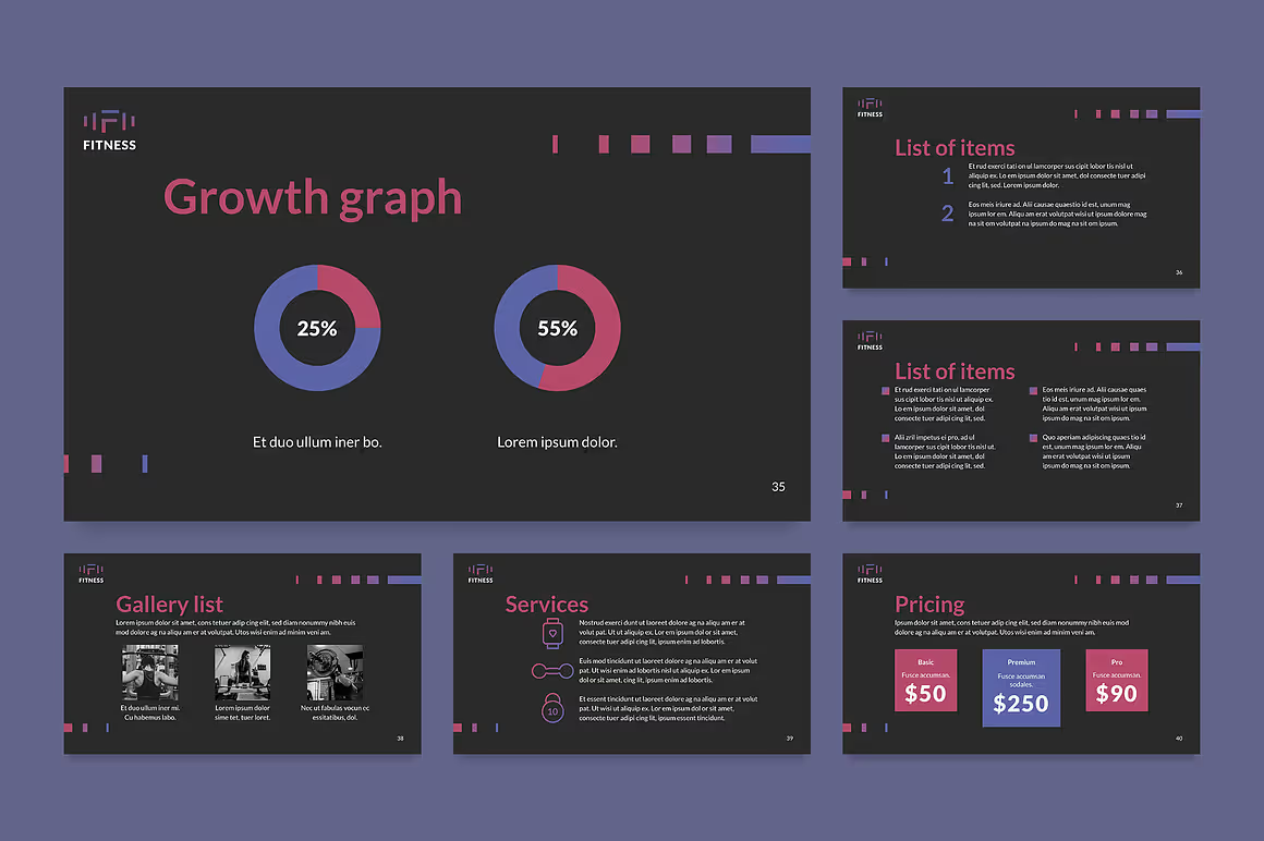
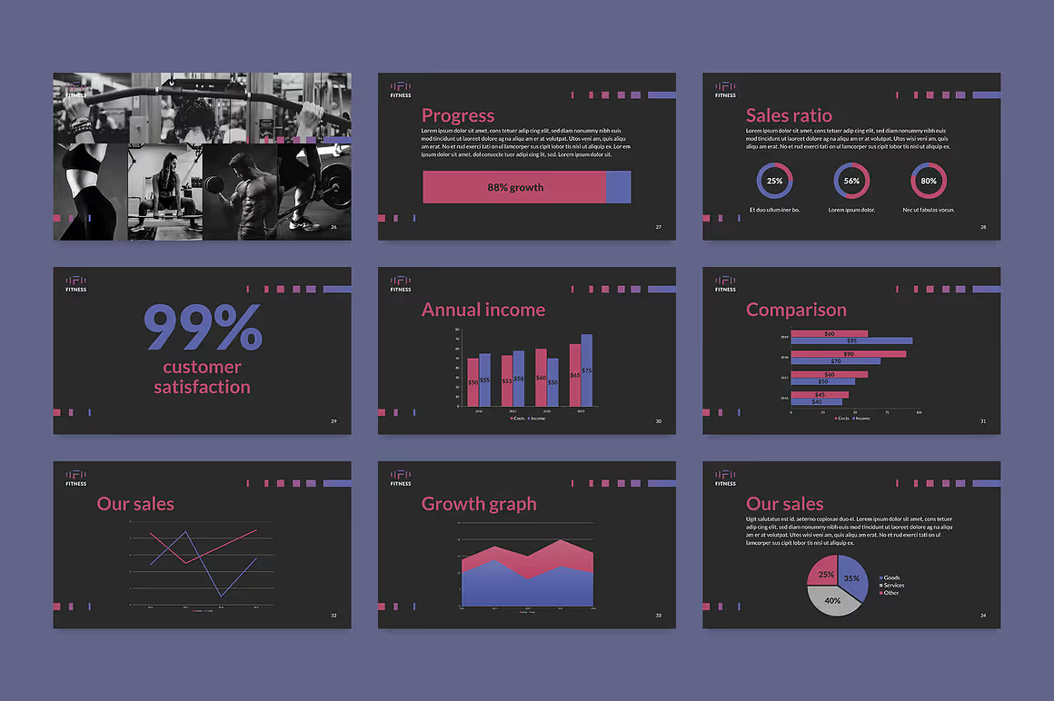
Crossfit Zone is another alluring presentation template that you can try to strengthen your business. It has a captivating layout with a soft but still firm color combination and gradient. This template mixes blue, pink, violet, and white which puts black as its background color. Besides, it also has numerous graphics, charts, and diagrams that can illustrate your performance. Furthermore, this template can help you increase your credible image instantly with its modern layout. So, you don’t have to put much effort into your presentation. Let this captivating template do its job for you.
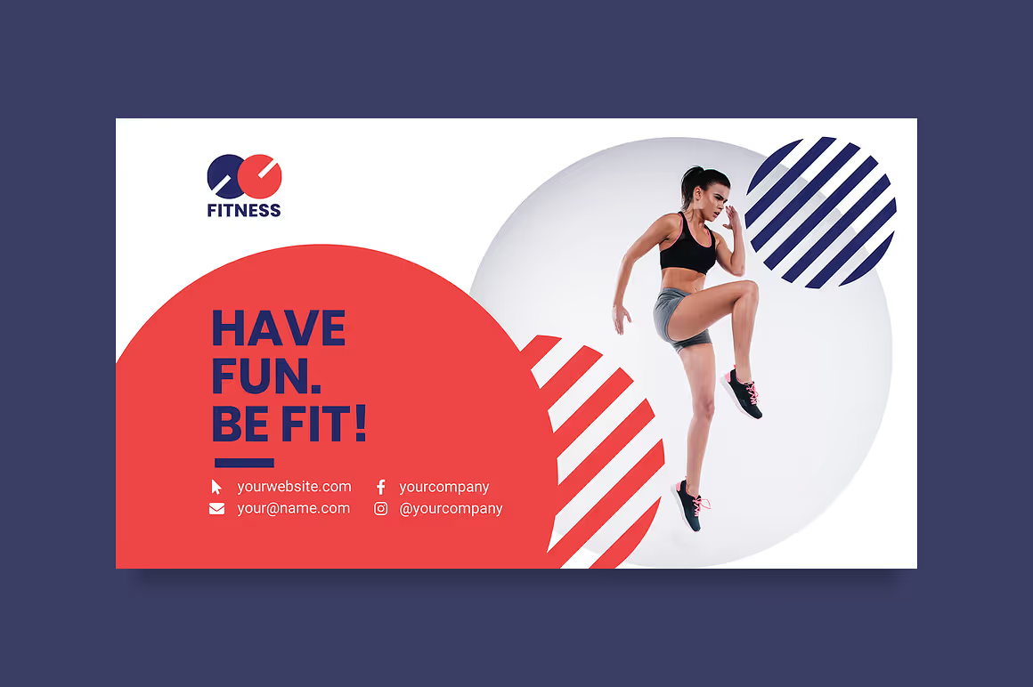
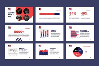
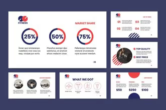
Does your gym center promote a healthy and joyful studio? Well, Fitness by TemplatesNow will be a perfect option for you. This template has a clean and modern layout that you can use to introduce your business. Moreover, its layout is organized in a neat way, making it pleasant to stare at. Furthermore, you can make an incredible impression since this template can create a professional image for your brand.

Are you running a yoga and pilates studio? You probably will be happy with this template. Yoga Club offers you a calming presentation template that you can try to promote your yoga class. This template is dominated by white color as its background and uses pink color tone as its highlight. This template is perfect if you target women as your ideal market. Moreover, the design is quite simple and clean, making your audience more focused on your presentation. Introduce your studio more lovely with this beautiful template!
Creating a fitness presentation can be another challenge for you. How you deliver your message visually is as important as you firm the words. There are many aspects you need to consider while creating your presentation. However, when you need an instant gateway, you can try some templates that we have mentioned above. As a result, you can save time more effectively.
Need more captivating templates for your business? Explore our gallery to find the ones that fit your brand voice. Kindly contact us for more details, help, and questions. See you in the next post!