From Web2 to Web3: How Web3 in Web Design Is Redefining Online Ownership
See how web3 in web design blends blockchain, wallets, and UX to create secure, decentralized, user-first digital experiences.
In the world of graphic design, you can find numerous styles from the most classic ones to the most modern ones. Besides, the design trend is like the upcycle style from time to time, including youthful design style. This style is all about creating a bold, playful, and energic design that is specially created for the youngster. In this article, we will explore this design style and how to make it more alive.
The design style is segmented. Sometimes it can work very well for a certain group, but it can’t for others. Thus, it is important to understand who your target audiences are and what your design is for. For example, the youthful design style has unique characteristics that can represent the energetic soul of teenagers. It plays with bright and bold colors, playful patterns, and creative typography to liven up the teenage mood. Hence, you can use this style to attract your audience, especially the younger ones.
"Youthful design style is all about giving the teens and youngster energy to the graphic design. We usually use bright and cheerful colors as well as cute elements to liven up this kind of mood." -Ghina Luqyana, Creative Director of Peterdraw Studio
Every design has its own unique points that create its special character. When we talk about youthful design style, teenagers will be our orientation. As we have mentioned above, we need to only focus on this group. To do so, there are a couple of key elements of this design style that you can take note of to create your own youthful design.
Adolescence or teenage is the transition era between childhood to adulthood. Many things are changing while this time. The little girls who previously loved childish stuff probably will change their preferences, and so do the boys. Soft pink, baby blue, and white will no longer become the ultimate color palette. In contrast, teenagers likely explore more colors to represent themselves.
“I usually recommend some bright and cheerful colors like orange, yellow, and blue to the designers to make the youthful design even more attractive. Besides, it also can add bright personality to the designs that our designers make,” Ghina said. Those colors are chosen with the main purpose to liven up the playful and cheerful mood. Other than that, bold and vibrant colors like shocking pink, electric blue, and some neon colors in the Y2K design style can be the other options.
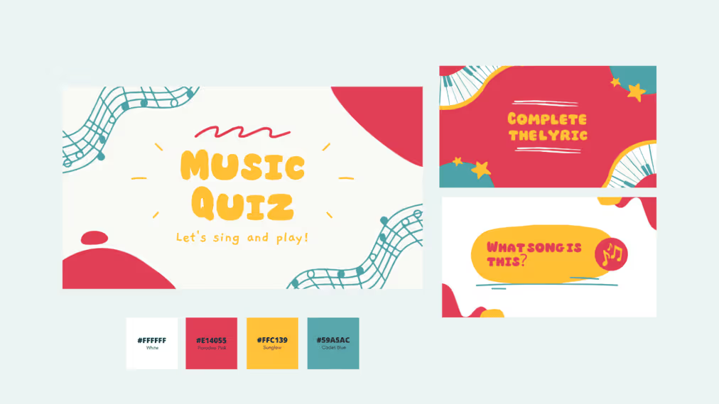
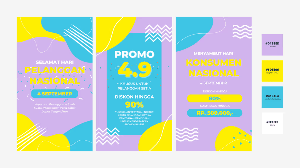
This is like we did in some of our designs targeting young audiences for some promotions. As you can see, there is a playful and bright color combination that we put in one palette. Even though the colors seem too much, they can highlight the personality of teenagers, which is bright and cheerful.
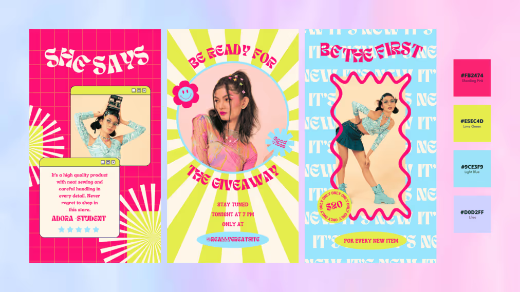
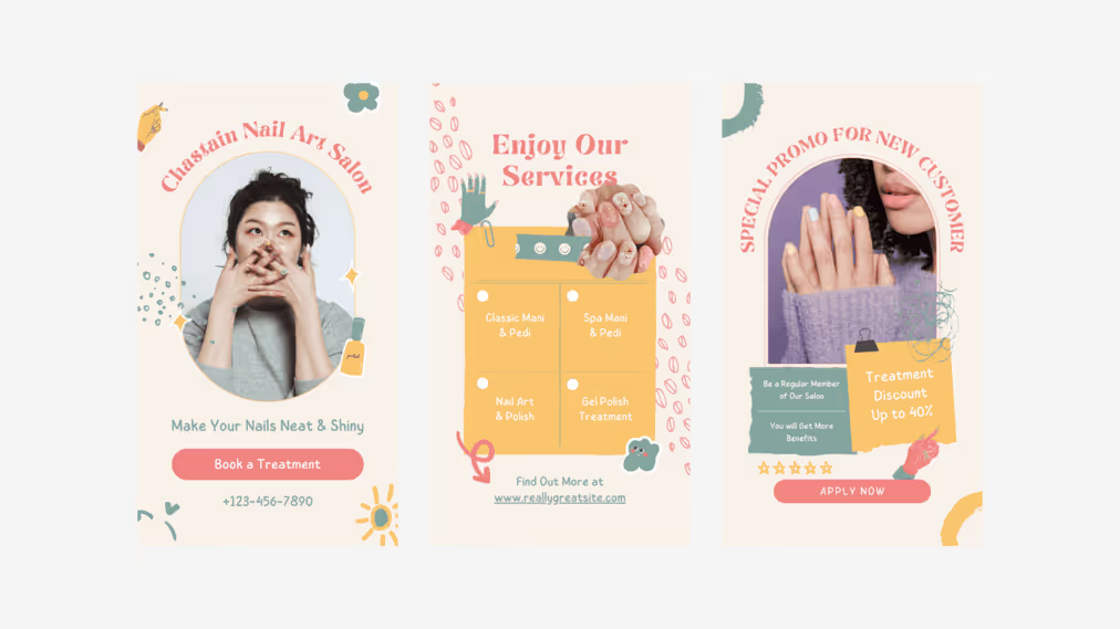
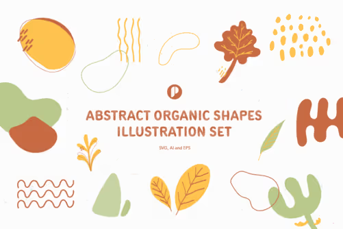
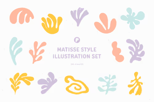
Besides colors, elements also become the biggest pinpoint to focus on. The use of illustrations and elements can simply add a cheerful personality. Thus, you can add some cute and playful hand-drawn illustrations. Other than that, you can also go with some geometric shapes to make your youthful design stand out. This is also like what we did for our designs which require our designers to put in many playful elements.


Not gonna lie, typography also takes an important role to liven up your youthful design. The designs that are aimed at youngsters tend to have playful, expressive, and bold typography in various sizes. Thus, don’t be afraid to play with some uncommon fonts. Leave the rigid ones like san and san serif, and start to play with the supple ones. The handwriting and script fonts like Summer, Polkawars, and Alloha can be your best escapement. But, if you want to make your design even more standout, it’s completely fine to try some bold fonts like Richey, Overlife,
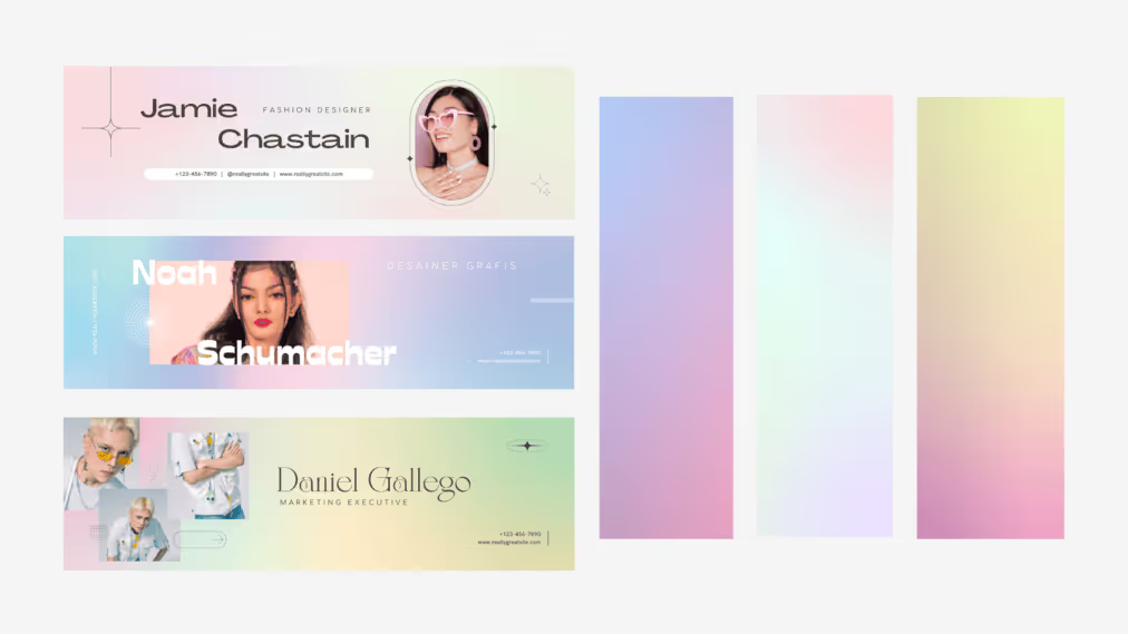
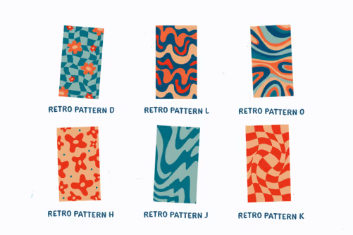
Gradients and patterns—especially in the Y2K style—are popular enough when we talk about youthful design. They can create a sense of movement and young energy effortlessly. Aside, put the chessboard and other retro patterns to make your design more dynamic. In addition, using the right photos and illustration is also the key to making your design stand out with its unique personality. For example, we likely use retro patterns and eye-catchy gradients as the background of our design. We this little touch, we hope that our design can catch the attention of our target audience.
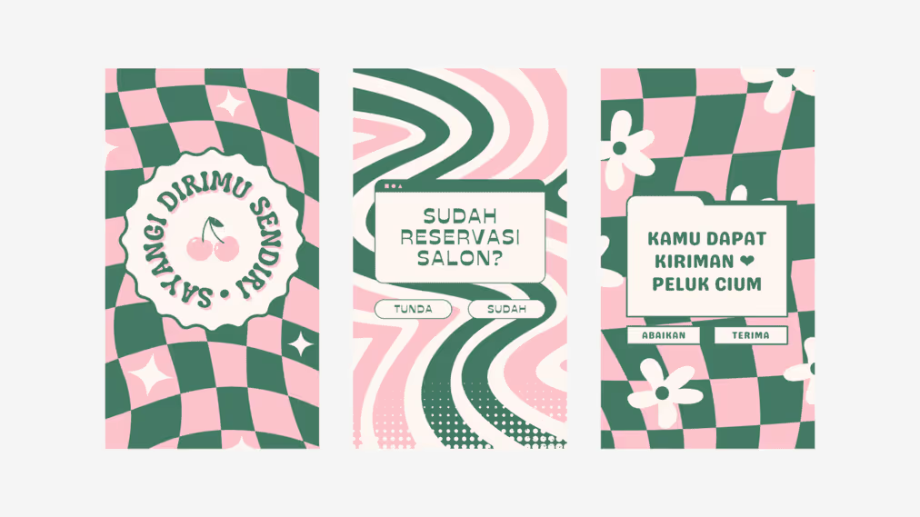
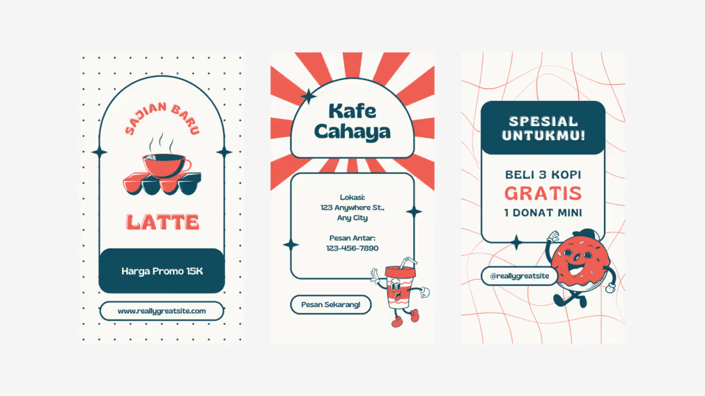
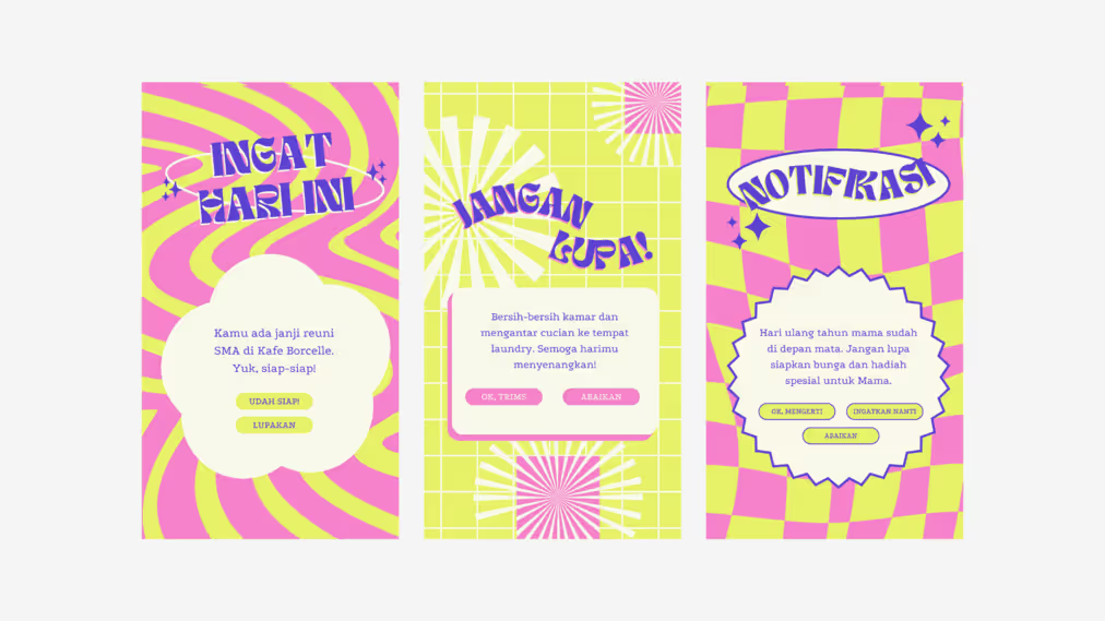
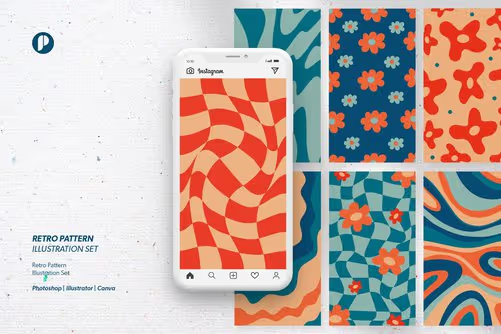
When we talk about youthful design style, we can’t get rid of the characteristic of teenagers. This group of Youngbloods has a lot of energy to try and sometimes likes to break the rules to find their voice. Thus, you can use this characteristic to make your design look like them. As a result, youthful designs often break the rules when it comes to layout arrangement. Additionally, they also like to incorporate overlapping elements, asymmetry, and unconventional arrangements, like in scrapbook style. Along with that, there is a clear goal why making this kind of arrangement for this design style. It is for creating a fresh and exciting look is so them.


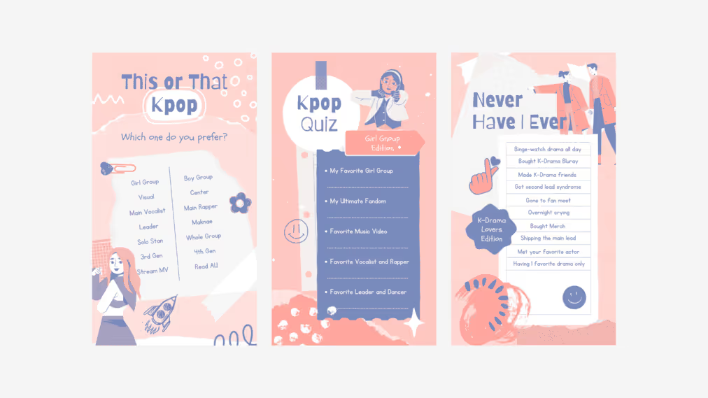
Overall, a youthful design style is all about bringing fun and energetic vibes to your design. Bright color palettes, playful elements and typography, dynamic patterns, and layout are the keys to inflaming the spirit of the youngster. With all of them, you can effortlessly create an eye-catchy design and give a touch of teenage personality.
Need more graphic design inspirations that meet your preference styles and needs? Explore our gallery and visit our Canva Shop to get numerous design templates for your business.